GPT Image 2.5 Prompting Guide: How to Write Prompts That Work
A practical GPT Image 2.5 prompting guide: the seven-part prompt skeleton, 12 copy-paste prompts, edit rules, and the settings that matter. Try it free on Felo.
GPT Image 2.5 removed most of the excuses.
It follows instructions more closely. It keeps a face, a product, or a character recognizable across edits. It renders short text you can actually read. And it generates up to 50% faster than GPT Image 2, so you can test five directions instead of one.
Which means that when a render still comes back wrong, the model is usually not the problem. The brief is.
OpenAI's own image prompting guide says it in one line: start with the image you need, then describe the subject, composition, style, and constraints. That is easy to read and surprisingly hard to do, and the prompt-level detail is the part worth keeping.
So here is the practical version: what each prompt slot does, twelve prompts you can copy today, and the rules that separate a usable image from a lucky one.
If you want to run any of these prompts while you read, Felo's GPT-Image 2.5 workspace is free to start, runs in the browser, and needs no API key.
Every image in this guide was generated with GPT-Image 2.5 on Felo, including the cover. No design overlays.
What changed in GPT Image 2.5
Four upgrades matter for prompt writing, because each one changes what you can ask for.
- Natural light and texture. Skin, fabric, metal, and glass read like materials instead of surfaces. You can describe them explicitly and expect them back.
- Reference fidelity. Upload a photo and the subject's distinctive features survive a new setting, style, or composition. That is what makes character and product series possible.
- Stable multi-turn editing. Across several rounds of changes, the parts you did not mention stay where they were. Earlier edits stop unraveling.
- Readable text. Short copy — headlines, labels, packaging, UI strings — renders more accurately, especially when you quote it and say where it goes.
Behind the API there are two models, and the choice is about speed versus precision:
| Model | Built for | Trade-off |
|---|---|---|
| GPT-Image-2.5 Flare | Everyday generation, social and product content, rapid prototyping, high volume | Quality comparable to GPT Image 2 at up to 50% lower latency |
| GPT-Image-2.5 Sunburst | Production creative, precise edits, dense detail, anything client-facing | Higher quality than GPT Image 2, slower per image |
Both cost the same per token. If you are not sure which one you need, generate the same prompt on both and compare the thing you actually care about — usually text accuracy or face consistency, not overall prettiness. We covered the launch details in GPT-Image 2.5 on Felo.
The seven slots of a GPT Image 2.5 prompt
Most prompts fail because they describe a subject and forget everything else. The model then makes reasonable choices for you, and reasonable is rarely what you wanted.
Fill these seven slots and the output stops being a lottery:
- Job — what the image is for. A product photo, an event poster, a character sheet, a slide. This single line changes the composition.
- Subject — who or what is in frame, described with the details that identify it: age, materials, colors, wear, finish.
- Action and interaction — what is happening. Where the hands are, where the gaze goes, how an object is held.
- Composition — framing, camera angle, how much space the subject occupies, and where empty space is needed for text.
- Light, material, and texture — the physical description. Soft window light, brushed aluminum, coarse paper, wet asphalt.
- Style and medium — photorealistic, editorial photograph, flat vector illustration, watercolor, 3D render. Ask for "photorealistic" or "real photograph" when that is the goal.
- Text and constraints — the exact copy in quotes, where it goes, how many times it appears, and what must not appear: extra text, logos, watermarks, heavy retouching.
For anything more complex than a single subject, group the slots into labeled sections. OpenAI's guide recommends a scene / subject / details / constraints structure, and it is the format that survives the most edits:
Scene: the setting, the time of day, the environment.
Subject: who or what the image is about.
Details: composition, light, materials, style, exact text.
Constraints: what must not change or must not appear.
Weak prompt vs. working prompt
Here is the same idea at two levels of detail.
Weak:
A premium coffee bag on a table, nice lighting.
You will get a coffee bag. You will not get your coffee bag, at the angle you need, with a label you can read.
Working:
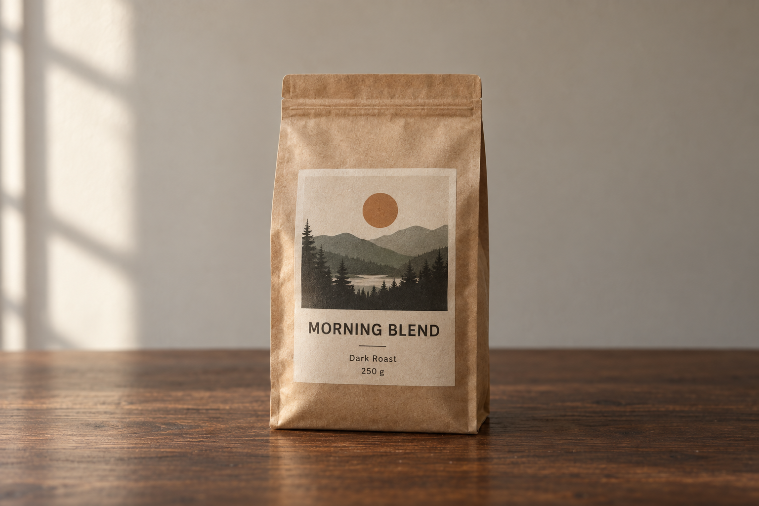
Product photograph of a 250 g matte kraft-paper coffee bag standing upright on a dark walnut
table. The front label faces the camera straight on and stays fully legible.
Label text (exact): "MORNING BLEND" as the headline, "Dark Roast · 250 g" beneath it.
Composition: centered, three-quarter height, generous negative space above for a headline.
Light: soft directional window light from the left, gentle contact shadow under the bag,
warm neutral color balance.
Style: premium e-commerce photography, shallow depth of field, subtle film grain.
Constraints: no extra text, no logos, no watermarks, no hands, no props crowding the frame.
Same model. Same settings. Two completely different assets.
Settings you should not put in the prompt
If you generate through the OpenAI API, size, quality, and background are parameters — not sentences. Telling the model "make it 4K" in prose is a suggestion. Setting size is a guarantee.
| Parameter | What to set it to | When it matters |
|---|---|---|
model | gpt-image-2.5-flare or gpt-image-2.5-sunburst | Speed versus precision, per workload |
quality | low, medium, high, xhigh, max | Small text, dense diagrams, final deliverables |
size | 1024x1024, 1536x1024, 1024x1536, 2048x2048, 2048x1152, 3840x2160, 2160x3840, or a custom WIDTHxHEIGHT | Print, slides, vertical social formats |
background | auto, opaque, or transparent | Cutouts, stickers, logos, compositing |
Custom sizes follow hard rules: each edge must be a multiple of 16, no edge may exceed 3,840 px, the long-to-short ratio cannot exceed 3:1, and total pixels must land between 655,360 and 8,294,400. Outputs above 3,686,400 pixels — anything past 2560×1440 — are flagged experimental, so check them before you ship.
Two habits make quality settings pay off:
- Draft low, finish high. Explore composition at
lowormedium, then re-run the winning prompt athighor above. Quality tiers change output tokens, and the top tier costs roughly 36× the bottom one. - Climb only to fix something. Move up a tier when small text is mush or a diagram's labels collapse — not because higher sounds safer. A higher setting does not guarantee a better image for every prompt.
On Felo you skip this layer entirely: you pick GPT-Image 2.5, choose your format and resolution, and generate. The workspace handles the parameters, so the prompt is the only thing you have to get right.
12 copy-paste prompts
These are working starting points, not sacred text. Swap the subject, keep the structure.
1. Photorealistic portrait that does not look synthetic
Create a photorealistic candid photograph of a bicycle mechanic in her late 40s,
wiping her hands on a rag in a narrow repair shop.
Visible skin texture: pores, freckles, a small scar on the forearm. Faded ink smudges
on her knuckles. A denim apron worn soft at the edges.
Shot like a 35 mm film photograph, medium shot at eye level, 50 mm lens.
Light: overcast daylight through an open garage door, soft falloff, no harsh highlights.
Color: natural and slightly muted, subtle grain.
Feel: unposed and ordinary, real materials and everyday clutter.
Constraints: no glamorization, no heavy retouching, no studio lighting, no text.
Why it works: it names the job (candid photograph), the light, and the film reference, then explicitly refuses the retouching the model would otherwise add.
2. E-commerce product shot with a legible label
Studio product photograph of a frosted glass 50 ml serum bottle with a brushed gold cap,
standing on a pale stone plinth against a soft beige backdrop.
Label text (exact): "LUMEN" as the brand, "Hydrating Serum · 50 ml" beneath it.
Render the label text once, straight on, sharp and fully legible.
Composition: centered, full bottle in frame, generous empty space on the right.
Light: large softbox from the upper right, gentle gradient falloff, clean contact shadow.
Style: premium beauty e-commerce photography, crisp detail, no props.
Constraints: no additional text, no logos, no watermarks, no reflections of studio equipment.
Why it works: short text, quoted exactly, positioned and counted — the three things that make in-image copy survive.
3. Poster with a headline you can read
Design a bold event poster for an electronic music night.
Headline (exact, once): "CITY LIGHTS FESTIVAL"
Subline (exact, once): "SAT 14 NOV · DOCK 9 · 22:00"
Visual: a duotone night skyline in deep indigo and warm amber, grain texture, strong diagonal
composition with the headline sitting in the calm upper third.
Typography: heavy condensed sans-serif, high contrast against the background, generous kerning.
Format: vertical poster, print quality.
Constraints: no extra text, no sponsor logos, no watermarks, no stock-photo people.
Why it works: it separates the artwork from the typography brief, spells out both strings, and keeps the copy short enough for a poster.
4. Character reference sheet for a series
Create a character reference sheet for an original character.
Character: a young forest ranger with close-cropped dark hair, freckles across the nose,
a moss-green canvas jacket, a burnt-orange scarf, and scuffed leather boots.
Sheet contents: three views — front, three-quarter, and profile — plus one detail close-up
of the scarf knot.
Style: clean concept-art illustration, soft cel shading, consistent line weight,
neutral light gray background.
Layout: evenly spaced figures, same proportions across every view, no overlapping limbs.
Constraints: original design, no copyrighted characters, no text, no watermarks.
Why it works: a reference sheet is a format, not a picture. Naming the views and the fixed details is what makes it reusable as an input for later scenes.
5. Comic strip with a consistent hero
Create a four-panel horizontal comic strip, same character in every panel.
Character consistency: same face, same short red jacket, same black bob haircut,
same proportions and line weight throughout.
Panel 1: she opens the front door and looks back into the apartment.
Panel 2: the door clicks shut; the cat, alone, turns slowly toward the empty room.
Panel 3: the cat sprawls across the sofa in a shaft of afternoon light.
Panel 4: the door opens again; the cat sits primly by the entrance, composed.
Style: clean flat comic illustration, limited palette, thin black outlines.
Constraints: no speech bubbles, no text, no watermarks, no style drift between panels.
Why it works: panels are listed explicitly, and the consistency clause is repeated instead of assumed.
6. Infographic that explains a process
Create a clean infographic titled "How a Heat Pump Heats a House" for a general audience.
Show four stages connected by arrows: the outdoor unit absorbs heat from the air →
the refrigerant is compressed → heat is released indoors → the refrigerant expands and loops back.
Label each stage with a short caption, and label the key parts: outdoor unit, compressor,
expansion valve, indoor coil.
Style: flat vector illustration, muted blue and warm orange palette, white background,
consistent icon style, generous white space, readable labels.
Constraints: no tiny text, no decorative clutter, no watermarks.
Why it works: it treats the image as an instructional design brief — audience, stages, labels, visual system — instead of an illustration request.
7. Pitch-deck slide with real numbers
Create one pitch-deck slide titled "Market Opportunity" in the style of a clean Series A deck.
Layout: title top-left, a TAM/SAM/SOM nested-circle diagram in muted blues and grays,
a bar chart beneath it showing growth from 2021 to 2026, and a quiet footer line.
Use exactly these numbers: TAM $42B, SAM $8.7B, SOM $340M.
Footnotes (exact): "Source: internal analysis"
Style: white background, modern sans-serif typography, generous margins, crisp data hierarchy,
no shadows and no gradients.
Constraints: no clip art, no stock photos, no decorative elements, no extra text.
Why it works: it specifies the deliverable (one slide), the canvas, the hierarchy, and the actual data — and it flags the footnotes as text, because that is where models improvise most.
8. App UI mockup that looks shipped
Create a realistic mobile app UI mockup for a neighborhood farmers market.
Screens: a simple header, a short vendor list with small photos and category labels,
a "Today's specials" section with two items, and a footer with location and opening hours.
Style: white background, subtle natural accent colors, clear type scale, minimal decoration,
realistic spacing and touch targets. It should look like a real, usable, well-designed product.
Present the screen inside a modern phone frame, straight on, on a plain light background.
Constraints: no concept-art styling, no invented brand logos, no watermarks.
Why it works: it describes the product as if it already exists and asks for interface realism instead of concept art.
9. Transparent product cutout
Extract the product from the input image and isolate it on a fully transparent background.
Output: centered product, crisp silhouette, clean alpha edges, no halos or fringing.
Preserve product geometry, proportions, and label legibility exactly.
Add only light polishing. Do not add a solid backdrop, checkerboard, scenery, floor, or shadow.
Do not restyle the product.
Constraints: transparency must be real alpha, not a painted background.
Why it works: it asks for the isolated subject and a transparent background, then names the specific failure modes — checkerboards and halos — before they happen.
10. Style transfer to a new subject
Use the visual style from the input image — its palette, texture, and rendering medium —
and apply it to a new subject: a lighthouse on a rocky coast at dusk.
Keep the style's color range, brush treatment, and level of detail.
Change only the subject. Do not copy the original composition or reuse its objects.
Constraints: no text, no watermarks, no signature, no frame border.
Why it works: it gives the reference a specific role — palette, texture, medium — instead of saying "same style," which is vague enough for the model to copy the whole picture.
11. Precise local edit
In this room photo, replace only the white dining chairs with chairs made of light oak.
Preserve everything else exactly: camera angle, wall color, rug pattern, table, pendant light,
window light direction, floor shadows, and surrounding objects.
Match the existing perspective and soft daylight; add realistic contact shadows and wood grain.
Constraints: change nothing outside the chairs, no added decor, no text.
Why it works: one change, one long preserve list. When the result still drifts, the fix is usually the missing item in that list — not a longer instruction.
12. Translate a design without breaking it
Translate the text in the infographic from English to Spanish.
Do not change any other aspect of the image: layout, icons, colors, typography,
line weights, spacing, and illustration style all stay exactly as they are.
Match the original type size and alignment so the translated text fits the same areas.
Constraints: no leftover English words, no added text, no watermarks.
Why it works: translation prompts fail by redesigning the layout. "Translate, do not redesign," plus a list of what stays fixed, keeps the asset reusable.
How to write text that actually renders
Text used to be the fastest way to make an AI image look fake. It is much better now, but only if you give it something to work with.
- Quote the copy exactly.
headline reads "CITY LIGHTS FESTIVAL"beats "add some event text." - Say how many times it appears. "Render the tagline exactly once" prevents doubles and echoes.
- Spell out anything unusual. For brand names or odd spellings, give the letters, then check the output letter by letter.
- Name the typography. Bold condensed sans-serif, centered, generous kerning, high contrast.
- Keep it short. Headlines, labels, prices, short callouts. Paragraphs still belong in a layout tool.
- Close the door. Finish with "no extra text, no watermarks, no logos" — otherwise the model may invent captions or signage.
- Raise quality for small text. Dense labels, legends, axes, and footnotes are worth
highor above, plus a landscape size that gives them room.
Two checks before you use anything: reread every word in the image, and reread every number. Charts and diagrams are where a plausible-looking mistake survives review.
Reference images need roles, not vibes
When you upload several images, number them and assign a job. "Use the references" gives the model room to blend everything together; assigning roles does not.
Image 1 is the identity reference for the person — preserve face, features, and proportions.
Image 2 is the clothing reference — dress the person in these garments.
Image 3 is the background reference — place her in that environment.
Match the lighting and color temperature of image 3, and keep the pose from image 1.
Constraints: do not change her face, body shape, or hairstyle; do not add accessories, text, or logos.
Two rules make this reliable:
- Say what moves and what stays. "Place the dog from image 2 next to the woman in image 1, matched to the existing light" is a compositing brief. "Combine these" is a wish.
- Restate the anchors every turn. For series work, repeat the identifying details — tunic color, facial features, proportions, palette — even when they feel obvious. Models drift when constraints stop being restated.
For recurring characters and products, approve one baseline image and reuse it as the input for every new scene. When a later version drifts, you still have the approved one.
Editing without drift
GPT Image 2.5 is better at multi-turn editing than its predecessor, but "better" is not "automatic." The pattern that holds up:
- Change one thing per turn. Lighting, background, or copy — not all three. Otherwise you cannot tell what worked.
- Use the change-only formula. "Change only X," followed by an explicit preserve list. For any region that must stay pixel-identical, composite it back into the original instead of relying on the prompt.
- Feed the previous output back in. Edit the image you just approved rather than re-describing the scene from scratch.
- Keep the approved versions. When an edit breaks the composition, you want a version to return to, not a memory of one.
- Finish fine typography elsewhere. The last 5% of kerning and spacing is faster in a layout tool than in three more generations.
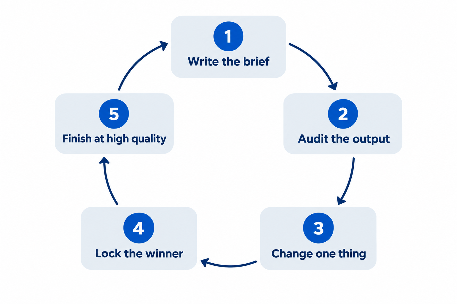
A 15-minute iteration loop
The difference between people who get usable images and people who get lucky ones is not prompt vocabulary. It is the loop.
- Baseline (2 minutes). Write the seven slots. Generate one image at draft quality.
- Audit (2 minutes). Check five things: subject, composition, light, text, constraints. Name the single biggest problem out loud.
- One change (2 minutes). Rewrite only the slot that caused the problem. Keep the rest of the prompt untouched so the comparison means something.
- Lock (1 minute). When a render is acceptable, save it and note which prompt version produced it. That version becomes your reference.
- Finish (5 minutes). Re-run the winning prompt at higher quality and full resolution. Then check the result at final size — on a phone feed, in a slide, or printed — not zoomed in on a monitor.
Most people skip step 3 and rewrite the entire prompt each time. That is how you spend an hour and learn nothing about what the model responded to.
Common failures and their fixes
| Symptom | What actually went wrong | Fix |
|---|---|---|
| Skin and surfaces look plastic | The prompt asked for "perfect" and "polished" but never for texture | Name skin, pores, wear, and materials; add "no heavy retouching" or "no glamorization" |
| Text is garbled or doubled | The copy was paraphrased, or the count was never stated | Quote the string, say "exactly once," raise quality for small type |
| The character changes between images | Consistency details stopped being repeated | Reuse the approved image as input and restate the identifying details every turn |
| The edit changed more than you asked | There was no preserve list | List what stays fixed, and composite pixel-identical regions |
| The same detail keeps coming back wrong | You keep re-rolling the whole prompt | Change one slot, keep everything else identical, then compare |
| A "transparent" PNG has a gray checkerboard | The background was drawn instead of removed | Request transparency explicitly, export PNG or WebP, check the alpha channel |
| 4K output looks soft in the fine print | Small text was generated at draft quality | Generate text-heavy images at high or above and check at final display size |
| Every image looks like a stock photo | The prompt described a category, not a specific moment | Add a job, a place, a time of day, and one concrete detail worth looking at |
Run these prompts on Felo
Everything in this guide works through the OpenAI API, with your own key, billing, and parameter management. If you would rather spend your time on prompts than plumbing, Felo puts GPT-Image 2.5 in a browser tab:
- Free to start. Daily credits, no credit card, no API key.
- No watermark, full commercial rights. Including on the free plan.
- Up to 4K output. Native 3840×2160, so the first render can be the final asset.
- 50+ visual styles and text in 50+ languages. Useful for posters, packaging, menus, and multilingual campaigns.
- Every top model in one workspace. GPT-Image 2.5, GPT-Image 2, Nano Banana Pro, Nano Banana 2 Lite, Grok Imagine 2.0, Gemini 3.1 Flash Image, and more — swap models when a job calls for a different strength.
- Guided workflows. Storyboards, expression sheets, title sequences, and sprite sheets that start you off with a working prompt structure.
Inside the workspace there is also a shelf of ready prompts you can fire off before writing your own — six-panel storyboards, event posters, product packaging, comic strips, explainer graphics, and ad variants. Treat them as calibration: run one, read the result, then apply the seven slots to your own project.
FAQ
What is the best way to prompt GPT Image 2.5? Describe the image the way you would brief a designer: intended use, subject, action, composition, light and materials, style, then exact text and constraints. Group those into labeled sections for complex images, and change one thing at a time when you iterate.
Should I use GPT-Image-2.5 Flare or Sunburst? Start with Flare when speed matters and the output will be reviewed quickly. Use Sunburst for production creative, dense detail, and precise edits. Both are priced the same, so the choice is about quality and latency, not cost.
How do I get readable text in an AI image? Quote the exact copy, say where it goes and how many times it appears, name the typography, keep it short, and add "no extra text." Then read every word in the output — and use a higher quality setting when the type is small.
How do I keep a character or product consistent across images? Approve one baseline image, upload it as a reference for each new scene, assign it an explicit role, and restate the identifying details in every prompt. Consistency comes from repeated constraints plus a fixed reference, not from luck.
Why does my edit change parts of the image I did not mention? Because the prompt only listed the change and never the preserve list. Say "change only X," then name everything that must stay: camera angle, lighting, geometry, labels, and background objects.
Do I need the OpenAI API to use these prompts? No. The prompt techniques are model-level, and Felo's GPT-Image 2.5 workspace runs the model in the browser without an API key, so you can paste any prompt from this guide and generate immediately.
Are images generated with GPT Image 2.5 free to use commercially? On Felo, yes — images come with full commercial rights and no watermark, including on the free plan.
Write the brief, not the wish
The gap between a mediocre render and a usable asset is almost never a magic word. It is a job description, a composition, a light, a material, a quoted line of copy, and a list of things that must not change.
Write all seven slots once and you will feel the difference. Then change one slot at a time and watch the model follow.
Open the workspace, paste a prompt from this guide, and see what GPT-Image 2.5 does with a real brief.