GPT-Image 2.5 Use Cases: 12 Things You Can Actually Make

From profile photos to product packshots: 12 GPT-Image 2.5 use cases with copy-paste prompts, plus the habits that keep faces, products, and text consistent.
A model upgrade is easy to celebrate and surprisingly hard to use. The renders look better, the details hold, the text reads — and then you sit down on a Tuesday afternoon and ask what any of that is actually for.
So here is the practical version. Twelve jobs GPT-Image 2.5 does well, ordered from personal projects to e-commerce work, each with a prompt you can copy and a short note on why it works. All of them follow one idea: brief the model the way you would brief a designer — what the image is for, who or what is in it, how it is framed, how it is lit, and what must not change.
If you have not read the launch notes yet, the short version: GPT-Image 2.5 (also called ChatGPT Images 2.5) arrived on September 8, 2026 with sharper detail, more natural light and texture, reference photos that stay recognizable, edits that hold together across turns, readable short text, and up to 50% lower latency than the previous generation. It runs on Felo, free to start, with no API key.
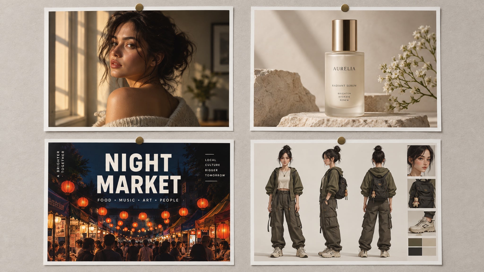
Every image in this post was generated with GPT-Image 2.5 on Felo. The text in the poster and packaging images is the model's output, not a design overlay.
Start with the job, not the model
Three questions decide almost everything that follows:
- Where will this image live? A profile photo, a poster, and a product listing have different rules — square or vertical, how close the crop is, how much empty space the layout needs.
- What has to stay identical? A face, a label, a logo, the curve of a bottle. Whatever that is goes into a reference image and into the preserve list inside your prompt.
- What is the exact copy? Quoted, spelled out, and placed. GPT-Image 2.5 renders short lines of text well; it does not write paragraphs for you.
Answer those three and the prompt mostly writes itself. If you want the full anatomy of a prompt — every slot, in order — our GPT-Image 2.5 prompting guide covers it in detail.
Personal projects
1. A profile photo that still looks like you
The upgrade most people feel first is skin. Faces come back with pores, freckles, and natural unevenness instead of the wax finish earlier models produced — but only if you ask for it and refuse the retouching.
Create a natural head-and-shoulders portrait of the person in the reference photo.
Keep the face, hairline, and features unchanged.
Expression: relaxed, mid-laugh, looking slightly off camera.
Light: late-afternoon window light from the left, soft falloff, a catchlight in the eyes.
Wardrobe: plain dark crew-neck, no logos.
Background: softly out-of-focus neutral grey wall, no clutter.
Style: 85 mm portrait, shallow depth of field, true-to-life skin texture, minimal retouching.
Constraints: no beauty filter, no skin smoothing, no added jewellery, no text.
Why it works: it names the lens and the light, then forbids the two things that make AI portraits obvious — plastic skin and studio perfection.
2. The same photo in four styles
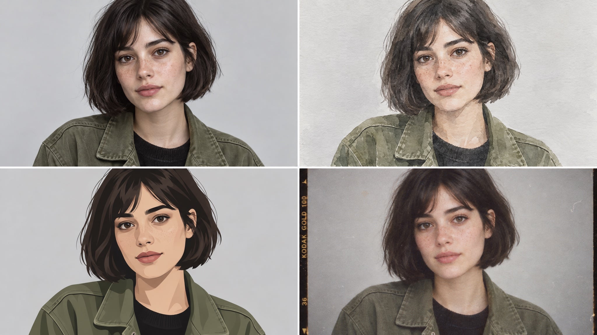
One reference photo is enough to build a small set of looks for the same person: a realistic version for work, an illustrated version for a channel banner, a film-look version for a personal page.
Create a four-panel grid of the same person from the reference photo:
photorealistic portrait, loose watercolour, flat vector illustration, and 1990s film photograph.
Keep the same face, the same short dark bob, and the same olive jacket in all four panels.
Evenly spaced panels, identical framing and head size, neutral light-grey background.
Constraints: no text, no watermark, no style blending between panels.
Why it works: "identical framing and head size" is doing the heavy lifting. Without it, the model varies the crop as well as the style, and the grid stops looking deliberate.
3. An invitation or poster for something you are hosting
This is the fastest way to see how far text rendering has come. Keep the copy to two short lines and let the model handle the layout.
Design a vertical poster for a rooftop dinner party.
Headline (exact, once): "SUNDAY SUPPER"
Subline (exact, once): "SUN 21 SEP · 18:30 · ROOFTOP"
Visual: warm minimal composition in terracotta and cream, a simple line-art table setting,
generous empty space around the type.
Typography: elegant serif headline, small uppercase sans-serif subline.
Constraints: no extra text, no logos, no watermark, no photographic people.
Why it works: the artwork brief and the typography brief are separated, both strings are quoted, and "no extra text" stops the model from inventing a tagline you did not ask for.
4. Photo restoration without the plastic surgery
Scanned family photos are one of the quiet wins here, because the model can rebuild missing texture instead of blurring what is left.
Restore and colourise this scanned family photograph.
Keep faces, clothing, and composition identical.
Repair the cracked corner and the faded area on the left without inventing new objects.
Return natural colour, neutral skin tones, and film-like grain.
Constraints: no glamour retouching, no added background elements, no cropping, no text.
Why it works: restoration fails when the model decides to improve the people in it. Naming the damage and forbidding invention keeps the result a repair rather than a remake.
Creator and social content
5. A poster with a headline people can read
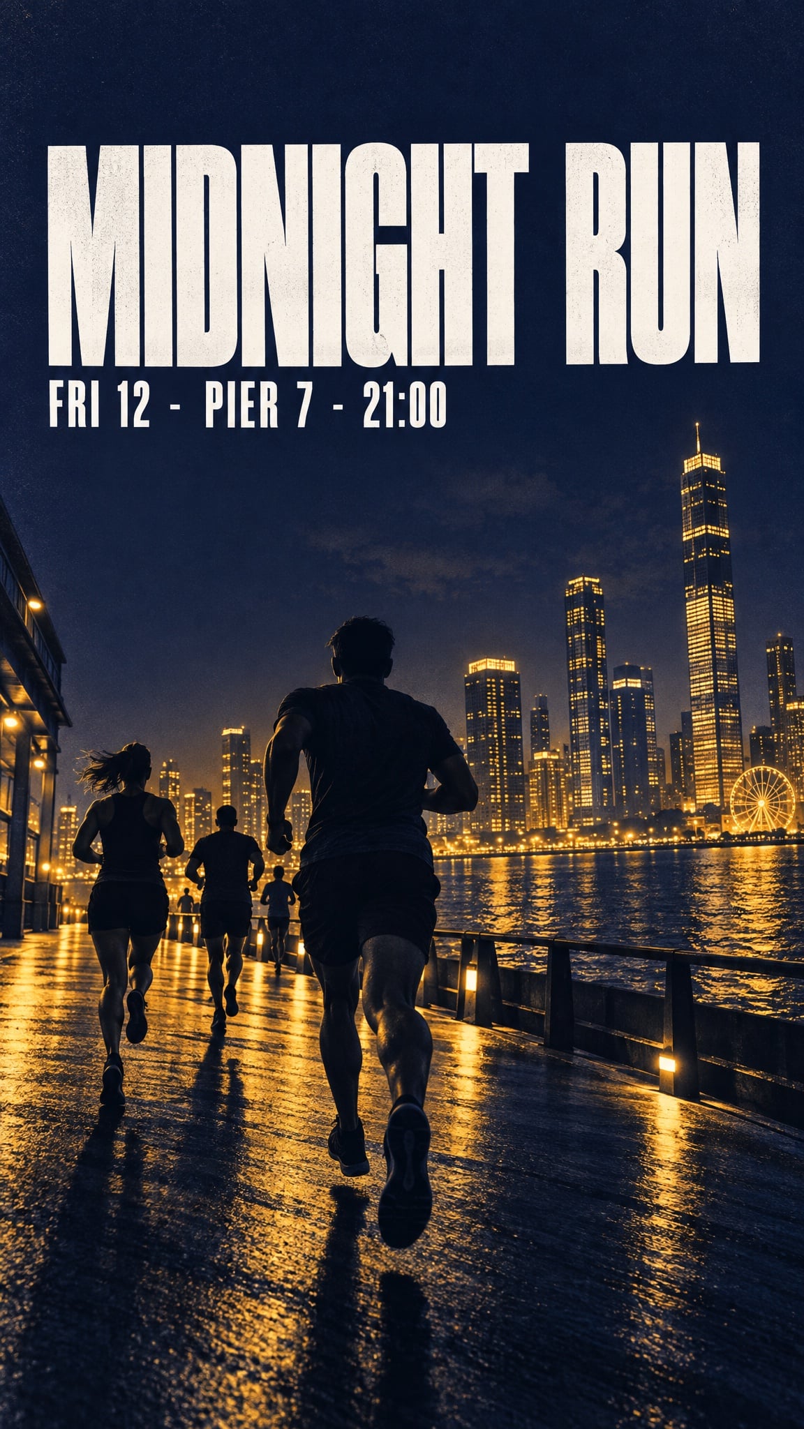
Short headlines, dates, and prices now survive generation — as long as they stay short, stay quoted, and stay placed.
Bold minimalist event poster for a night run.
Headline (exact, once): "MIDNIGHT RUN"
Subline (exact, once): "FRI 12 · PIER 7 · 21:00"
Visual: deep indigo background, warm amber duotone skyline silhouette, strong diagonal
composition, headline sitting in the calm upper third.
Typography: heavy condensed sans-serif, high contrast, generous kerning.
Format: vertical, print quality.
Constraints: no extra text, no sponsor logos, no watermarks, no stock-photo people.
Why it works: the headline sits in "the calm upper third" — a compositional instruction that keeps the type away from busy artwork instead of hoping it lands somewhere readable.
6. A character sheet you can reuse
A reference sheet is a format, not a picture. Build one and every later scene can start from the same approved face.
Create a character reference sheet for an original character.
Character: a teenage skater with a close-cropped undercut, a faded red hoodie,
ripped black jeans, and scuffed high-tops.
Sheet contents: front, three-quarter, and profile views, plus a close-up of the hand holding a board.
Style: clean concept-art illustration, soft cel shading, consistent line weight, light grey background.
Layout: evenly spaced figures, identical proportions in every view, no overlapping limbs.
Constraints: original design, no text, no watermark.
Why it works: the sheet lists the views explicitly and fixes the identifying details. Those same details then become your consistency clause in later prompts.
7. Comic strips and storyboards
Panels are where earlier models fell apart, character drifting from frame to frame. With a reference image and a repeated consistency clause, four panels hold.
Create a four-panel horizontal comic strip with the same character in every panel.
Character consistency: same face, same faded red hoodie, same undercut, same line weight.
Panel 1: she kicks her board up and catches it.
Panel 2: a security guard points at a sign.
Panel 3: she shrugs, board under her arm.
Panel 4: she skates away down an empty street in evening light.
Style: clean flat comic illustration, limited palette, thin black outlines.
Constraints: no speech bubbles, no text, no watermark, no style drift between panels.
Why it works: each panel is a separate instruction instead of one long scene description, and the consistency clause is repeated rather than assumed.
8. Thumbnails that survive a small screen
Thumbnails are a readability problem before they are an art problem. One subject, one text block, and enough contrast to work at 320 pixels wide.
Design a video thumbnail about building a home espresso bar.
Composition: subject on the left, large text block on the right, high contrast,
readable at small size.
Text (exact, once): "MY 800 SETUP"
Subject: a chrome espresso machine on a wooden counter, steam rising, warm morning light.
Style: crisp editorial photograph, slightly elevated saturation.
Constraints: no extra text, no arrows, no circles, no shocked-face people, no watermark.
Why it works: "readable at small size" is the whole brief. It pushes the model toward fewer elements and stronger contrast instead of a busy scene.
E-commerce and product work
9. Packshots with a label you can read
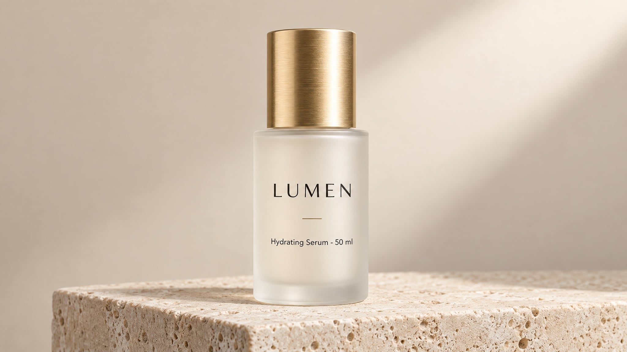
This is the use case that changes budgets. A clean studio packshot used to mean a photographer, a studio, and a week. Now the constraint is the label copy, and that is a writing task.
Studio product photograph of a frosted glass 50 ml serum bottle with a brushed gold cap,
standing on a pale travertine plinth against a soft beige backdrop.
Label text (exact): "LUMEN" as the brand, "Hydrating Serum · 50 ml" beneath it,
rendered once, straight on, sharp and fully legible.
Composition: centred, full bottle in frame, generous empty space on the right.
Light: large softbox from the upper right, gentle gradient falloff, clean contact shadow.
Style: premium beauty e-commerce photography, crisp detail, no props.
Constraints: no additional text, no logos, no watermark, no studio reflections.
Why it works: short text, quoted exactly, positioned and counted. Those three moves are what keep in-image copy legible at listing size.
10. On-model and lifestyle shots without a studio day
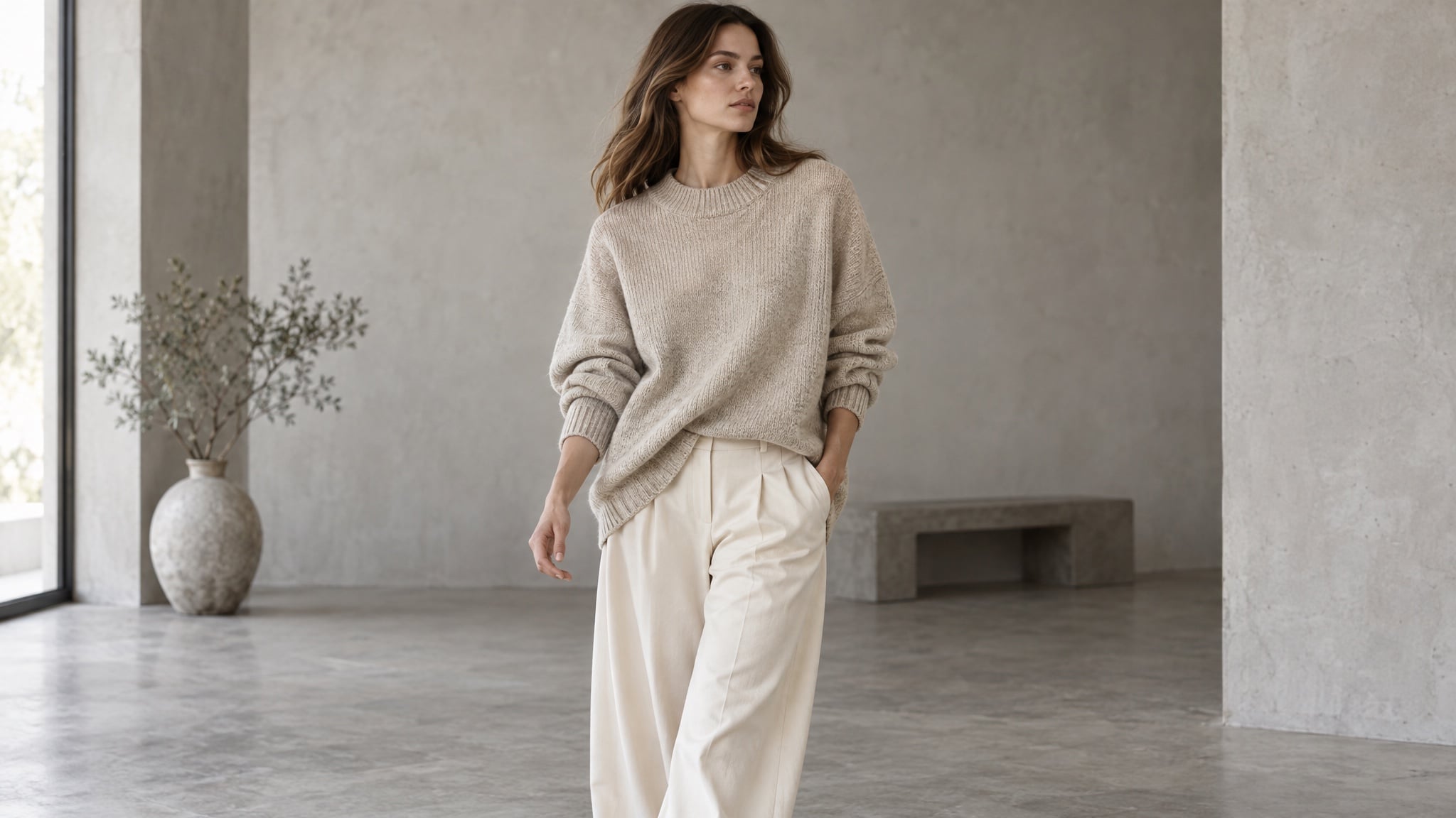
Upload the approved garment shot, then move it onto a model, into a room, or into daylight. The clothing has to stay the same garment — same colour, same weave, same silhouette.
Editorial e-commerce photograph of a model wearing the oversized oatmeal knit sweater
and wide-leg cream trousers from the reference images. Mid-shot, mid-stride, three-quarter angle.
Keep garment colour, texture, and silhouette exactly as in the reference.
Light: soft daylight in a minimal concrete studio, gentle shadow, neutral colour balance.
Style: catalogue lookbook photography, shallow depth of field, natural fabric folds.
Constraints: no text, no watermark, no pattern changes, no extra accessories.
Why it works: the preserve list names the properties that make the garment sellable. "No pattern changes" sounds unnecessary until a knit comes back with a print it never had.
11. One product, many scenes
Once a product render is approved, variants are cheap. Same bottle, same label, same proportions — new room, new light, new season.
Same product, new scene: keep the bottle, cap, label, and proportions identical to the reference.
Scene: a bathroom shelf at 7 a.m., condensation on the window, a folded linen towel behind.
Light: cool morning daylight from the left, soft reflections on the glass.
Composition: eye level, product in the right third, quiet negative space on the left.
Style: natural lifestyle photography, muted palette, realistic materials.
Constraints: unchanged label text and geometry, no extra products, no text overlays.
Why it works: it separates "what changes" from "what is fixed" in the first line. Edits drift when the model has to guess which parts of the image are load-bearing.
12. Packaging and menus in several languages
Multilingual product art used to mean a designer per market. The model handles the layout and the type; you still have to supply the translated strings.
Create three versions of the same coffee packaging, one per language, identical in layout.
Pack: 250 g matte kraft-paper bag with a matte black label band.
Label line 1 (exact): "MORNING BLEND"
Label line 2 (exact): "Dark Roast · 250 g"
Keep the bag shape, label position, and typography identical across all three versions.
Style: studio packshot, soft neutral background, softbox light from the upper left.
Constraints: no extra text, no watermark, no colour shift between versions.
Why it works: layout is fixed and only the strings change, so a market adaptation stays recognisably the same product instead of becoming three different designs.
The habits that hold across all twelve
Use cases differ; the failure modes do not. Six habits prevent most of them:
- Put the subject in the reference, not just the prompt. A face or product that comes in as an image stays consistent far more reliably than one described in words.
- Change one thing per turn. Adjusting light, background, and crop at the same time makes it impossible to tell which instruction caused the drift.
- Draft cheap, finish expensive. Explore composition at a low quality setting, then re-run the winner at high or above. Quality tiers change output tokens, and the top tier costs roughly 36× the bottom one.
- Quote text, then count it. "Rendered once" plus the exact string prevents doubled labels and invented taglines.
- Write a preserve list. Every prompt gets a final line naming what must not change: label geometry, garment colour, camera angle, background objects.
- Reuse the approved image as input. Consistency comes from a fixed reference plus repeated constraints, not from re-rolling until something looks close.
Where to run these prompts
Everything above works through the OpenAI API with your own key, billing, and parameter management. If you would rather spend the afternoon on images than on plumbing, Felo puts GPT-Image 2.5 in a browser tab:
- Free to start. Daily credits, no credit card, no API key, no installation.
- No watermark, full commercial rights. Including on the free plan.
- Up to 4K output. Native 3840×2160, so the first render can already be the final asset.
- 50+ visual styles and text in 50+ languages. Built for posters, packaging, menus, and multi-market campaigns.
- Every top model in one workspace. GPT-Image 2.5, GPT-Image 2, Nano Banana Pro, Nano Banana 2 Lite, and more — swap models when a job suits a different strength.
- Guided workflows. Storyboards, expression sheets, title sequences, and sprite sheets that start from a working prompt structure instead of a blank box.
There is also a shelf of ready-made prompts inside the workspace — six-panel storyboards, event posters, product packaging, comic strips, explainer graphics, ad variants. Run one first as calibration, read what the model did with each slot, then apply the structure to your own product.
FAQ
What can I make with GPT-Image 2.5? Anything that needs a specific image rather than a generic one: portraits and avatars, event posters, comic strips and storyboards, thumbnails, product packshots, on-model fashion shots, lifestyle scenes, packaging, menus, and campaign variants.
Do I need an API key to use these prompts? No. The prompt techniques are model-level, and Felo runs GPT-Image 2.5 in the browser without an API key, so you can paste any prompt above and generate immediately.
How do I keep a product or a face consistent across images? Approve one baseline image, upload it as a reference every time, and restate the identifying details in each prompt. Consistency is a product of a fixed reference plus repeated constraints.
Why does the text in my image come out wrong? Usually because the copy was paraphrased, unquoted, or too long. Quote the exact string, state where it goes and how many times it appears, keep it short, and add "no extra text."
Do higher quality settings always produce better images? No. They cost more and take longer, and they mainly help with small type, dense detail, and final deliverables. Use them to fix a specific problem, not as a default.
Can I sell what I generate? On Felo, images come with full commercial rights and no watermark, including on the free plan — so a packshot you generate can go straight into a listing.
Pick one job and ship it
The useful question is never "what can this model do?" It is "which of my images has been waiting on a studio?" A label that needed a reshoot. A style set for a personal page. A storyboard for a video you keep postponing.
Choose the one case from this list that costs you the most time today, paste its prompt, and change one slot at a time until the render is something you would actually publish.
Try GPT-Image 2.5 on Felo — free →
This post is also available in 简体中文, 日本語, 한국어, 繁體中文, हिन्दी, Français, العربية, Русский, اردو, Bahasa Indonesia, Deutsch, Tiếng Việt, Türkçe, Italiano, ไทย, Español, বাংলা and Português.