GPT Image 2.5 vs Nano Banana 2.1: 13 Kasus Penggunaan Dibandingkan

Model gambar mana yang cocok untuk proyek Anda berikutnya? Bandingkan GPT Image 2.5 dan Nano Banana 2.1 untuk gambar ecommerce, thumbnail, infografis, diagram akademik dan lainnya.
Sebuah listing produk, thumbnail YouTube, dan diagram ilmiah membutuhkan hal berbeda dari model gambar. Listing harus mempertahankan produk; thumbnail harus menjaga judul tetap terbaca; diagram metode harus menghubungkan kotak yang tepat.
Kami memberikan kedua model brief yang sama untuk 13 kasus penggunaan dan membandingkan output aktualnya. Untuk lima tugas dengan banyak teks, kami juga menghasilkan versi terpisah dalam bahasa Inggris, Jepang, dan Korea. Contoh utama di bawah ini menggunakan salinan bahasa Inggris atau tidak mengandung teks headline; perbandingan lokal memiliki salinan Jepang dan Korea sendiri.
Rekomendasi menjelaskan model mana yang saya pilih pertama untuk brief tersebut. Setiap bagian menampilkan dua hasil yang dihasilkan secara independen dan menjelaskan pertukaran yang terjadi.
Coba contoh di Felo: GPT Image 2.5, Nano Banana 2.1, atau AI Image tool.
Model mana yang sebaiknya dicoba terlebih dahulu?
| Kasus penggunaan | Pilihan pertama dalam sampel ini |
|---|---|
| Listing produk latar putih | Keduanya; pilih berdasarkan hasil akhir |
| Grafik detail produk | GPT untuk callout besar |
| Iklan produk gaya hidup | GPT untuk hero iklan |
| Konsep produk tanpa referensi | Pilih objek yang diinginkan terlebih dahulu |
| Thumbnail YouTube dan tutorial | GPT untuk penekanan judul tebal |
| Checklist packing dan kartu pengetahuan | GPT untuk tipe besar di mobile; NB untuk kartu yang lapang |
| Poster acara | NB untuk poster grafis; GPT untuk suasana venue |
| Infografis numerik | NB untuk brief bar-chart ini |
| Diagram proses | GPT untuk pelatihan; NB untuk figur laporan |
| Penjelasan konsep ilmiah | GPT untuk notasi gaya paper; NB untuk slide kelas |
| Diagram metode riset dan arsitektur model | GPT untuk kerangka tujuh node ini |
| Ilustrasi cerita dan concept art | GPT untuk tekstur kaya; NB untuk adegan sederhana |
| Konsep desain interior | GPT untuk atmosfer; NB untuk arah yang lebih simpel |
Referensi produk bersama
Tiga tes ecommerce pertama menggunakan produk contoh fiktif yang sama, termasuk gagang kiri, tutup minum ivory, dan badan biru bertekstur.
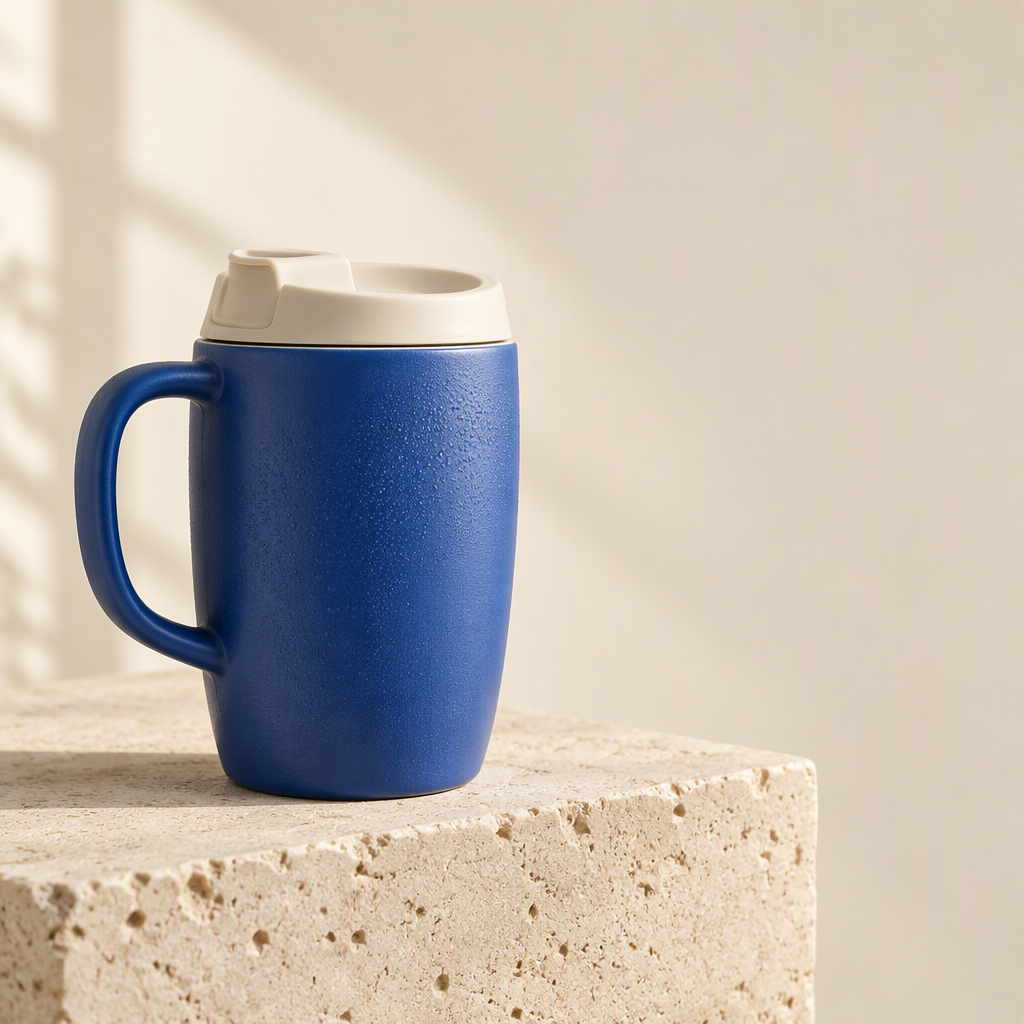
1. Listing produk latar putih
Brief bersama: Pertahankan mug biru yang sama, gagang, tutup minum, dan proporsi, hilangkan blok batu, dan tempatkan produk lengkap di latar putih.
| GPT Image 2.5 | Nano Banana 2.1 |
|---|---|
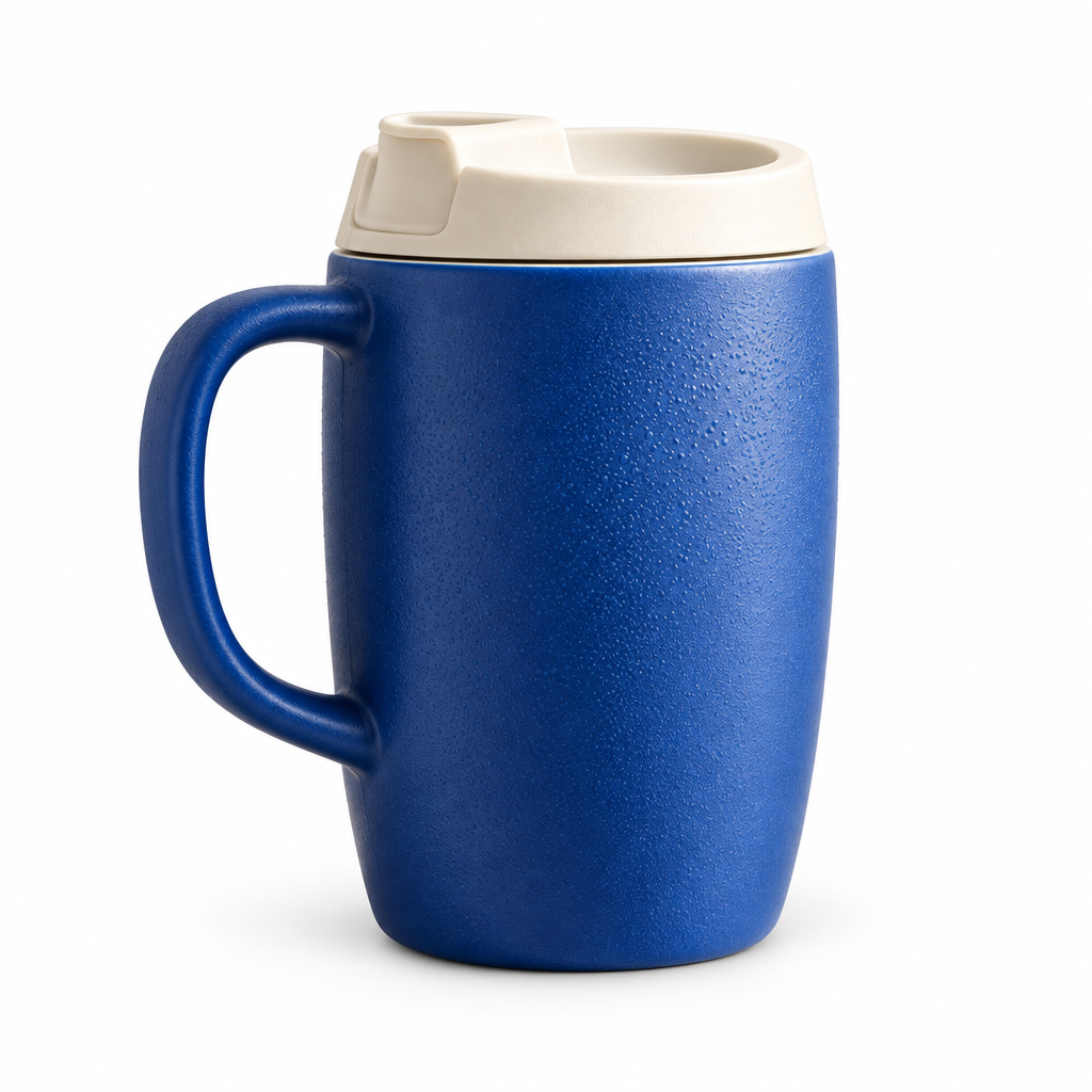 | 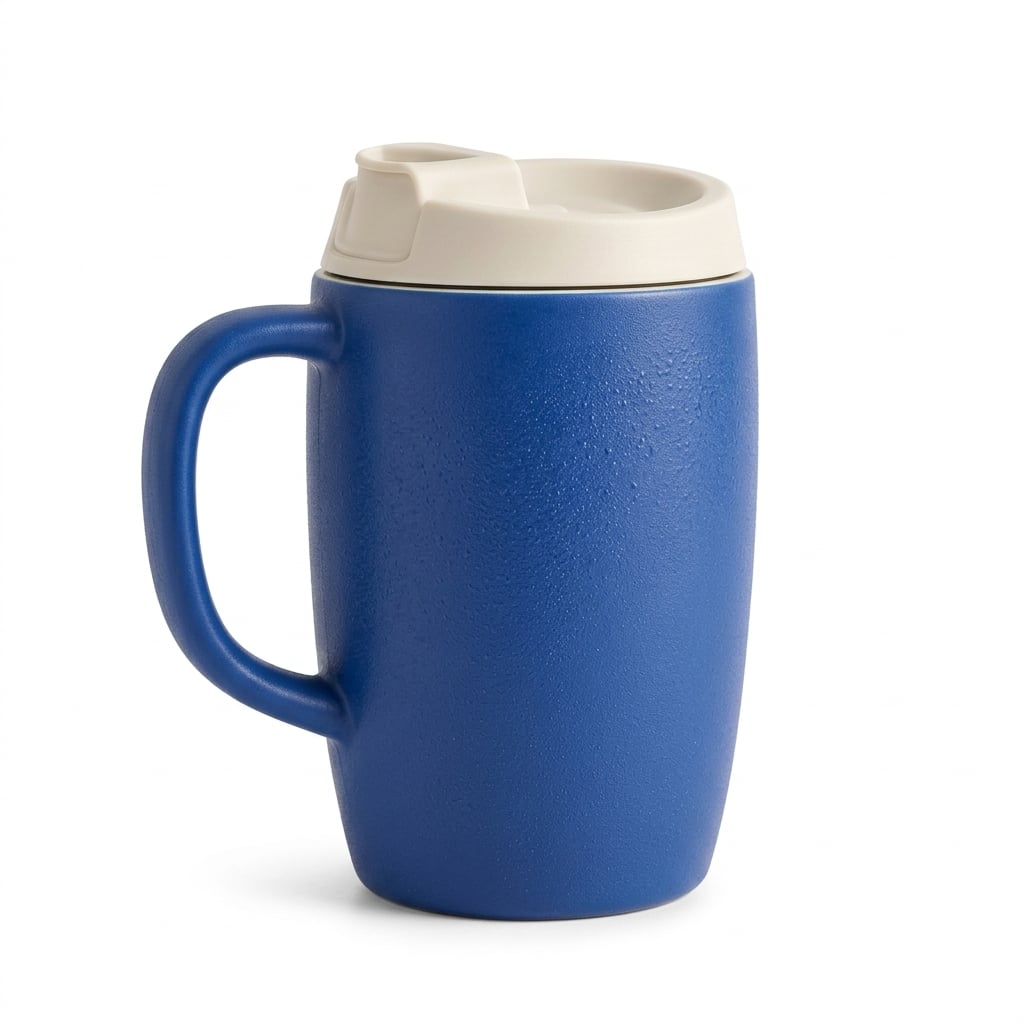 |
Kedua model mempertahankan gagang dan tutup, tidak mengubah referensi menjadi cangkir travel lain. GPT Image 2.5 menonjolkan tekstur dan tetesan; Nano Banana 2.1 memberikan permukaan dan bayangan kontak yang lebih lembut. Tidak ada pemenang jelas untuk satu produk ini.
Kapan saya menggunakannya: Mulai dengan GPT jika detail permukaan menjadi prioritas; mulai dengan Nano Banana 2.1 jika lebih suka pencahayaan katalog yang lembut. Untuk listing nyata, bandingkan bukaan tutup, lengkung gagang, warna, dan siluet dengan produk asli sebelum menyetujui output.
2. Grafik detail produk
Brief bersama: Gunakan mug referensi yang sama dan tiga tampilan detail lingkaran, diberi label Ceramic body, Ivory lid, dan Curved handle.
| GPT Image 2.5 | Nano Banana 2.1 |
|---|---|
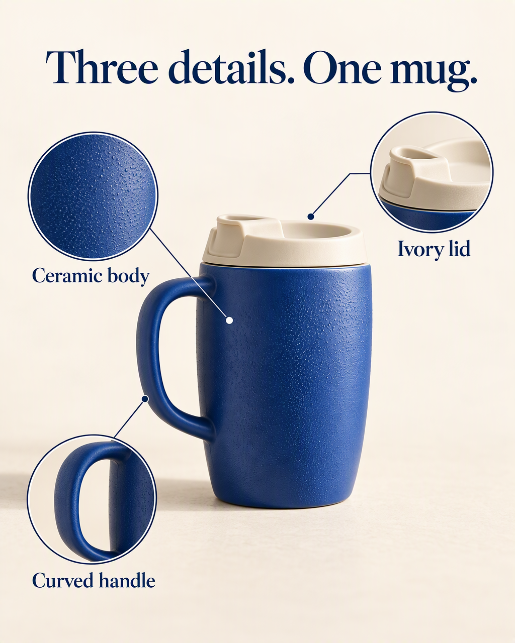 | 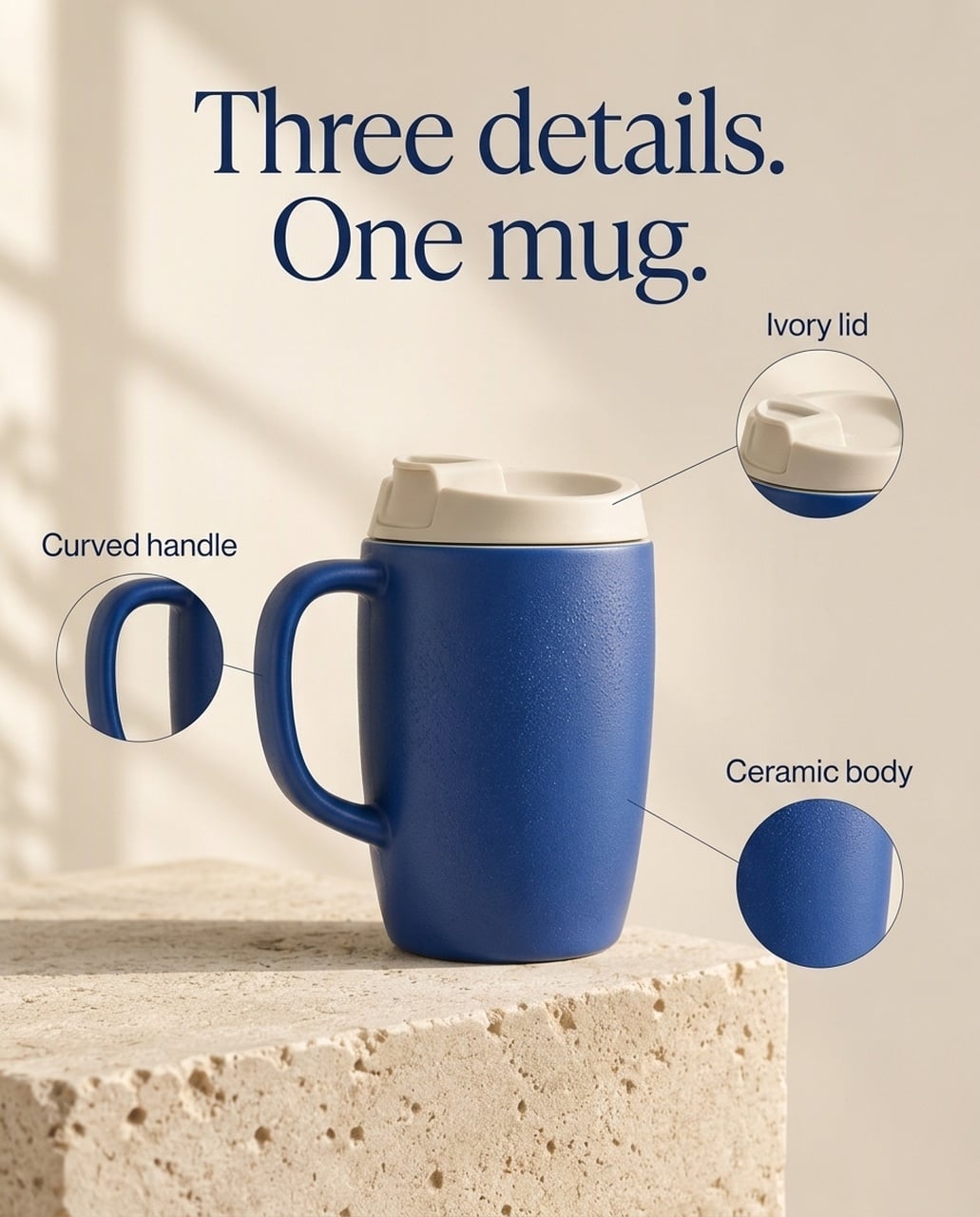 |
Kedua gambar bahasa Inggris mempertahankan headline dan label yang diminta. GPT memberi ruang lebih pada crop tekstur dan tutup serta label fitur yang lebih besar. Nano Banana 2.1 membuat callout lebih kecil di sekitar produk yang terpusat dan mempertahankan lebih banyak setting batu asli. Di beberapa versi, GPT menempatkan endpoint leader tutup tepat di atas produk, sehingga posisi garis masih perlu diperiksa.
Kapan saya menggunakannya: Untuk hero detail produk di mobile dengan close-up material menonjol, saya mulai dengan GPT. Untuk halaman produk pendukung yang lebih tenang, Nano Banana 2.1 menjadi alternatif. Pilihan ini soal penekanan dan pembersihan anotasi, bukan bukti satu model lebih baik mempertahankan setiap SKU.
Versi Jepang
| GPT Image 2.5 | Nano Banana 2.1 |
|---|---|
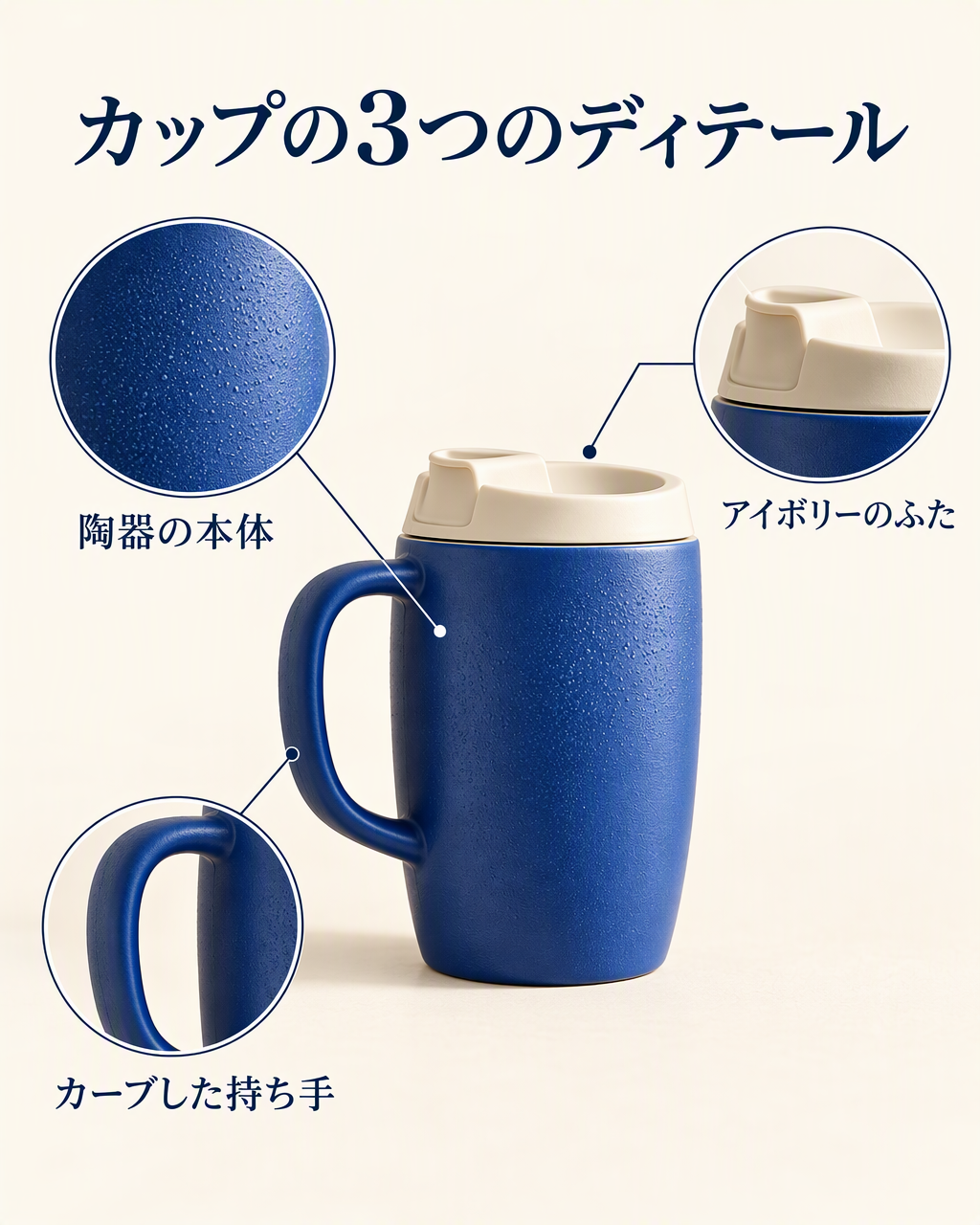 | 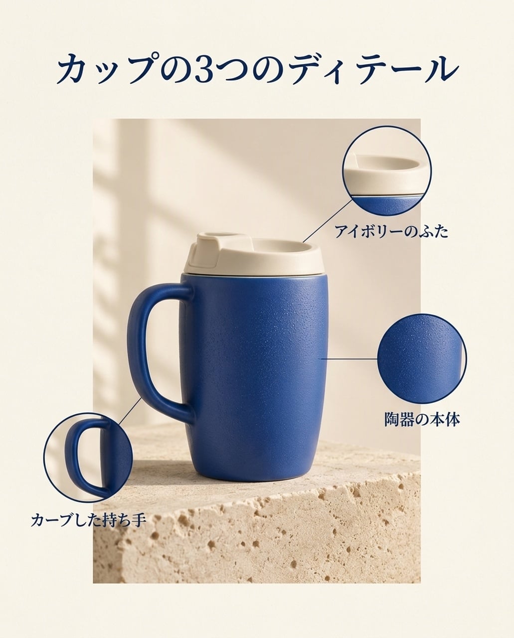 |
Keduanya menampilkan カップの3つのディテール dan label fitur yang diminta. GPT memperbesar crop tekstur, sementara Nano Banana 2.1 menggunakan panel produk yang lebih tertahan. Periksa endpoint garis leader, bukan hanya headline.
Versi Korea
| GPT Image 2.5 | Nano Banana 2.1 |
|---|---|
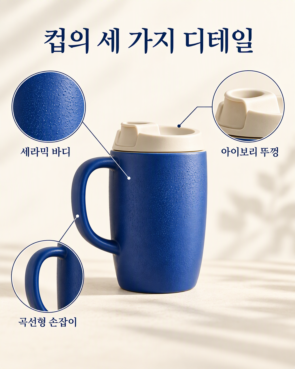 | 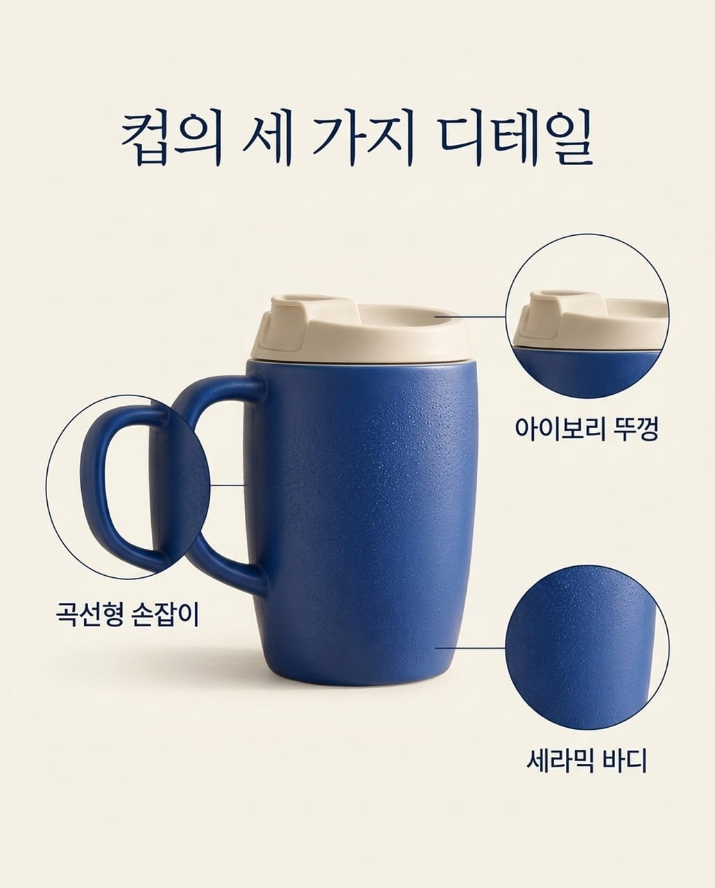 |
Keduanya menampilkan tiga label fitur Korea. GPT menggunakan callout lebih lebar dan besar; Nano Banana 2.1 memakai layout yang lebih tenang. Crop gagang melengkung lebih menumpuk produk utama di versi NB.
3. Iklan produk gaya hidup
Brief bersama: Tempatkan mug yang sama di meja sarapan oak di samping satu notebook tertutup, dengan dapur blur lembut dan ruang salinan jelas di kanan.
| GPT Image 2.5 | Nano Banana 2.1 |
|---|---|
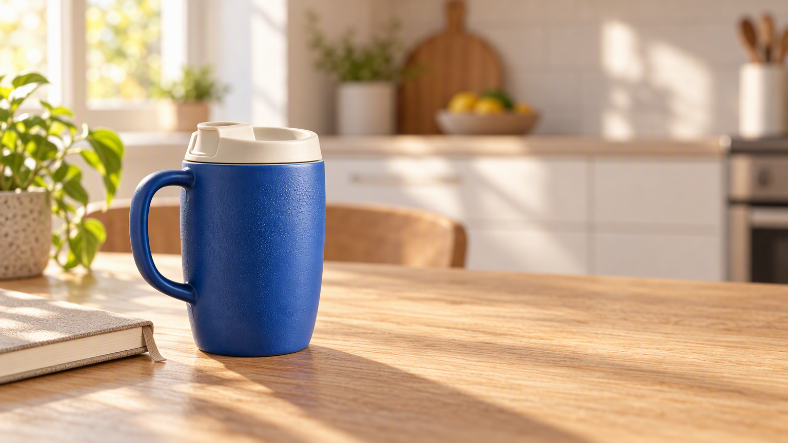 | 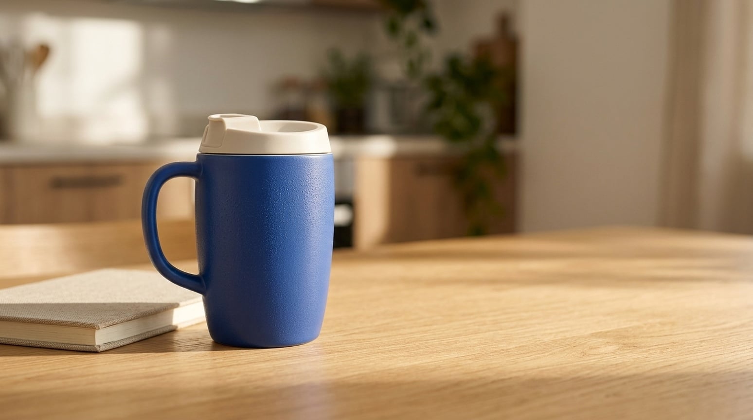 |
GPT memberikan pemisahan mug yang lebih kuat dari dapur hangat, dengan tekstur keramik, serat kayu, dan cahaya terarah. Nano Banana 2.1 menjaga adegan lebih tenang dan kontras rendah. Keduanya mempertahankan struktur produk utama dan menyisakan ruang salinan yang bisa digunakan.
Kapan saya menggunakannya: Mulai dengan GPT untuk banner brand atau iklan gaya hidup di mana produk menjadi fokus. Coba Nano Banana 2.1 untuk visual sehari-hari yang lebih tenang. Periksa geometri produk, skala, dan bayangan sebelum menambah salinan kampanye.
4. Konsep produk tanpa referensi
Brief bersama: Deskripsikan mug travel keramik biru, tutup ivory, blok batu kapur, dan ruang salinan kosong, tanpa foto produk.
| GPT Image 2.5 | Nano Banana 2.1 |
|---|---|
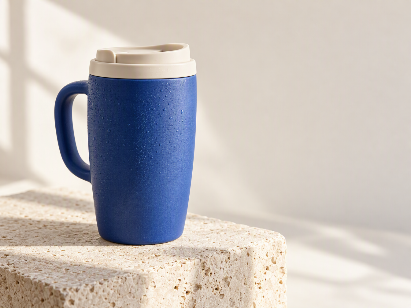 | 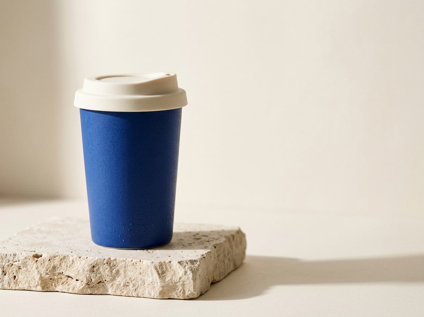 |
GPT menghasilkan mug dengan gagang; Nano Banana 2.1 menghasilkan cangkir ramping tanpa gagang. Prompt tidak menyebut gagang, sehingga kedua interpretasi ini masuk akal. GPT menonjolkan tetesan dan tekstur material, Nano Banana 2.1 memberikan siluet produk yang lebih sederhana.
Kapan saya menggunakannya: Gunakan GPT untuk eksplorasi konsep iklan taktil dan Nano Banana 2.1 untuk arah cangkir portabel yang lebih bersih. Untuk menggambarkan produk nyata, berikan referensi yang sama ke kedua model; pasangan berbasis teks ini tidak dapat memastikan kesetiaan produk.
5. Thumbnail YouTube dan tutorial
Brief bersama: Tampilkan tangan memotret jalan malam dengan ponsel, dengan BETTER PHONE PHOTOS dan 3 COMPOSITION TIPS di kanan.
| GPT Image 2.5 | Nano Banana 2.1 |
|---|---|
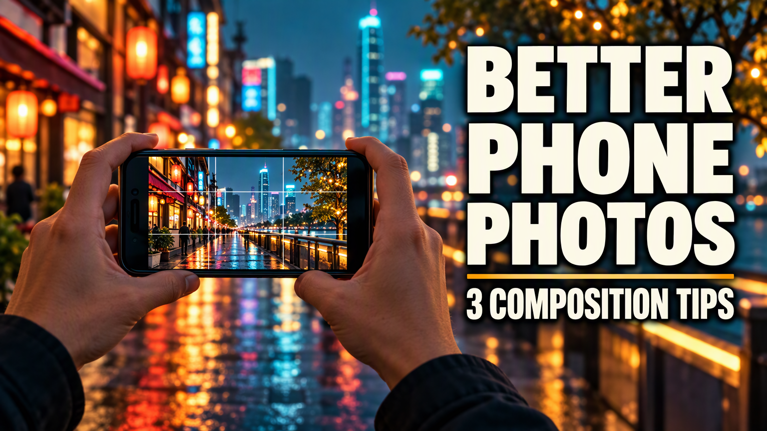 | 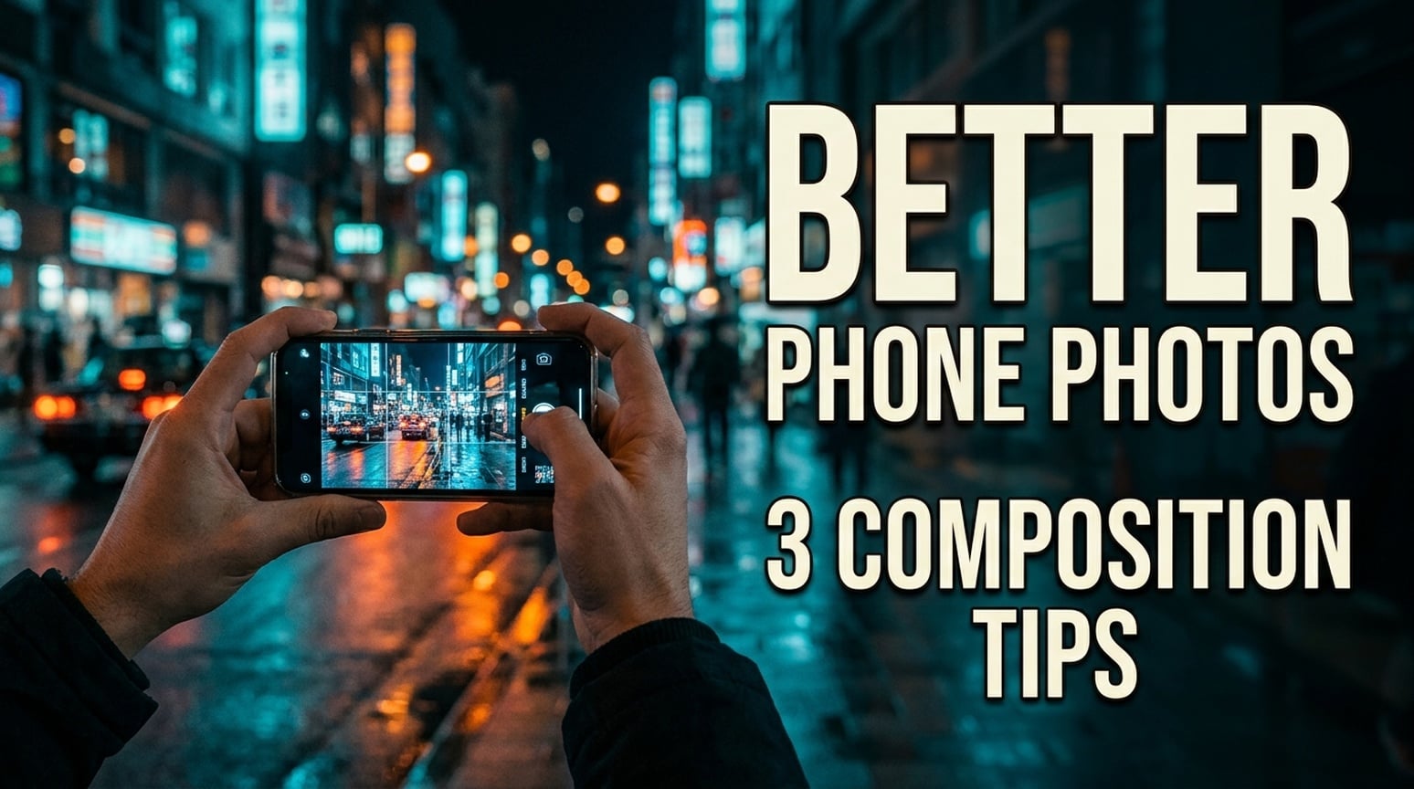 |
Kedua thumbnail bahasa Inggris mempertahankan dua string teks yang diminta, dengan pemilihan line break berbeda. GPT memakai tipe sangat tebal dan baris kedua yang kompak. Nano Banana 2.1 menggunakan huruf lebih sempit, memecah subtitle jadi dua baris, dan memberikan tampilan lebih dokumenter.
Kapan saya menggunakannya: Untuk thumbnail tutorial tebal, saya mulai dengan GPT. Untuk channel fotografi yang lebih suka gambar tidak menonjol, coba Nano Banana 2.1. Periksa crop dan judul di ukuran thumbnail sebenarnya. Gambar ini tidak diuji untuk click-through rate; contoh Jepang dan Korea ada di bawah.
Versi Jepang
| GPT Image 2.5 | Nano Banana 2.1 |
|---|---|
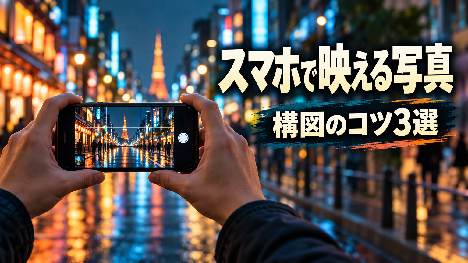 | 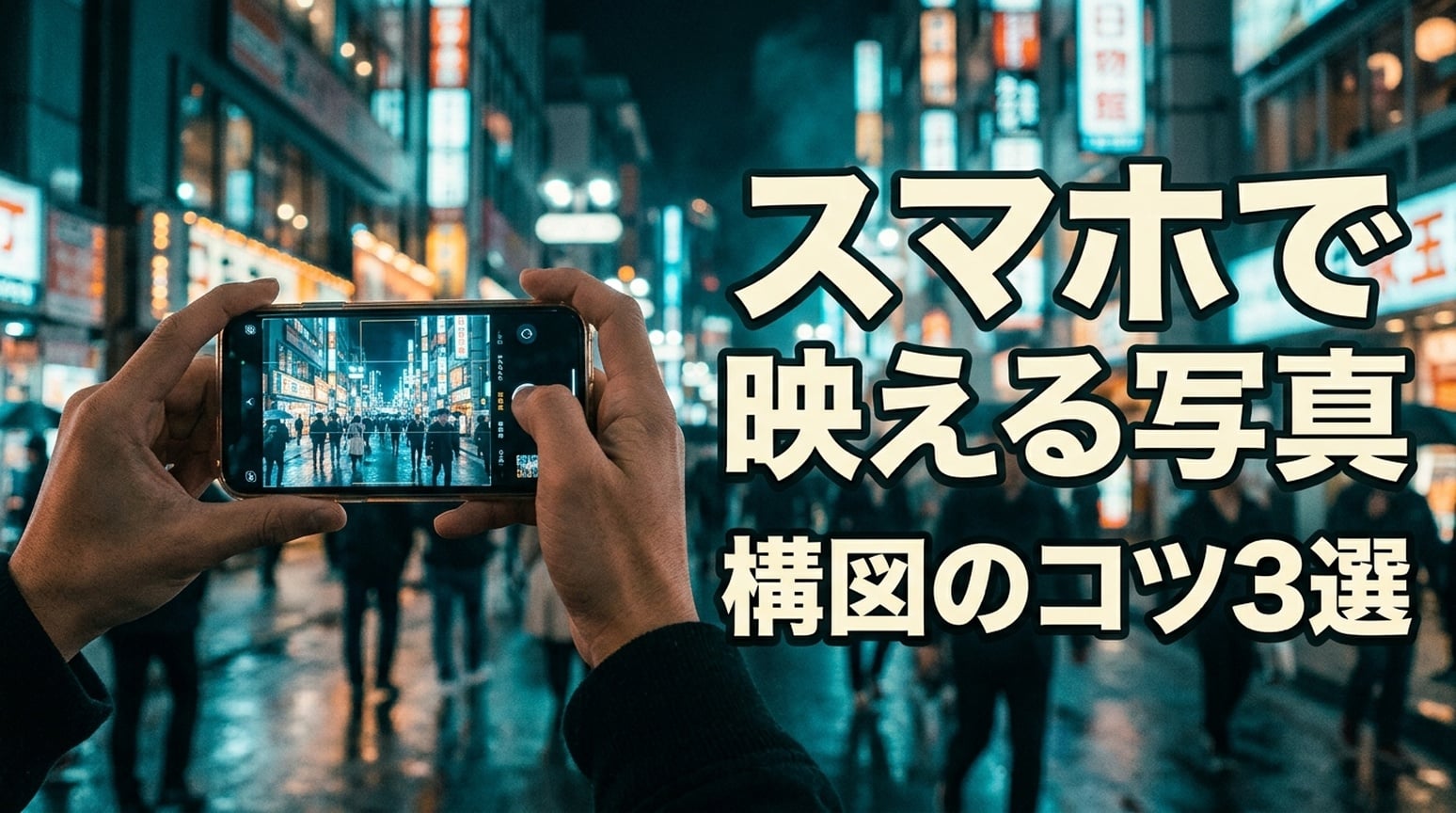 |
Keduanya mempertahankan スマホで映える写真 dan 構図のコツ3選. GPT menjaga headline utama di satu baris dan memisahkan subtitle dengan panel brush gelap. NB memecah headline setelah スマホで dan memakai outline lebih kuat.
Versi Korea
| GPT Image 2.5 | Nano Banana 2.1 |
|---|---|
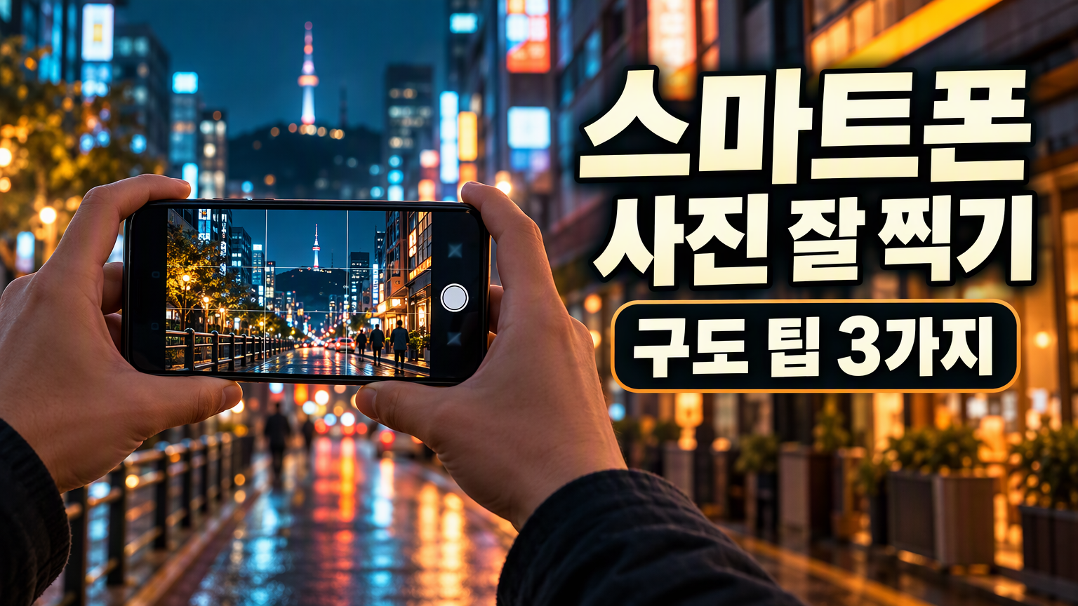 | 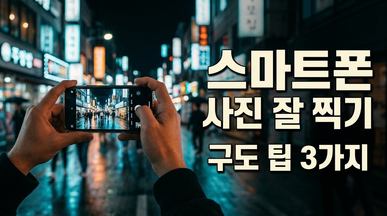 |
Keduanya mempertahankan kata-kata Korea yang dikenali. GPT menonjolkan baris kedua dengan panel bulat gelap; jarak antar kata tampak lebih rapat. NB memisahkan headline dan subtitle lebih terbuka. Spasi perlu diperiksa di hasil akhir.
6. Checklist packing dan kartu pengetahuan
Brief bersama: Render enam kategori dan daftar item yang ditentukan dalam checklist packing dua kolom, tiga baris, tanpa salinan tambahan.
| GPT Image 2.5 | Nano Banana 2.1 |
|---|---|
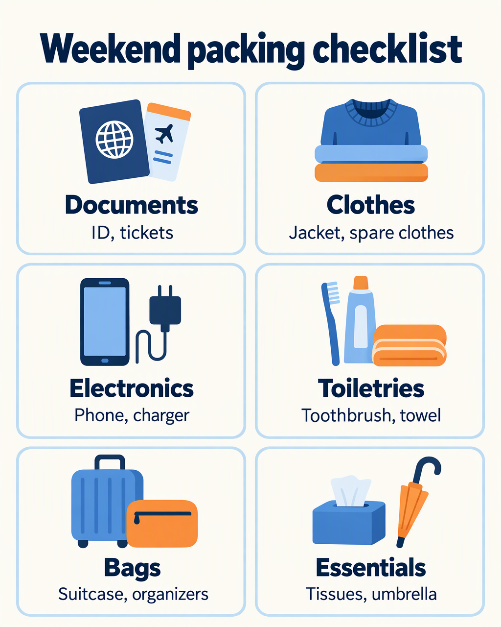 | 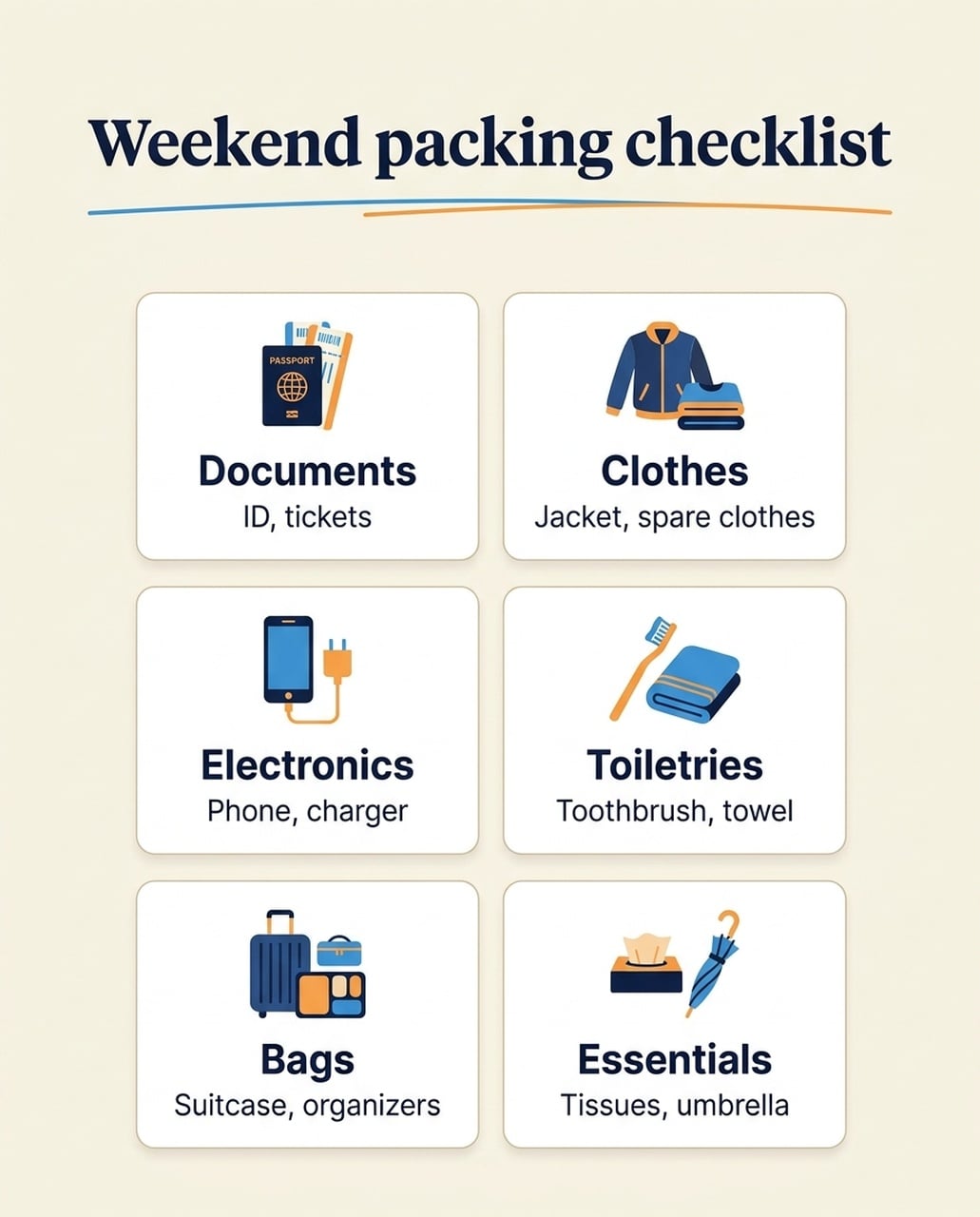 |
Versi bahasa Inggris mempertahankan enam kategori dan daftar itemnya. GPT memberi ilustrasi dan label ruang lebih besar di setiap kartu. Nano Banana 2.1 membuat ikon lebih kecil dan ruang putih lebih banyak; ikon paspor juga memuat label PASSPORT kecil yang tidak diminta. Versi Jepang dan Korea tidak mengulang subtitle bahasa Inggris ekstra yang muncul di eksperimen checklist China sebelumnya.
Kapan saya menggunakannya: Pilih GPT jika label besar yang mudah dibaca di mobile menjadi prioritas. Pilih Nano Banana 2.1 jika lebih suka layout kartu yang lebih tertahan, dan periksa label ikon serta body copy. Jangan menganggap kesalahan salinan di satu bahasa sebagai klaim untuk semua bahasa.
Versi Jepang
| GPT Image 2.5 | Nano Banana 2.1 |
|---|---|
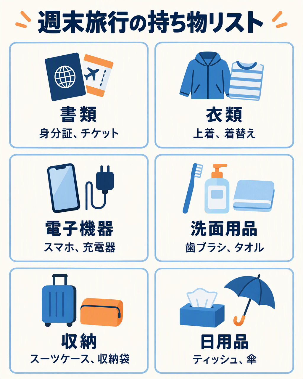 | 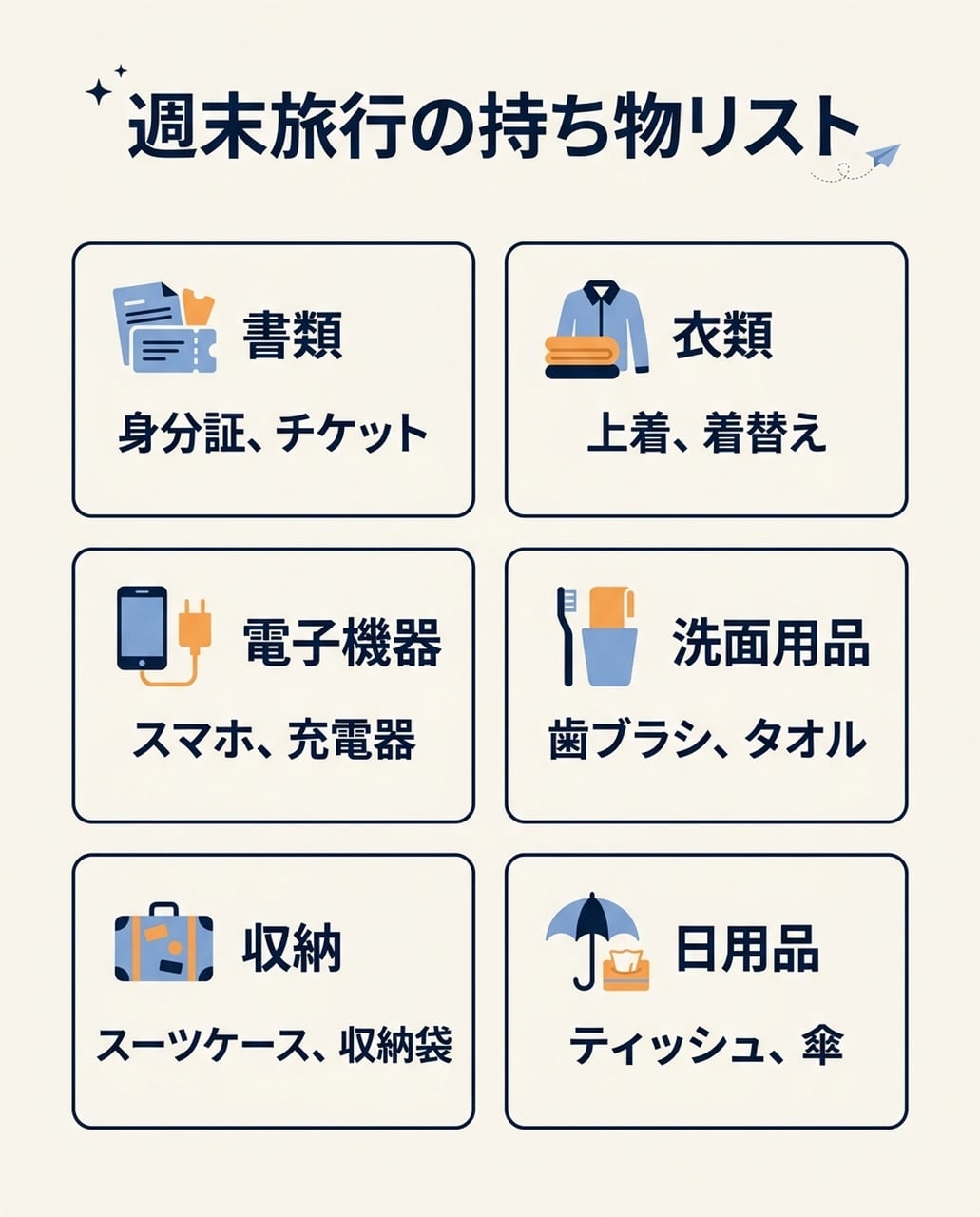 |
Keduanya menampilkan enam kategori Jepang dan daftar item tanpa subtitle bahasa Inggris yang tidak diinginkan dari tes China. GPT memilih ilustrasi lebih besar; NB memadukan ikon kecil dengan blok teks kompak.
Versi Korea
| GPT Image 2.5 | Nano Banana 2.1 |
|---|---|
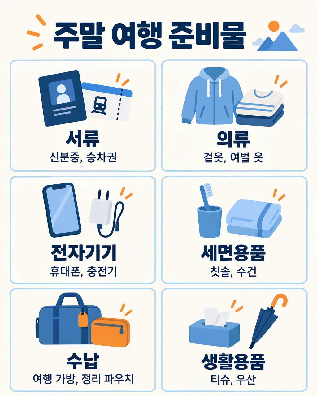 | 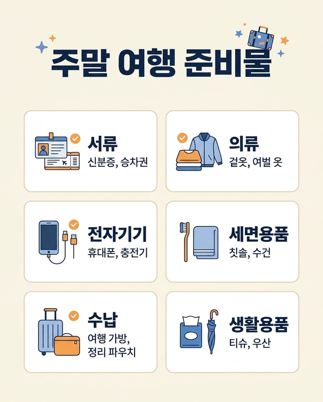 |
Keduanya menampilkan enam kategori Korea dan item terkait. GPT menjaga daftar item lebih panjang di satu baris jika memungkinkan; NB membagi daftar item Bags di dua baris. Keduanya butuh review spasi dan glyph kecil.
7. Poster acara
Brief bersama: Render NIGHT GARDEN dan Botanical light show · Kyoto · 7–9 pm dengan bentuk botani bercahaya hijau dan amber.
| GPT Image 2.5 | Nano Banana 2.1 |
|---|---|
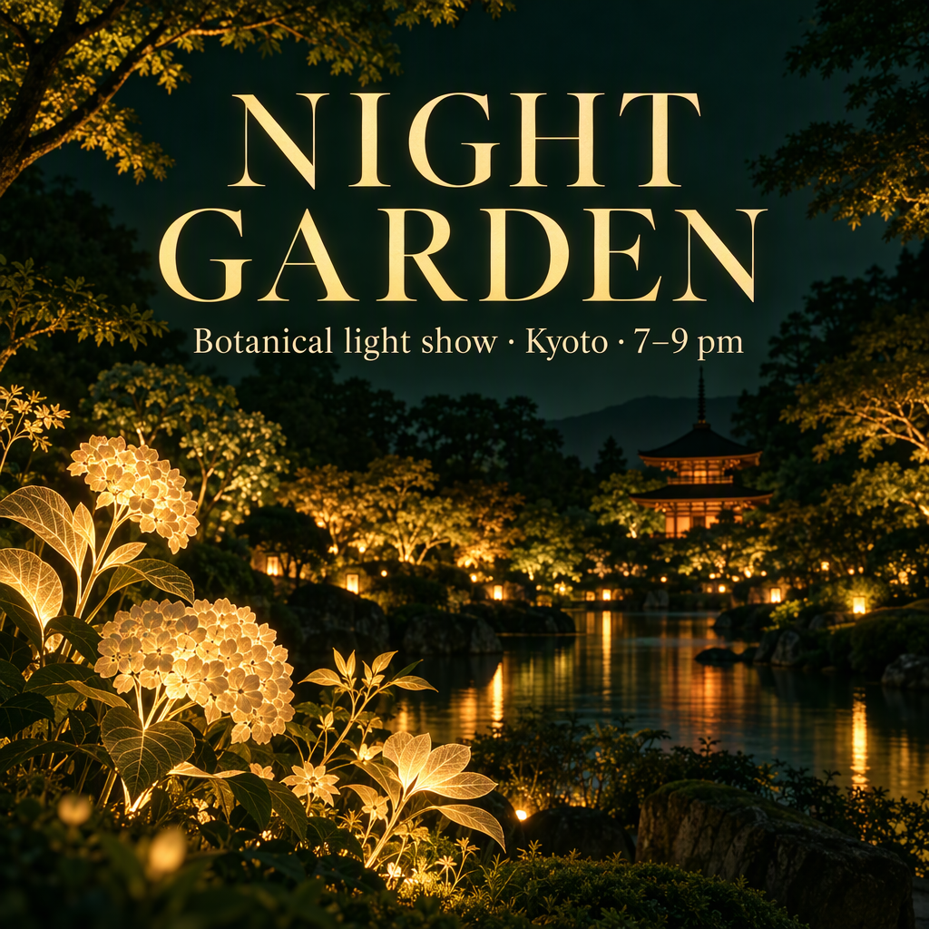 | 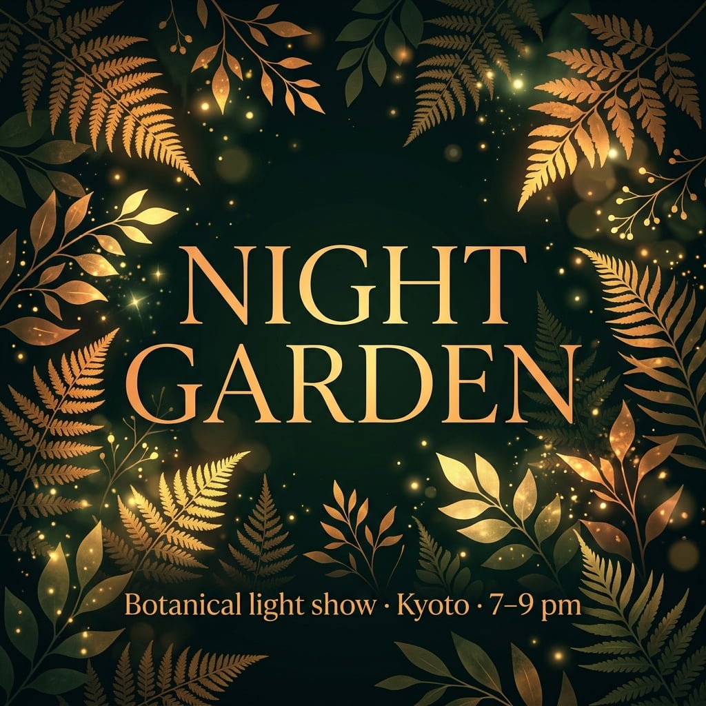 |
Kedua poster bahasa Inggris mempertahankan salinan acara utama. GPT menciptakan venue taman dengan bangunan dan air. Nano Banana 2.1 membingkai judul dengan dedaunan dan menempatkan subtitle di bawah. Versi Jepang dan Korea mengelompokkan info acara lebih terpusat.
Kapan saya menggunakannya: Mulai dengan Nano Banana 2.1 untuk poster acara grafis yang dipimpin tipografi. Mulai dengan GPT untuk visual kampanye atmosfer. Jika venue nyata penting, berikan referensi ke kedua model; bangunan yang dibuat tidak berarti lokasi nyata.
Versi Jepang
| GPT Image 2.5 | Nano Banana 2.1 |
|---|---|
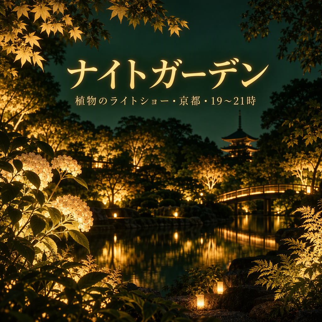 | 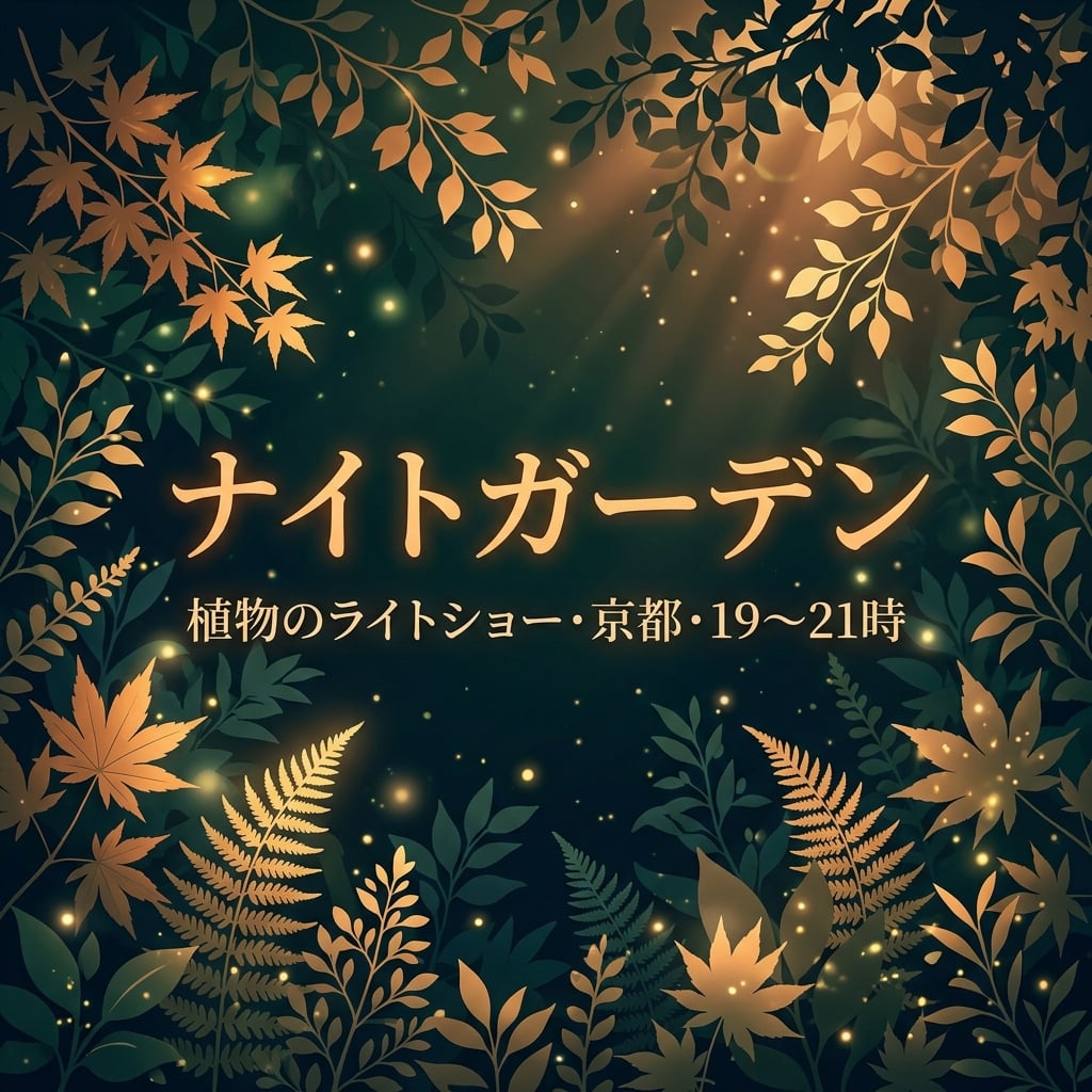 |
Keduanya mempertahankan ナイトガーデン dan info lokasi/waktu. NB mengelompokkan judul dan subtitle di tengah dengan dedaunan; GPT memakai subtitle kecil di atas adegan taman detail. Periksa glyph rentang waktu jika tanda baca penting.
Versi Korea
| GPT Image 2.5 | Nano Banana 2.1 |
|---|---|
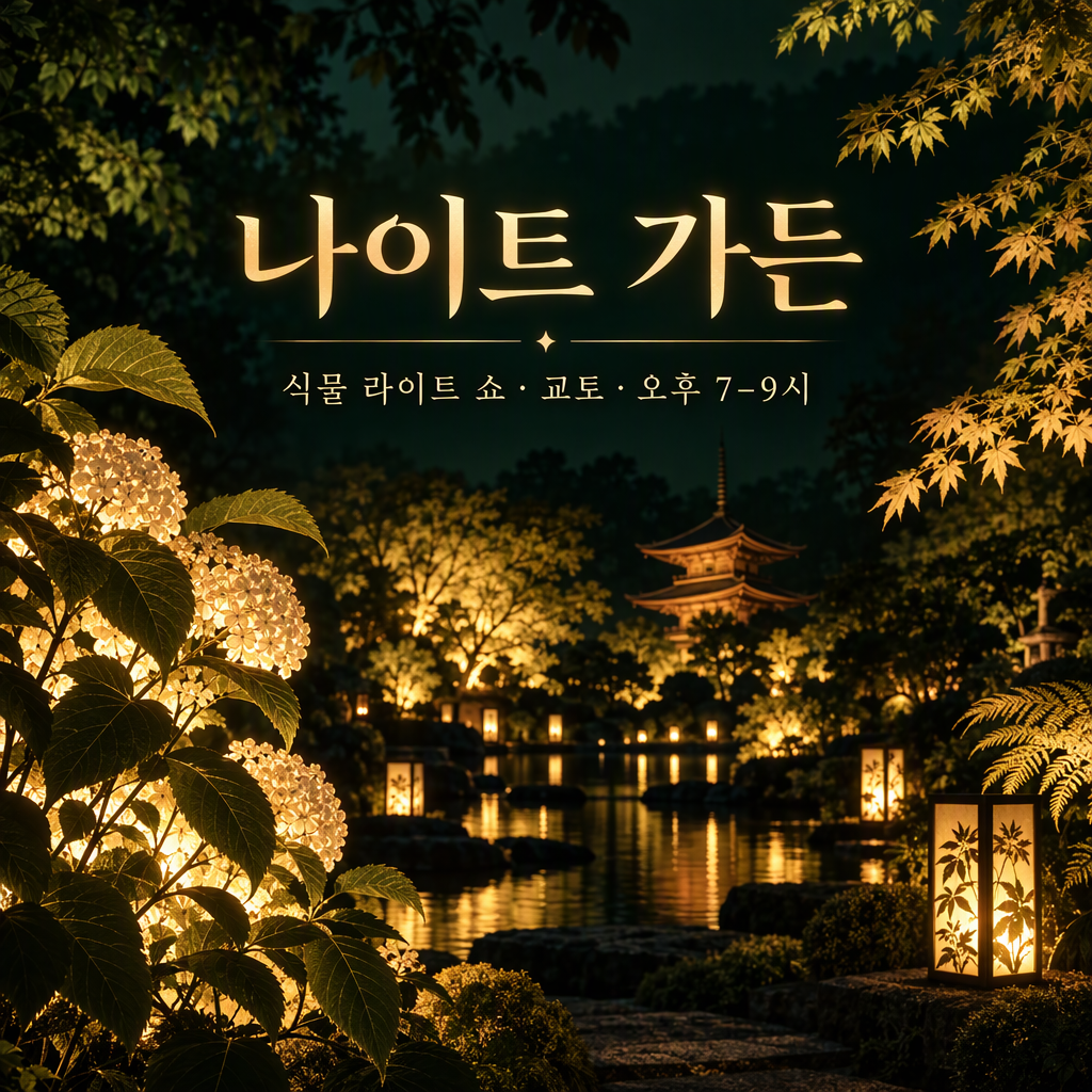 | 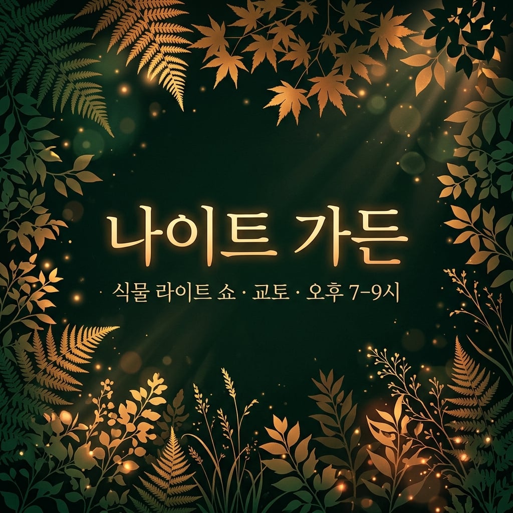 |
Keduanya mempertahankan 나이트 가든 dan info lokasi/waktu Korea. NB menonjolkan teks tengah; GPT menonjolkan venue taman imajinasi. Perbedaan ini terutama soal gaya kampanye, bukan bukti akurasi Korea.
8. Infografis numerik
Brief bersama: Gambar empat bar di satu baseline nol untuk 40%, 25%, 20%, dan 15%, dengan label tepat dan catatan data ilustratif yang jelas.
| GPT Image 2.5 | Nano Banana 2.1 |
|---|---|
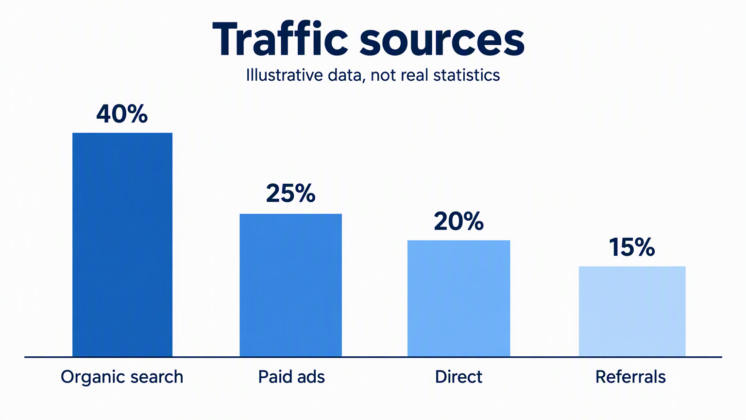 | 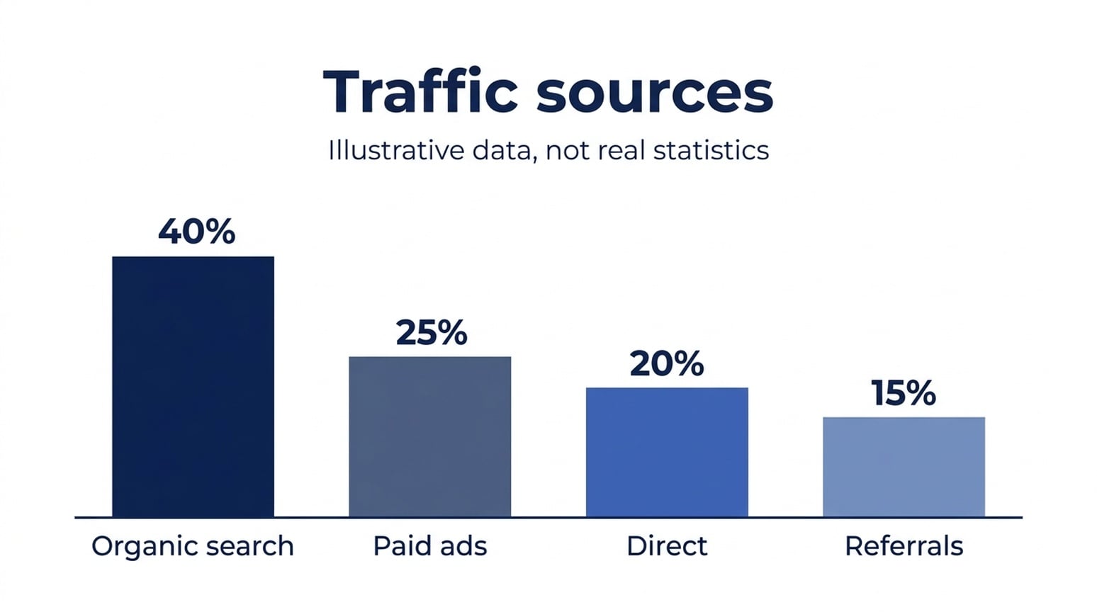 |
Enam gambar bahasa Inggris, Jepang, dan Korea mempertahankan nilai yang ditampilkan dan label kategori yang dikenali. Bar perlu pemeriksaan ulang. Dengan bar pertama dinormalisasi ke 40, pengukuran piksel kasar bar GPT bahasa Inggris memberi 25.6, 21.0, dan 16.3; bar Nano Banana 2.1 memberi 24.7, 20.1, dan 15.6. Nano Banana 2.1 lebih dekat ke proporsi yang diminta di tiga sampel bahasa ini, meski keduanya tidak persis numerik.
Kapan saya menggunakannya: Untuk draft infografis sederhana ini, saya mulai dengan Nano Banana 2.1. Untuk chart yang geometri harus tepat, render bar final dengan alat chart data. Persentase di atas bar tidak membuktikan tinggi bar benar.
Versi Jepang
| GPT Image 2.5 | Nano Banana 2.1 |
|---|---|
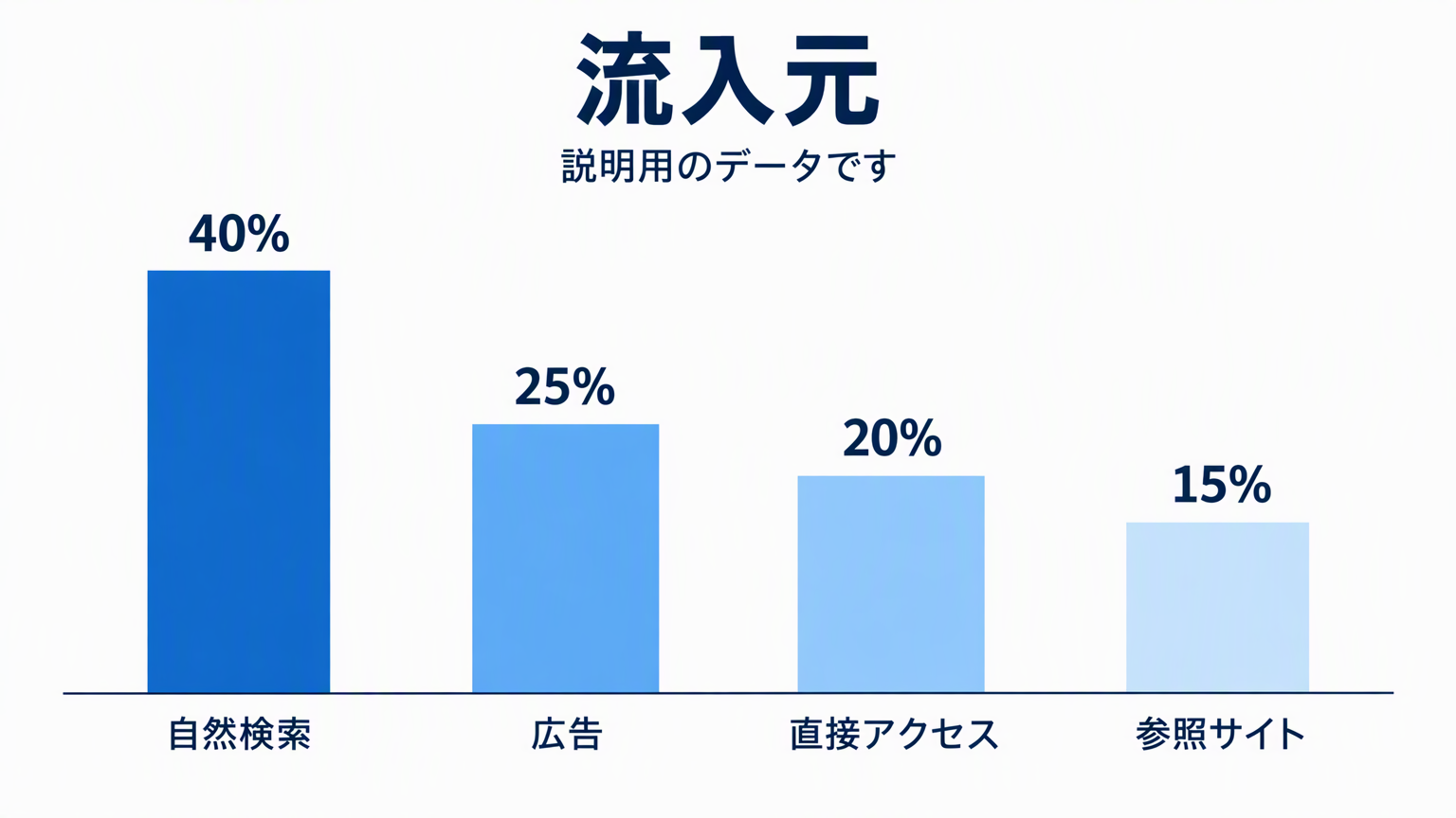 | 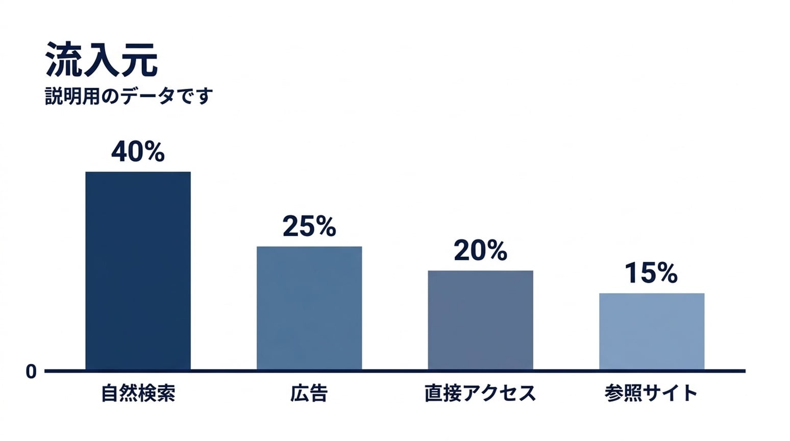 |
Label Jepang tetap terbaca di kedua gambar. NB menambah marker nol di baseline bersama. Rasio bar NB lebih dekat ke nilai yang diminta, tapi bar terpendek masih agak tinggi.
Versi Korea
| GPT Image 2.5 | Nano Banana 2.1 |
|---|---|
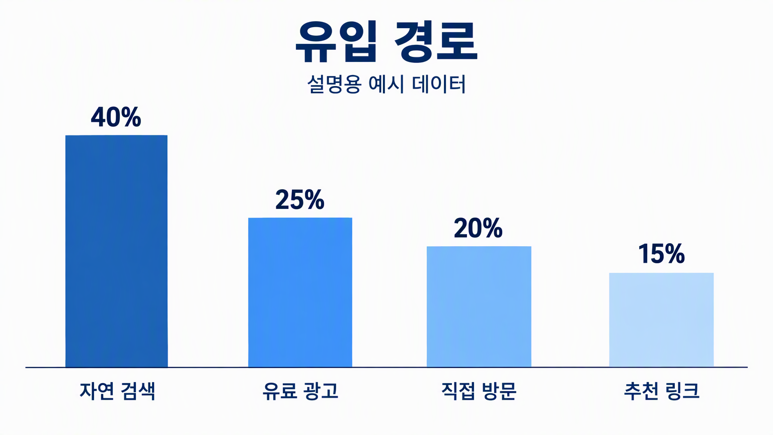 | 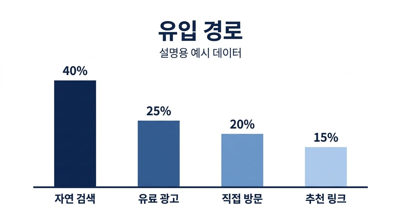 |
Keduanya mempertahankan label Korea dan empat persentase. Dari sampel bahasa ini, hasil NB Korea sangat dekat ke rasio tinggi bar yang diminta. Ini tetap gambar perkiraan, bukan chart tervalidasi data.
9. Diagram proses
Brief bersama: Tampilkan Generate, Inspect, dan Refine berurutan, masing-masing dengan baris pendukung yang ditentukan, terhubung panah.
| GPT Image 2.5 | Nano Banana 2.1 |
|---|---|
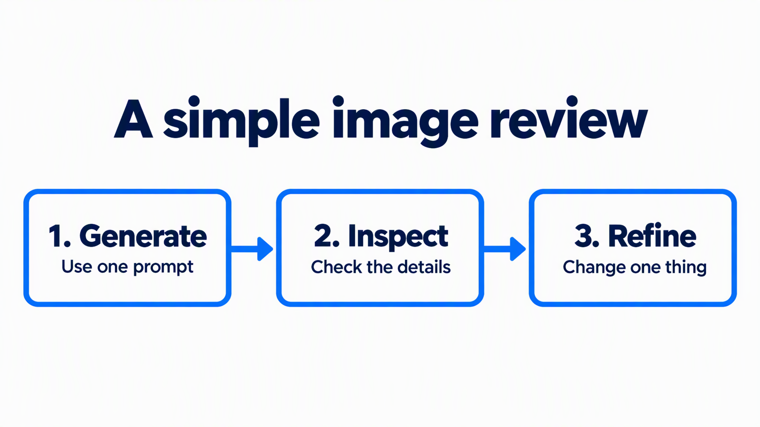 | 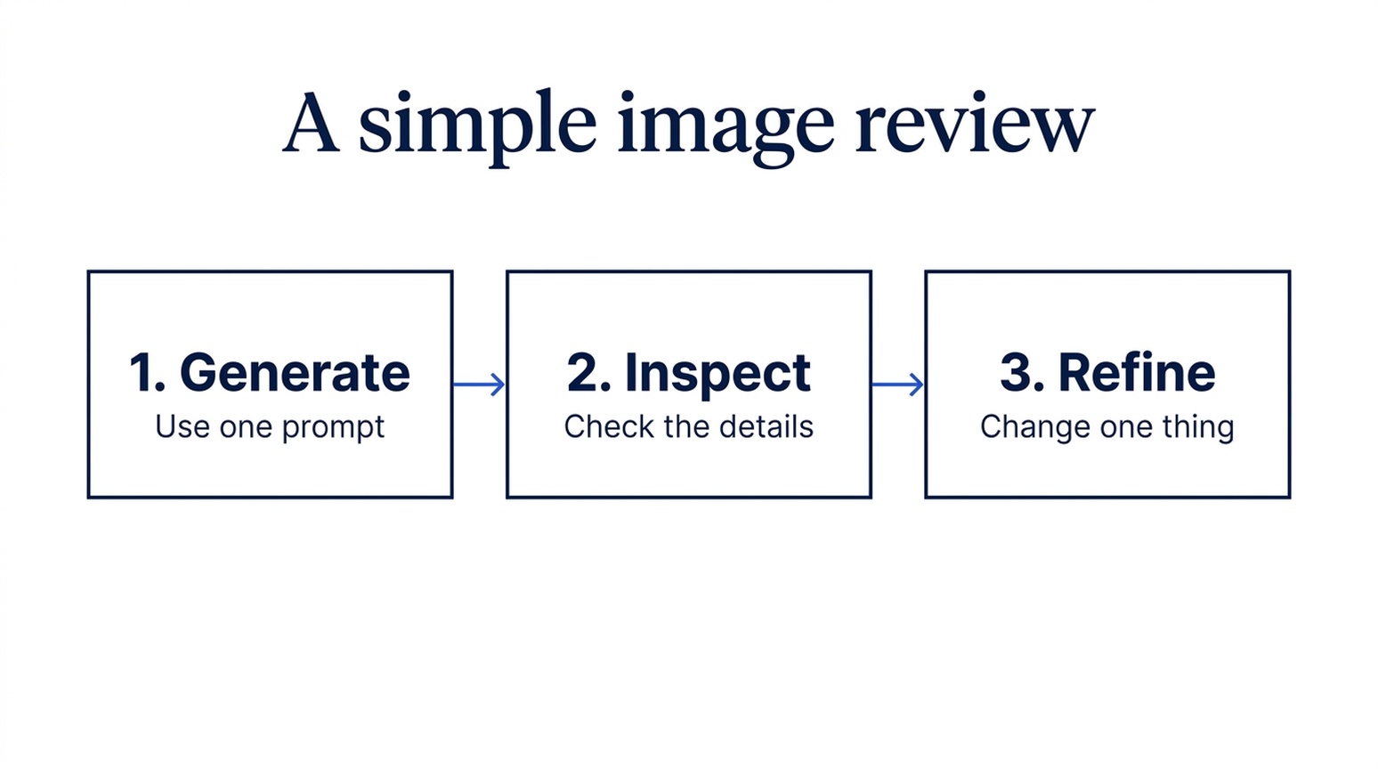 |
Kedua output mempertahankan label, teks pendukung, dan urutan tiga langkah. GPT memakai panah biru tebal dan bingkai bulat. Nano Banana 2.1 memakai konektor tipis dan kotak persegi panjang yang tenang. Keduanya diminta dalam format landscape yang sama.
Kapan saya menggunakannya: Pilih GPT untuk slide pelatihan di mana urutan harus langsung menonjol. Pilih Nano Banana 2.1 untuk figur proses pendukung di laporan. Pasangan ini tidak punya pemenang akurasi konten yang jelas.
10. Penjelasan konsep ilmiah
Brief bersama: Jelaskan proses difusi sederhana dengan empat sampel makin noisy, lalu empat sampel denoising urutan terbalik.
| GPT Image 2.5 | Nano Banana 2.1 |
|---|---|
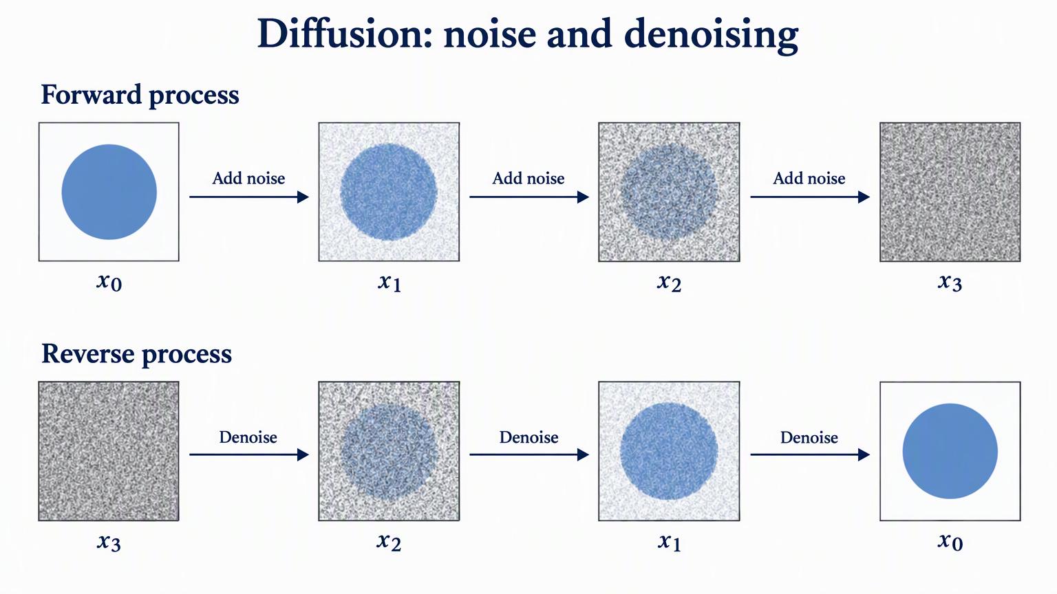 | 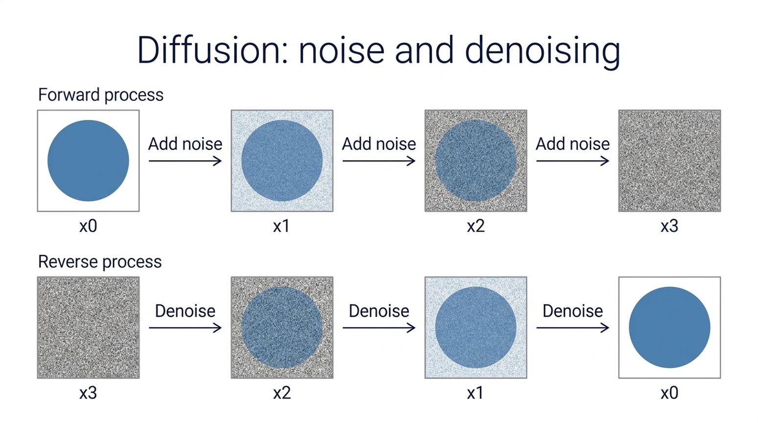 |
Kedua model mempertahankan jumlah sampel, urutan x0-ke-x3 dan x3-ke-x0, serta arah panah yang diminta. GPT menampilkan subscript matematis dan progresi noise yang lebih terlihat. Nano Banana 2.1 memakai label polos dan layout sans-serif sederhana.
Kapan saya menggunakannya: Mulai dengan GPT untuk figur penjelasan gaya paper, atau Nano Banana 2.1 untuk slide kelas sederhana. Ini ilustrasi konsep, bukan hasil eksperimen. Periksa notasi paper dan proses sebelum digunakan. Konsep dasar dibahas di Denoising Diffusion Probabilistic Models.
11. Diagram metode riset dan arsitektur model
Brief bersama: Gambar jalur utama pemrosesan gambar, cabang referensi masuk ke Feature fusion, dan koneksi skip putus-putus dari Input image ke Image decoder.
| GPT Image 2.5 | Nano Banana 2.1 |
|---|---|
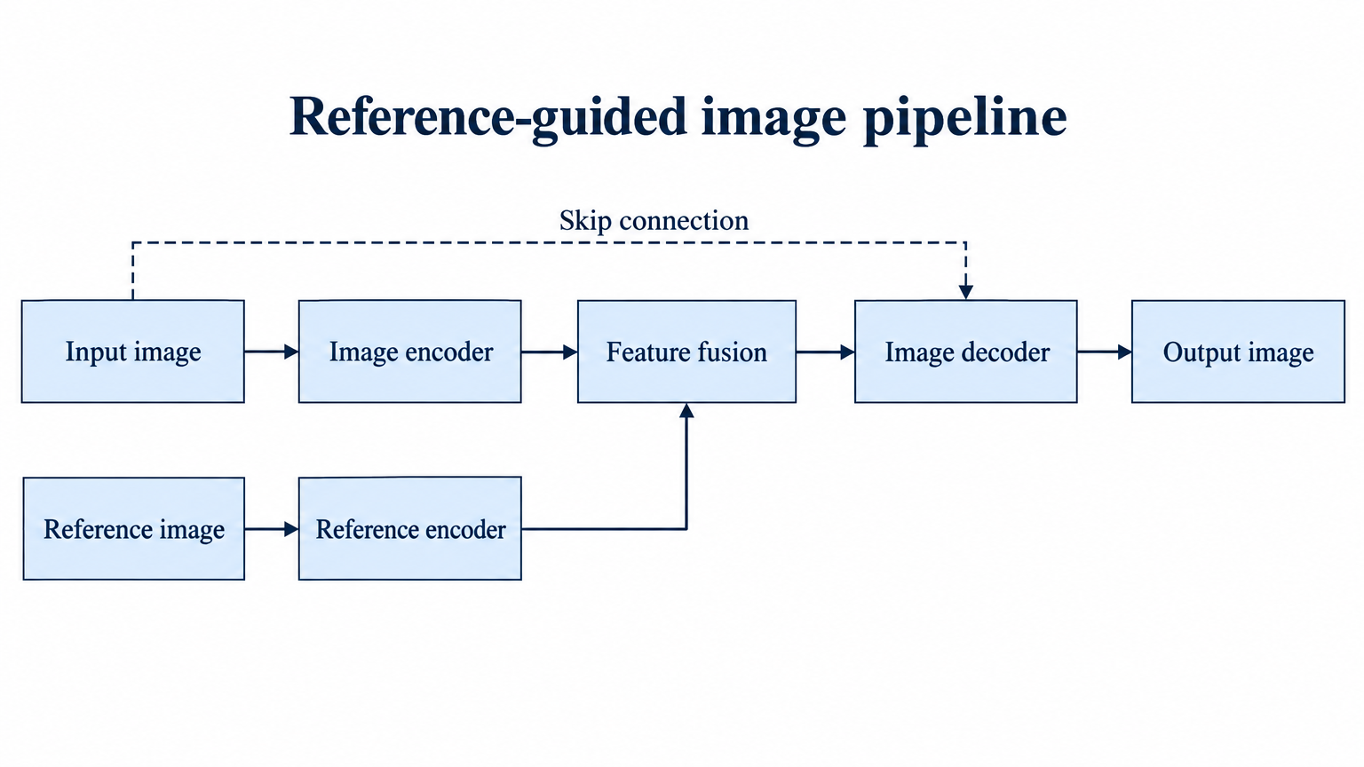 | 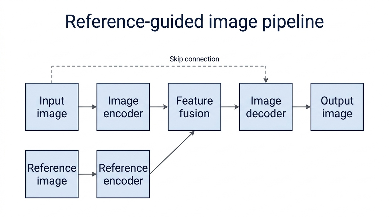 |
Kedua model menghubungkan jalur utama, cabang referensi, dan koneksi skip ke kotak yang diminta. GPT menjaga label lebih panjang di node lebar dan memakai cabang ortogonal jelas. Nano Banana 2.1 membagi label jadi dua baris, dengan label Reference bawah dekat tepi kotak.
Kapan saya menggunakannya: Saya mulai dengan GPT untuk diagram metode ini karena penyesuaian label dan kotak lebih sedikit. Nano Banana 2.1 juga benar topologinya. Kerangka ini hipotetis; untuk paper nyata, verifikasi setiap asal, tujuan, dan arah panah daripada menganggap diagram masuk akal sebagai bukti metode.
12. Ilustrasi cerita dan concept art
Brief bersama: Tempatkan observatorium kecil dan astronom di dalam cangkir teh transparan di atas lumut di hutan blue-hour.
| GPT Image 2.5 | Nano Banana 2.1 |
|---|---|
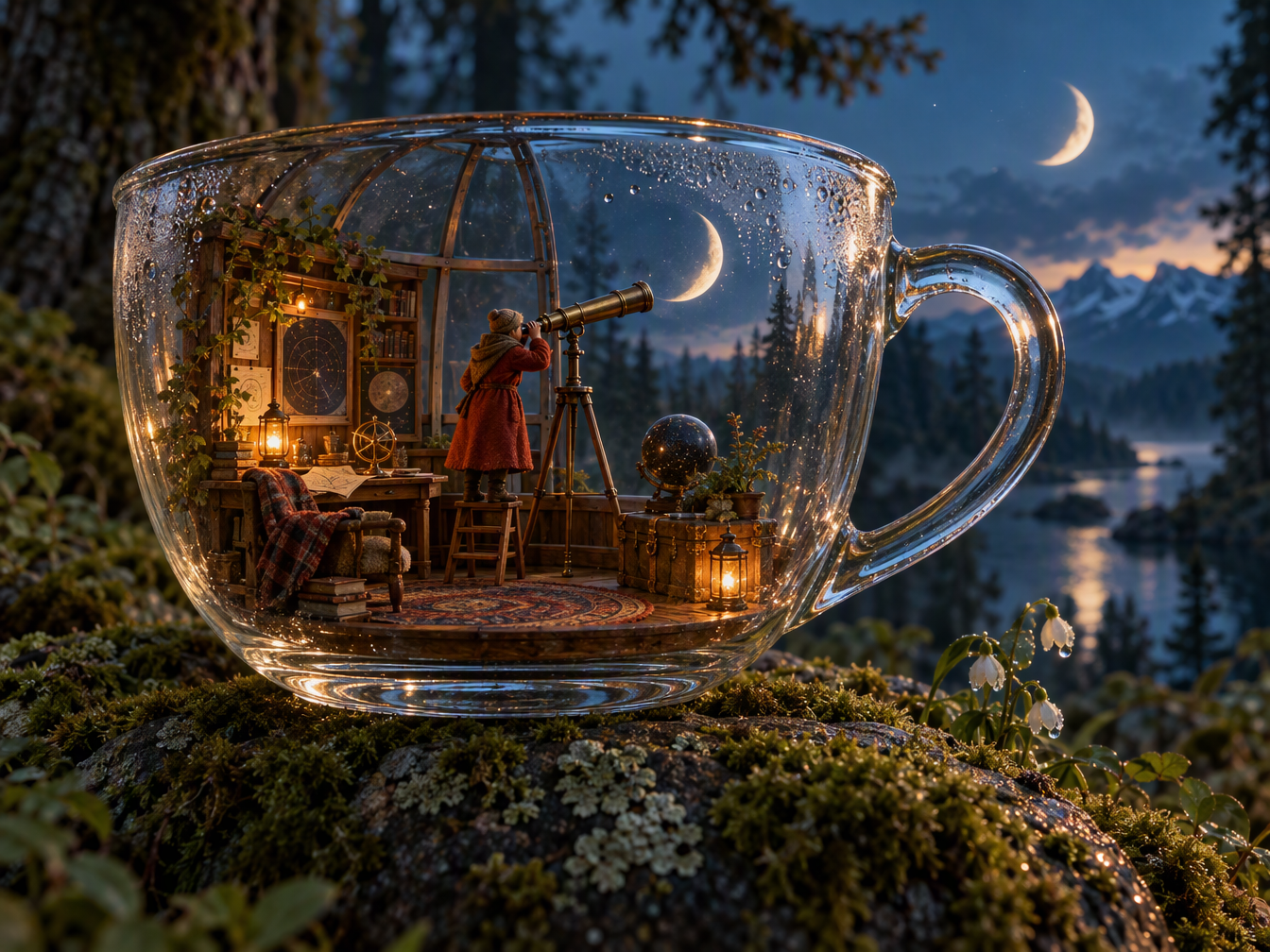 | 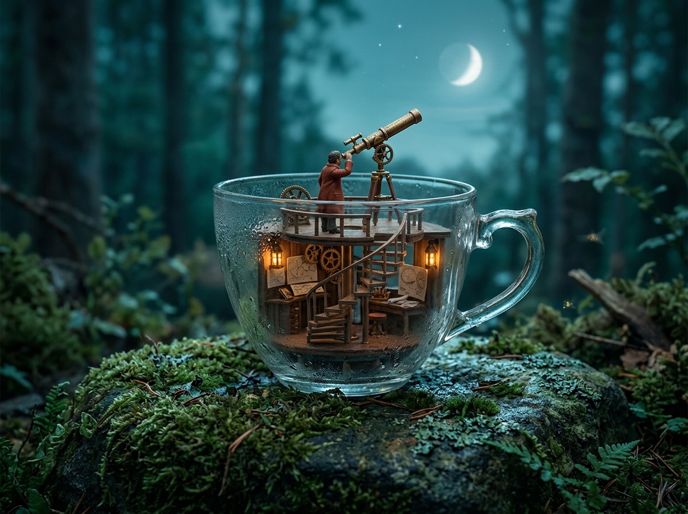 |
GPT membuat ruangan miniatur lengkap dan refleksi kaca meyakinkan, tapi menambah bulan sabit kedua. Nano Banana 2.1 memberikan struktur observatorium lebih sederhana dan satu bulan di atas cangkir. Tidak ada yang benar-benar mengikuti instruksi spasial.
Kapan saya menggunakannya: Untuk konsep fantasi detail, mulai dengan GPT dan rencanakan koreksi bulan ekstra. Untuk ilustrasi miniatur tenang, mulai dengan Nano Banana 2.1. Gambar lebih rumit tidak otomatis lebih setia.
13. Konsep desain interior
Brief bersama: Tampilkan kafe baca dengan tiga meja bundar di kiri, rak buku sisi jendela berkesinambungan, counter belakang, dan lorong tengah yang jelas.
| GPT Image 2.5 | Nano Banana 2.1 |
|---|---|
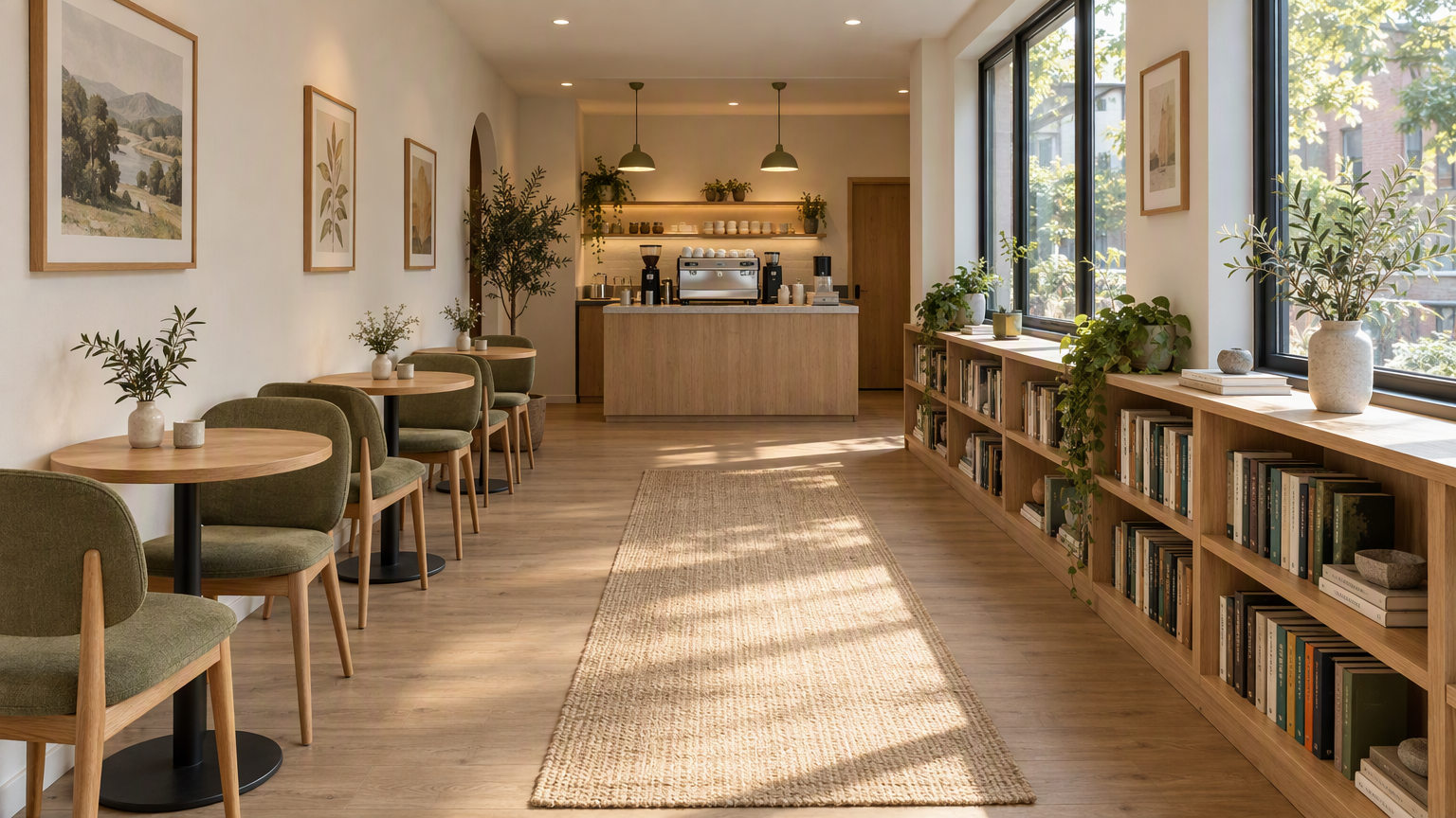 | 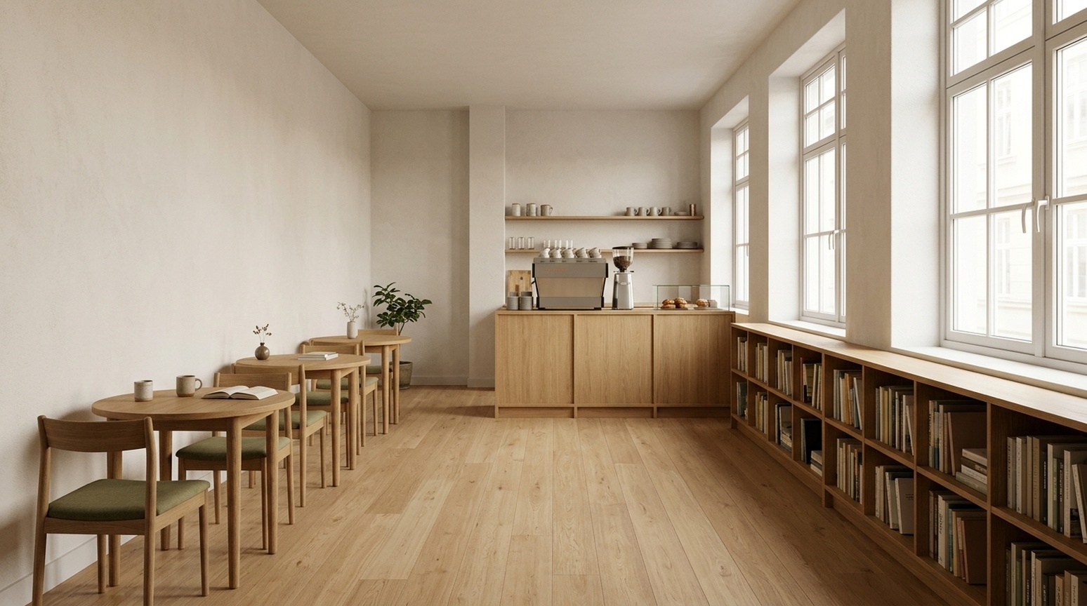 |
GPT menonjolkan cahaya samping, tekstur oak, dan upholstery olive, serta menambah karpet, karya seni, dan tanaman. Nano Banana 2.1 memakai dekorasi lebih sedikit dan pandangan lebih langsung ke lorong dan rak buku. Furnitur belakang tumpang tindih, sehingga jumlah meja dan kursi butuh pemeriksaan teliti.
Kapan saya menggunakannya: Mulai dengan GPT untuk konsep klien yang atmosferik; mulai dengan Nano Banana 2.1 untuk arah visual lebih sederhana. Gambar perspektif tidak memastikan dimensi terukur, lebar sirkulasi, atau rencana yang bisa dibangun.
Memilih untuk pekerjaan Anda sendiri
Untuk thumbnail atau hero detail produk, GPT Image 2.5 menjadi percobaan pertama yang berguna jika ingin teks menonjol dan crop detail. Untuk poster acara yang dipimpin tipografi, Nano Banana 2.1 memberi arah grafis yang berguna. Untuk brief bar-chart, geometri NB lebih dekat ke proporsi yang diberikan di tiga sampel bahasa kami.
Untuk produk referensi, periksa objek sebelum setting. Untuk figur ilmiah, periksa hubungan sebelum gaya. Untuk pemasaran lokal, periksa gambar target bahasa sebenarnya: subtitle bahasa Inggris ekstra di checklist China sebelumnya tidak muncul di sampel checklist Jepang dan Korea kami.
Buat gambar sendiri dengan alat Felo ini
Pilih alat awal berdasarkan contoh di atas:
| Tugas Anda | Alat Felo yang Direkomendasikan |
|---|---|
| Grafik detail produk, thumbnail tegas, atau draft diagram metode riset | GPT Image 2.5 |
| Poster acara, kartu pengetahuan sederhana, atau draft grafik batang sederhana | Nano Banana 2.1 |
| Jelajahi ide gambar sebelum memilih model | AI Image |
Salin prompt yang sesuai dari lampiran di bawah. Untuk perbandingan yang adil, gunakan prompt, gambar referensi, dan salinan bahasa Inggris, Jepang, atau Korea yang sama persis di kedua alat model. Tinjau detail produk, label, dan data sebelum publikasi.
Catatan pembuatan dan review
Artikel ini memuat 23 pasangan gambar: 13 kasus utama dan sepuluh varian Jepang/Korea tambahan, total 46 gambar perbandingan. Setiap pasangan memakai prompt konten yang sama dan, jika relevan, referensi yang sama. GPT dijalankan dengan skill ePhone GPT Image 2.5 Sunburst kualitas tinggi; Nano Banana 2.1 memakai default skill yang diminta. Setting kualitas dan biaya tidak dinormalisasi. Kami mempertahankan output pertama yang berhasil dikembalikan untuk setiap run yang ditampilkan dan tidak menyentuh konten.
Observasi teks berupa pemeriksaan visual, bukan sertifikasi penutur asli atau benchmark bahasa berulang. Karakter kecil, tanda baca rentang waktu Jepang, dan spasi Korea masih perlu review pengiriman. Proporsi bar diukur secara kasar dari piksel dan dipengaruhi antialiasing. Tidak ada pengujian click-through rate, conversion rate, atau reliabilitas multi-run.
Prompt persis yang digunakan dalam perbandingan
Gunakan prompt dan gambar referensi yang sama di kedua model. Referensi produk ditampilkan di atas.
Ecommerce White
Create a square ecommerce catalog photograph using the supplied blue travel mug as the exact product reference. Preserve the cobalt-blue ceramic body, the curved handle on the left, the ivory drinking lid, the lid opening, the body proportions and surface texture. Remove the limestone block and the original environment. Show the complete mug centered on a pure white background, three-quarter view, with one subtle natural contact shadow beneath it. Product fills about 75% of the canvas height. No added objects, no text, no logo, no badge, no watermark. Do not redesign the product. Square 1:1.
Ecommerce Lifestyle
Create a realistic landscape lifestyle advertising photograph using the supplied blue travel mug as the exact product reference. Preserve its cobalt-blue ceramic body, curved handle, ivory drinking lid, and proportions. Place the complete mug on a light oak breakfast table next to one closed linen notebook in a quiet sunlit apartment kitchen. The mug is the sharp hero subject on the left third; the kitchen is softly out of focus. Warm morning light comes from the left. Leave the right third uncluttered as copy space. Natural believable scale and contact shadows. No people, no additional mugs, no text, no logo, no watermark. Landscape 16:9.
Academic Diffusion
Create a scientifically correct schematic for explaining a diffusion model in an academic presentation. Landscape 16:9, white background, precise thin lines, navy text, muted blue and gray palette, no decorative scenery. Exact title: 'Diffusion: noise and denoising'. Two clearly separated horizontal rows, each containing exactly four square image samples. The top row is labeled 'Forward process'. Its samples run left to right: a clean blue circle labeled 'x0', a lightly noisy version labeled 'x1', a very noisy version labeled 'x2', pure gray noise labeled 'x3'. Connect adjacent samples with three right-pointing arrows, each labeled 'Add noise'. The bottom row is labeled 'Reverse process'. Its samples run left to right: pure gray noise labeled 'x3', a very noisy blue circle labeled 'x2', a lightly noisy circle labeled 'x1', a clean blue circle labeled 'x0'. Connect adjacent samples with three right-pointing arrows, each labeled 'Denoise'. Preserve these exact labels, arrow directions, sample counts, and ordering. This is a conceptual explanation, not experimental results. No equations, no additional labels, no 3D, no watermark.
Interior Concept
Create a photorealistic interior design concept image of a small contemporary reading cafe, landscape 16:9. Wide view from the entrance at eye level, a clear continuous central aisle leading to the rear counter. Along the left wall, exactly three small round oak tables, each with exactly two chairs. Along the right wall, one continuous low oak bookcase beneath large windows. A compact coffee counter is centered on the rear wall. Warm white plaster, light oak, muted olive textiles, soft morning daylight from the right, believable furniture scale, coherent straight perspective, no people, no signage, no text, no extra tables, no watermark.
Academic Method
Create a precise academic method diagram for a hypothetical reference-guided image pipeline. White background, landscape 16:9, navy text, thin dark arrows, restrained pale blue rectangles, generous spacing, no decorative imagery. Exact title: 'Reference-guided image pipeline'. Use exactly seven boxes, each label appearing once. The main row runs left to right: 'Input image' -> 'Image encoder' -> 'Feature fusion' -> 'Image decoder' -> 'Output image'. A second row below the first two boxes contains 'Reference image' -> 'Reference encoder'. Draw one arrow from 'Reference encoder' upward and to the right into 'Feature fusion'. Draw one additional dashed skip-connection arrow from 'Input image' to 'Image decoder', routed above the main row and labeled exactly 'Skip connection'. All seven connectors must terminate on the specified boxes; do not connect the reference branch directly to the output or decoder. Keep every label readable and every box distinct. No extra boxes, no other labels, no graph statistics, no equations, no watermark. This is a hypothetical diagram, not an architecture attributed to a real paper.
Fantasy Scene
A cinematic editorial illustration of a tiny observatory built inside a clear glass teacup, resting on a moss-covered stone in a quiet forest at blue hour. A miniature astronomer in a rust-red coat looks through a brass telescope at a luminous crescent moon visible through the cup. Delicate reflections and condensation on the glass, rich tactile detail, restrained teal and amber palette, storybook realism, carefully composed, no text, no letters, landscape 4:3.
Product Concept
A premium studio product photograph of a matte cobalt-blue ceramic travel mug with an ivory lid, standing on a pale limestone block. Three-quarter view, soft morning window light from the upper left, subtle condensation, warm off-white background, generous negative space on the right, no logo, no text, no extra objects, realistic commercial photography, landscape 4:3.
Process Infographic
Create a clear horizontal infographic titled “A simple image review”. Show exactly three connected panels in this order, with these exact labels: “1. Generate”, “2. Inspect”, “3. Refine”. Add one small line under each: “Use one prompt”, “Check the details”, “Change one thing”. Flat editorial vector style, navy text, cobalt-blue connectors, white background, evenly spaced panels, no icons, no extra words, 16:9.
Prompt perbandingan bahasa Inggris, Jepang, dan Korea
ecommerce-detail-en
Language: English. Requested size: 1024x1280.
Specified text:
- Three details. One mug.
- Ceramic body
- Ivory lid
- Curved handle
Create a portrait ecommerce product detail graphic using the supplied blue travel mug as the exact product reference. Preserve its cobalt-blue ceramic body, left handle, ivory drinking lid, proportions, and texture. Put one full product view in the center, with three small circular detail crops around it: the ceramic body surface, the ivory lid, and the curved handle. Each detail crop must correspond to the same product. Add exactly this English headline: "Three details. One mug.". Add exactly these three labels next to their corresponding detail crops: "Ceramic body", "Ivory lid", "Curved handle". All text must be in English; do not add translations or another language. Use thin connector lines that point to the correct feature, generous spacing, a warm off-white background, navy text, refined commercial editorial layout. No invented performance claims, no numbers, no prices, no other words, no watermark. Portrait 4:5.
Reference: shared mug
data-infographic-en
Language: English. Requested size: 1536x864.
Specified text:
- Traffic sources
- Illustrative data, not real statistics
- Organic search
- Paid ads
- Direct
- Referrals
- 40%
- 25%
- 20%
- 15%
Design a precise flat vector infographic on a white background, landscape 16:9. Exact English title: "Traffic sources". Exact small subtitle: "Illustrative data, not real statistics". Draw exactly four vertical bars on one common zero baseline, left to right with these exact labels and values: "Organic search" 40%, "Paid ads" 25%, "Direct" 20%, "Referrals" 15%. Bar heights must be proportional to 40, 25, 20, 15: the first is tallest, the second is 62.5% of its height, the third is 50%, and the fourth is 37.5%. Put each value directly above its own bar and its category directly below. Use four restrained shades of blue, navy text, wide margins, readable typography. All text must be in English, with no translations or additional words. No perspective, no 3D, no icons, no extra charts, no watermark.
video-thumbnail-en
Language: English. Requested size: 1536x864.
Specified text:
- BETTER PHONE PHOTOS
- 3 COMPOSITION TIPS
Create a polished landscape 16:9 YouTube thumbnail for a English-language smartphone photography tutorial. On the left, a realistic close view of two hands holding one smartphone horizontally, its screen visibly framing the same neon-lit city street seen behind it. Use dramatic but believable teal and warm orange night lighting, a strong focal subject and crisp silhouettes. On the right, add exactly these two text strings in two distinct title groups: "BETTER PHONE PHOTOS" and "3 COMPOSITION TIPS". The first is larger; both must be readable at a thumbnail width of 320 pixels. Use bold high-contrast ivory typography with a subtle dark outline. Typography and line breaks must be natural for English, preserving every character exactly. All background signs must be abstract and unreadable. No other readable words, no translations, no camera brands, no logos, no comparison panels, no watermark. Keep all text inside the frame with generous margins.
event-poster-en
Language: English. Requested size: 1024x1024.
Specified text:
- NIGHT GARDEN
- Botanical light show · Kyoto · 7–9 pm
Design a square event poster with exactly this English headline: "NIGHT GARDEN". Add exactly this subtitle: "Botanical light show · Kyoto · 7–9 pm". Use luminous botanical silhouettes, deep forest green and warm amber, refined editorial typography, clear contrast, balanced margins, all text fully inside the canvas. Use natural English typography and line breaks without changing any characters. No other words, no translations, no logos, no watermark.
social-knowledge-en
Language: English. Requested size: 1024x1280.
Specified text:
- Weekend packing checklist
- Documents
- ID, tickets
- Clothes
- Jacket, spare clothes
- Electronics
- Phone, charger
- Toiletries
- Toothbrush, towel
- Bags
- Suitcase, organizers
- Essentials
- Tissues, umbrella
Design a readable portrait 4:5 English knowledge card for a travel packing checklist. Exact headline: "Weekend packing checklist". Use exactly six equal cards in a two-column by three-row grid. Left to right, top to bottom, each card has exactly this heading and one text line: "Documents" with "ID, tickets"; "Clothes" with "Jacket, spare clothes"; "Electronics" with "Phone, charger"; "Toiletries" with "Toothbrush, towel"; "Bags" with "Suitcase, organizers"; "Essentials" with "Tissues, umbrella". One simple relevant flat icon per card. Clean cream background, navy typography, restrained blue and orange accents, clear title hierarchy, comfortable whitespace, no overlapping elements. Use natural English typography and line breaks. Preserve all specified text and punctuation exactly. No extra copy, no translations, no other languages, no watermark.
ecommerce-detail-ja
Language: Japanese. Requested size: 1024x1280.
Specified text:
- カップの3つのディテール
- 陶器の本体
- アイボリーのふた
- カーブした持ち手
Create a portrait ecommerce product detail graphic using the supplied blue travel mug as the exact product reference. Preserve its cobalt-blue ceramic body, left handle, ivory drinking lid, proportions, and texture. Put one full product view in the center, with three small circular detail crops around it: the ceramic body surface, the ivory lid, and the curved handle. Each detail crop must correspond to the same product. Add exactly this Japanese headline: "カップの3つのディテール". Add exactly these three labels next to their corresponding detail crops: "陶器の本体", "アイボリーのふた", "カーブした持ち手". All text must be in Japanese; do not add translations or another language. Use thin connector lines that point to the correct feature, generous spacing, a warm off-white background, navy text, refined commercial editorial layout. No invented performance claims, no numbers, no prices, no other words, no watermark. Portrait 4:5.
Reference: shared mug
data-infographic-ja
Language: Japanese. Requested size: 1536x864.
Specified text:
- 流入元
- 説明用のデータです
- 自然検索
- 広告
- 直接アクセス
- 参照サイト
- 40%
- 25%
- 20%
- 15%
Design a precise flat vector infographic on a white background, landscape 16:9. Exact Japanese title: "流入元". Exact small subtitle: "説明用のデータです". Draw exactly four vertical bars on one common zero baseline, left to right with these exact labels and values: "自然検索" 40%, "広告" 25%, "直接アクセス" 20%, "参照サイト" 15%. Bar heights must be proportional to 40, 25, 20, 15: the first is tallest, the second is 62.5% of its height, the third is 50%, and the fourth is 37.5%. Put each value directly above its own bar and its category directly below. Use four restrained shades of blue, navy text, wide margins, readable typography. All text must be in Japanese, with no translations or additional words. No perspective, no 3D, no icons, no extra charts, no watermark.
video-thumbnail-ja
Language: Japanese. Requested size: 1536x864.
Specified text:
- スマホで映える写真
- 構図のコツ3選
Create a polished landscape 16:9 YouTube thumbnail for a Japanese-language smartphone photography tutorial. On the left, a realistic close view of two hands holding one smartphone horizontally, its screen visibly framing the same neon-lit city street seen behind it. Use dramatic but believable teal and warm orange night lighting, a strong focal subject and crisp silhouettes. On the right, add exactly these two text strings in two distinct title groups: "スマホで映える写真" and "構図のコツ3選". The first is larger; both must be readable at a thumbnail width of 320 pixels. Use bold high-contrast ivory typography with a subtle dark outline. Typography and line breaks must be natural for Japanese, preserving every character exactly. All background signs must be abstract and unreadable. No other readable words, no translations, no camera brands, no logos, no comparison panels, no watermark. Keep all text inside the frame with generous margins.
event-poster-ja
Language: Japanese. Requested size: 1024x1024.
Specified text:
- ナイトガーデン
- 植物のライトショー・京都・19〜21時
Design a square event poster with exactly this Japanese headline: "ナイトガーデン". Add exactly this subtitle: "植物のライトショー・京都・19〜21時". Use luminous botanical silhouettes, deep forest green and warm amber, refined editorial typography, clear contrast, balanced margins, all text fully inside the canvas. Use natural Japanese typography and line breaks without changing any characters. No other words, no translations, no logos, no watermark.
social-knowledge-ja
Language: Japanese. Requested size: 1024x1280.
Specified text:
- 週末旅行の持ち物リスト
- 書類
- 身分証、チケット
- 衣類
- 上着、着替え
- 電子機器
- スマホ、充電器
- 洗面用品
- 歯ブラシ、タオル
- 収納
- スーツケース、収納袋
- 日用品
- ティッシュ、傘
Design a readable portrait 4:5 Japanese knowledge card for a travel packing checklist. Exact headline: "週末旅行の持ち物リスト". Use exactly six equal cards in a two-column by three-row grid. Left to right, top to bottom, each card has exactly this heading and one text line: "書類" with "身分証、チケット"; "衣類" with "上着、着替え"; "電子機器" with "スマホ、充電器"; "洗面用品" with "歯ブラシ、タオル"; "収納" with "スーツケース、収納袋"; "日用品" with "ティッシュ、傘". One simple relevant flat icon per card. Clean cream background, navy typography, restrained blue and orange accents, clear title hierarchy, comfortable whitespace, no overlapping elements. Use natural Japanese typography and line breaks. Preserve all specified text and punctuation exactly. No extra copy, no translations, no other languages, no watermark.
ecommerce-detail-ko
Language: Korean. Requested size: 1024x1280.
Specified text:
- 컵의 세 가지 디테일
- 세라믹 바디
- 아이보리 뚜껑
- 곡선형 손잡이
Create a portrait ecommerce product detail graphic using the supplied blue travel mug as the exact product reference. Preserve its cobalt-blue ceramic body, left handle, ivory drinking lid, proportions, and texture. Put one full product view in the center, with three small circular detail crops around it: the ceramic body surface, the ivory lid, and the curved handle. Each detail crop must correspond to the same product. Add exactly this Korean headline: "컵의 세 가지 디테일". Add exactly these three labels next to their corresponding detail crops: "세라믹 바디", "아이보리 뚜껑", "곡선형 손잡이". All text must be in Korean; do not add translations or another language. Use thin connector lines that point to the correct feature, generous spacing, a warm off-white background, navy text, refined commercial editorial layout. No invented performance claims, no numbers, no prices, no other words, no watermark. Portrait 4:5.
Reference: shared mug
data-infographic-ko
Language: Korean. Requested size: 1536x864.
Specified text:
- 유입 경로
- 설명용 예시 데이터
- 자연 검색
- 유료 광고
- 직접 방문
- 추천 링크
- 40%
- 25%
- 20%
- 15%
Design a precise flat vector infographic on a white background, landscape 16:9. Exact Korean title: "유입 경로". Exact small subtitle: "설명용 예시 데이터". Draw exactly four vertical bars on one common zero baseline, left to right with these exact labels and values: "자연 검색" 40%, "유료 광고" 25%, "직접 방문" 20%, "추천 링크" 15%. Bar heights must be proportional to 40, 25, 20, 15: the first is tallest, the second is 62.5% of its height, the third is 50%, and the fourth is 37.5%. Put each value directly above its own bar and its category directly below. Use four restrained shades of blue, navy text, wide margins, readable typography. All text must be in Korean, with no translations or additional words. No perspective, no 3D, no icons, no extra charts, no watermark.
video-thumbnail-ko
Language: Korean. Requested size: 1536x864.
Specified text:
- 스마트폰 사진 잘 찍기
- 구도 팁 3가지
Create a polished landscape 16:9 YouTube thumbnail for a Korean-language smartphone photography tutorial. On the left, a realistic close view of two hands holding one smartphone horizontally, its screen visibly framing the same neon-lit city street seen behind it. Use dramatic but believable teal and warm orange night lighting, a strong focal subject and crisp silhouettes. On the right, add exactly these two text strings in two distinct title groups: "스마트폰 사진 잘 찍기" and "구도 팁 3가지". The first is larger; both must be readable at a thumbnail width of 320 pixels. Use bold high-contrast ivory typography with a subtle dark outline. Typography and line breaks must be natural for Korean, preserving every character exactly. All background signs must be abstract and unreadable. No other readable words, no translations, no camera brands, no logos, no comparison panels, no watermark. Keep all text inside the frame with generous margins.
event-poster-ko
Language: Korean. Requested size: 1024x1024.
Specified text:
- 나이트 가든
- 식물 라이트 쇼 · 교토 · 오후 7–9시
Design a square event poster with exactly this Korean headline: "나이트 가든". Add exactly this subtitle: "식물 라이트 쇼 · 교토 · 오후 7–9시". Use luminous botanical silhouettes, deep forest green and warm amber, refined editorial typography, clear contrast, balanced margins, all text fully inside the canvas. Use natural Korean typography and line breaks without changing any characters. No other words, no translations, no logos, no watermark.
social-knowledge-ko
Language: Korean. Requested size: 1024x1280.
Specified text:
- 주말 여행 준비물
- 서류
- 신분증, 승차권
- 의류
- 겉옷, 여벌 옷
- 전자기기
- 휴대폰, 충전기
- 세면용품
- 칫솔, 수건
- 수납
- 여행 가방, 정리 파우치
- 생활용품
- 티슈, 우산
Design a readable portrait 4:5 Korean knowledge card for a travel packing checklist. Exact headline: "주말 여행 준비물". Use exactly six equal cards in a two-column by three-row grid. Left to right, top to bottom, each card has exactly this heading and one text line: "서류" with "신분증, 승차권"; "의류" with "겉옷, 여벌 옷"; "전자기기" with "휴대폰, 충전기"; "세면용품" with "칫솔, 수건"; "수납" with "여행 가방, 정리 파우치"; "생활용품" with "티슈, 우산". One simple relevant flat icon per card. Clean cream background, navy typography, restrained blue and orange accents, clear title hierarchy, comfortable whitespace, no overlapping elements. Use natural Korean typography and line breaks. Preserve all specified text and punctuation exactly. No extra copy, no translations, no other languages, no watermark.
Tulisan ini juga tersedia dalam English, 简体中文, 日本語, 한국어, 繁體中文, हिन्दी, Français, العربية, Русский, اردو, Deutsch, Tiếng Việt, Türkçe, Italiano, ไทย, Español, বাংলা and Português.