GPT Image 2.5 vs Nano Banana 2.1: 13 casi d’uso a confronto

Quale modello di immagini si adatta al tuo prossimo progetto? Confronta GPT Image 2.5 e Nano Banana 2.1 su immagini ecommerce, miniature, infografiche, diagrammi accademici e altro.
Un annuncio prodotto, una miniatura YouTube e un diagramma scientifico richiedono caratteristiche diverse da un modello di immagini. Un annuncio deve mantenere il prodotto; una miniatura deve rendere leggibile il titolo; un diagramma di metodo deve collegare le caselle giuste.
Abbiamo fornito a entrambi i modelli lo stesso brief per 13 casi d’uso e confrontato i risultati reali. Per cinque compiti con molto testo, abbiamo generato versioni separate in inglese, giapponese e coreano. Gli esempi principali qui sotto usano testo inglese o non contengono titoli; i confronti localizzati hanno testo giapponese e coreano dedicato.
Le raccomandazioni descrivono quale modello proverei per questi brief. Ogni sezione mostra i due risultati generati indipendentemente e spiega il compromesso.
Prova gli esempi su Felo: GPT Image 2.5, Nano Banana 2.1 o lo strumento AI Image.
Quale modello provare per primo?
| Caso d’uso | Prima scelta in questi esempi |
|---|---|
| Annunci prodotto su sfondo bianco | Entrambi; scegli in base alla finitura |
| Grafica dettagli prodotto | GPT per callout grandi |
| Pubblicità prodotto lifestyle | GPT per un’immagine hero pubblicitaria |
| Concept prodotto senza riferimento | Scegli prima l’oggetto desiderato |
| Miniature YouTube e tutorial | GPT per titoli in evidenza |
| Checklist e card informative | GPT per testo grande mobile; NB per card ariose |
| Poster evento | NB per poster grafici; GPT per atmosfera location |
| Infografiche numeriche | NB per questo brief a barre |
| Diagrammi di processo | GPT per training; NB per figure da report |
| Spiegazioni concetti scientifici | GPT per notazione stile paper; NB per slide didattiche |
| Diagrammi metodo di ricerca e architettura modello | GPT per questo framework a sette nodi |
| Illustrazioni e concept art | GPT per texture ricca; NB per scena sobria |
| Concept interior design | GPT per atmosfera; NB per direzione più semplice |
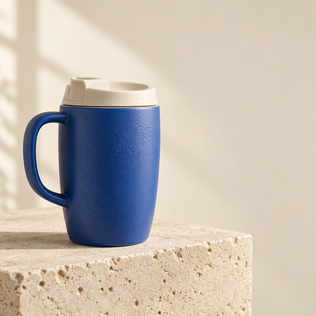
Il riferimento prodotto condiviso
I primi tre test ecommerce usano lo stesso prodotto fittizio, con manico a sinistra, coperchio avorio e corpo blu testurizzato.
1. Annunci prodotto su sfondo bianco
Brief condiviso: Mantieni la stessa tazza blu, manico, coperchio e proporzioni, rimuovi il blocco di pietra e posiziona il prodotto completo su sfondo bianco.
| GPT Image 2.5 | Nano Banana 2.1 |
|---|---|
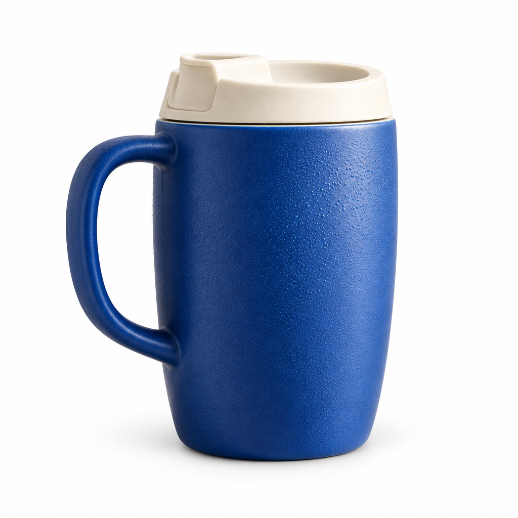 | 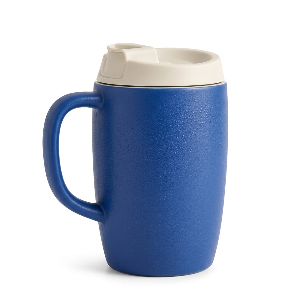 |
Entrambi i modelli mantengono manico e coperchio invece di trasformare il riferimento in una tazza da viaggio diversa. GPT Image 2.5 mette in risalto texture e gocce; Nano Banana 2.1 offre una superficie e un’ombra di contatto più morbida. Nessuno produce un vincitore netto per questo prodotto.
Quando lo userei: Inizia con GPT se il dettaglio della superficie conta di più; inizia con Nano Banana 2.1 se preferisci una luce da catalogo più morbida. Per un annuncio reale, confronta apertura coperchio, curva manico, colore e silhouette con il prodotto prima di approvare il risultato.
2. Grafica dettagli prodotto
Brief condiviso: Usa la stessa tazza di riferimento e tre viste circolari, etichettate Corpo ceramico, Coperchio avorio e Manico curvo.
| GPT Image 2.5 | Nano Banana 2.1 |
|---|---|
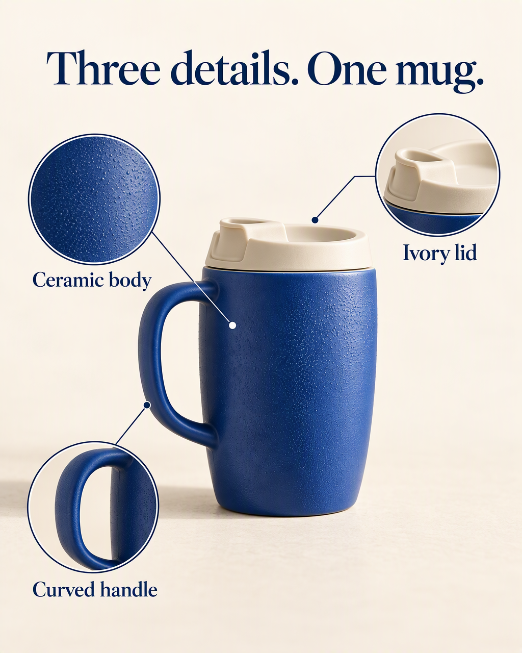 | 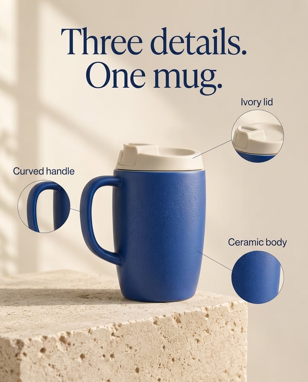 |
Entrambe le immagini inglesi mantengono titolo richiesto ed etichette. GPT dà più spazio a texture e ritagli coperchio, con etichette più grandi. Nano Banana 2.1 crea callout più piccoli attorno al prodotto centrato e mantiene più del setting originale. In alcune versioni, GPT posiziona il punto finale della linea coperchio appena sopra il prodotto, quindi la posizione va controllata.
Quando lo userei: Per un hero dettaglio prodotto mobile con close-up materiali evidenti, partirei da GPT. Per una pagina prodotto secondaria più sobria, Nano Banana 2.1 è un’alternativa utile. La scelta riguarda enfasi e pulizia annotazioni, non la prova che un modello preserva meglio ogni SKU.
Versione giapponese
| GPT Image 2.5 | Nano Banana 2.1 |
|---|---|
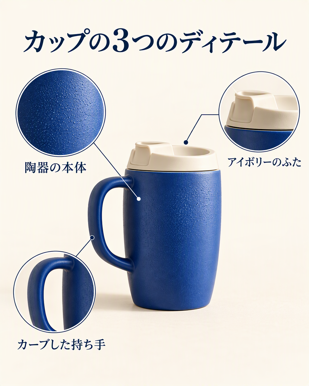 | 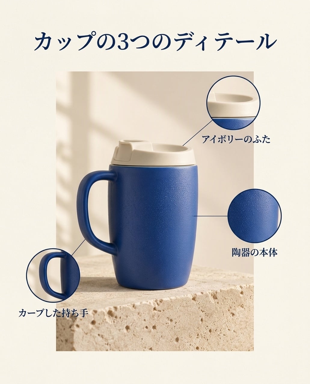 |
Entrambe mostrano カップの3つのディテール e le etichette richieste. GPT ingrandisce il ritaglio texture, mentre Nano Banana 2.1 usa un pannello prodotto più contenuto. Controlla i punti finali delle linee leader invece di giudicare solo il titolo.
Versione coreana
| GPT Image 2.5 | Nano Banana 2.1 |
|---|---|
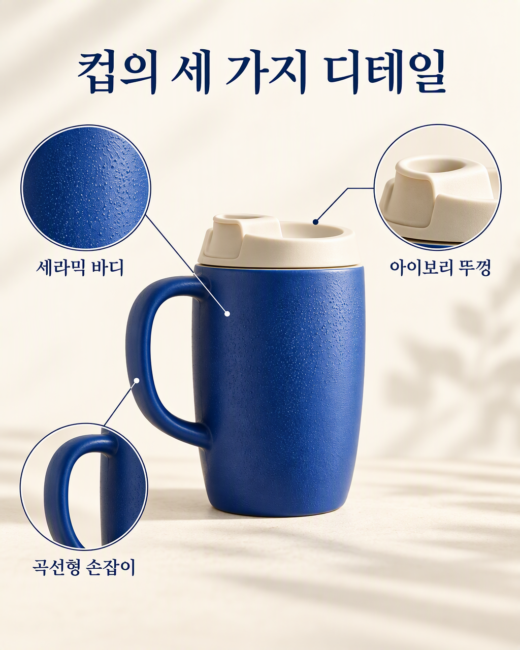 | 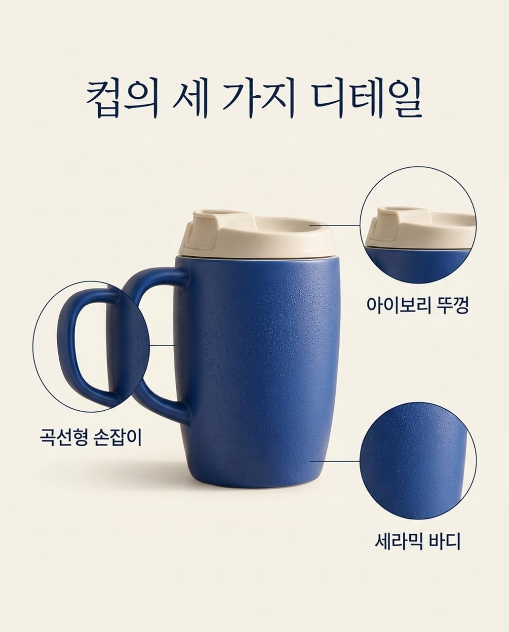 |
Entrambe mostrano le tre etichette coreane. GPT usa callout più larghi e grandi; Nano Banana 2.1 usa un layout più tranquillo. Il ritaglio manico curvo si sovrappone di più al prodotto principale nella versione NB.
3. Pubblicità prodotto lifestyle
Brief condiviso: Posiziona la stessa tazza su un tavolo da colazione in rovere accanto a un quaderno chiuso, con cucina sfocata e spazio testo libero a destra.
| GPT Image 2.5 | Nano Banana 2.1 |
|---|---|
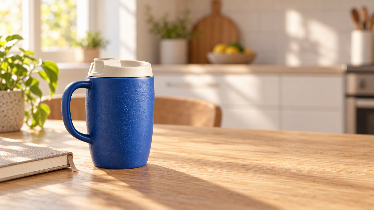 | 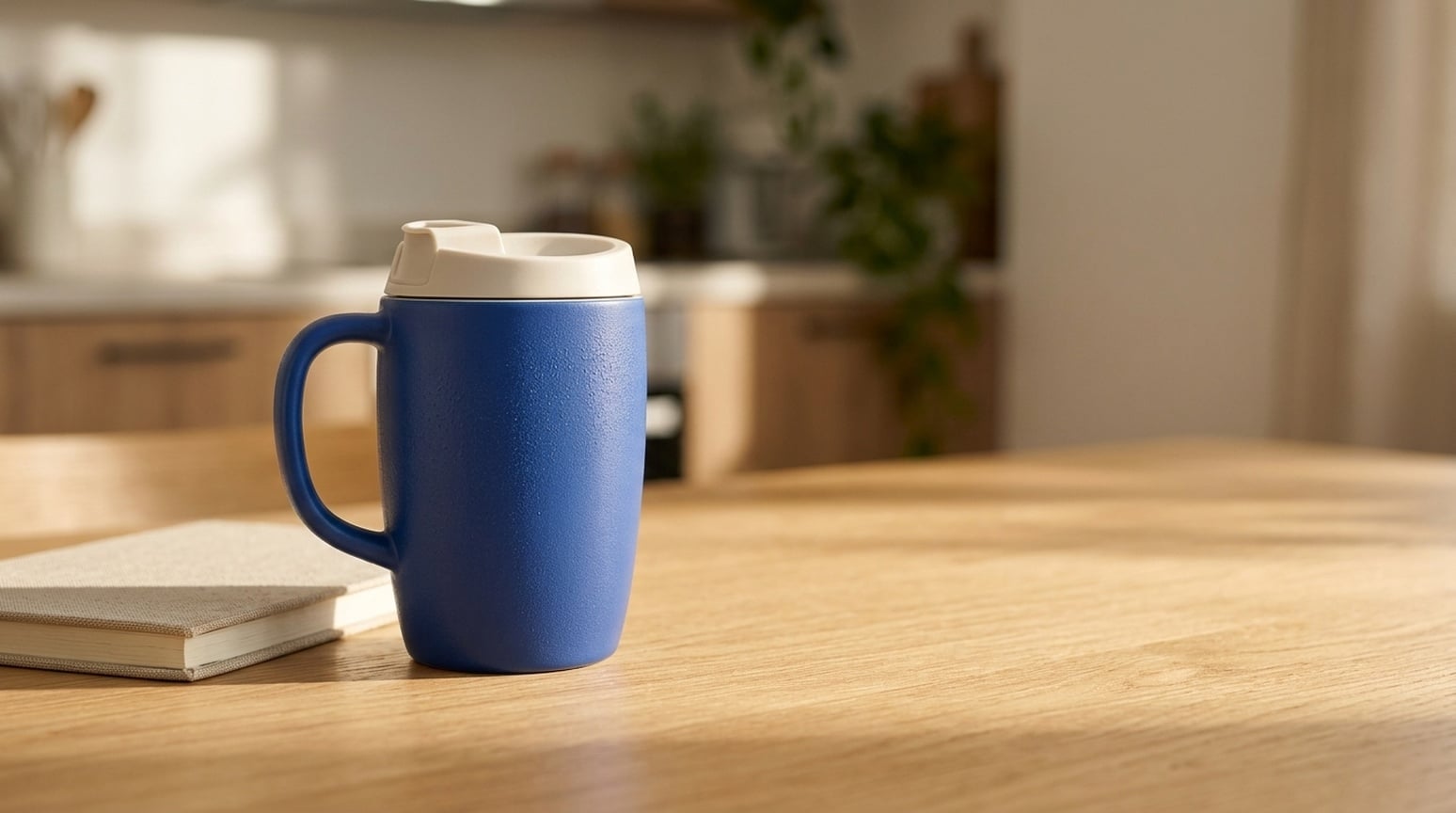 |
GPT separa la tazza dalla cucina calda, con texture ceramica, venatura legno e luce direzionale evidenti. Nano Banana 2.1 mantiene la scena più calma e con meno contrasto. Entrambi mantengono la struttura prodotto e lasciano spazio testo utilizzabile.
Quando lo userei: Inizia con GPT per un banner brand o pubblicità lifestyle dove il prodotto guida la scena. Prova Nano Banana 2.1 per un visual quotidiano più sobrio. Controlla geometria prodotto, scala e ombre prima di aggiungere testo campagna.
4. Concept prodotto senza riferimento
Brief condiviso: Descrivi una tazza da viaggio blu ceramica, coperchio avorio, blocco calcare e spazio testo vuoto, senza foto prodotto.
| GPT Image 2.5 | Nano Banana 2.1 |
|---|---|
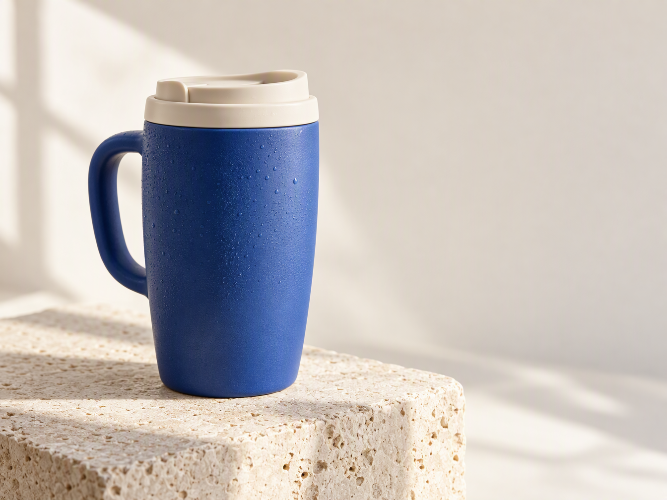 | 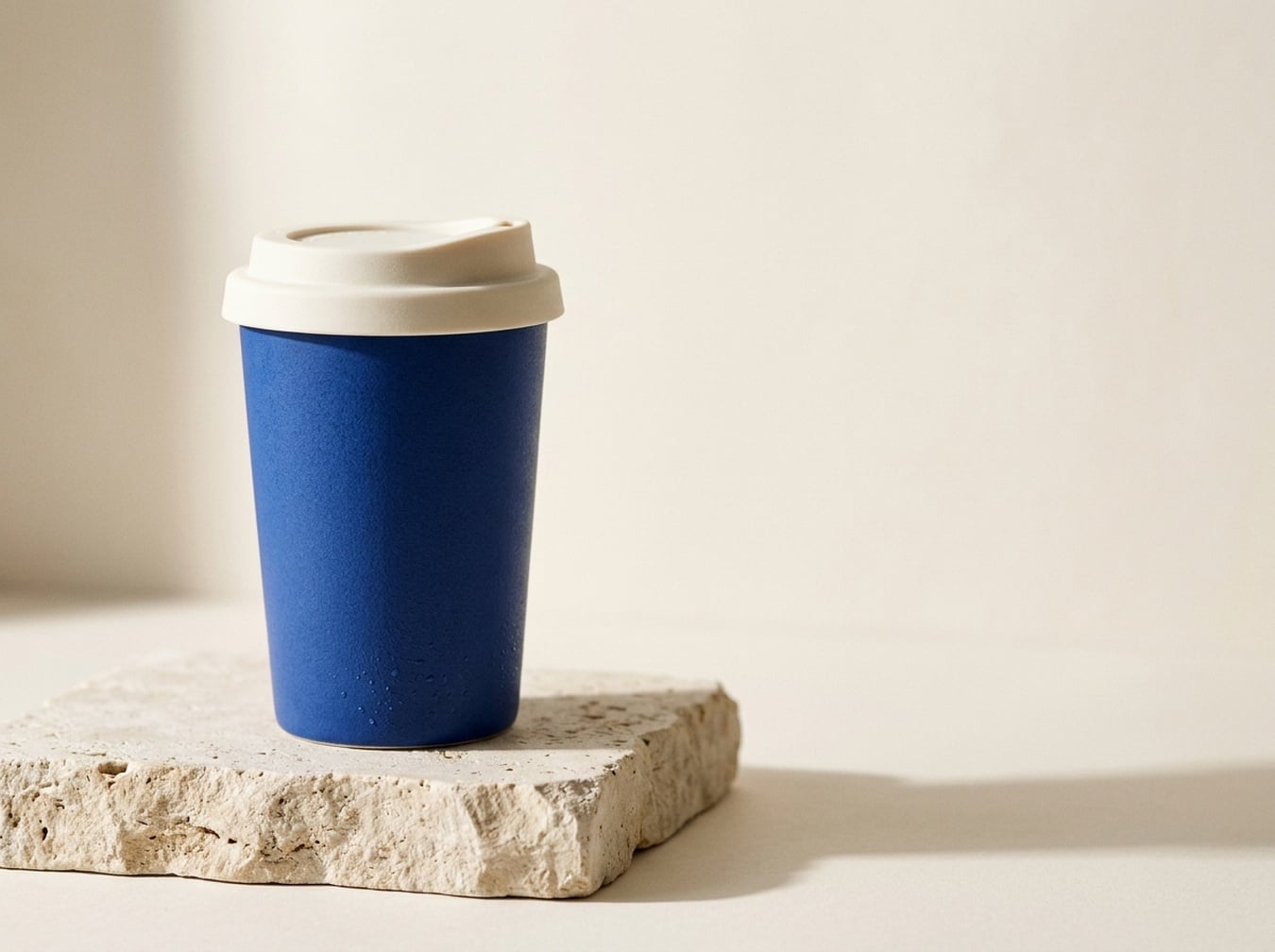 |
GPT genera una tazza con manico; Nano Banana 2.1 una tazza sottile senza manico. Il prompt non specifica il manico, quindi sono due interpretazioni plausibili della descrizione. GPT mette in risalto gocce e texture materiale, Nano Banana 2.1 offre una silhouette prodotto più semplice.
Quando lo userei: Usa GPT per esplorare un concept pubblicitario tattile e Nano Banana 2.1 per una direzione tazza portatile più pulita. Per rappresentare un prodotto esistente, fornisci lo stesso riferimento a entrambi; questa coppia solo testo non stabilisce fedeltà prodotto.
5. Miniature YouTube e tutorial
Brief condiviso: Mostra mani che fotografano una strada notturna con telefono, con BETTER PHONE PHOTOS e 3 COMPOSITION TIPS a destra.
| GPT Image 2.5 | Nano Banana 2.1 |
|---|---|
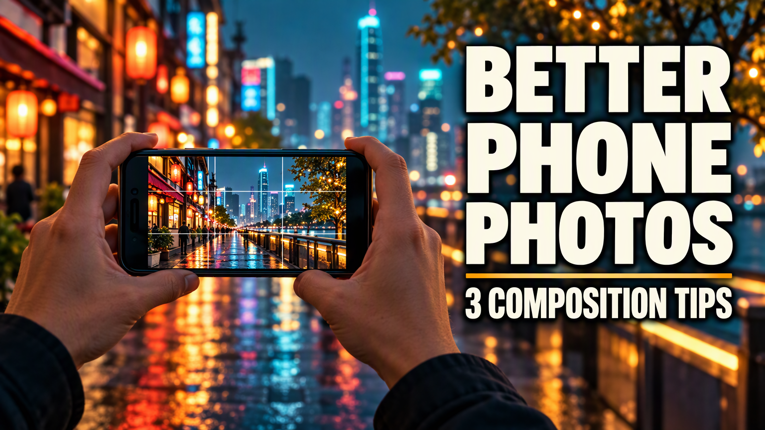 | 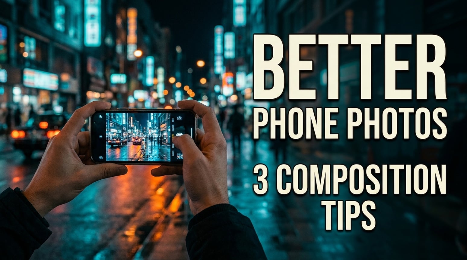 |
Entrambe le miniature inglesi mantengono i due testi richiesti, scegliendo interruzioni diverse. GPT usa caratteri molto pesanti e una seconda linea compatta. Nano Banana 2.1 usa lettere più strette, divide il sottotitolo in due linee e dà alla scena un aspetto più documentaristico.
Quando lo userei: Per una miniatura tutorial in evidenza, partirei da GPT. Per un canale fotografico che preferisce immagini meno enfatiche, prova Nano Banana 2.1. Controlla crop finale e titolo alla dimensione reale. Queste immagini non sono testate per click-through; esempi giapponesi e coreani seguono sotto.
Versione giapponese
| GPT Image 2.5 | Nano Banana 2.1 |
|---|---|
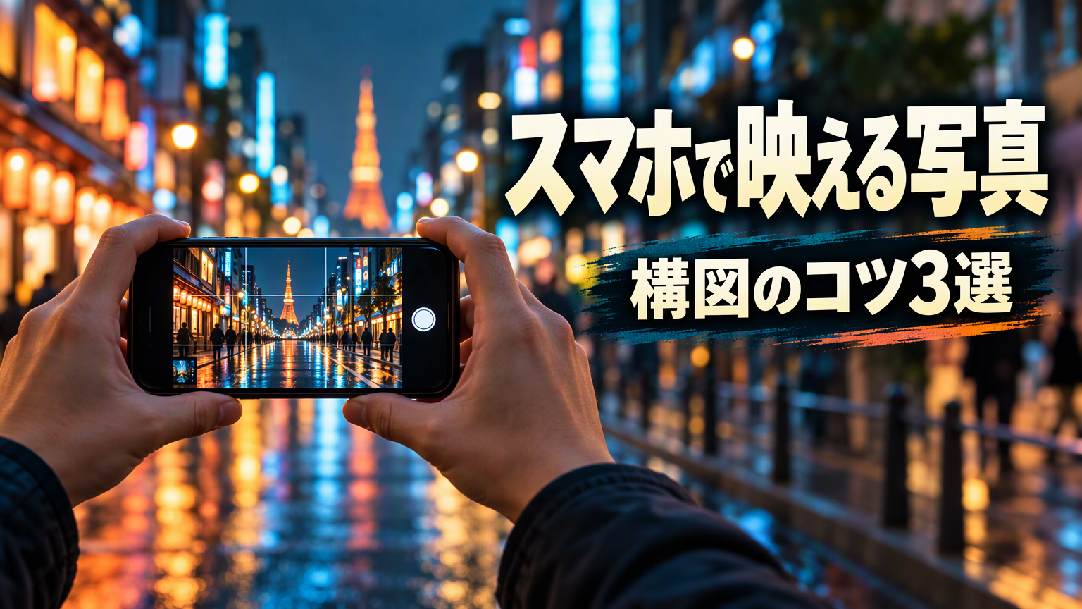 | 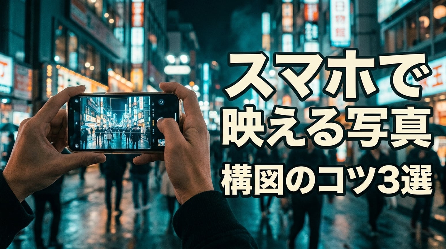 |
Entrambe mantengono スマホで映える写真 e 構図のコツ3選. GPT mantiene il titolo principale su una linea e separa il sottotitolo con un pannello scuro. NB divide il titolo dopo スマホで e usa un contorno più marcato.
Versione coreana
| GPT Image 2.5 | Nano Banana 2.1 |
|---|---|
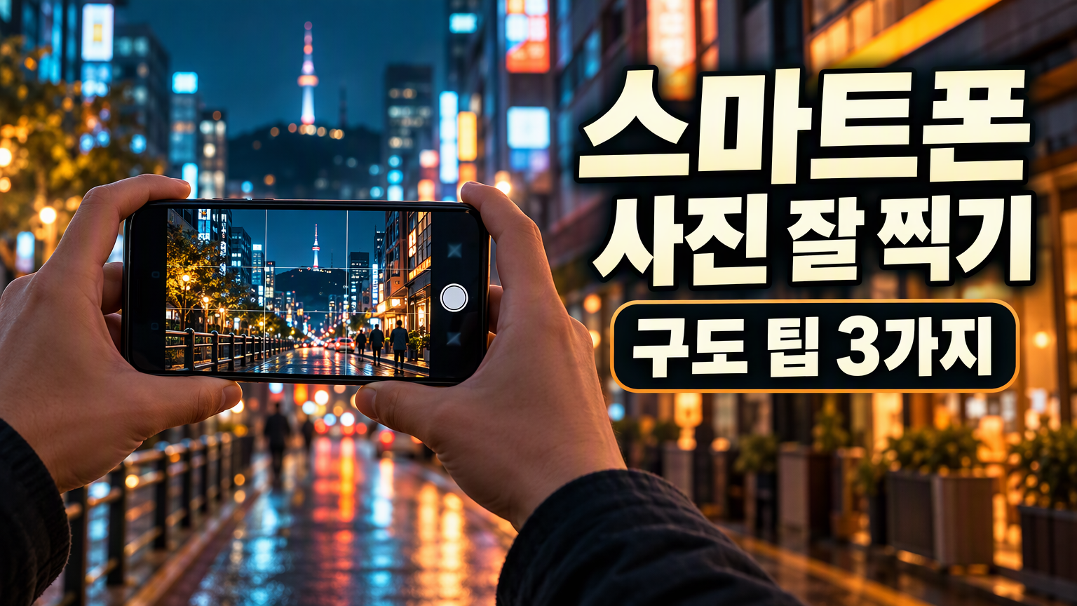 | 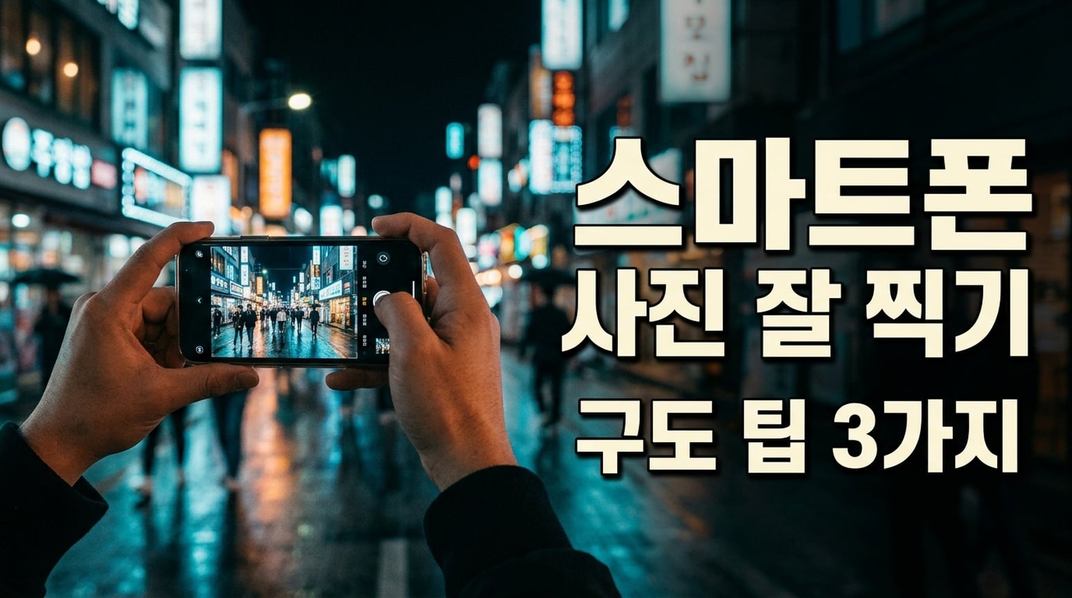 |
Entrambe mantengono il testo coreano riconoscibile. GPT mette in risalto la seconda linea con pannello scuro arrotondato; la spaziatura delle parole appare più stretta. NB separa titolo e sottotitolo più apertamente. La spaziatura va controllata nella consegna finale.
6. Checklist e card informative
Brief condiviso: Rendi sei categorie e liste di oggetti specificate in una checklist a due colonne e tre righe, senza testo aggiuntivo.
| GPT Image 2.5 | Nano Banana 2.1 |
|---|---|
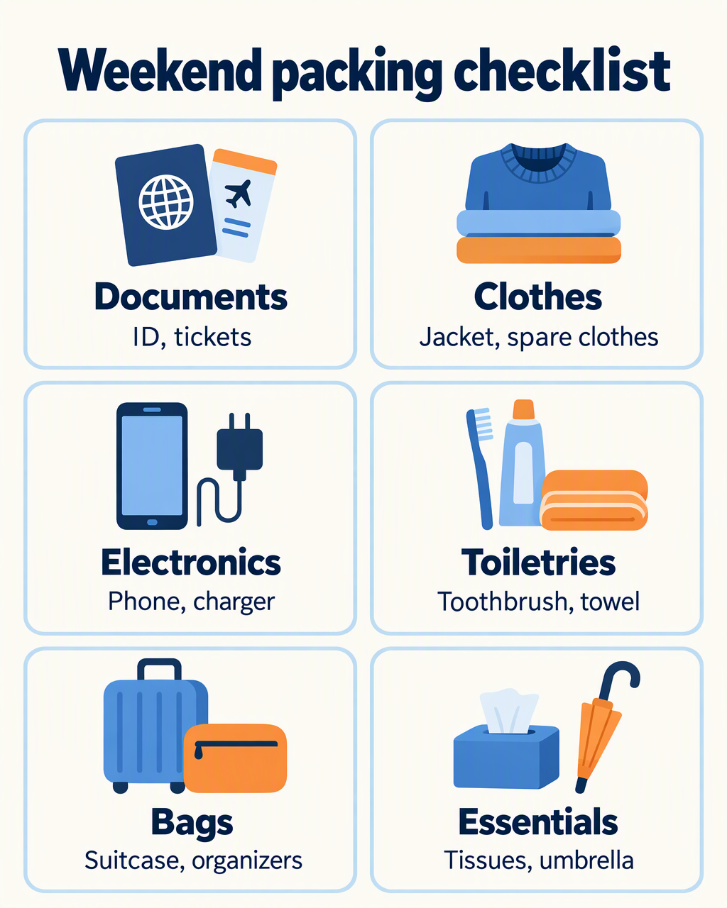 | 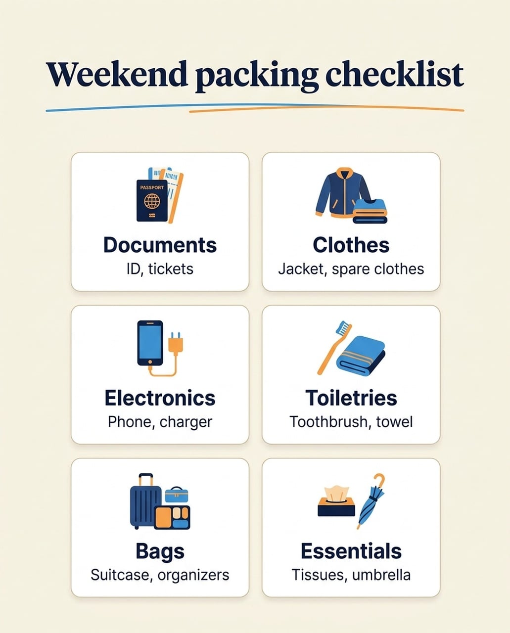 |
Le versioni inglesi mantengono le sei categorie e le liste oggetti. GPT dà più spazio a illustrazioni ed etichette in ogni card. Nano Banana 2.1 crea icone più piccole e più spazio bianco; la sua icona passaporto contiene anche un’etichetta PASSPORT non richiesta. Le versioni giapponese e coreana non ripetono il sottotitolo inglese extra visto nell’esperimento cinese.
Quando lo userei: Scegli GPT quando servono etichette grandi leggibili su mobile. Scegli Nano Banana 2.1 se preferisci layout card più sobri, e controlla etichette icone e testo. Non trasferire un errore di testo visto in una lingua in una affermazione su tutte le lingue.
Versione giapponese
| GPT Image 2.5 | Nano Banana 2.1 |
|---|---|
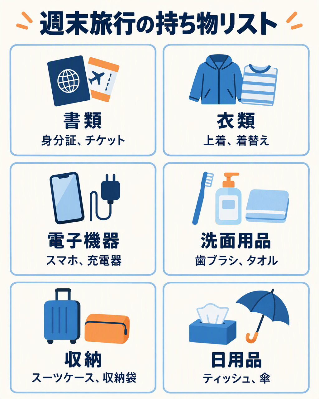 | 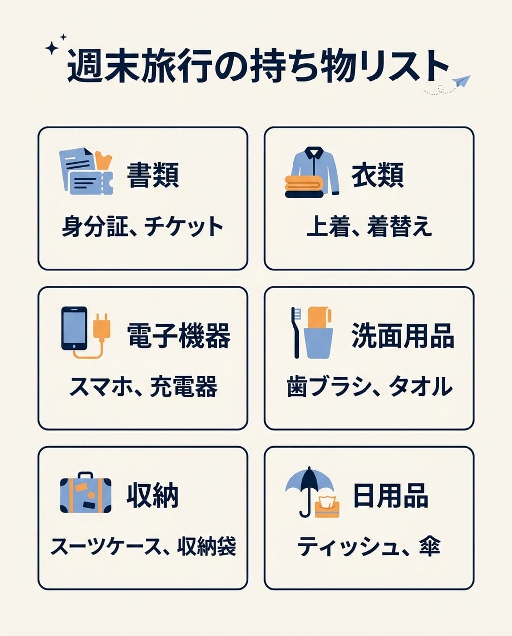 |
Entrambe mostrano le sei categorie giapponesi e le liste oggetti senza il sottotitolo inglese non voluto del test cinese. GPT privilegia illustrazioni più grandi; NB abbina icone più piccole a blocchi testo compatti.
Versione coreana
| GPT Image 2.5 | Nano Banana 2.1 |
|---|---|
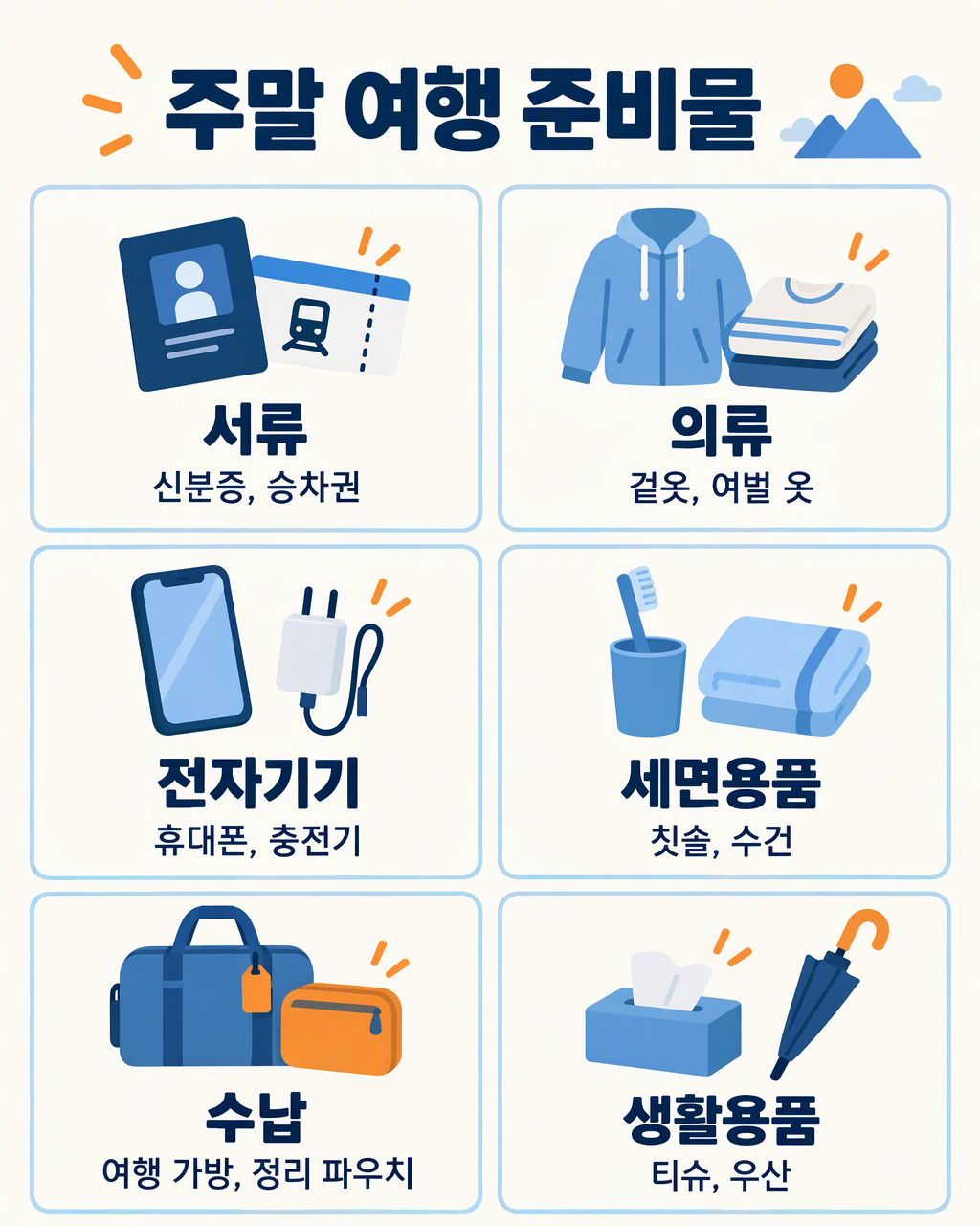 | 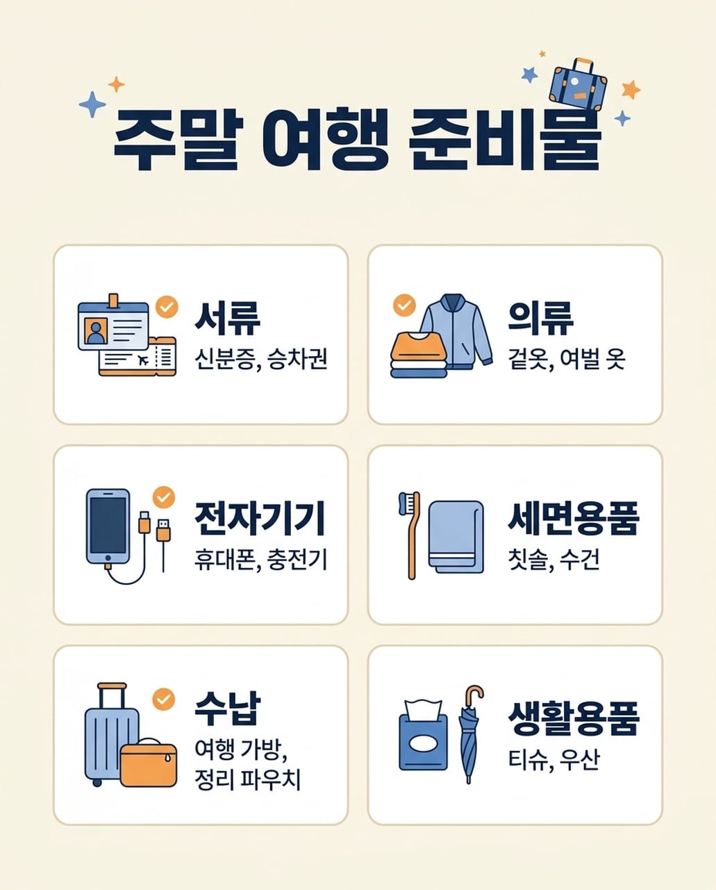 |
Entrambe mostrano le sei categorie coreane e i relativi oggetti. GPT mantiene liste oggetti più lunghe su una linea dove possibile; NB va a capo la lista Bags su due linee. Entrambe richiedono revisione finale di spaziatura e glifi piccoli.
7. Poster evento
Brief condiviso: Rendi NIGHT GARDEN e Botanical light show · Kyoto · 7–9 pm con forme botaniche luminose in verde e ambra.
| GPT Image 2.5 | Nano Banana 2.1 |
|---|---|
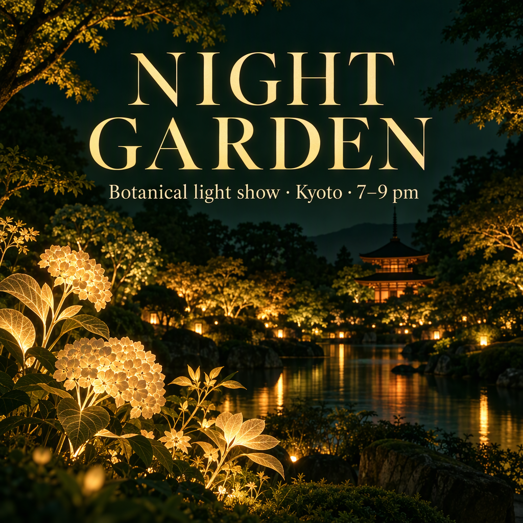 | 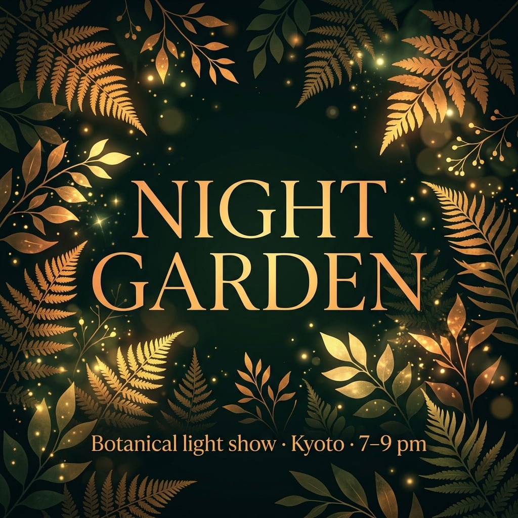 |
Entrambi i poster inglesi mantengono il testo evento principale. GPT inventa una location giardino con edifici e acqua. Nano Banana 2.1 incornicia il titolo con fogliame e mette il sottotitolo in basso. Le versioni giapponese e coreana raggruppano le info evento più centralmente.
Quando lo userei: Inizia con Nano Banana 2.1 per un poster evento grafico guidato dalla tipografia. Inizia con GPT per un visual campagna atmosferico. Se la location reale conta, fornisci un riferimento; gli edifici inventati non implicano una location reale.
Versione giapponese
| GPT Image 2.5 | Nano Banana 2.1 |
|---|---|
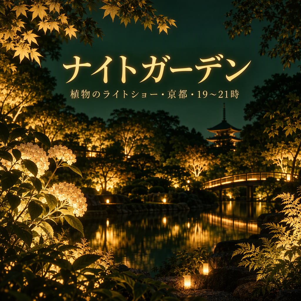 | 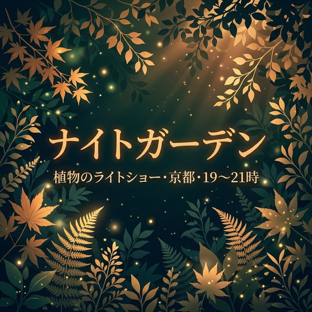 |
Entrambe mantengono ナイトガーデン e info luogo/orario. NB raggruppa titolo e sottotitolo centralmente su fogliame; GPT usa sottotitolo più piccolo sopra una scena giardino dettagliata. Controlla il glifo intervallo orario se la punteggiatura conta.
Versione coreana
| GPT Image 2.5 | Nano Banana 2.1 |
|---|---|
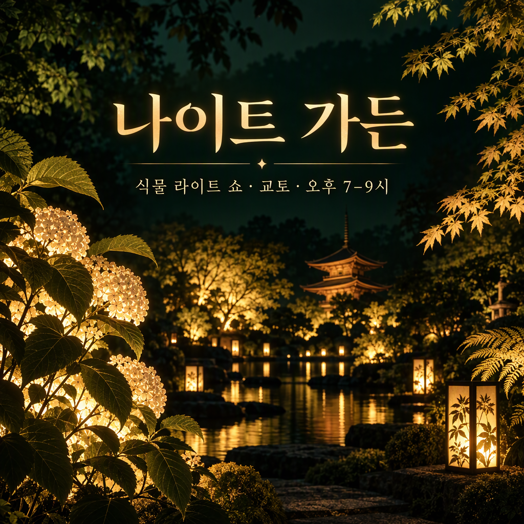 | 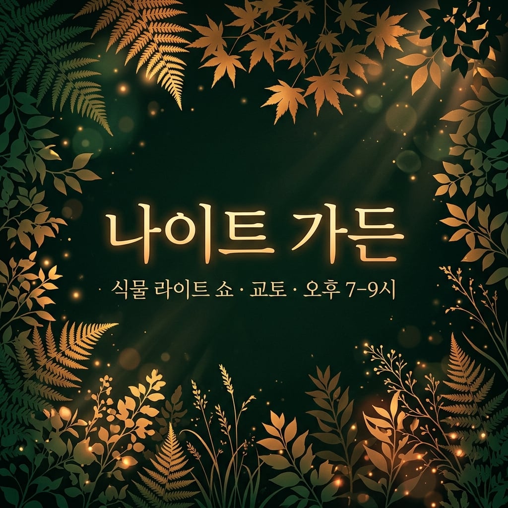 |
Entrambe mantengono 나이트 가든 e info luogo/orario coreana. NB mette in risalto il testo centrale; GPT mette in risalto una location giardino immaginata. La differenza riguarda soprattutto lo stile campagna, non una differenza provata di accuratezza coreana.
8. Infografiche numeriche
Brief condiviso: Disegna quattro barre su una baseline zero per 40%, 25%, 20% e 15%, con etichette esatte e nota dati illustrativa chiara.
| GPT Image 2.5 | Nano Banana 2.1 |
|---|---|
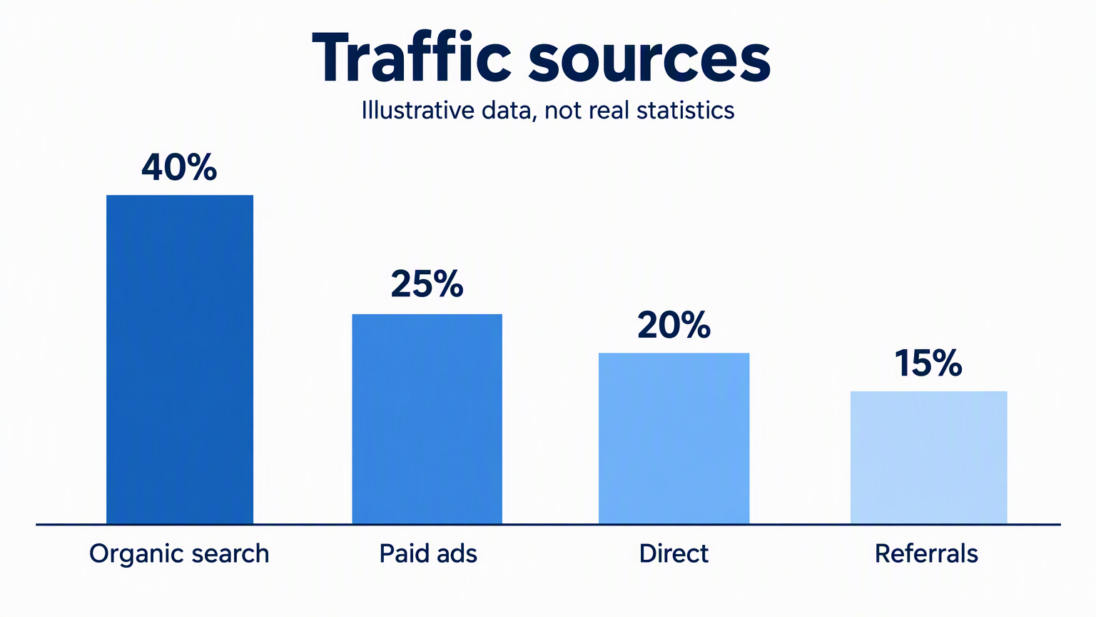 | 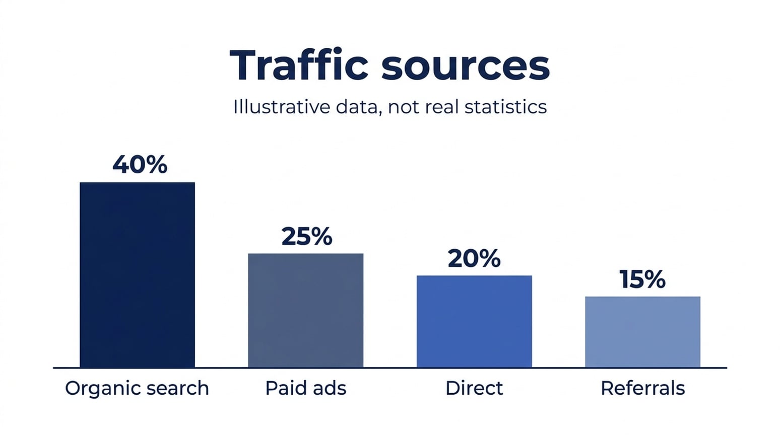 |
Tutte le sei immagini inglesi, giapponesi e coreane mantengono i valori visualizzati e le etichette categoria riconoscibili. Le barre richiedono un controllo ulteriore. Con la prima barra normalizzata a 40, misure pixel approssimative delle barre GPT inglesi danno 25.6, 21.0 e 16.3; quelle Nano Banana 2.1 danno 24.7, 20.1 e 15.6. Nano Banana 2.1 si avvicina di più alle proporzioni richieste in questi tre esempi, anche se nessuna è numericamente esatta.
Quando lo userei: Per questo semplice draft infografico, partirei da Nano Banana 2.1. Per un grafico che richiede geometria esatta, genera le barre finali con uno strumento dati. Percentuali corrette sopra le barre non stabiliscono che le altezze siano corrette.
Versione giapponese
| GPT Image 2.5 | Nano Banana 2.1 |
|---|---|
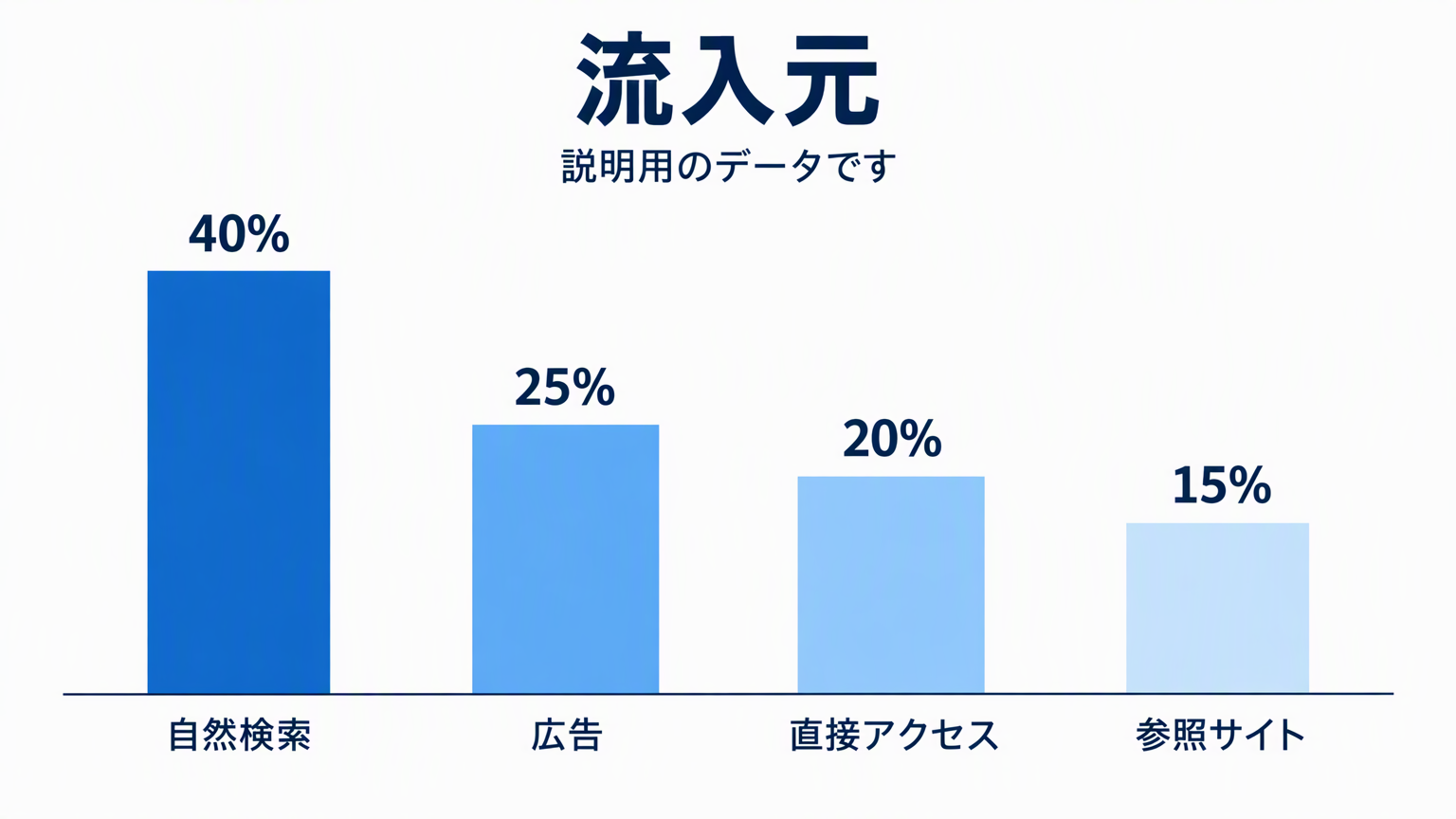 | 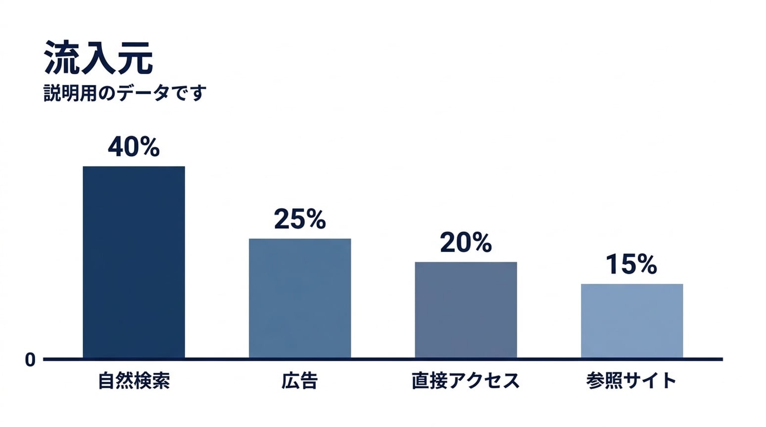 |
Le etichette giapponesi restano leggibili in entrambe. NB aggiunge un marcatore zero alla baseline condivisa. I rapporti barre sono più vicini ai valori richiesti, ma la barra più corta resta un po’ alta.
Versione coreana
| GPT Image 2.5 | Nano Banana 2.1 |
|---|---|
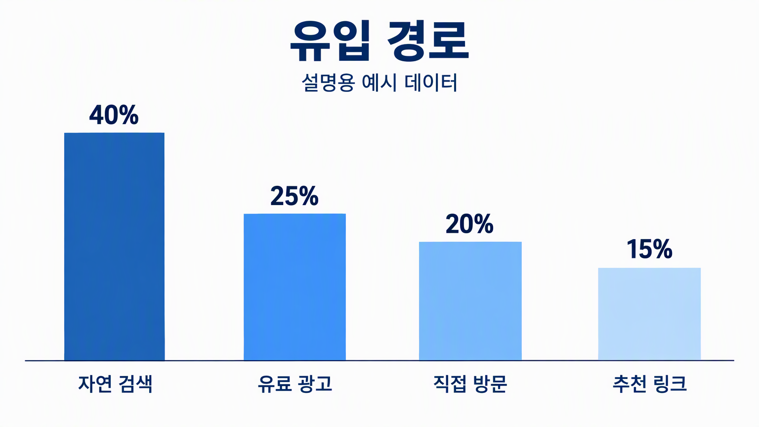 | 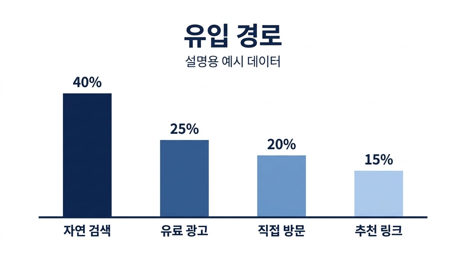 |
Entrambe mantengono le etichette coreane e le quattro percentuali. Di questi esempi, il risultato NB coreano è particolarmente vicino ai rapporti altezza barre specificati. Resta un’immagine approssimativa, non un grafico validato dati.
9. Diagrammi di processo
Brief condiviso: Mostra Generate, Inspect e Refine in ordine, ciascuno con la propria linea di supporto, collegati da frecce.
| GPT Image 2.5 | Nano Banana 2.1 |
|---|---|
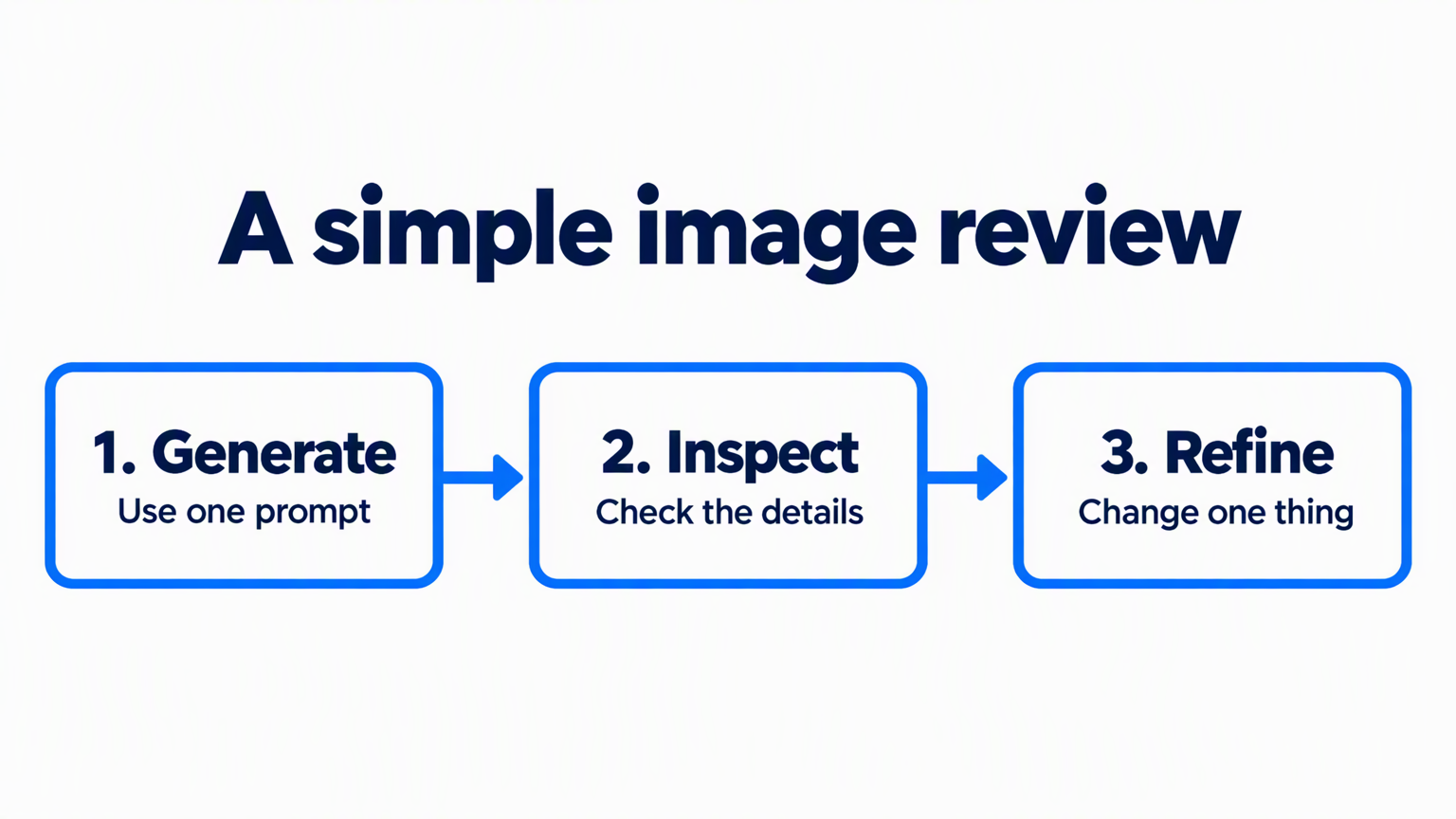 | 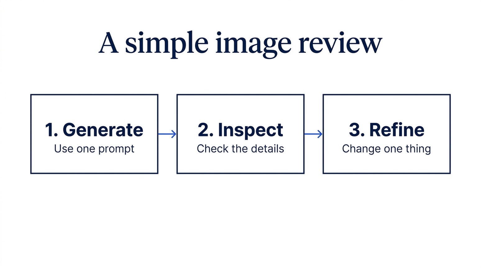 |
Entrambi mantengono etichette, testo di supporto e ordine a tre step. GPT usa frecce blu spesse e frame arrotondati. Nano Banana 2.1 usa connettori più sottili e box rettangolari più sobri. Entrambi richiesti nello stesso formato landscape.
Quando lo userei: Scegli GPT per una slide training dove la sequenza deve risaltare subito. Scegli Nano Banana 2.1 per una figura processo di supporto in un report. Nessun vincitore netto sull’accuratezza contenuto.
10. Spiegazioni concetti scientifici
Brief condiviso: Spiega un processo di diffusione semplificato con quattro campioni via via più rumorosi, seguiti da quattro campioni denoising in ordine inverso.
| GPT Image 2.5 | Nano Banana 2.1 |
|---|---|
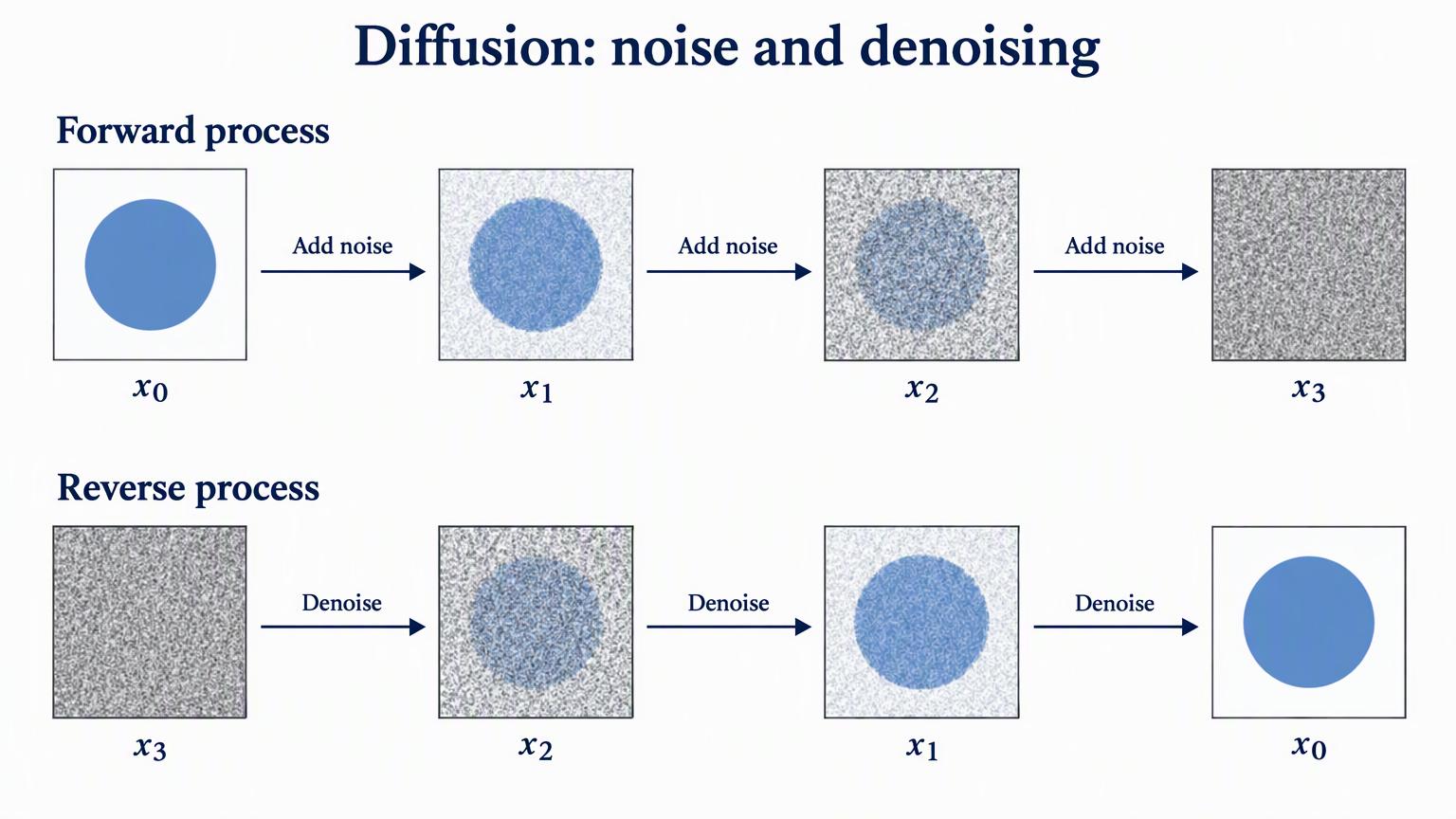 | 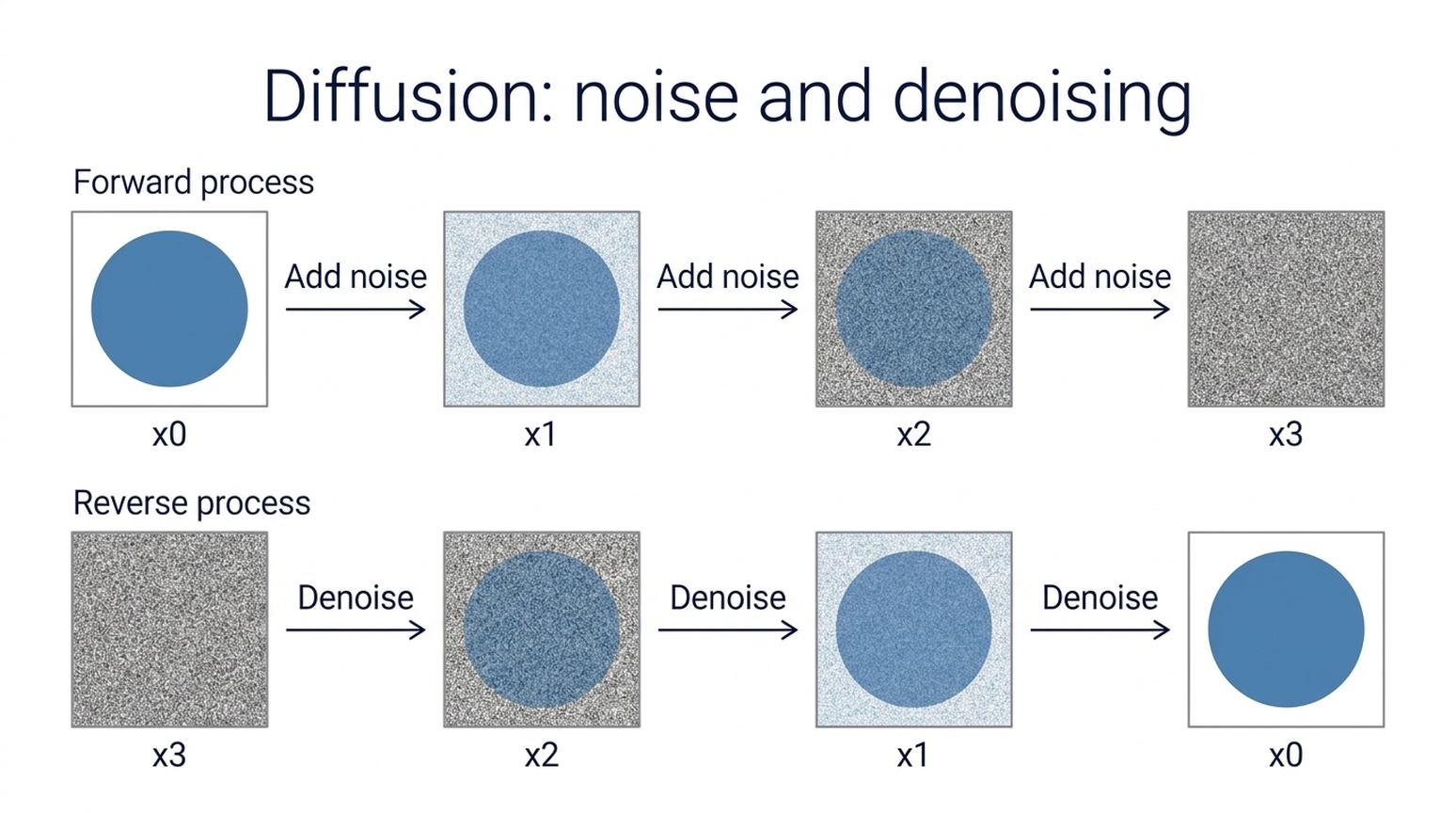 |
Entrambi mantengono il numero di campioni, ordinamento x0-x3 e x3-x0, e direzioni frecce richieste. GPT rende sottoscritti matematici e una progressione rumore più visibile. Nano Banana 2.1 usa etichette semplici e layout sans-serif più pulito.
Quando lo userei: Inizia con GPT per una figura esplicativa stile paper, o Nano Banana 2.1 per una slide didattica diretta. Sono illustrazioni concettuali, non risultati sperimentali. Controlla notazione paper e processo prima dell’uso. Il concetto è discusso in Denoising Diffusion Probabilistic Models.
11. Diagrammi metodo di ricerca e architettura modello
Brief condiviso: Disegna un percorso principale image-processing, un ramo riferimento che entra in Feature fusion, e una skip connection tratteggiata da Input image a Image decoder.
| GPT Image 2.5 | Nano Banana 2.1 |
|---|---|
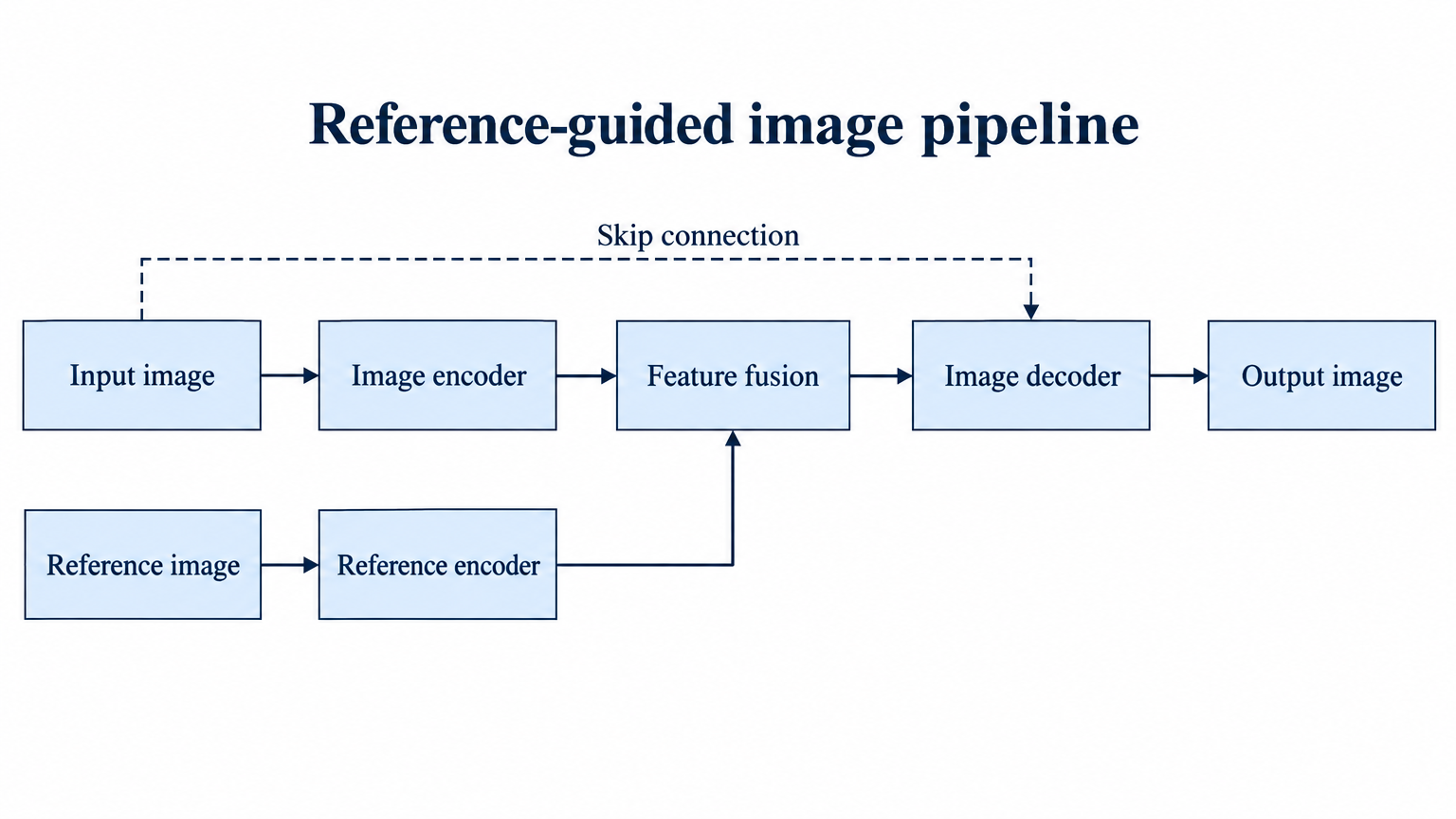 | 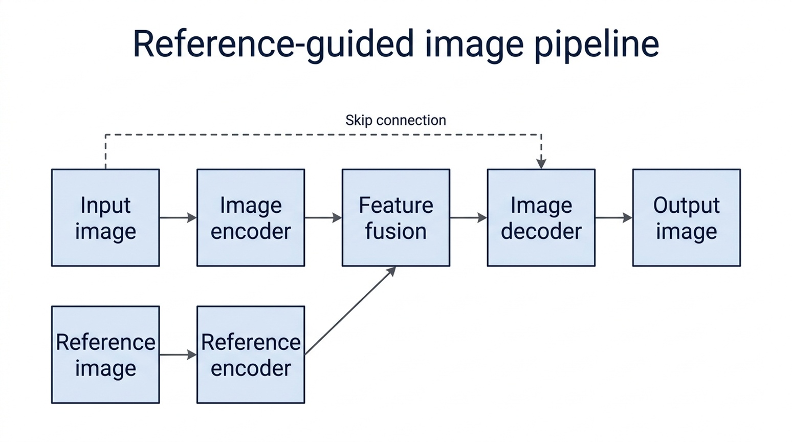 |
Entrambi collegano percorso principale, ramo riferimento e skip connection alle caselle richieste. GPT mantiene etichette più lunghe dentro nodi più larghi e usa un ramo ortogonale chiaro. Nano Banana 2.1 va a capo le etichette su due linee, con Reference in basso vicino ai bordi box.
Quando lo userei: Partirei da GPT per questo diagramma metodo perché richiede meno aggiustamenti etichette e box. Nano Banana 2.1 coglie anche la topologia. Il framework è ipotetico; per un paper reale, verifica origine, destinazione e direzione frecce invece di trattare un diagramma plausibile come prova del metodo.
12. Illustrazioni e concept art
Brief condiviso: Metti un piccolo osservatorio e astronomo dentro una tazza trasparente su muschio in una foresta blue-hour.
| GPT Image 2.5 | Nano Banana 2.1 |
|---|---|
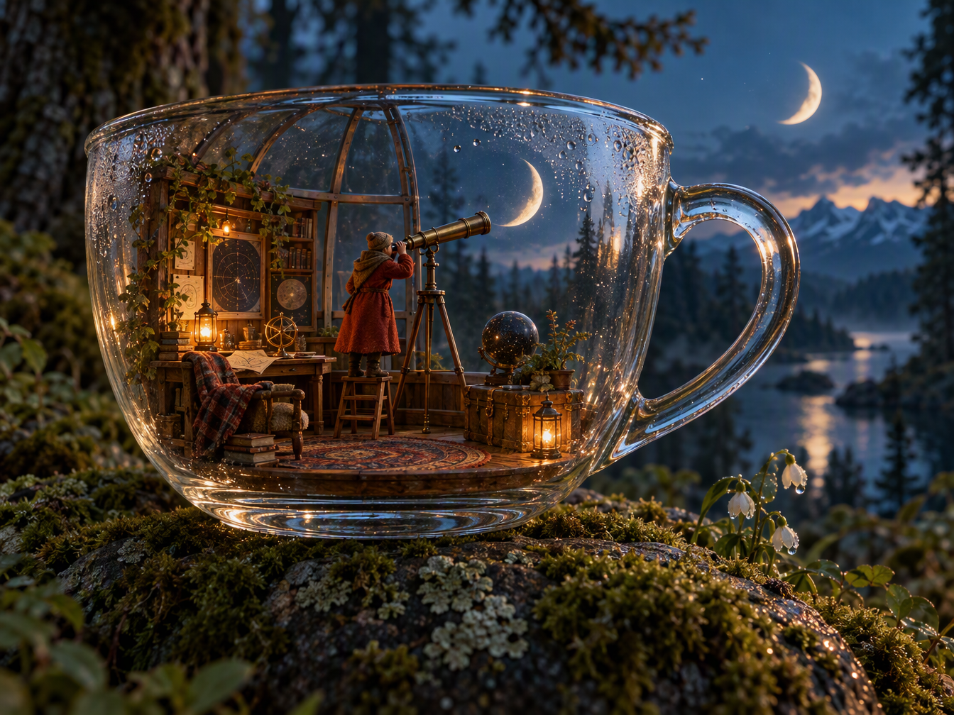 | 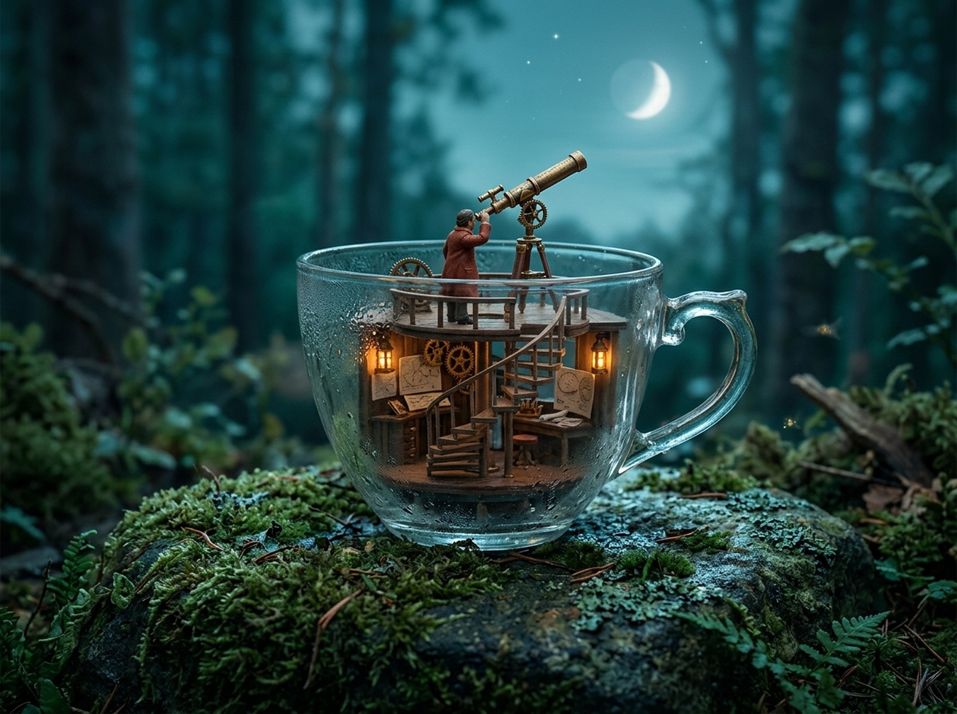 |
GPT crea una stanza miniatura arredata e riflessi vetro convincenti, ma aggiunge una seconda luna crescente. Nano Banana 2.1 dà all’osservatorio una struttura più semplice e usa una sola luna sopra la tazza. Nessuno implementa perfettamente tutte le istruzioni spaziali.
Quando lo userei: Per un concept fantasy dettagliato, inizia con GPT e pianifica di correggere la luna extra. Per un’illustrazione miniatura più sobria, inizia con Nano Banana 2.1. L’immagine più elaborata non è automaticamente quella più fedele.
13. Concept interior design
Brief condiviso: Mostra un caffè lettura con tre tavoli rotondi a sinistra, una libreria continua lato finestra, un bancone posteriore e corridoio centrale libero.
| GPT Image 2.5 | Nano Banana 2.1 |
|---|---|
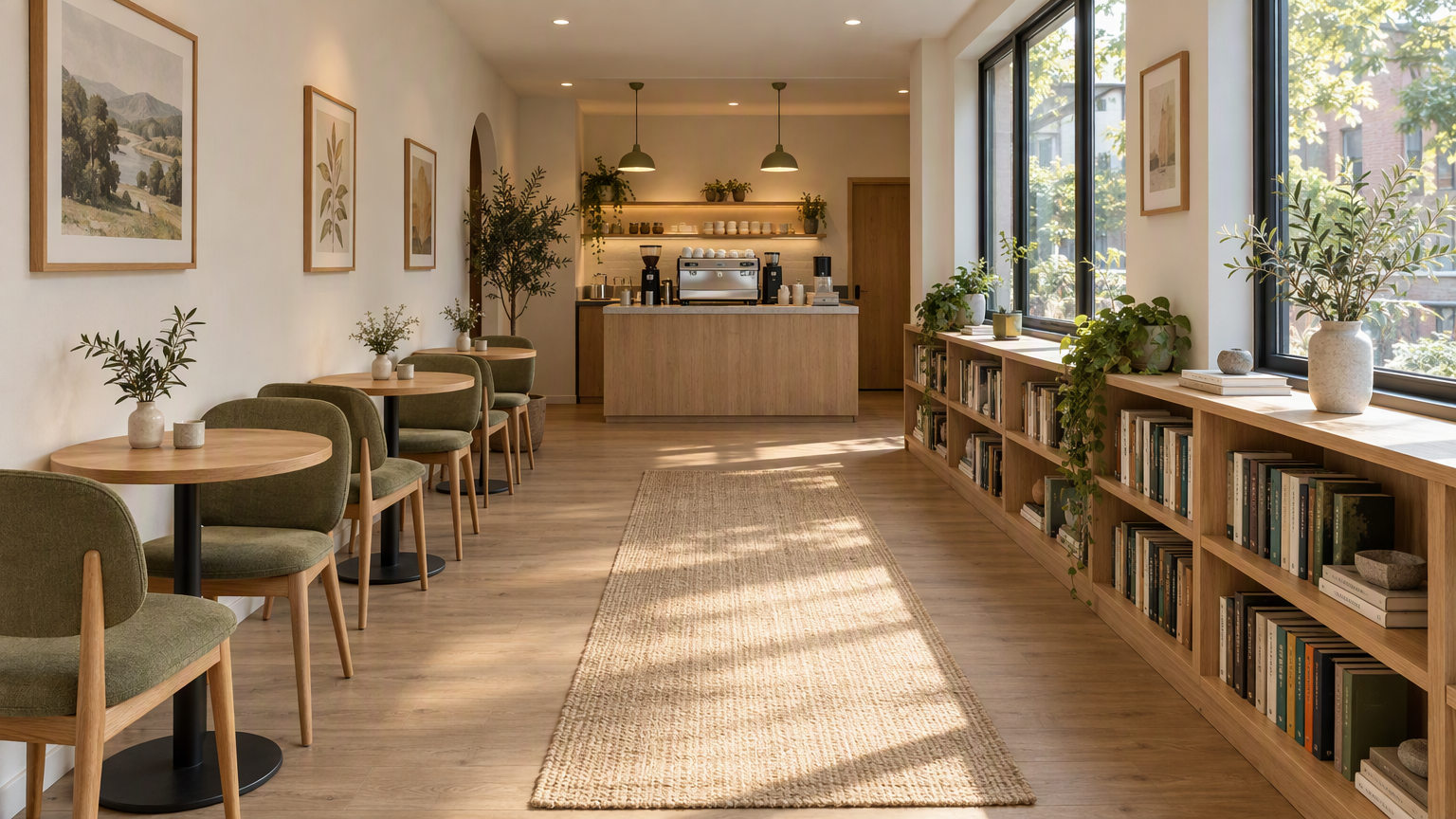 | 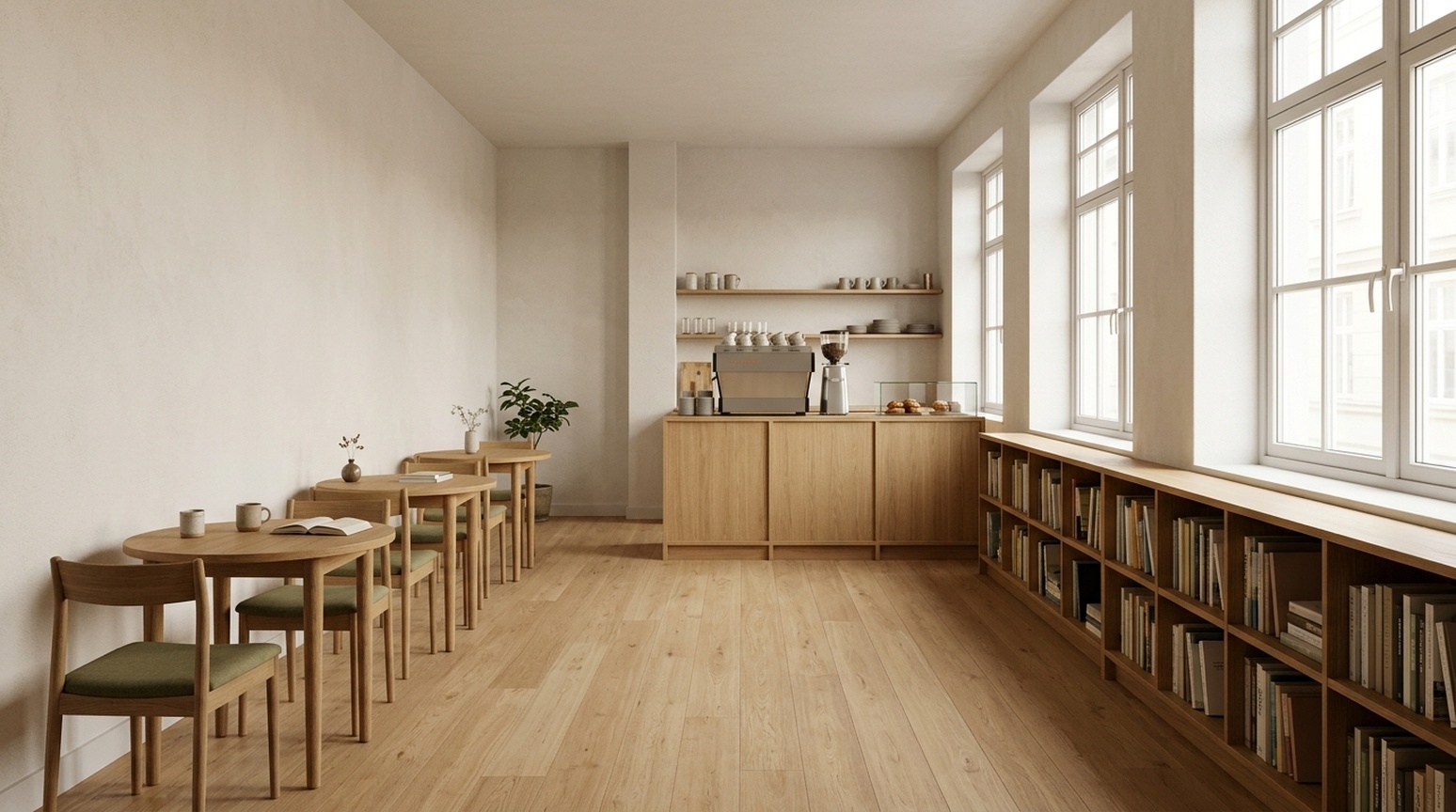 |
GPT mette in risalto luce laterale, texture rovere e rivestimento oliva, aggiunge tappeto, arte e piante. Nano Banana 2.1 usa meno decorazioni e una vista più diretta su corridoio e libreria. Gli arredi posteriori si sovrappongono, quindi il conteggio preciso tavoli e sedie richiede controllo attento.
Quando lo userei: Inizia con GPT per un concept cliente atmosferico; inizia con Nano Banana 2.1 per una direzione visual più semplice. Nessuna immagine prospettica stabilisce dimensioni misurate, larghezze circolazione o un piano realizzabile.
Scegliere per il proprio lavoro
Per una miniatura o un hero dettaglio prodotto, GPT Image 2.5 offre un primo tentativo utile quando servono testo in evidenza e ritagli dettagli. Per poster evento guidati dalla tipografia, Nano Banana 2.1 offre una direzione grafica utile. Per il brief a barre, la sua geometria si avvicina alle proporzioni fornite nei tre esempi linguistici.
Per prodotti di riferimento, controlla l’oggetto prima del setting. Per figure scientifiche, controlla le relazioni prima dello stile. Per marketing localizzato, controlla l’immagine nella lingua target: il sottotitolo inglese extra in una checklist cinese precedente non si ripete nei nostri esempi giapponesi e coreani.
Crea le tue immagini con questi strumenti Felo
Scegli uno strumento iniziale in base agli esempi sopra:
| La tua attività | Strumento Felo consigliato |
|---|---|
| Grafica dettagli prodotto, miniature audaci o bozze di diagrammi di metodo di ricerca | GPT Image 2.5 |
| Poster di eventi, schede di conoscenza semplici o bozze di grafici a barre semplici | Nano Banana 2.1 |
| Esplora un'idea di immagine prima di scegliere il modello | AI Image |
Copia un prompt corrispondente dall'appendice qui sotto. Per un confronto equo, usa lo stesso prompt, immagine di riferimento e testo esatto in inglese, giapponese o coreano in entrambi gli strumenti modello. Controlla dettagli prodotto, etichette e dati prima della pubblicazione.
Note su generazione e revisione
L’articolo contiene 23 coppie visualizzate: 13 casi principali e dieci varianti giapponese/coreano, per 46 immagini confronto. Ogni coppia usa lo stesso prompt contenuto e, dove rilevante, lo stesso riferimento. GPT ha usato la skill ePhone GPT Image 2.5 Sunburst richiesta ad alta qualità; Nano Banana 2.1 ha usato i default skill richiesti. Le impostazioni qualità e i costi non sono normalizzati. Abbiamo mantenuto il primo output restituito con successo per ogni run visualizzata e non abbiamo ritoccato il contenuto.
Le osservazioni testo sono controlli visuali, non certificazione madrelingua o benchmark linguistico ripetuto. Caratteri piccoli, punteggiatura intervallo orario giapponese e spaziatura coreana richiedono ancora revisione di consegna. Le proporzioni barre sono state misurate approssimativamente dai pixel e sono soggette ad antialiasing. Nessun click-through, conversione o affidabilità multi-run è stato testato.
Leggi i prompt esatti qui sotto.
Prompt esatti usati nei confronti
Usa lo stesso prompt e immagine riferimento in entrambi i modelli. Il riferimento prodotto è mostrato sopra.
Ecommerce White
Create a square ecommerce catalog photograph using the supplied blue travel mug as the exact product reference. Preserve the cobalt-blue ceramic body, the curved handle on the left, the ivory drinking lid, the lid opening, the body proportions and surface texture. Remove the limestone block and the original environment. Show the complete mug centered on a pure white background, three-quarter view, with one subtle natural contact shadow beneath it. Product fills about 75% of the canvas height. No added objects, no text, no logo, no badge, no watermark. Do not redesign the product. Square 1:1.
Ecommerce Lifestyle
Create a realistic landscape lifestyle advertising photograph using the supplied blue travel mug as the exact product reference. Preserve its cobalt-blue ceramic body, curved handle, ivory drinking lid, and proportions. Place the complete mug on a light oak breakfast table next to one closed linen notebook in a quiet sunlit apartment kitchen. The mug is the sharp hero subject on the left third; the kitchen is softly out of focus. Warm morning light comes from the left. Leave the right third uncluttered as copy space. Natural believable scale and contact shadows. No people, no additional mugs, no text, no logo, no watermark. Landscape 16:9.
Academic Diffusion
Create a scientifically correct schematic for explaining a diffusion model in an academic presentation. Landscape 16:9, white background, precise thin lines, navy text, muted blue and gray palette, no decorative scenery. Exact title: 'Diffusion: noise and denoising'. Two clearly separated horizontal rows, each containing exactly four square image samples. The top row is labeled 'Forward process'. Its samples run left to right: a clean blue circle labeled 'x0', a lightly noisy version labeled 'x1', a very noisy version labeled 'x2', pure gray noise labeled 'x3'. Connect adjacent samples with three right-pointing arrows, each labeled 'Add noise'. The bottom row is labeled 'Reverse process'. Its samples run left to right: pure gray noise labeled 'x3', a very noisy blue circle labeled 'x2', a lightly noisy circle labeled 'x1', a clean blue circle labeled 'x0'. Connect adjacent samples with three right-pointing arrows, each labeled 'Denoise'. Preserve these exact labels, arrow directions, sample counts, and ordering. This is a conceptual explanation, not experimental results. No equations, no additional labels, no 3D, no watermark.
Interior Concept
Create a photorealistic interior design concept image of a small contemporary reading cafe, landscape 16:9. Wide view from the entrance at eye level, a clear continuous central aisle leading to the rear counter. Along the left wall, exactly three small round oak tables, each with exactly two chairs. Along the right wall, one continuous low oak bookcase beneath large windows. A compact coffee counter is centered on the rear wall. Warm white plaster, light oak, muted olive textiles, soft morning daylight from the right, believable furniture scale, coherent straight perspective, no people, no signage, no text, no extra tables, no watermark.
Academic Method
Create a precise academic method diagram for a hypothetical reference-guided image pipeline. White background, landscape 16:9, navy text, thin dark arrows, restrained pale blue rectangles, generous spacing, no decorative imagery. Exact title: 'Reference-guided image pipeline'. Use exactly seven boxes, each label appearing once. The main row runs left to right: 'Input image' -> 'Image encoder' -> 'Feature fusion' -> 'Image decoder' -> 'Output image'. A second row below the first two boxes contains 'Reference image' -> 'Reference encoder'. Draw one arrow from 'Reference encoder' upward and to the right into 'Feature fusion'. Draw one additional dashed skip-connection arrow from 'Input image' to 'Image decoder', routed above the main row and labeled exactly 'Skip connection'. All seven connectors must terminate on the specified boxes; do not connect the reference branch directly to the output or decoder. Keep every label readable and every box distinct. No extra boxes, no other labels, no graph statistics, no equations, no watermark. This is a hypothetical diagram, not an architecture attributed to a real paper.
Fantasy Scene
A cinematic editorial illustration of a tiny observatory built inside a clear glass teacup, resting on a moss-covered stone in a quiet forest at blue hour. A miniature astronomer in a rust-red coat looks through a brass telescope at a luminous crescent moon visible through the cup. Delicate reflections and condensation on the glass, rich tactile detail, restrained teal and amber palette, storybook realism, carefully composed, no text, no letters, landscape 4:3.
Product Concept
A premium studio product photograph of a matte cobalt-blue ceramic travel mug with an ivory lid, standing on a pale limestone block. Three-quarter view, soft morning window light from the upper left, subtle condensation, warm off-white background, generous negative space on the right, no logo, no text, no extra objects, realistic commercial photography, landscape 4:3.
Process Infographic
Create a clear horizontal infographic titled “A simple image review”. Show exactly three connected panels in this order, with these exact labels: “1. Generate”, “2. Inspect”, “3. Refine”. Add one small line under each: “Use one prompt”, “Check the details”, “Change one thing”. Flat editorial vector style, navy text, cobalt-blue connectors, white background, evenly spaced panels, no icons, no extra words, 16:9.
Prompt confronto inglese, giapponese e coreano
ecommerce-detail-en
Lingua: English. Dimensione richiesta: 1024x1280.
Testo specificato:
- Three details. One mug.
- Ceramic body
- Ivory lid
- Curved handle
Create a portrait ecommerce product detail graphic using the supplied blue travel mug as the exact product reference. Preserve its cobalt-blue ceramic body, left handle, ivory drinking lid, proportions, and texture. Put one full product view in the center, with three small circular detail crops around it: the ceramic body surface, the ivory lid, and the curved handle. Each detail crop must correspond to the same product. Add exactly this English headline: "Three details. One mug.". Add exactly these three labels next to their corresponding detail crops: "Ceramic body", "Ivory lid", "Curved handle". All text must be in English; do not add translations or another language. Use thin connector lines that point to the correct feature, generous spacing, a warm off-white background, navy text, refined commercial editorial layout. No invented performance claims, no numbers, no prices, no other words, no watermark. Portrait 4:5.
Riferimento: shared mug
data-infographic-en
Lingua: English. Dimensione richiesta: 1536x864.
Testo specificato:
- Traffic sources
- Illustrative data, not real statistics
- Organic search
- Paid ads
- Direct
- Referrals
- 40%
- 25%
- 20%
- 15%
Design a precise flat vector infographic on a white background, landscape 16:9. Exact English title: "Traffic sources". Exact small subtitle: "Illustrative data, not real statistics". Draw exactly four vertical bars on one common zero baseline, left to right with these exact labels and values: "Organic search" 40%, "Paid ads" 25%, "Direct" 20%, "Referrals" 15%. Bar heights must be proportional to 40, 25, 20, 15: the first is tallest, the second is 62.5% of its height, the third is 50%, and the fourth is 37.5%. Put each value directly above its own bar and its category directly below. Use four restrained shades of blue, navy text, wide margins, readable typography. All text must be in English, with no translations or additional words. No perspective, no 3D, no icons, no extra charts, no watermark.
video-thumbnail-en
Lingua: English. Dimensione richiesta: 1536x864.
Testo specificato:
- BETTER PHONE PHOTOS
- 3 COMPOSITION TIPS
Create a polished landscape 16:9 YouTube thumbnail for a English-language smartphone photography tutorial. On the left, a realistic close view of two hands holding one smartphone horizontally, its screen visibly framing the same neon-lit city street seen behind it. Use dramatic but believable teal and warm orange night lighting, a strong focal subject and crisp silhouettes. On the right, add exactly these two text strings in two distinct title groups: "BETTER PHONE PHOTOS" and "3 COMPOSITION TIPS". The first is larger; both must be readable at a thumbnail width of 320 pixels. Use bold high-contrast ivory typography with a subtle dark outline. Typography and line breaks must be natural for English, preserving every character exactly. All background signs must be abstract and unreadable. No other readable words, no translations, no camera brands, no logos, no comparison panels, no watermark. Keep all text inside the frame with generous margins.
event-poster-en
Lingua: English. Dimensione richiesta: 1024x1024.
Testo specificato:
- NIGHT GARDEN
- Botanical light show · Kyoto · 7–9 pm
Design a square event poster with exactly this English headline: "NIGHT GARDEN". Add exactly this subtitle: "Botanical light show · Kyoto · 7–9 pm". Use luminous botanical silhouettes, deep forest green and warm amber, refined editorial typography, clear contrast, balanced margins, all text fully inside the canvas. Use natural English typography and line breaks without changing any characters. No other words, no translations, no logos, no watermark.
social-knowledge-en
Lingua: English. Dimensione richiesta: 1024x1280.
Testo specificato:
- Weekend packing checklist
- Documents
- ID, tickets
- Clothes
- Jacket, spare clothes
- Electronics
- Phone, charger
- Toiletries
- Toothbrush, towel
- Bags
- Suitcase, organizers
- Essentials
- Tissues, umbrella
Design a readable portrait 4:5 English knowledge card for a travel packing checklist. Exact headline: "Weekend packing checklist". Use exactly six equal cards in a two-column by three-row grid. Left to right, top to bottom, each card has exactly this heading and one text line: "Documents" with "ID, tickets"; "Clothes" with "Jacket, spare clothes"; "Electronics" with "Phone, charger"; "Toiletries" with "Toothbrush, towel"; "Bags" with "Suitcase, organizers"; "Essentials" with "Tissues, umbrella". One simple relevant flat icon per card. Clean cream background, navy typography, restrained blue and orange accents, clear title hierarchy, comfortable whitespace, no overlapping elements. Use natural English typography and line breaks. Preserve all specified text and punctuation exactly. No extra copy, no translations, no other languages, no watermark.
ecommerce-detail-ja
Lingua: Japanese. Dimensione richiesta: 1024x1280.
Testo specificato:
- カップの3つのディテール
- 陶器の本体
- アイボリーのふた
- カーブした持ち手
Create a portrait ecommerce product detail graphic using the supplied blue travel mug as the exact product reference. Preserve its cobalt-blue ceramic body, left handle, ivory drinking lid, proportions, and texture. Put one full product view in the center, with three small circular detail crops around it: the ceramic body surface, the ivory lid, and the curved handle. Each detail crop must correspond to the same product. Add exactly this Japanese headline: "カップの3つのディテール". Add exactly these three labels next to their corresponding detail crops: "陶器の本体", "アイボリーのふた", "カーブした持ち手". All text must be in Japanese; do not add translations or another language. Use thin connector lines that point to the correct feature, generous spacing, a warm off-white background, navy text, refined commercial editorial layout. No invented performance claims, no numbers, no prices, no other words, no watermark. Portrait 4:5.
Riferimento: shared mug
data-infographic-ja
Lingua: Japanese. Dimensione richiesta: 1536x864.
Testo specificato:
- 流入元
- 説明用のデータです
- 自然検索
- 広告
- 直接アクセス
- 参照サイト
- 40%
- 25%
- 20%
- 15%
Design a precise flat vector infographic on a white background, landscape 16:9. Exact Japanese title: "流入元". Exact small subtitle: "説明用のデータです". Draw exactly four vertical bars on one common zero baseline, left to right with these exact labels and values: "自然検索" 40%, "広告" 25%, "直接アクセス" 20%, "参照サイト" 15%. Bar heights must be proportional to 40, 25, 20, 15: the first is tallest, the second is 62.5% of its height, the third is 50%, and the fourth is 37.5%. Put each value directly above its own bar and its category directly below. Use four restrained shades of blue, navy text, wide margins, readable typography. All text must be in Japanese, with no translations or additional words. No perspective, no 3D, no icons, no extra charts, no watermark.
video-thumbnail-ja
Lingua: Japanese. Dimensione richiesta: 1536x864.
Testo specificato:
- スマホで映える写真
- 構図のコツ3選
Create a polished landscape 16:9 YouTube thumbnail for a Japanese-language smartphone photography tutorial. On the left, a realistic close view of two hands holding one smartphone horizontally, its screen visibly framing the same neon-lit city street seen behind it. Use dramatic but believable teal and warm orange night lighting, a strong focal subject and crisp silhouettes. On the right, add exactly these two text strings in two distinct title groups: "スマホで映える写真" and "構図のコツ3選". The first is larger; both must be readable at a thumbnail width of 320 pixels. Use bold high-contrast ivory typography with a subtle dark outline. Typography and line breaks must be natural for Japanese, preserving every character exactly. All background signs must be abstract and unreadable. No other readable words, no translations, no camera brands, no logos, no comparison panels, no watermark. Keep all text inside the frame with generous margins.
event-poster-ja
Lingua: Japanese. Dimensione richiesta: 1024x1024.
Testo specificato:
- ナイトガーデン
- 植物のライトショー・京都・19〜21時
Design a square event poster with exactly this Japanese headline: "ナイトガーデン". Add exactly this subtitle: "植物のライトショー・京都・19〜21時". Use luminous botanical silhouettes, deep forest green and warm amber, refined editorial typography, clear contrast, balanced margins, all text fully inside the canvas. Use natural Japanese typography and line breaks without changing any characters. No other words, no translations, no logos, no watermark.
social-knowledge-ja
Lingua: Japanese. Dimensione richiesta: 1024x1280.
Testo specificato:
- 週末旅行の持ち物リスト
- 書類
- 身分証、チケット
- 衣類
- 上着、着替え
- 電子機器
- スマホ、充電器
- 洗面用品
- 歯ブラシ、タオル
- 収納
- スーツケース、収納袋
- 日用品
- ティッシュ、傘
Design a readable portrait 4:5 Japanese knowledge card for a travel packing checklist. Exact headline: "週末旅行の持ち物リスト". Use exactly six equal cards in a two-column by three-row grid. Left to right, top to bottom, each card has exactly this heading and one text line: "書類" with "身分証、チケット"; "衣類" with "上着、着替え"; "電子機器" with "スマホ、充電器"; "洗面用品" with "歯ブラシ、タオル"; "収納" with "スーツケース、収納袋"; "日用品" with "ティッシュ、傘". One simple relevant flat icon per card. Clean cream background, navy typography, restrained blue and orange accents, clear title hierarchy, comfortable whitespace, no overlapping elements. Use natural Japanese typography and line breaks. Preserve all specified text and punctuation exactly. No extra copy, no translations, no other languages, no watermark.
ecommerce-detail-ko
Lingua: Korean. Dimensione richiesta: 1024x1280.
Testo specificato:
- 컵의 세 가지 디테일
- 세라믹 바디
- 아이보리 뚜껑
- 곡선형 손잡이
Create a portrait ecommerce product detail graphic using the supplied blue travel mug as the exact product reference. Preserve its cobalt-blue ceramic body, left handle, ivory drinking lid, proportions, and texture. Put one full product view in the center, with three small circular detail crops around it: the ceramic body surface, the ivory lid, and the curved handle. Each detail crop must correspond to the same product. Add exactly this Korean headline: "컵의 세 가지 디테일". Add exactly these three labels next to their corresponding detail crops: "세라믹 바디", "아이보리 뚜껑", "곡선형 손잡이". All text must be in Korean; do not add translations or another language. Use thin connector lines that point to the correct feature, generous spacing, a warm off-white background, navy text, refined commercial editorial layout. No invented performance claims, no numbers, no prices, no other words, no watermark. Portrait 4:5.
Riferimento: shared mug
data-infographic-ko
Lingua: Korean. Dimensione richiesta: 1536x864.
Testo specificato:
- 유입 경로
- 설명용 예시 데이터
- 자연 검색
- 유료 광고
- 직접 방문
- 추천 링크
- 40%
- 25%
- 20%
- 15%
Design a precise flat vector infographic on a white background, landscape 16:9. Exact Korean title: "유입 경로". Exact small subtitle: "설명용 예시 데이터". Draw exactly four vertical bars on one common zero baseline, left to right with these exact labels and values: "자연 검색" 40%, "유료 광고" 25%, "직접 방문" 20%, "추천 링크" 15%. Bar heights must be proportional to 40, 25, 20, 15: the first is tallest, the second is 62.5% of its height, the third is 50%, and the fourth is 37.5%. Put each value directly above its own bar and its category directly below. Use four restrained shades of blue, navy text, wide margins, readable typography. All text must be in Korean, with no translations or additional words. No perspective, no 3D, no icons, no extra charts, no watermark.
video-thumbnail-ko
Lingua: Korean. Dimensione richiesta: 1536x864.
Testo specificato:
- 스마트폰 사진 잘 찍기
- 구도 팁 3가지
Create a polished landscape 16:9 YouTube thumbnail for a Korean-language smartphone photography tutorial. On the left, a realistic close view of two hands holding one smartphone horizontally, its screen visibly framing the same neon-lit city street seen behind it. Use dramatic but believable teal and warm orange night lighting, a strong focal subject and crisp silhouettes. On the right, add exactly these two text strings in two distinct title groups: "스마트폰 사진 잘 찍기" and "구도 팁 3가지". The first is larger; both must be readable at a thumbnail width of 320 pixels. Use bold high-contrast ivory typography with a subtle dark outline. Typography and line breaks must be natural for Korean, preserving every character exactly. All background signs must be abstract and unreadable. No other readable words, no translations, no camera brands, no logos, no comparison panels, no watermark. Keep all text inside the frame with generous margins.
event-poster-ko
Lingua: Korean. Dimensione richiesta: 1024x1024.
Testo specificato:
- 나이트 가든
- 식물 라이트 쇼 · 교토 · 오후 7–9시
Design a square event poster with exactly this Korean headline: "나이트 가든". Add exactly this subtitle: "식물 라이트 쇼 · 교토 · 오후 7–9시". Use luminous botanical silhouettes, deep forest green and warm amber, refined editorial typography, clear contrast, balanced margins, all text fully inside the canvas. Use natural Korean typography and line breaks without changing any characters. No other words, no translations, no logos, no watermark.
social-knowledge-ko
Lingua: Korean. Dimensione richiesta: 1024x1280.
Testo specificato:
- 주말 여행 준비물
- 서류
- 신분증, 승차권
- 의류
- 겉옷, 여벌 옷
- 전자기기
- 휴대폰, 충전기
- 세면용품
- 칫솔, 수건
- 수납
- 여행 가방, 정리 파우치
- 생활용품
- 티슈, 우산
Design a readable portrait 4:5 Korean knowledge card for a travel packing checklist. Exact headline: "주말 여행 준비물". Use exactly six equal cards in a two-column by three-row grid. Left to right, top to bottom, each card has exactly this heading and one text line: "서류" with "신분증, 승차권"; "의류" with "겉옷, 여벌 옷"; "전자기기" with "휴대폰, 충전기"; "세면용품" with "칫솔, 수건"; "수납" with "여행 가방, 정리 파우치"; "생활용품" with "티슈, 우산". One simple relevant flat icon per card. Clean cream background, navy typography, restrained blue and orange accents, clear title hierarchy, comfortable whitespace, no overlapping elements. Use natural Korean typography and line breaks. Preserve all specified text and punctuation exactly. No extra copy, no translations, no other languages, no watermark.
Questo articolo è disponibile anche in English, 简体中文, 日本語, 한국어, 繁體中文, हिन्दी, Français, العربية, Русский, اردو, Bahasa Indonesia, Deutsch, Tiếng Việt, Türkçe, ไทย, Español, বাংলা and Português.