GPT-Image 2.5の活用例:実際に作れる12のもの

プロフィール写真から商品パックショットまで:コピペできるプロンプト付きのGPT-Image 2.5活用例12選。顔・商品・テキストの一貫性を保つ習慣も紹介。
モデルのアップグレードは祝いやすいが、実際に使うのは難しい。レンダリングの見栄えが上がり、細部が保たれ、テキストも読めるようになる——だが、火曜の午後に座って「これで何ができるのか」と考え込むことになる。
そこで実用編をまとめた。GPT-Image 2.5が得意な12の仕事を、個人プロジェクトからEC業務まで順に並べ、コピペできるプロンプトと「なぜうまくいくか」の短い解説を添えた。どれも一つの考え方に従う:デザイナーに指示するようにモデルに伝える——画像の用途、誰・何が写るか、構図、ライティング、変えてはいけない要素。
リリースノートをまだ読んでいない場合、要点はこうだ:GPT-Image 2.5(ChatGPT Images 2.5とも呼ばれる)は2026年9月8日に登場し、よりシャープなディテール、自然な光と質感、認識できる参照写真、ターンをまたぐ編集の一貫性、読みやすい短文テキスト、前世代比で最大50%低遅延を実現した。Felo上で無料で使え、APIキー不要。
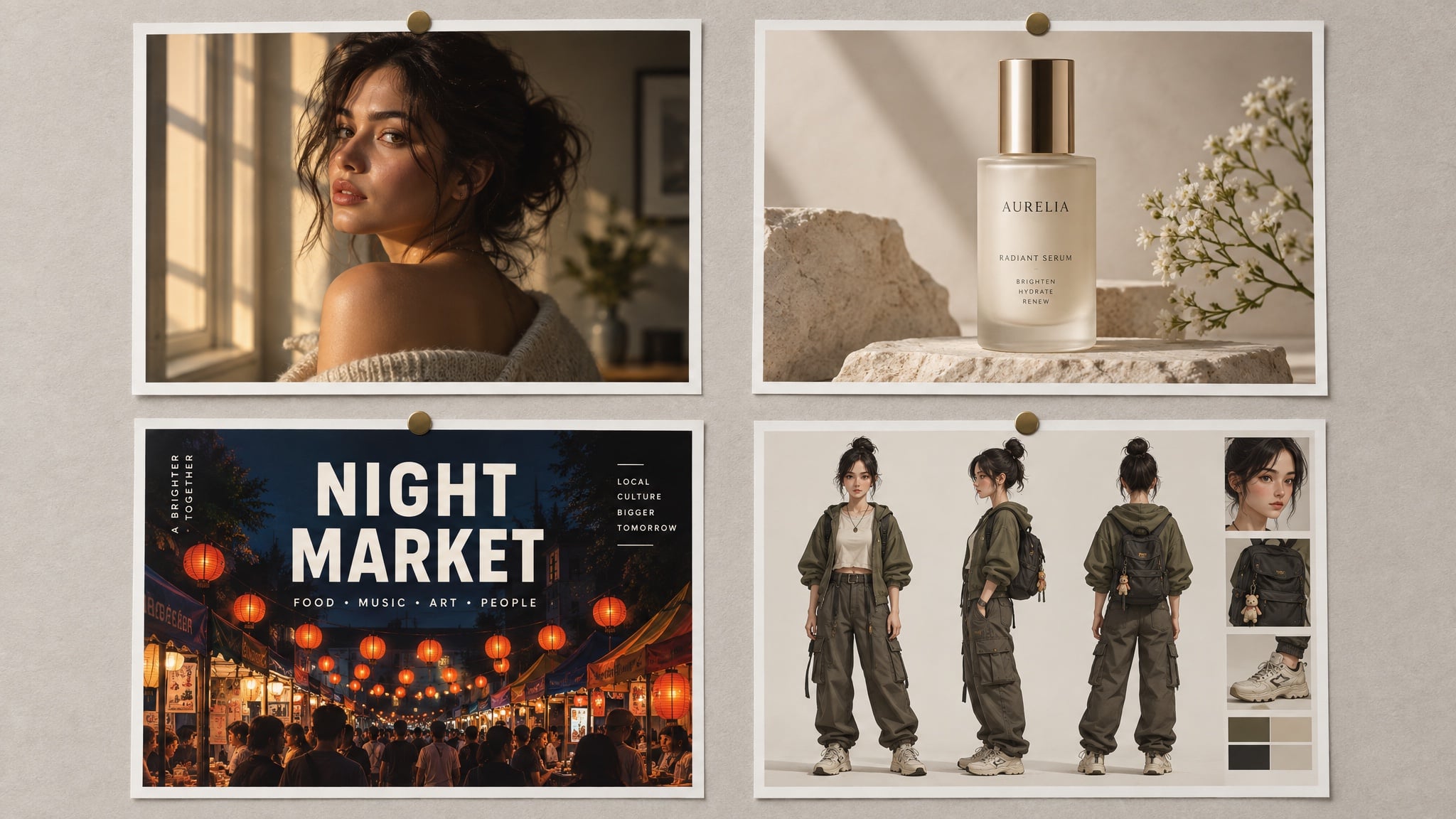
本記事内の全画像はFelo上のGPT-Image 2.5で生成。ポスターやパッケージ画像のテキストもモデルの出力であり、デザインの後付けではない。
モデルより先に「仕事」から考える
ほぼすべてを決めるのは次の3つの質問:
- この画像はどこで使う? プロフィール写真、ポスター、商品リストではルールが異なる——正方形か縦長か、クロップの寄り具合、レイアウトの余白量など。
- 何を絶対に変えない? 顔、ラベル、ロゴ、ボトルの曲線など。これらは参照画像とプロンプト内の「保持リスト」に入れる。
- 正確なコピーは? 引用し、スペルも明記し、配置も指定する。GPT-Image 2.5は短いテキストのレンダリングが得意だが、長文は書かない。
この3つを答えれば、プロンプトの大半は自動的に決まる。プロンプトの全構造を知りたい場合は、GPT-Image 2.5プロンプトガイドで詳細を解説している。
個人プロジェクト
1. 自分らしさを保つプロフィール写真
多くの人が最初に感じるアップグレードは肌。顔は毛穴やそばかす、自然なムラを持って戻り、以前のモデルのようなワックス仕上げにはならない——ただし、そう指示し、レタッチを拒否した場合のみ。
Create a natural head-and-shoulders portrait of the person in the reference photo.
Keep the face, hairline, and features unchanged.
Expression: relaxed, mid-laugh, looking slightly off camera.
Light: late-afternoon window light from the left, soft falloff, a catchlight in the eyes.
Wardrobe: plain dark crew-neck, no logos.
Background: softly out-of-focus neutral grey wall, no clutter.
Style: 85 mm portrait, shallow depth of field, true-to-life skin texture, minimal retouching.
Constraints: no beauty filter, no skin smoothing, no added jewellery, no text.
なぜうまくいくか:レンズと光を指定し、AIポートレートでありがちな「プラスチック肌」と「スタジオ的な完璧さ」を明確に禁止している。
2. 同じ写真を4つのスタイルで
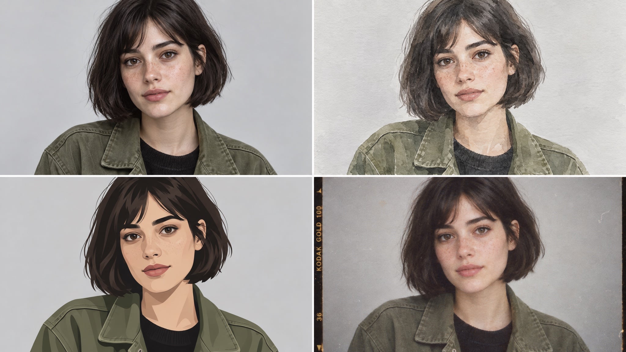
参照写真1枚で、同じ人物の小さなスタイルセットを作れる:仕事用のリアルなバージョン、チャンネルバナー用のイラスト、個人ページ用のフィルム風など。
Create a four-panel grid of the same person from the reference photo:
photorealistic portrait, loose watercolour, flat vector illustration, and 1990s film photograph.
Keep the same face, the same short dark bob, and the same olive jacket in all four panels.
Evenly spaced panels, identical framing and head size, neutral light-grey background.
Constraints: no text, no watermark, no style blending between panels.
なぜうまくいくか:「同じ構図・同じ顔の大きさ」が肝。これがないとモデルはクロップもスタイルもバラバラにし、グリッドの統一感が失われる。
3. 主催イベントの招待状やポスター
テキストレンダリングの進化を最速で体感できる。コピーは短い2行に絞り、レイアウトはモデルに任せる。
Design a vertical poster for a rooftop dinner party.
Headline (exact, once): "SUNDAY SUPPER"
Subline (exact, once): "SUN 21 SEP · 18:30 · ROOFTOP"
Visual: warm minimal composition in terracotta and cream, a simple line-art table setting,
generous empty space around the type.
Typography: elegant serif headline, small uppercase sans-serif subline.
Constraints: no extra text, no logos, no watermark, no photographic people.
なぜうまくいくか:アートワークとタイポグラフィを分け、両方の文字列を引用し、「余計なテキスト禁止」でモデルが勝手にキャッチコピーを作るのを防ぐ。
4. 「整形」しない写真修復
スキャンした家族写真は静かな勝利例。モデルは残った部分をぼかさず、失われた質感を再構築できる。
Restore and colourise this scanned family photograph.
Keep faces, clothing, and composition identical.
Repair the cracked corner and the faded area on the left without inventing new objects.
Return natural colour, neutral skin tones, and film-like grain.
Constraints: no glamour retouching, no added background elements, no cropping, no text.
なぜうまくいくか:修復は、モデルが人物を「良くしよう」とすると失敗する。ダメージを明記し、創作を禁じることで「修理」にとどめる。
クリエイター・SNS向け
5. 読める見出しのポスター
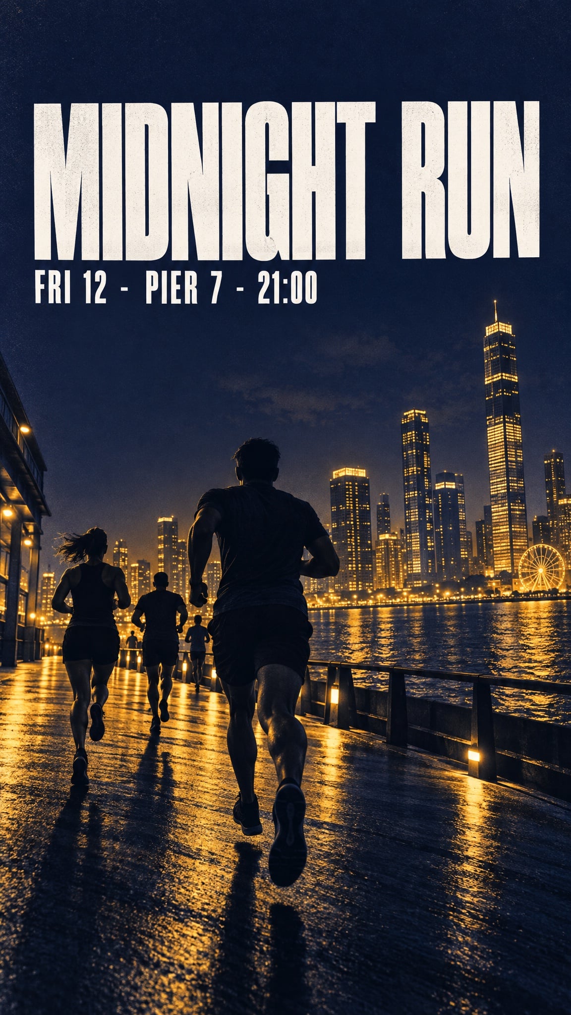
短い見出し、日付、価格は今や生成を生き残る——短く、引用し、配置を指定すれば。
Bold minimalist event poster for a night run.
Headline (exact, once): "MIDNIGHT RUN"
Subline (exact, once): "FRI 12 · PIER 7 · 21:00"
Visual: deep indigo background, warm amber duotone skyline silhouette, strong diagonal
composition, headline sitting in the calm upper third.
Typography: heavy condensed sans-serif, high contrast, generous kerning.
Format: vertical, print quality.
Constraints: no extra text, no sponsor logos, no watermarks, no stock-photo people.
なぜうまくいくか:見出しを「静かな上1/3」に配置——アートワークの混雑を避け、読みやすさを確保する構図指示。
6. 使い回せるキャラクターシート
リファレンスシートは「フォーマット」であり「絵」ではない。一度作れば、以降のシーンはすべて同じ顔から始められる。
Create a character reference sheet for an original character.
Character: a teenage skater with a close-cropped undercut, a faded red hoodie,
ripped black jeans, and scuffed high-tops.
Sheet contents: front, three-quarter, and profile views, plus a close-up of the hand holding a board.
Style: clean concept-art illustration, soft cel shading, consistent line weight, light grey background.
Layout: evenly spaced figures, identical proportions in every view, no overlapping limbs.
Constraints: original design, no text, no watermark.
なぜうまくいくか:シートが視点を明記し、特徴を固定している。同じ特徴が後のプロンプトの一貫性条件になる。
7. コマ割り漫画・ストーリーボード
パネルは従来モデルの苦手分野。キャラクターがコマごとに変わってしまう。参照画像と繰り返しの一貫性条件で、4コマが保たれる。
Create a four-panel horizontal comic strip with the same character in every panel.
Character consistency: same face, same faded red hoodie, same undercut, same line weight.
Panel 1: she kicks her board up and catches it.
Panel 2: a security guard points at a sign.
Panel 3: she shrugs, board under her arm.
Panel 4: she skates away down an empty street in evening light.
Style: clean flat comic illustration, limited palette, thin black outlines.
Constraints: no speech bubbles, no text, no watermark, no style drift between panels.
なぜうまくいくか:各パネルを個別に指示し、一貫性条件を毎回明記している。暗黙ではなく明示が効く。
8. 小さい画面でも読めるサムネイル
サムネイルはアート以前に「可読性」の問題。主題1つ、テキストブロック1つ、320ピクセル幅でも成立するコントラスト。
Design a video thumbnail about building a home espresso bar.
Composition: subject on the left, large text block on the right, high contrast,
readable at small size.
Text (exact, once): "MY 800 SETUP"
Subject: a chrome espresso machine on a wooden counter, steam rising, warm morning light.
Style: crisp editorial photograph, slightly elevated saturation.
Constraints: no extra text, no arrows, no circles, no shocked-face people, no watermark.
なぜうまくいくか:「小さいサイズで読める」が全指示。要素を絞り、強いコントラストを促す。
EC・商品用途
9. 読めるラベルのパックショット
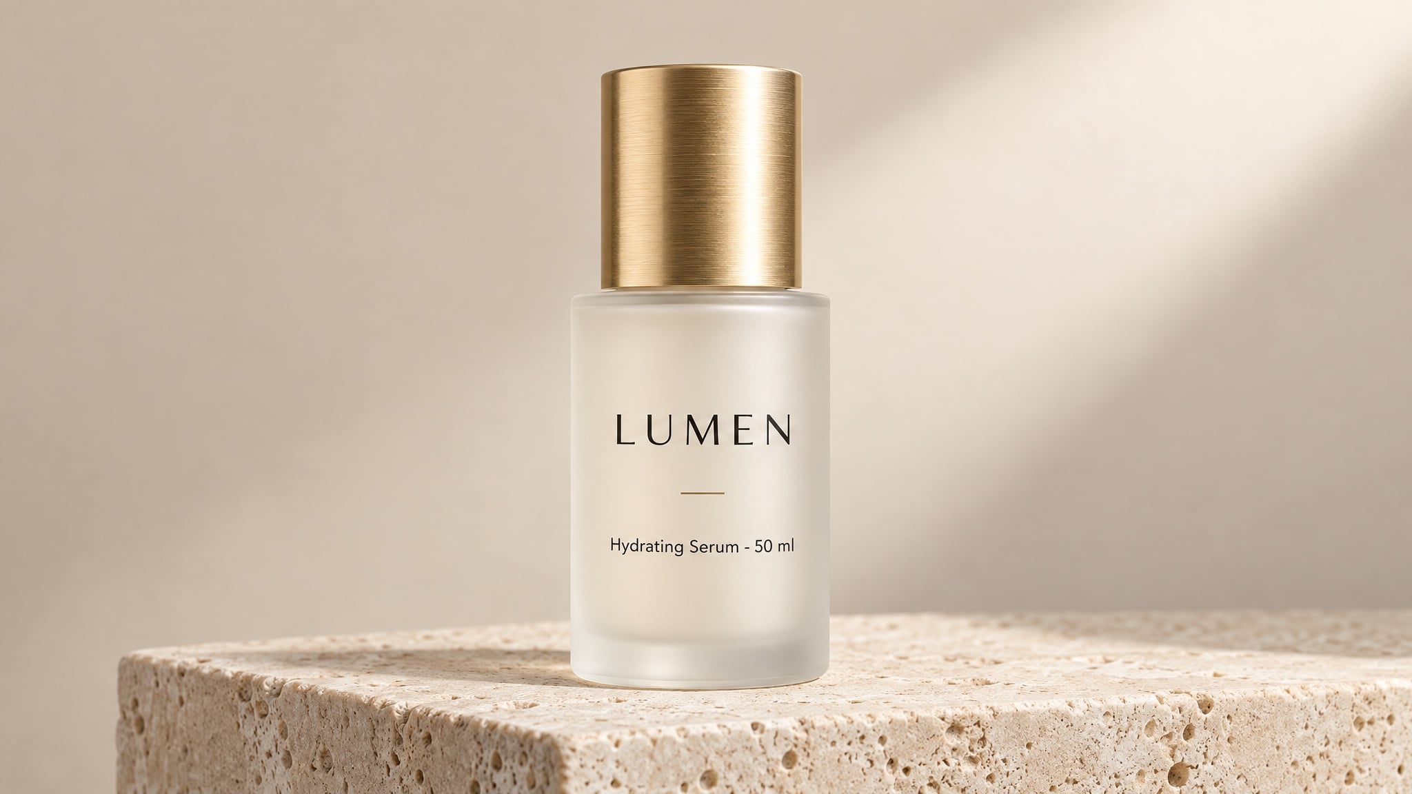
この用途が予算を変える。きれいなスタジオパックショットは従来、カメラマン・スタジオ・1週間が必要だった。今はラベルコピーが課題で、それは「書く」仕事。
Studio product photograph of a frosted glass 50 ml serum bottle with a brushed gold cap,
standing on a pale travertine plinth against a soft beige backdrop.
Label text (exact): "LUMEN" as the brand, "Hydrating Serum · 50 ml" beneath it,
rendered once, straight on, sharp and fully legible.
Composition: centred, full bottle in frame, generous empty space on the right.
Light: large softbox from the upper right, gentle gradient falloff, clean contact shadow.
Style: premium beauty e-commerce photography, crisp detail, no props.
Constraints: no additional text, no logos, no watermark, no studio reflections.
なぜうまくいくか:短いテキストを正確に引用し、位置と回数も指定。これでリストサイズでもラベルが読める。
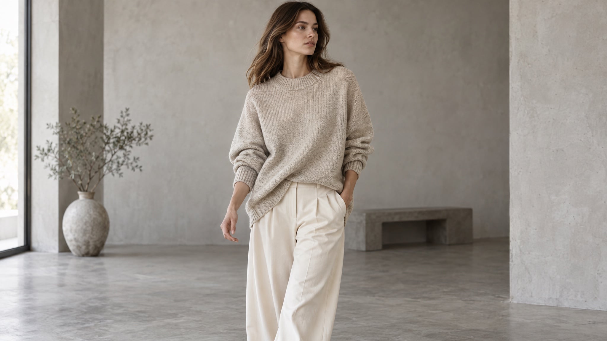
10. モデル着用・ライフスタイルカットもスタジオ不要
承認済みの服画像をアップロードし、モデル着用・室内・屋外へ移せる。服は同じ色・織り・シルエットを保つ必要がある。
Editorial e-commerce photograph of a model wearing the oversized oatmeal knit sweater
and wide-leg cream trousers from the reference images. Mid-shot, mid-stride, three-quarter angle.
Keep garment colour, texture, and silhouette exactly as in the reference.
Light: soft daylight in a minimal concrete studio, gentle shadow, neutral colour balance.
Style: catalogue lookbook photography, shallow depth of field, natural fabric folds.
Constraints: no text, no watermark, no pattern changes, no extra accessories.
なぜうまくいくか:「保持リスト」で売りになる服の特徴を明記。「パターン変更禁止」は一見不要だが、ニットが勝手に柄物になるのを防ぐ。
11. 1つの商品で多様なシーン
商品レンダリングが承認されれば、バリエーションは安価。同じボトル・ラベル・比率——新しい部屋、新しい光、新しい季節。
Same product, new scene: keep the bottle, cap, label, and proportions identical to the reference.
Scene: a bathroom shelf at 7 a.m., condensation on the window, a folded linen towel behind.
Light: cool morning daylight from the left, soft reflections on the glass.
Composition: eye level, product in the right third, quiet negative space on the left.
Style: natural lifestyle photography, muted palette, realistic materials.
Constraints: unchanged label text and geometry, no extra products, no text overlays.
なぜうまくいくか:冒頭で「変えるもの」と「固定するもの」を分けている。編集がぶれるのは、どこが重要かモデルが推測する場合。
12. 多言語パッケージ・メニュー
多言語商品アートは従来、市場ごとにデザイナーが必要だった。モデルはレイアウトと書体を担当し、翻訳済み文字列は自分で用意する。
Create three versions of the same coffee packaging, one per language, identical in layout.
Pack: 250 g matte kraft-paper bag with a matte black label band.
Label line 1 (exact): "MORNING BLEND"
Label line 2 (exact): "Dark Roast · 250 g"
Keep the bag shape, label position, and typography identical across all three versions.
Style: studio packshot, soft neutral background, softbox light from the upper left.
Constraints: no extra text, no watermark, no colour shift between versions.
なぜうまくいくか:レイアウトを固定し、文字列だけを変えるので、市場ごとの適応でも同じ商品として認識できる。
12例すべてに共通する習慣
用途は違っても、失敗パターンは同じ。6つの習慣が大半を防ぐ:
- 主題はプロンプトだけでなく参照画像にも入れる。 顔や商品を画像で渡すと、テキスト記述より一貫性が保たれる。
- 1ターンで1つだけ変える。 光・背景・クロップを同時に変えると、どの指示でぶれたか分からなくなる。
- 下書きは安く、本番は高品質で。 構図検討は低品質設定で行い、勝ち案だけ高品質で再生成。品質ランクで出力トークンが変わり、最上位は最下位の約36倍コスト。
- テキストは引用し、回数も指定。 「1回だけ表示」+正確な文字列で、ラベルの重複や架空キャッチコピーを防ぐ。
- 保持リストを書く。 すべてのプロンプトに「変えてはいけないもの」を明記:ラベル形状、服の色、カメラアングル、背景小物など。
- 承認済み画像を毎回入力に使う。 一貫性は固定参照+繰り返しの制約から生まれ、「当たりが出るまで再生成」では得られない。
これらのプロンプトを動かす場所
上記すべてはOpenAI API経由で自分のキー・課金・パラメータ管理で動く。画像生成に集中したい場合は、FeloでGPT-Image 2.5をブラウザで使える:
- 無料で始められる。 毎日クレジット付与、クレカ不要、APIキー不要、インストール不要。
- ウォーターマークなし・商用利用可。 無料プランも含む。
- 最大4K出力。 ネイティブ3840×2160で、初回レンダリングがそのまま納品物になる。
- 50以上のビジュアルスタイル・50以上の言語テキスト。 ポスター・パッケージ・メニュー・多国展開向け。
- 主要モデルを1ワークスペースで。 GPT-Image 2.5, GPT-Image 2, Nano Banana Pro, Nano Banana 2 Liteなど——用途に応じてモデル切り替え。
- ガイド付きワークフロー。 ストーリーボード、表情シート、タイトルシーケンス、スプライトシートなど、構造化プロンプトから始められる。
ワークスペース内には既成プロンプト集もある——6コマストーリーボード、イベントポスター、商品パッケージ、漫画、解説グラフィック、広告バリエーション。まず1つ試し、モデルが各スロットで何をしたか観察し、自分の商品に構造を応用できる。
FAQ
GPT-Image 2.5で何が作れる?
汎用画像ではなく「特定の画像」が必要なものすべて:ポートレートやアバター、イベントポスター、漫画・ストーリーボード、サムネイル、商品パックショット、モデル着用写真、ライフスタイルシーン、パッケージ、メニュー、キャンペーンバリエーション。
これらのプロンプトにAPIキーは必要?
不要。プロンプト技法はモデルレベルであり、FeloはAPIキーなしでGPT-Image 2.5をブラウザで動かせるので、上記プロンプトをそのまま貼り付けて即生成できる。
商品や顔の一貫性を保つには?
基準となる画像を1枚承認し、毎回参照画像としてアップロードし、特徴を各プロンプトで再記述する。一貫性は固定参照+繰り返し制約の産物。
画像内テキストがうまく出ないのはなぜ?
多くはコピーが言い換え・非引用・長すぎのいずれか。正確な文字列を引用し、配置・回数を明記し、短くし、「余計なテキスト禁止」を加える。
高品質設定は常に良い画像を生む?
違う。コストと時間が増え、小さい文字・細部・納品物向けに効果がある。特定の問題解決用であり、常用は推奨しない。
生成画像は販売できる?
Feloでは全画像がウォーターマークなし・商用利用可(無料プラン含む)。生成したパックショットをそのまま商品リストに使える。
1つ選んで出荷しよう
「このモデルで何ができる?」ではなく、「どの画像がスタジオ待ちか?」が本質的な問い。再撮が必要なラベル、個人ページ用のスタイルセット、先延ばし中の動画用ストーリーボード。
今一番時間を奪っているケースを1つ選び、そのプロンプトを貼り付け、1スロットずつ変えていけば、実際に公開できるレンダリングにたどり着く。
この記事は次の言語でもお読みいただけます:English、简体中文、한국어、繁體中文、हिन्दी、Français、العربية、Русский、اردو、Bahasa Indonesia、Deutsch、Tiếng Việt、Türkçe、Italiano、ไทย、Español、বাংলা、Português。