جی پی ٹی امیج 2.5 بمقابلہ نینو بنانا 2.1: 13 استعمالات کا موازنہ

کون سا امیج ماڈل آپ کے اگلے پروجیکٹ کے لیے موزوں ہے؟ جی پی ٹی امیج 2.5 اور نینو بنانا 2.1 کا موازنہ کریں: ای کامرس امیجز، تھمب نیلز، انفوگرافکس، تعلیمی ڈایاگرامز اور مزید۔
ایک پروڈکٹ لسٹنگ، یوٹیوب تھمب نیل اور سائنسی ڈایاگرام کو امیج ماڈل سے مختلف چیزیں درکار ہوتی ہیں۔ لسٹنگ میں پروڈکٹ برقرار رہنا چاہیے؛ تھمب نیل میں عنوان پڑھنے کے قابل رہنا چاہیے؛ طریقہ کار کے ڈایاگرام میں درست باکسز جڑنے چاہئیں۔
ہم نے دونوں ماڈلز کو 13 استعمالات کے لیے ایک ہی ہدایت دی اور ان کے اصل نتائج کا موازنہ کیا۔ پانچ ایسے کاموں کے لیے جن میں زیادہ متن شامل تھا، ہم نے الگ الگ انگریزی، جاپانی اور کوریائی ورژن بھی بنائے۔ نیچے دی گئی بنیادی مثالیں انگریزی متن یا بغیر ہیڈ لائن کے ہیں؛ مقامی موازنوں میں جاپانی اور کوریائی متن شامل ہے۔
سفارشات میں بتایا گیا ہے کہ ان ہدایات کے لیے میں پہلے کون سا ماڈل آزماؤں گا۔ ہر حصے میں دونوں آزادانہ طور پر بنائے گئے نتائج دکھائے گئے ہیں اور ان کے فرق کی وضاحت کی گئی ہے۔
Felo پر مثالیں آزمائیں: GPT Image 2.5، Nano Banana 2.1، یا AI Image ٹول۔
پہلے کون سا ماڈل آزمائیں؟
| استعمال | ان نمونوں میں پہلی پسند |
|---|---|
| سفید پس منظر والی پروڈکٹ لسٹنگز | دونوں؛ فنش کے مطابق منتخب کریں |
| پروڈکٹ ڈیٹیل گرافکس | بڑے کال آؤٹس کے لیے جی پی ٹی |
| لائف اسٹائل پروڈکٹ ایڈورٹائزنگ | اشتہاری ہیرو کے لیے جی پی ٹی |
| ریفرنس کے بغیر پروڈکٹ کانسیپٹس | پہلے مطلوبہ آبجیکٹ منتخب کریں |
| یوٹیوب اور ٹیوٹوریل تھمب نیلز | جلی عنوان کے لیے جی پی ٹی |
| پیکنگ چیک لسٹس اور نالج کارڈز | بڑے موبائل فونٹ کے لیے جی پی ٹی؛ ہوا دار کارڈز کے لیے نینو بنانا |
| ایونٹ پوسٹرز | گرافک پوسٹرز کے لیے نینو بنانا؛ وینیو موڈ کے لیے جی پی ٹی |
| عددی انفوگرافکس | اس بار چارٹ کے لیے نینو بنانا |
| پراسیس ڈایاگرامز | تربیت کے لیے جی پی ٹی؛ رپورٹ کے لیے نینو بنانا |
| سائنسی تصور کی وضاحتیں | پیپر اسٹائل نوٹیشن کے لیے جی پی ٹی؛ کلاس روم سلائیڈز کے لیے نینو بنانا |
| ریسرچ میتھڈ اور ماڈل آرکیٹیکچر ڈایاگرامز | اس سیون نوڈ فریم ورک کے لیے جی پی ٹی |
| کہانی کی عکاسی اور کانسیپٹ آرٹ | بھرپور ٹیکسچر کے لیے جی پی ٹی؛ محدود منظر کے لیے نینو بنانا |
| انٹیریئر ڈیزائن کانسیپٹس | ماحول کے لیے جی پی ٹی؛ سادہ سمت کے لیے نینو بنانا |
مشترکہ پروڈکٹ ریفرنس
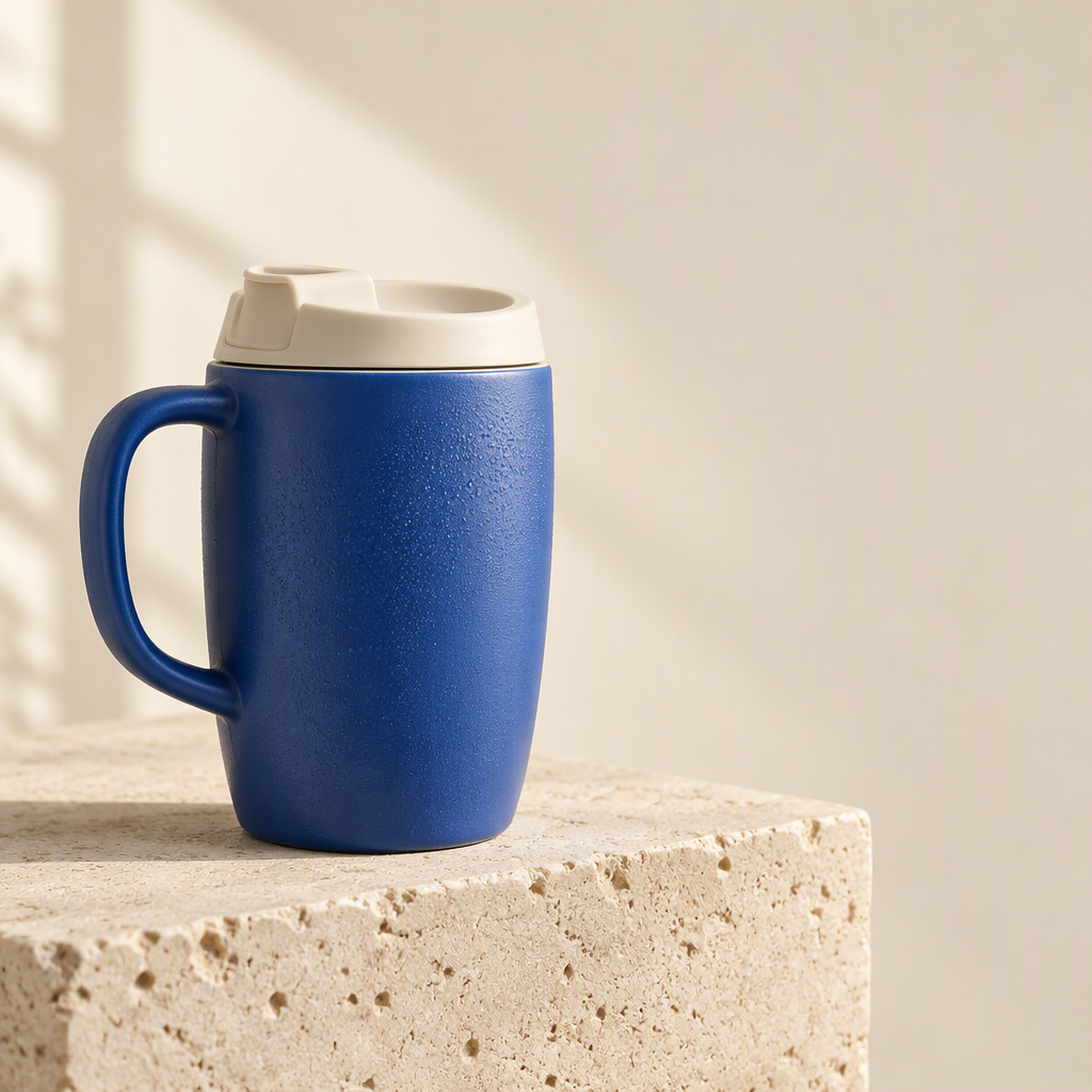
پہلے تین ای کامرس ٹیسٹ ایک ہی فرضی پروڈکٹ استعمال کرتے ہیں، جس میں اس کا بایاں ہینڈل، ہاتھی دانت کا ڈرنکنگ ڑککن اور نیلا بناوٹ والا جسم شامل ہے۔
1. سفید پس منظر والی پروڈکٹ لسٹنگز
مشترکہ ہدایت: وہی نیلا مگ، ہینڈل، ڈرنکنگ ڑککن اور تناسب برقرار رکھیں، پتھر کا بلاک ہٹا دیں، اور مکمل پروڈکٹ کو سفید پس منظر پر رکھیں۔
| جی پی ٹی امیج 2.5 | نینو بنانا 2.1 |
|---|---|
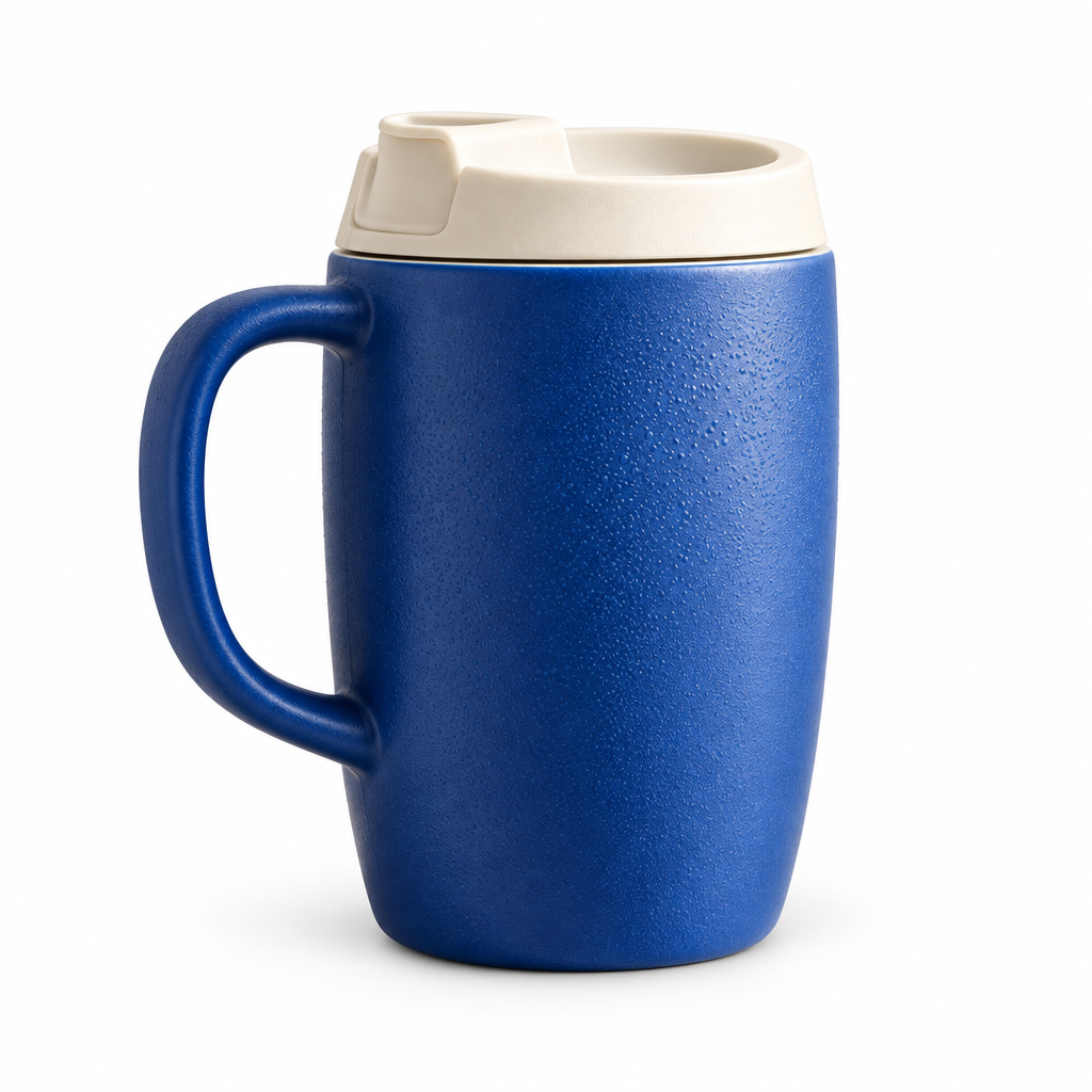 | 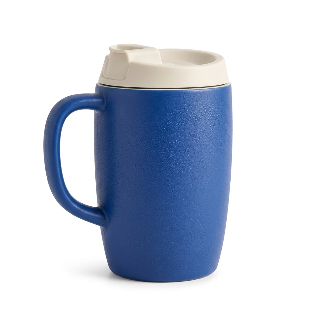 |
دونوں ماڈلز نے ہینڈل اور ڑککن برقرار رکھے اور ریفرنس کو مختلف ٹریول کپ میں تبدیل نہیں کیا۔ جی پی ٹی امیج 2.5 میں بناوٹ اور پانی کے قطرے نمایاں ہیں؛ نینو بنانا 2.1 میں سطح اور سایہ نرم ہیں۔ کسی ایک پروڈکٹ کے لیے واضح فاتح سامنے نہیں آیا۔
استعمال کا وقت: اگر سطح کی تفصیل اہم ہو تو جی پی ٹی سے شروع کریں؛ اگر نرم کیٹلاگ لائٹنگ چاہیے تو نینو بنانا 2.1 سے شروع کریں۔ اصل لسٹنگ کے لیے، ڑککن کا کھلنا، ہینڈل کا خم، رنگ اور سلیوٹ اصل پروڈکٹ سے موازنہ کریں۔
2. پروڈکٹ ڈیٹیل گرافکس
مشترکہ ہدایت: وہی ریفرنس مگ اور تین گول ڈیٹیل ویوز استعمال کریں، جن پر Ceramic body، Ivory lid اور Curved handle کے لیبل ہوں۔
| جی پی ٹی امیج 2.5 | نینو بنانا 2.1 |
|---|---|
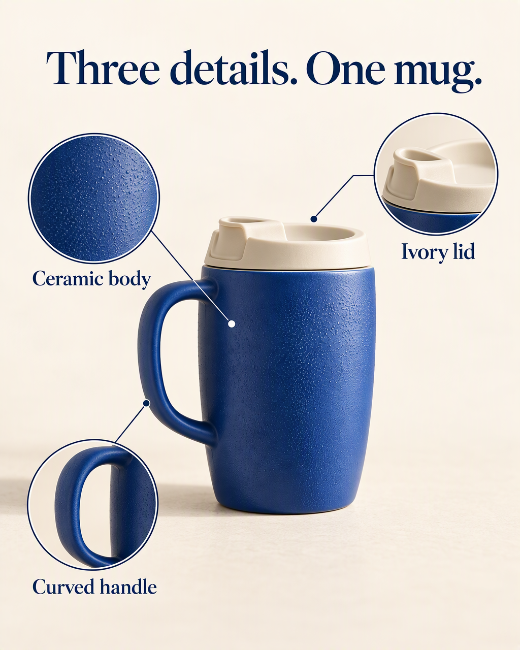 | 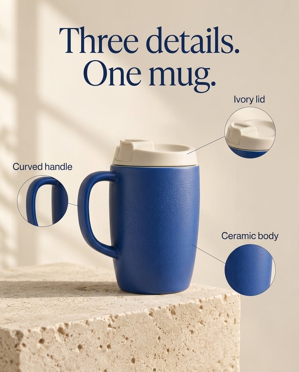 |
دونوں انگریزی امیجز میں مطلوبہ ہیڈ لائن اور لیبلز برقرار ہیں۔ جی پی ٹی میں بناوٹ اور ڑککن کے کراپس کو زیادہ جگہ ملی اور فیچر لیبلز بڑے ہیں۔ نینو بنانا 2.1 میں چھوٹے کال آؤٹس اور سینٹرڈ پروڈکٹ ہے اور اصل پتھر کا پس منظر زیادہ برقرار ہے۔ کئی ورژنز میں جی پی ٹی نے ڑککن کا لیڈر لائن اینڈ پوائنٹ پروڈکٹ کے اوپر رکھا، اس لیے لائن کی پوزیشن چیک کریں۔
استعمال کا وقت: اگر موبائل پر نمایاں میٹریل کلوز اپ چاہیے تو جی پی ٹی سے شروع کریں۔ اگر سپورٹنگ پروڈکٹ پیج چاہیے تو نینو بنانا 2.1 آزمائیں۔ یہ انتخاب زور اور اینوٹیشن کی صفائی کا ہے، نہ کہ ہر SKU کی درستگی کا۔
جاپانی ورژن
| جی پی ٹی امیج 2.5 | نینو بنانا 2.1 |
|---|---|
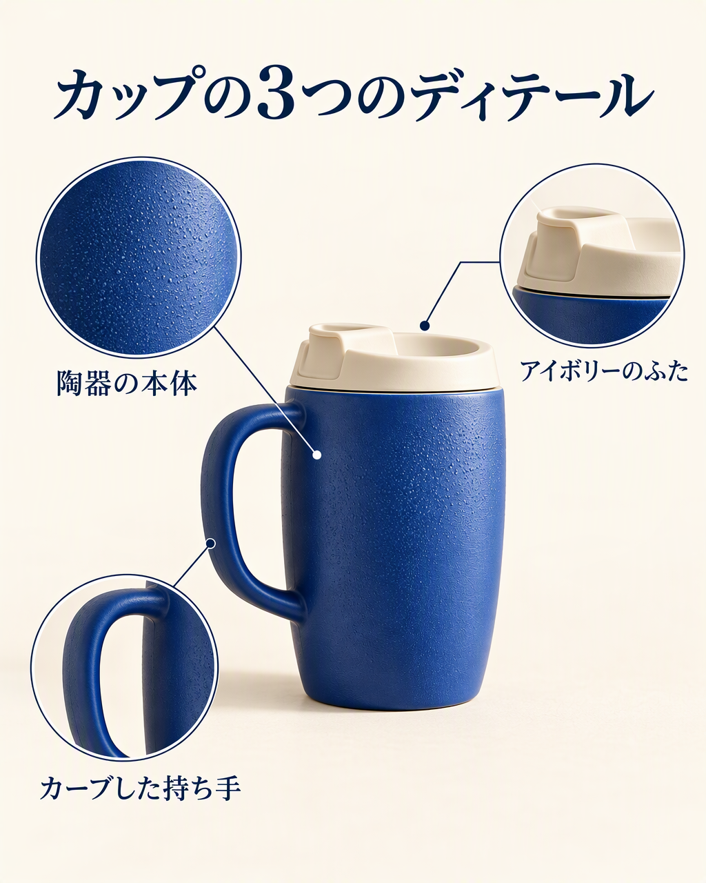 | 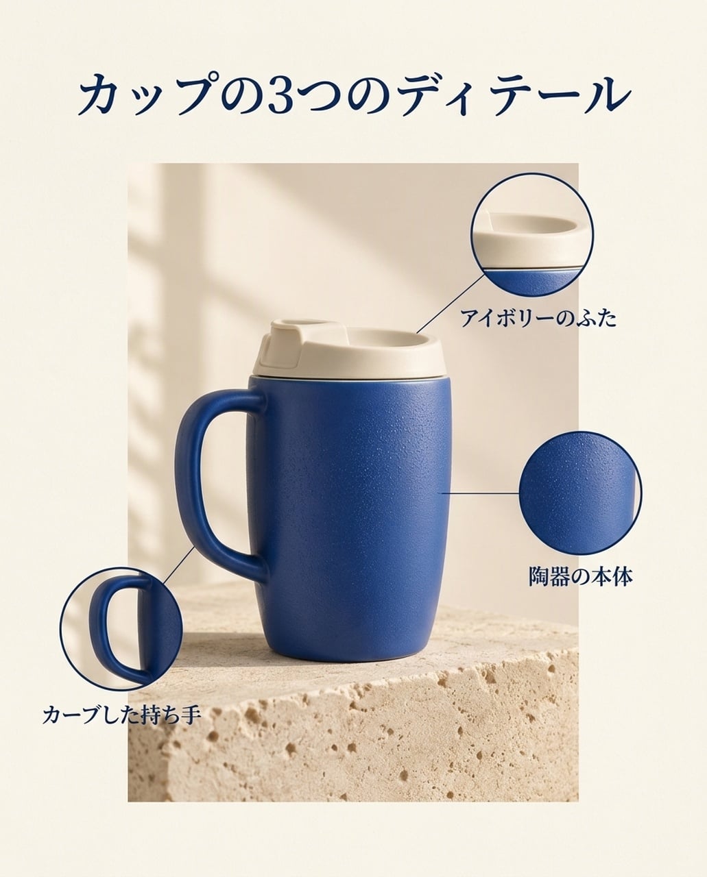 |
دونوں میں カップの3つのディテール اور مطلوبہ فیچر لیبلز موجود ہیں۔ جی پی ٹی نے بناوٹ والے کراپ کو بڑا کیا، جبکہ نینو بنانا 2.1 میں پروڈکٹ پینل محدود ہے۔ ہیڈ لائن کے بجائے لیڈر لائن اینڈ پوائنٹس چیک کریں۔
کوریائی ورژن
| جی پی ٹی امیج 2.5 | نینو بنانا 2.1 |
|---|---|
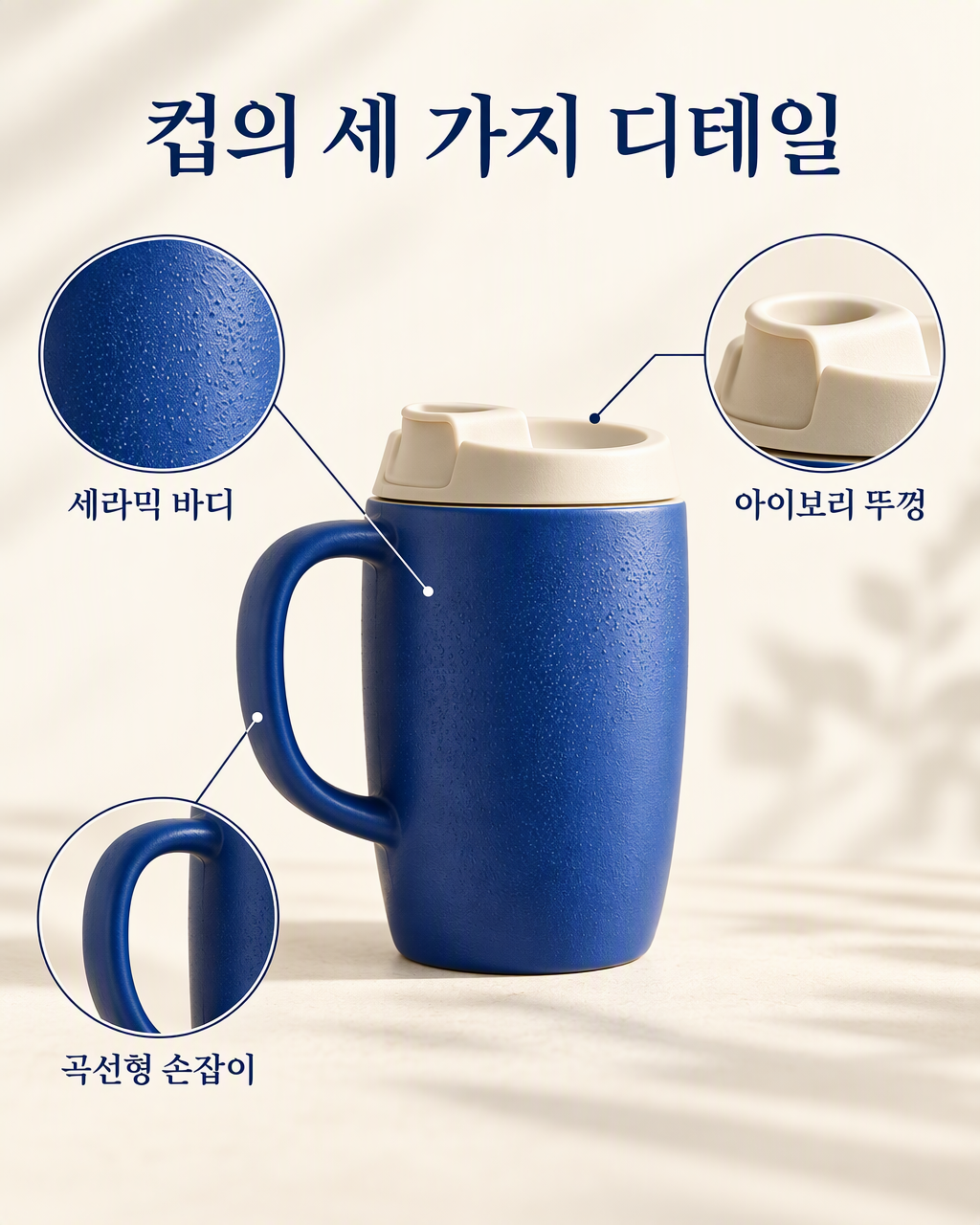 | 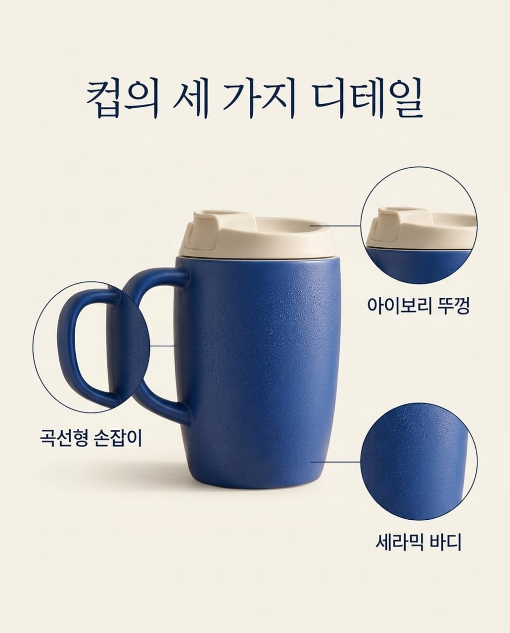 |
دونوں میں تینوں کوریائی فیچر لیبلز موجود ہیں۔ جی پی ٹی میں چوڑے اور بڑے کال آؤٹس ہیں؛ نینو بنانا 2.1 میں پرسکون لے آؤٹ ہے۔ نینو بنانا ورژن میں ہینڈل کا کراپ پروڈکٹ کے ساتھ زیادہ اوورلیپ کرتا ہے۔
3. لائف اسٹائل پروڈکٹ ایڈورٹائزنگ
مشترکہ ہدایت: وہی مگ اوک ناشتے کی میز پر ایک بند نوٹ بک کے ساتھ رکھیں، پس منظر میں نرم دھندلا کچن اور دائیں طرف خالی جگہ ہو۔
| جی پی ٹی امیج 2.5 | نینو بنانا 2.1 |
|---|---|
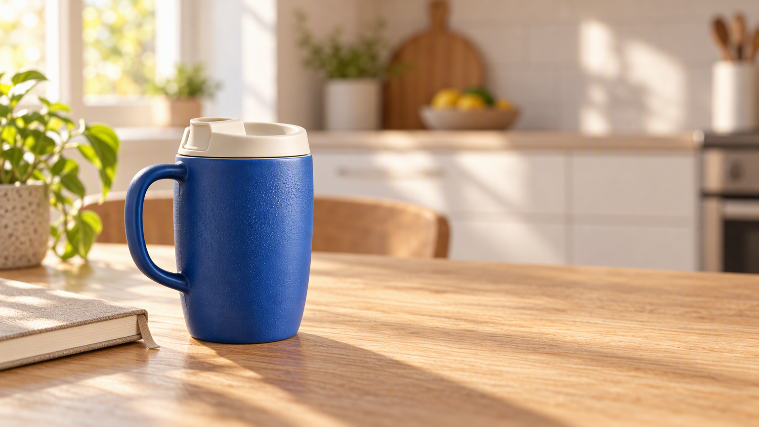 | 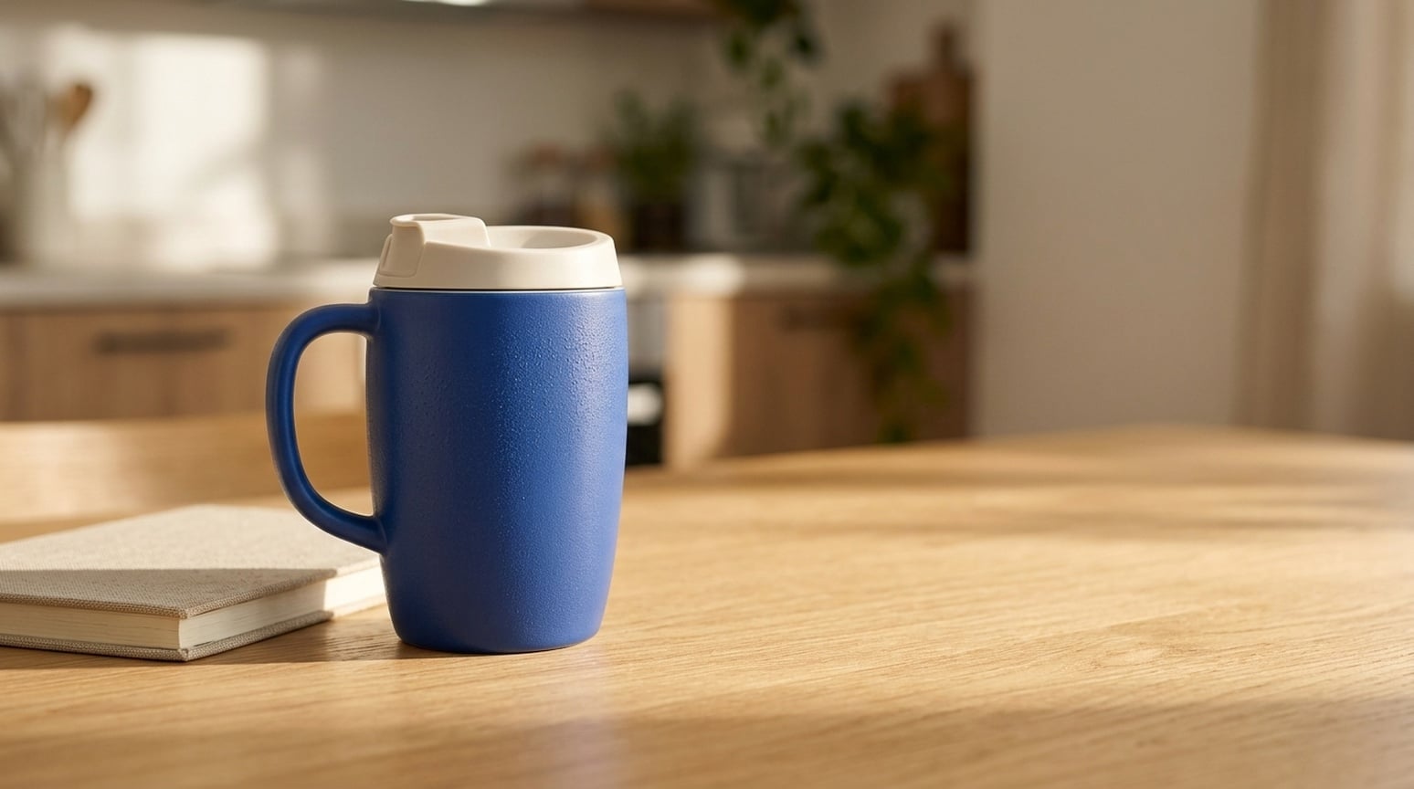 |
جی پی ٹی نے مگ کو گرم کچن سے الگ دکھایا، واضح سیرامک بناوٹ، لکڑی کا دانہ اور سمت دار روشنی کے ساتھ۔ نینو بنانا 2.1 میں منظر پرسکون اور کم تضاد والا ہے۔ دونوں میں پروڈکٹ کی ساخت برقرار ہے اور خالی جگہ موجود ہے۔
استعمال کا وقت: اگر برانڈ بینر یا لائف اسٹائل اشتہار چاہیے تو جی پی ٹی سے شروع کریں۔ اگر روزمرہ کا پرسکون منظر چاہیے تو نینو بنانا 2.1 آزمائیں۔ پروڈکٹ کی جیومیٹری، سکیل اور سائے چیک کریں۔
4. ریفرنس کے بغیر پروڈکٹ کانسیپٹس
مشترکہ ہدایت: ایک نیلا سیرامک ٹریول مگ، ہاتھی دانت کا ڑککن، چونا پتھر کا بلاک اور خالی جگہ بیان کریں، پروڈکٹ کی تصویر نہ دیں۔
| جی پی ٹی امیج 2.5 | نینو بنانا 2.1 |
|---|---|
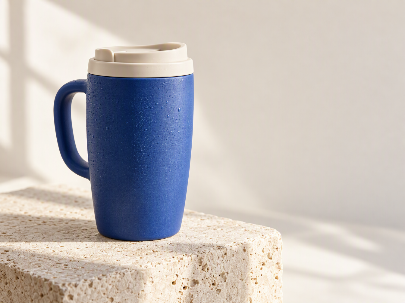 | 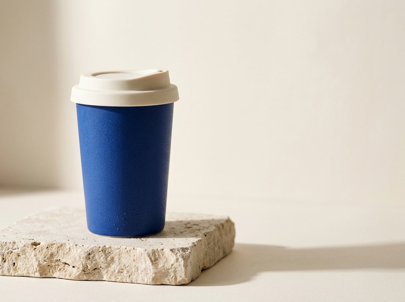 |
جی پی ٹی نے ہینڈل والا مگ بنایا؛ نینو بنانا 2.1 نے پتلا بغیر ہینڈل کپ بنایا۔ پرامپٹ میں ہینڈل کی وضاحت نہیں تھی، اس لیے دونوں درست تشریحات ہیں۔ جی پی ٹی میں قطرے اور میٹریل کی بناوٹ نمایاں ہے، نینو بنانا 2.1 میں سادہ سلیوٹ ہے۔
استعمال کا وقت: اگر ٹچ ایڈورٹائزنگ کانسیپٹ چاہیے تو جی پی ٹی آزمائیں؛ اگر صاف کپ چاہیے تو نینو بنانا 2.1 آزمائیں۔ اصل پروڈکٹ دکھانے کے لیے دونوں کو ایک ہی ریفرنس دیں؛ صرف متن سے پروڈکٹ کی درستگی ثابت نہیں ہوتی۔
5. یوٹیوب اور ٹیوٹوریل تھمب نیلز
مشترکہ ہدایت: فون سے رات کی سڑک کی تصویر لیتے ہاتھ دکھائیں، دائیں طرف BETTER PHONE PHOTOS اور 3 COMPOSITION TIPS لکھا ہو۔
| جی پی ٹی امیج 2.5 | نینو بنانا 2.1 |
|---|---|
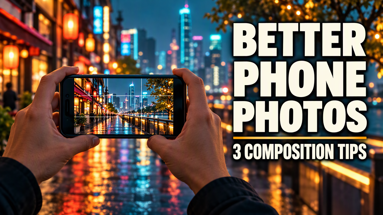 | 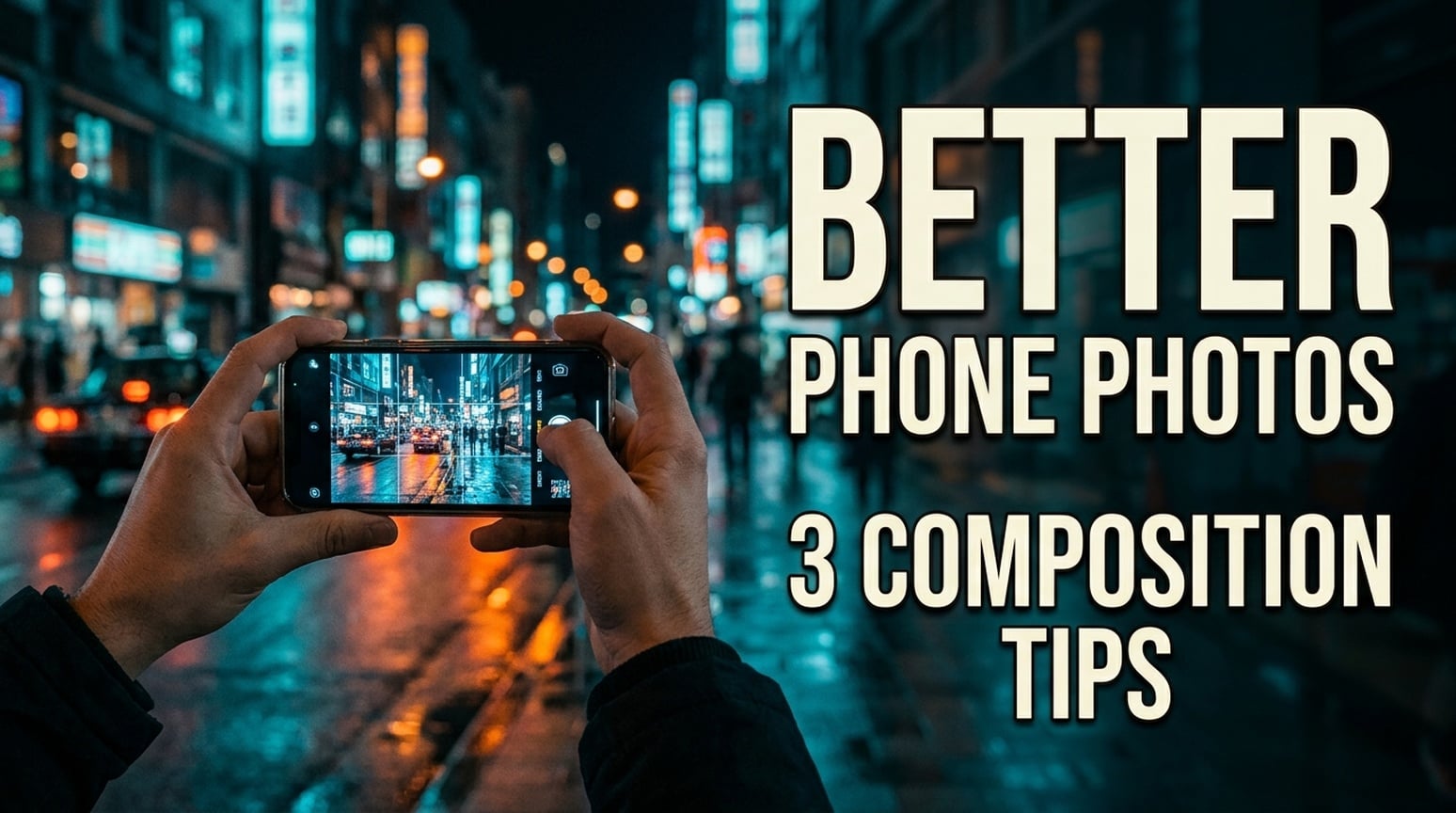 |
دونوں انگریزی تھمب نیلز میں دونوں مطلوبہ جملے موجود ہیں، لائن بریک مختلف ہیں۔ جی پی ٹی میں بہت جلی فونٹ اور کمپیکٹ سیکنڈری لائن ہے۔ نینو بنانا 2.1 میں پتلا فونٹ، سب ٹائٹل دو لائنوں میں اور منظر ڈاکیومنٹری انداز میں ہے۔
استعمال کا وقت: اگر جلی ٹیوٹوریل تھمب نیل چاہیے تو جی پی ٹی سے شروع کریں۔ اگر کم زور امیج چاہیے تو نینو بنانا 2.1 آزمائیں۔ اصل تھمب نیل سائز پر کراپ اور عنوان چیک کریں۔ کلک تھرو ریٹ کا ٹیسٹ نہیں ہوا؛ جاپانی اور کوریائی مثالیں نیچے ہیں۔
جاپانی ورژن
| جی پی ٹی امیج 2.5 | نینو بنانا 2.1 |
|---|---|
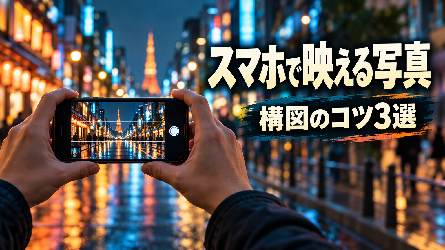 | 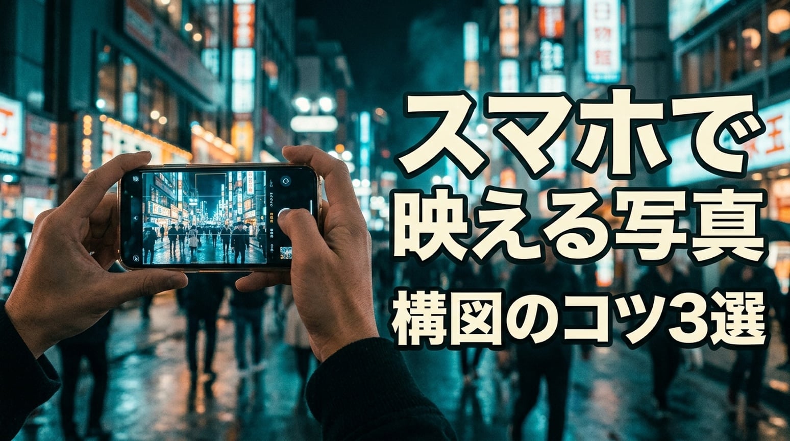 |
دونوں میں スマホで映える写真 اور 構図のコツ3選 برقرار ہیں۔ جی پی ٹی نے ہیڈ لائن ایک لائن میں رکھی اور سب ٹائٹل کو سیاہ پینل میں الگ کیا۔ نینو بنانا نے ہیڈ لائن کو تقسیم کیا اور آؤٹ لائن مضبوط رکھی۔
کوریائی ورژن
| جی پی ٹی امیج 2.5 | نینو بنانا 2.1 |
|---|---|
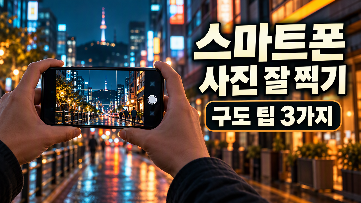 | 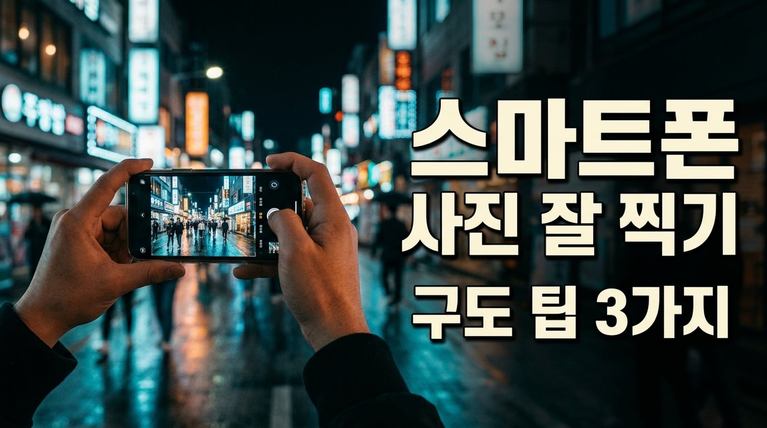 |
دونوں میں کوریائی جملے برقرار ہیں۔ جی پی ٹی نے سیکنڈری لائن کو سیاہ گول پینل میں رکھا؛ لفظوں کا فاصلہ کم ہے۔ نینو بنانا نے ہیڈ لائن اور سب ٹائٹل کو الگ الگ رکھا۔ فائنل ڈیلیوری میں اسپیسنگ چیک کریں۔
6. پیکنگ چیک لسٹس اور نالج کارڈز
مشترکہ ہدایت: چھ مخصوص کیٹیگریز اور آئٹم لسٹس کو دو کالم، تین قطاروں والی پیکنگ چیک لسٹ میں دکھائیں، اضافی متن نہ ہو۔
| جی پی ٹی امیج 2.5 | نینو بنانا 2.1 |
|---|---|
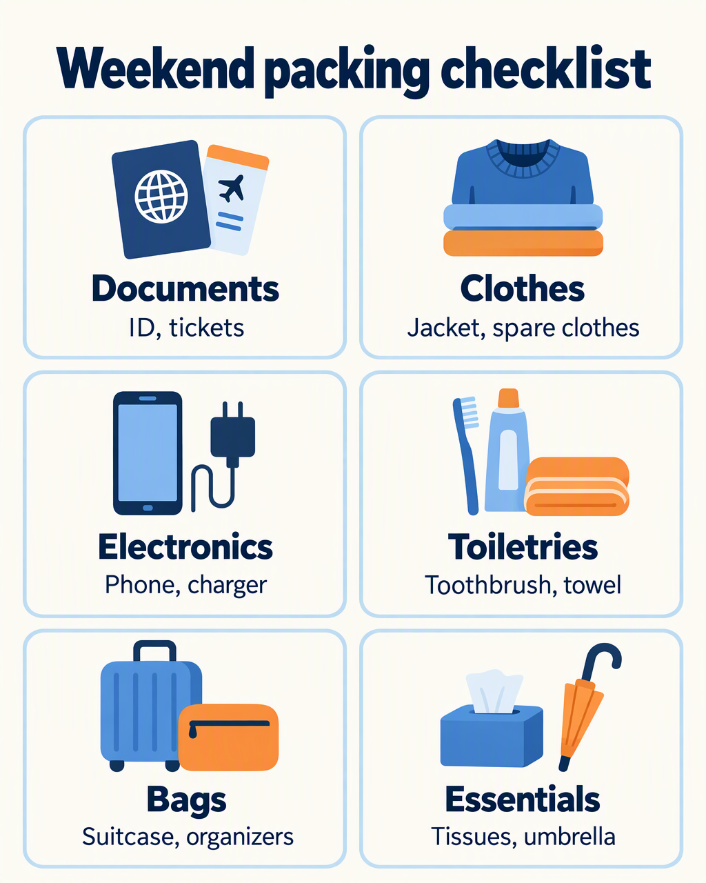 | 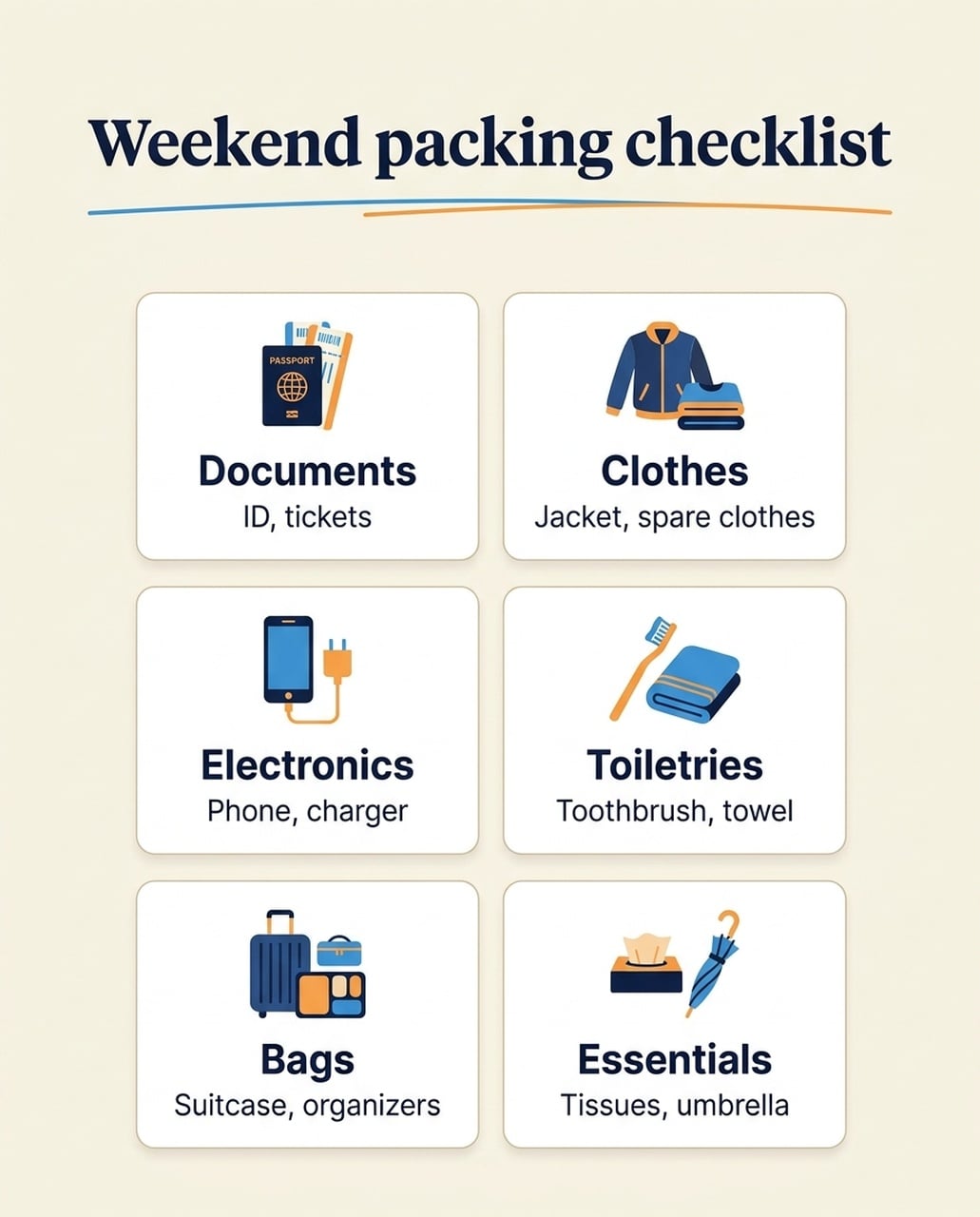 |
دونوں انگریزی ورژنز میں چھ کیٹیگریز اور ان کی آئٹم لسٹس موجود ہیں۔ جی پی ٹی میں تصاویر اور لیبلز کو زیادہ جگہ ملی۔ نینو بنانا 2.1 میں چھوٹے آئیکنز اور زیادہ خالی جگہ ہے؛ اس کے پاسپورٹ آئیکن میں غیر مطلوبہ PASSPORT لیبل بھی ہے۔ جاپانی اور کوریائی ورژنز میں اضافی انگریزی سب ٹائٹل نہیں ہے۔
استعمال کا وقت: اگر بڑے موبائل فونٹ چاہیے تو جی پی ٹی منتخب کریں۔ اگر محدود کارڈ لے آؤٹ چاہیے تو نینو بنانا 2.1 منتخب کریں، آئیکن لیبلز بھی چیک کریں۔ ایک زبان میں غلطی کو ہر زبان پر لاگو نہ کریں۔
جاپانی ورژن
| جی پی ٹی امیج 2.5 | نینو بنانا 2.1 |
|---|---|
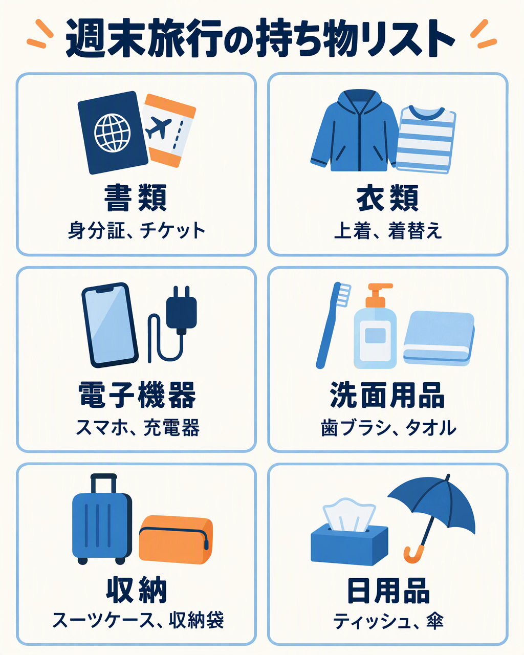 | 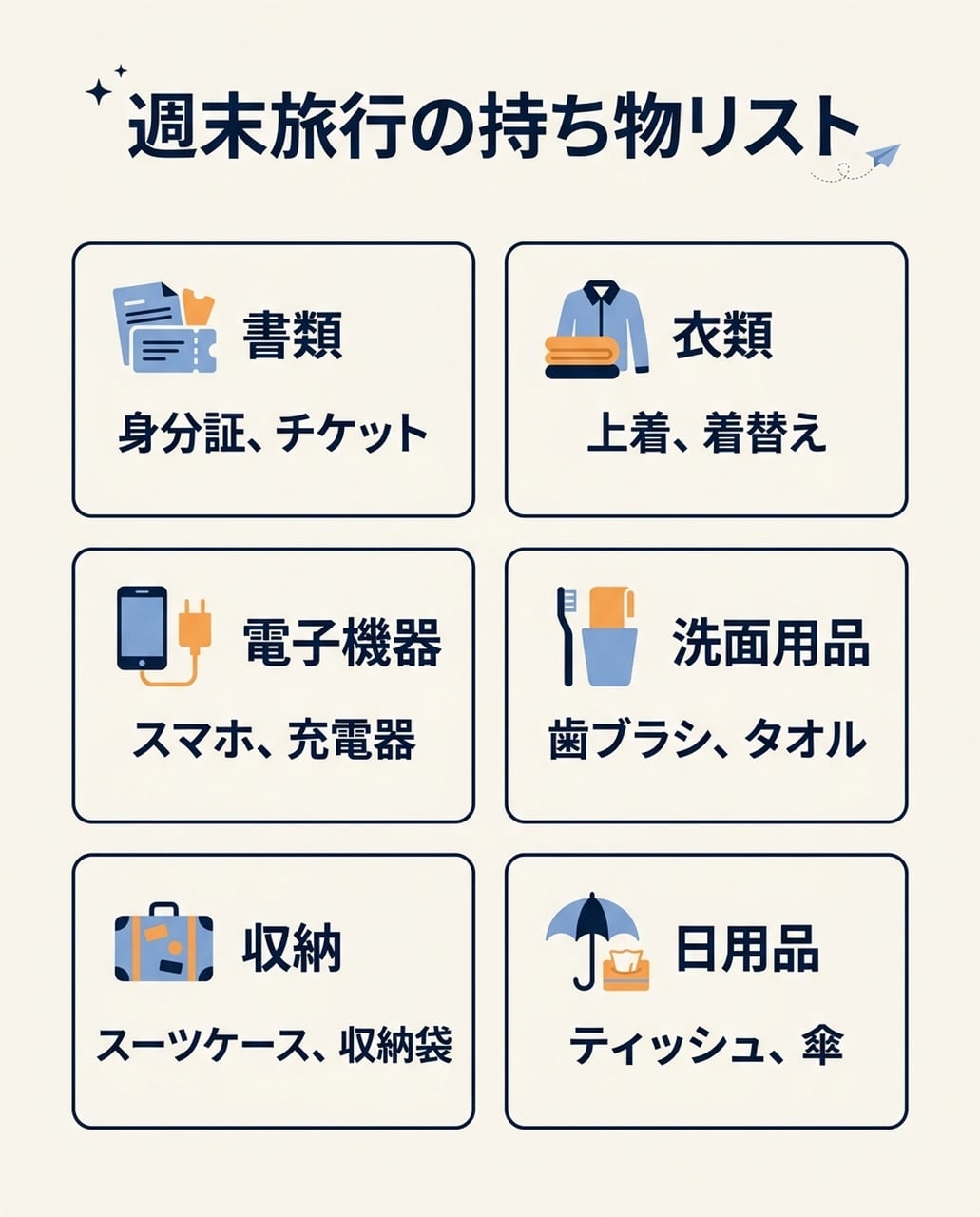 |
دونوں میں چھ جاپانی کیٹیگریز اور آئٹم لسٹس ہیں، غیر مطلوبہ انگریزی سب ٹائٹل نہیں۔ جی پی ٹی میں بڑی تصاویر ہیں؛ نینو بنانا میں چھوٹے آئیکنز اور کمپیکٹ متن ہے۔
کوریائی ورژن
| جی پی ٹی امیج 2.5 | نینو بنانا 2.1 |
|---|---|
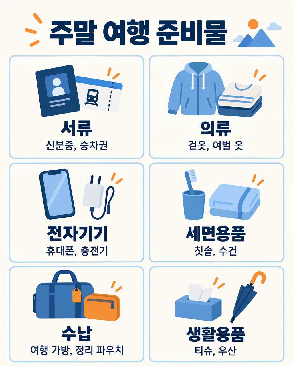 | 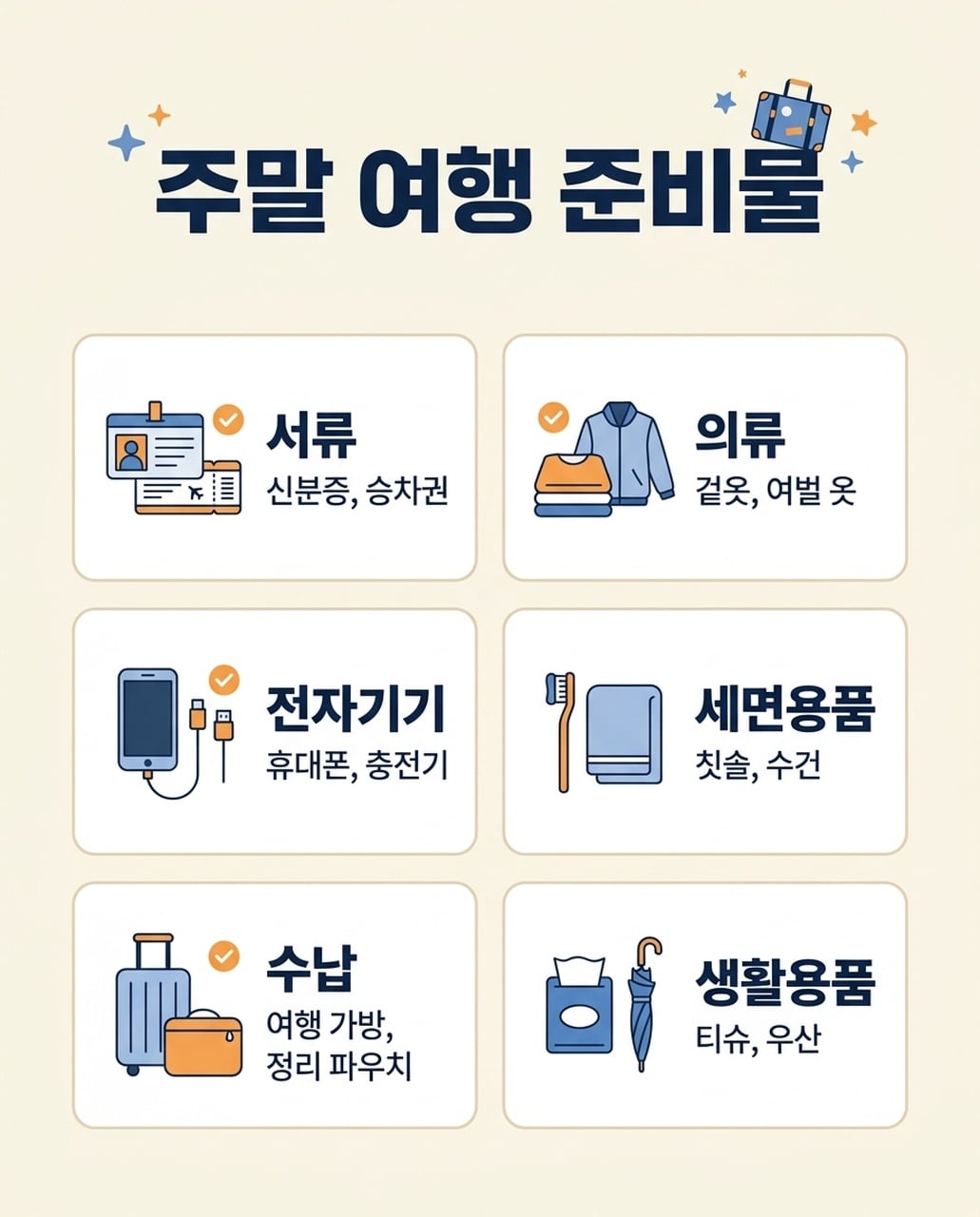 |
دونوں میں چھ کوریائی کیٹیگریز اور متعلقہ آئٹمز ہیں۔ جی پی ٹی نے لمبی آئٹم لسٹس ایک لائن میں رکھی؛ نینو بنانا نے Bags آئٹمز دو لائنوں میں تقسیم کیے۔ دونوں میں اسپیسنگ اور چھوٹے حروف چیک کریں۔
7. ایونٹ پوسٹرز
مشترکہ ہدایت: NIGHT GARDEN اور Botanical light show · Kyoto · 7–9 pm کو سبز اور امبر روشنی والے پودوں کے ساتھ دکھائیں۔
| جی پی ٹی امیج 2.5 | نینو بنانا 2.1 |
|---|---|
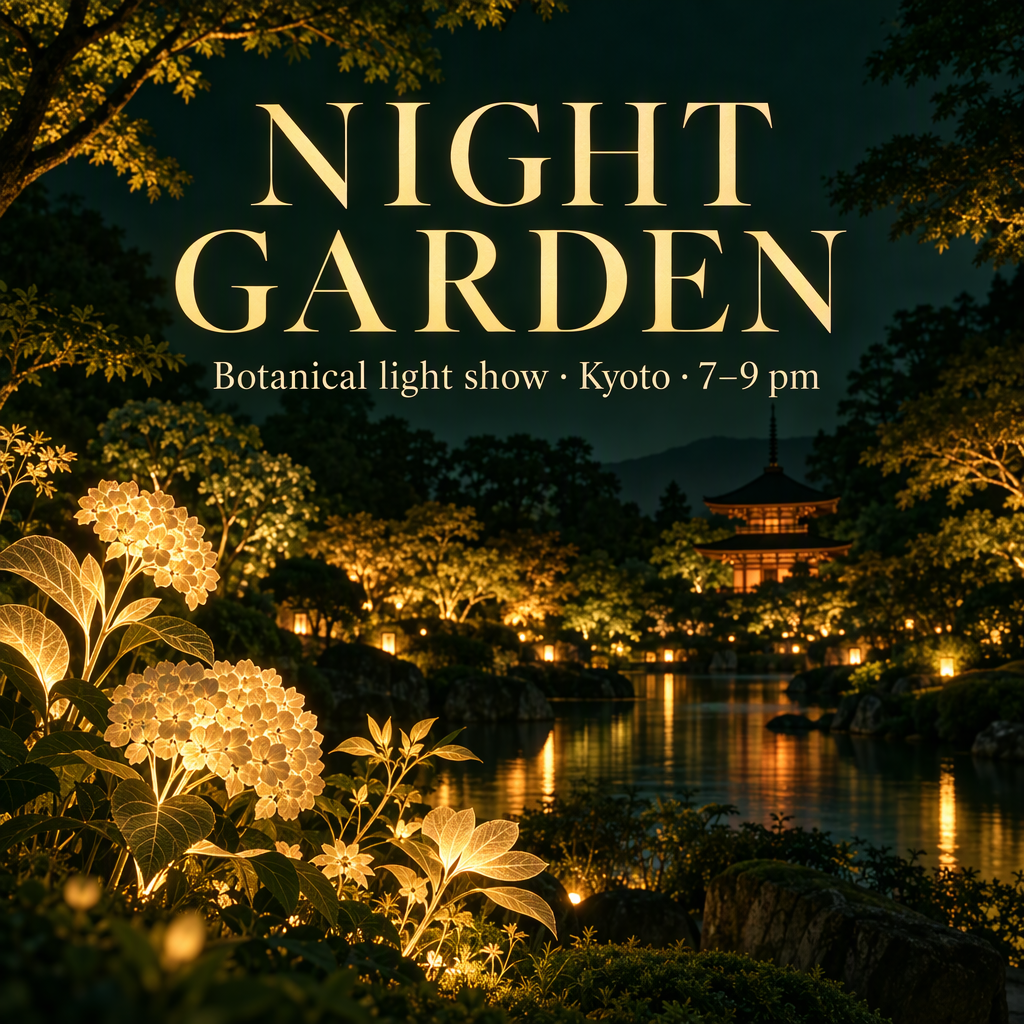 | 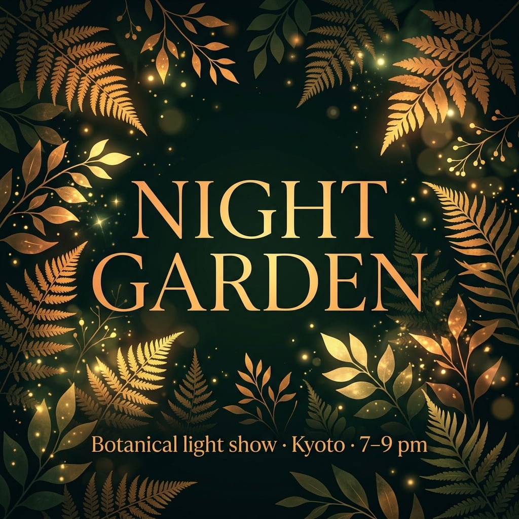 |
دونوں انگریزی پوسٹرز میں ایونٹ کا متن برقرار ہے۔ جی پی ٹی نے باغ، عمارتیں اور پانی تخلیق کیے۔ نینو بنانا 2.1 نے عنوان کو پودوں کے ساتھ فریم کیا اور سب ٹائٹل نیچے رکھا۔ اس کے جاپانی اور کوریائی ورژنز میں معلومات مرکزی طور پر گروپ ہیں۔
استعمال کا وقت: اگر گرافک، ٹائپوگرافی والا ایونٹ پوسٹر چاہیے تو نینو بنانا 2.1 سے شروع کریں۔ اگر ماحول والا کیمپین چاہیے تو جی پی ٹی سے شروع کریں۔ اگر اصل وینیو اہم ہو تو دونوں کو ریفرنس دیں؛ تخلیق شدہ عمارتیں اصل جگہ ظاہر نہیں کرتیں۔
جاپانی ورژن
| جی پی ٹی امیج 2.5 | نینو بنانا 2.1 |
|---|---|
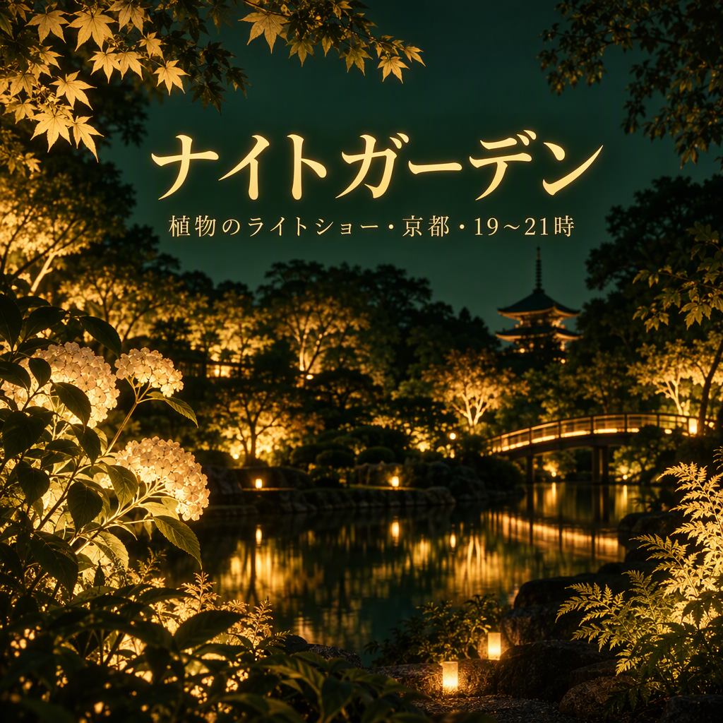 | 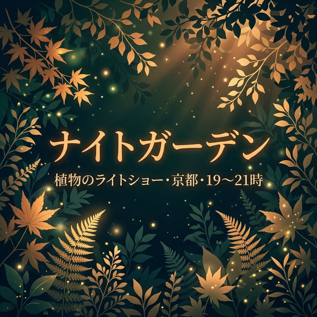 |
دونوں میں ナイトガーデン اور مقام/وقت کی معلومات ہیں۔ نینو بنانا نے عنوان اور سب ٹائٹل کو پودوں کے ساتھ مرکز میں رکھا؛ جی پی ٹی نے سب ٹائٹل چھوٹا اور باغ کا منظر تفصیل سے دکھایا۔ وقت کی علامت چیک کریں۔
کوریائی ورژن
| جی پی ٹی امیج 2.5 | نینو بنانا 2.1 |
|---|---|
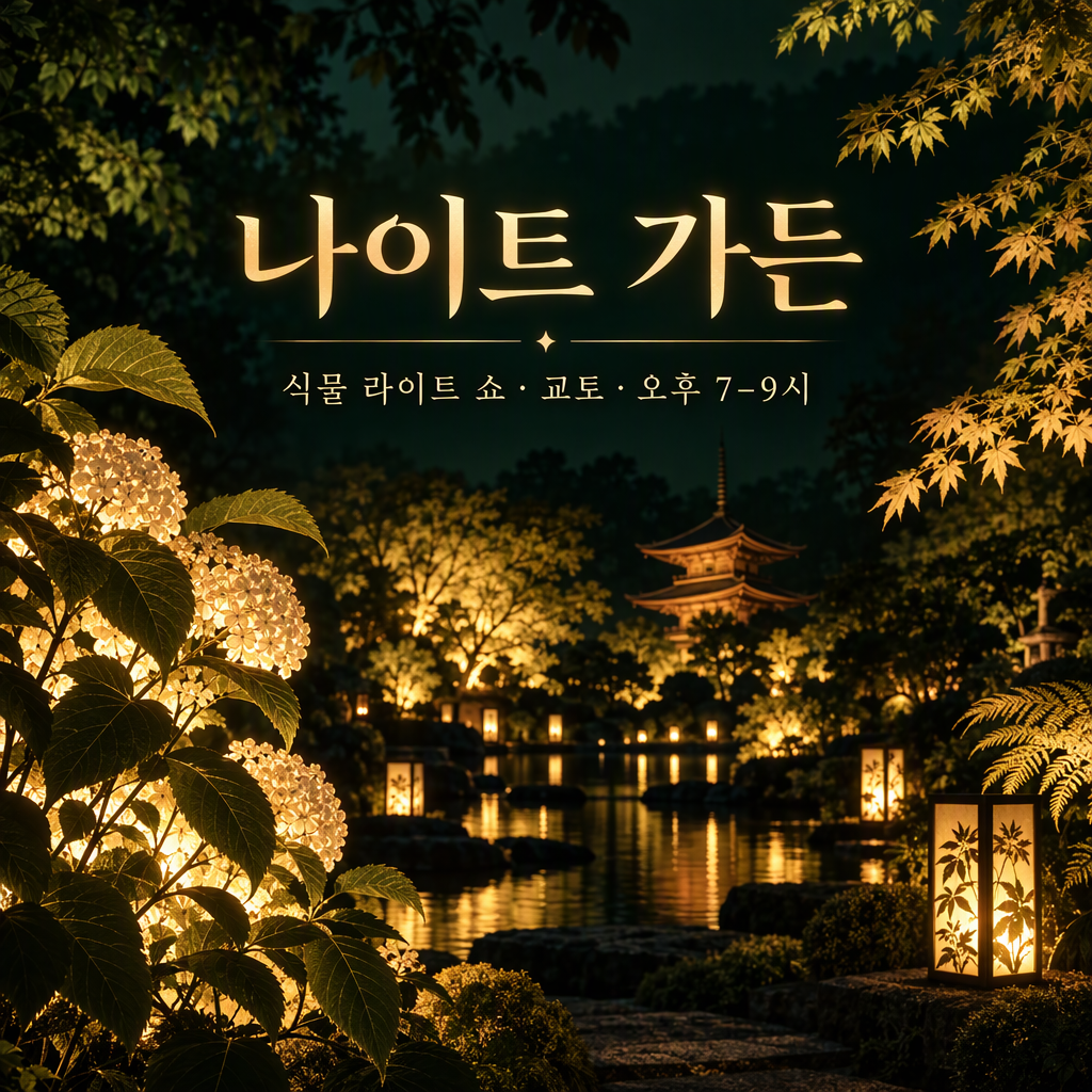 | 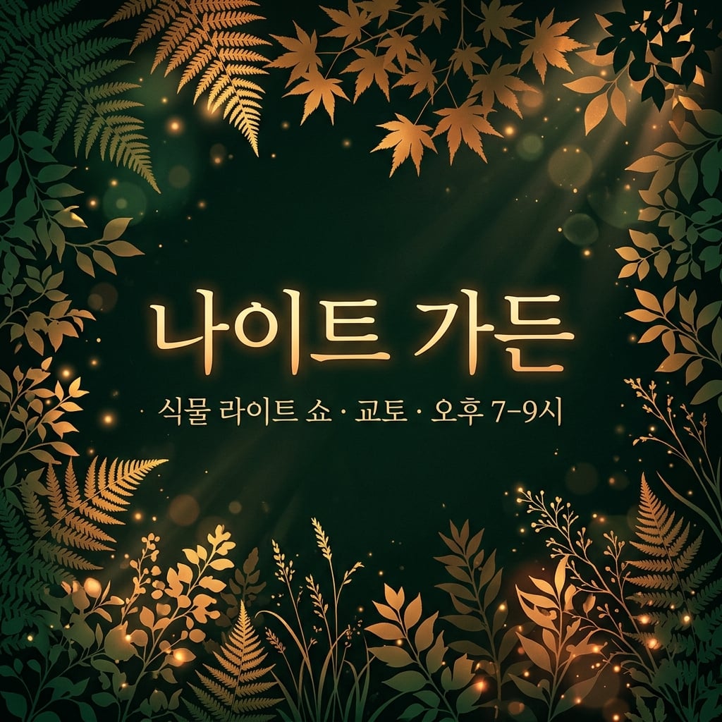 |
دونوں میں 나이트 가든 اور کوریائی مقام/وقت کی معلومات ہیں۔ نینو بنانا نے مرکزی متن کو نمایاں کیا؛ جی پی ٹی نے تخلیقی باغ کو نمایاں کیا۔ فرق کیمپین اسٹائل کا ہے، کوریائی درستگی کا نہیں۔
8. عددی انفوگرافکس
مشترکہ ہدایت: ایک زیرو بیس لائن پر چار بارز بنائیں: 40%, 25%, 20% اور 15%، درست لیبلز اور واضح نوٹ کے ساتھ۔
| جی پی ٹی امیج 2.5 | نینو بنانا 2.1 |
|---|---|
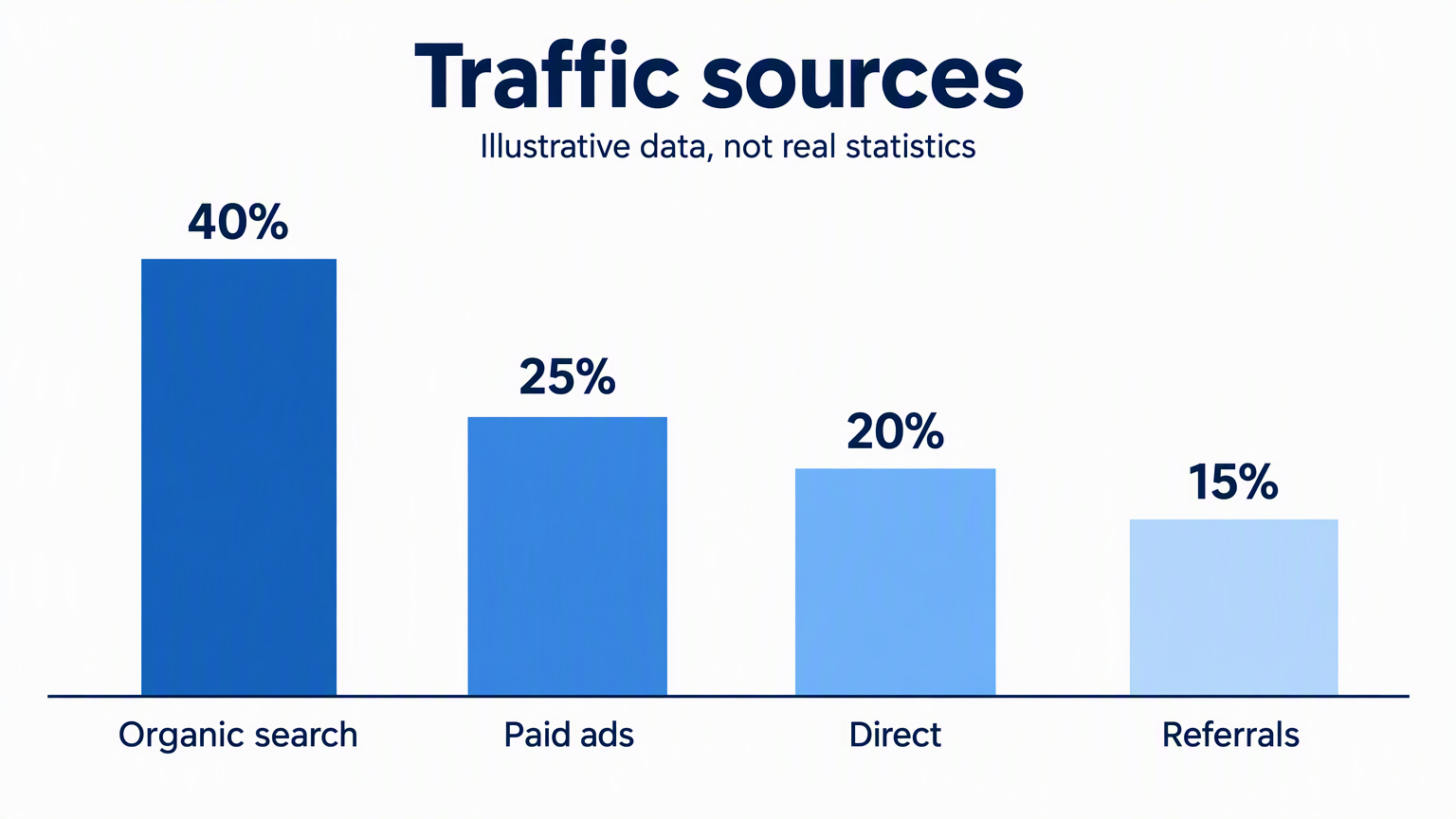 | 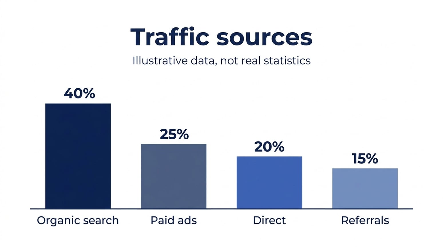 |
تمام چھ انگریزی، جاپانی اور کوریائی امیجز میں دکھائی گئی ویلیوز اور کیٹیگری لیبلز برقرار ہیں۔ بارز کو مزید چیک کریں۔ پہلے بار کو 40 پر نارملائز کرنے پر، انگریزی جی پی ٹی بارز تقریباً 25.6، 21.0 اور 16.3 پکسلز ہیں؛ نینو بنانا 2.1 بارز 24.7، 20.1 اور 15.6 ہیں۔ نینو بنانا 2.1 کے بارز تینوں زبانوں میں قریب تر ہیں، اگرچہ کوئی بھی بالکل درست نہیں۔
استعمال کا وقت: اس سادہ انفوگرافک کے لیے نینو بنانا 2.1 سے شروع کریں۔ اگر چارٹ کی جیومیٹری بالکل درست چاہیے تو ڈیٹا چارٹنگ ٹول استعمال کریں۔ بار کے اوپر درست فیصد لکھا ہونا بار کی اونچائی کی درستگی ثابت نہیں کرتا۔
جاپانی ورژن
| جی پی ٹی امیج 2.5 | نینو بنانا 2.1 |
|---|---|
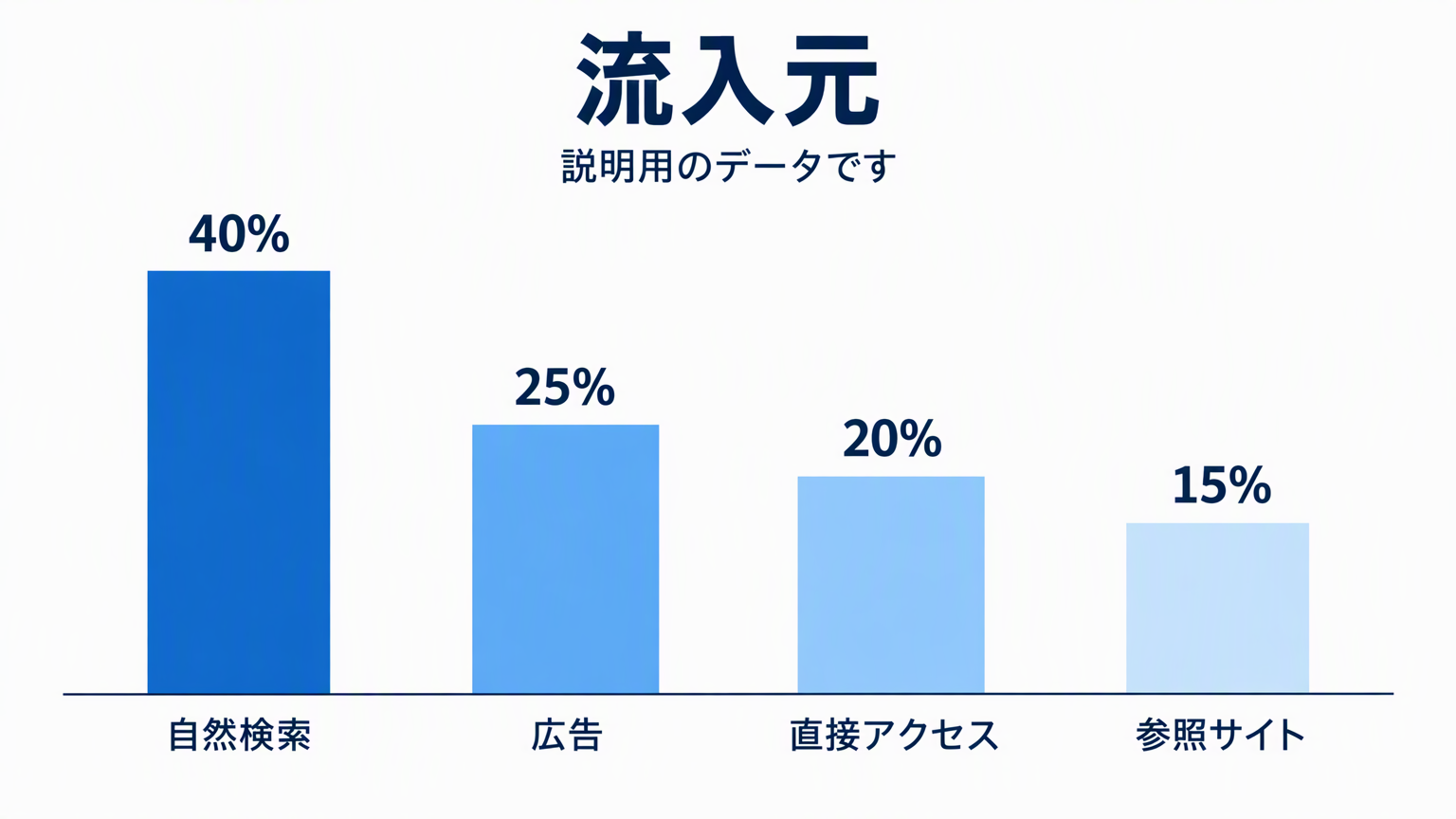 | 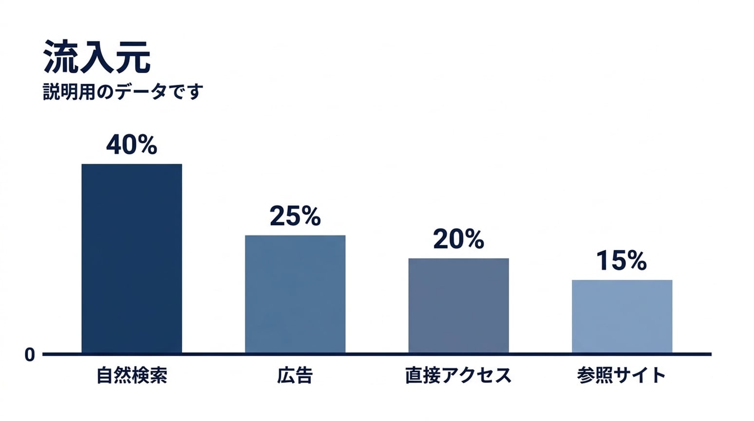 |
دونوں میں جاپانی لیبلز پڑھنے کے قابل ہیں۔ نینو بنانا نے زیرو مارکر شامل کیا۔ اس کے بار ریشوز قریب تر ہیں، لیکن سب سے چھوٹا بار اب بھی کچھ زیادہ ہے۔
کوریائی ورژن
| جی پی ٹی امیج 2.5 | نینو بنانا 2.1 |
|---|---|
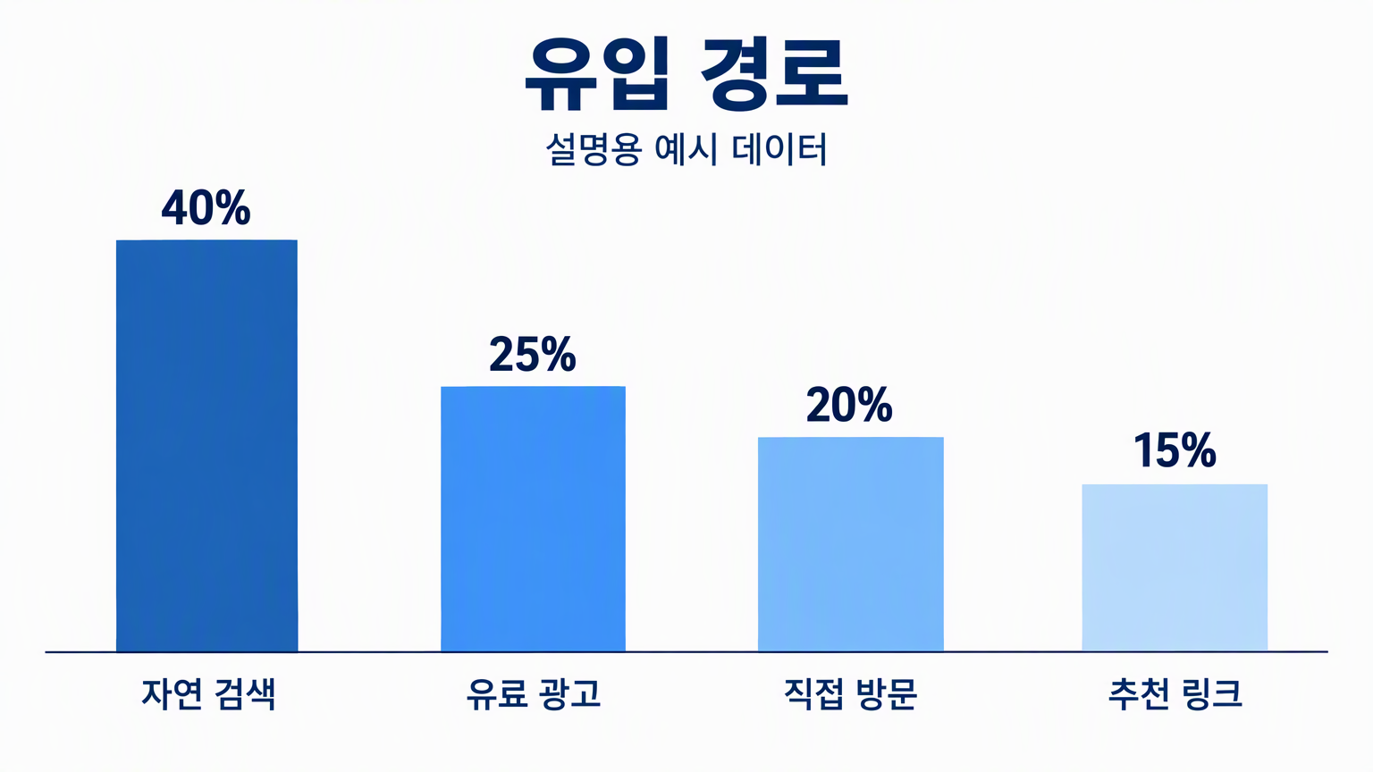 | 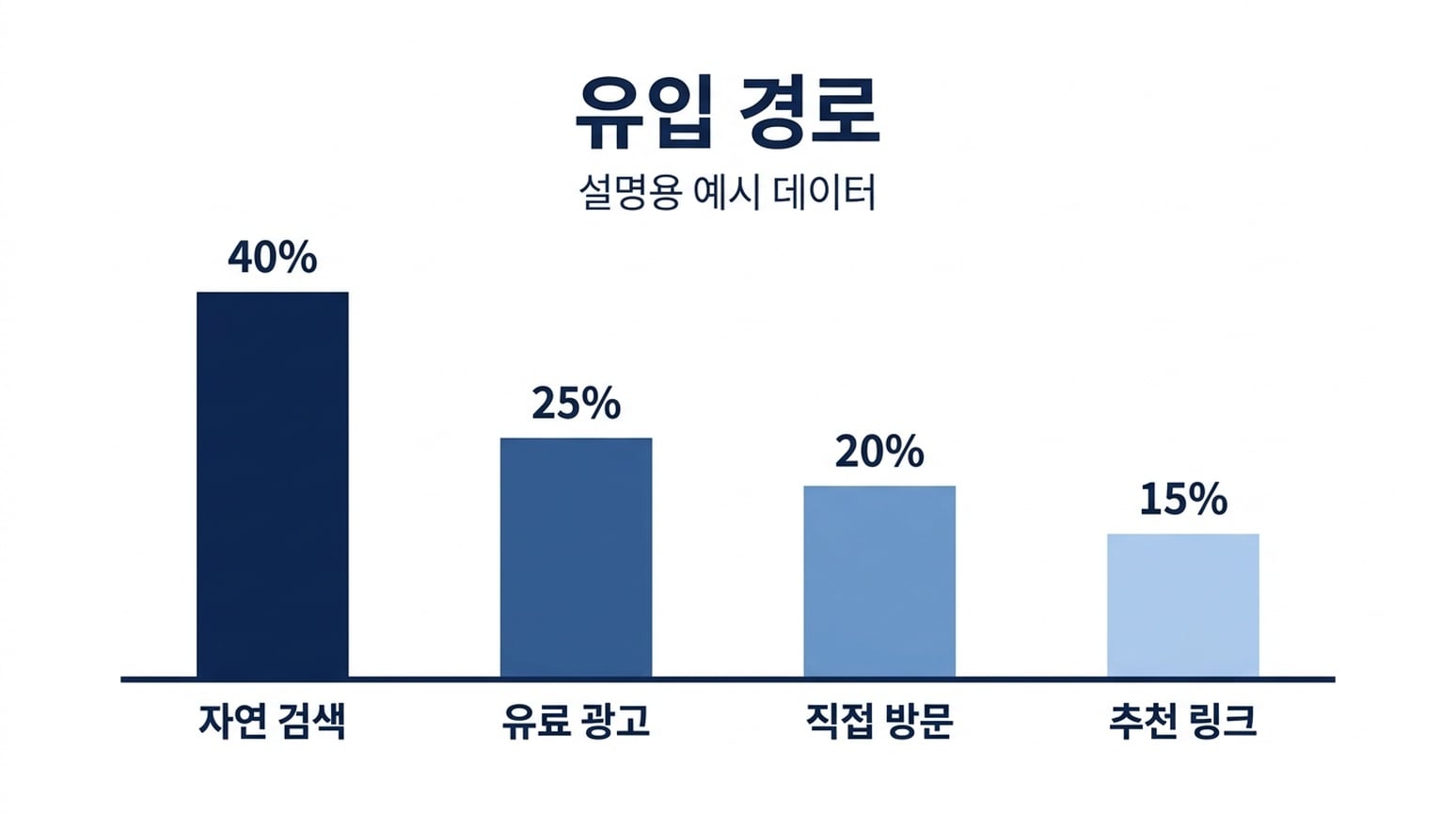 |
دونوں میں کوریائی لیبلز اور چار فیصد برقرار ہیں۔ ان زبانوں میں کوریائی نینو بنانا کا نتیجہ بار ہائٹ ریشوز کے قریب ہے۔ یہ اب بھی تخمینی امیج ہے، ڈیٹا سے تصدیق شدہ چارٹ نہیں۔
9. پراسیس ڈایاگرامز
مشترکہ ہدایت: Generate، Inspect اور Refine کو ترتیب وار دکھائیں، ہر ایک کے ساتھ اس کی سپورٹنگ لائن اور تیروں سے جڑا ہو۔
| جی پی ٹی امیج 2.5 | نینو بنانا 2.1 |
|---|---|
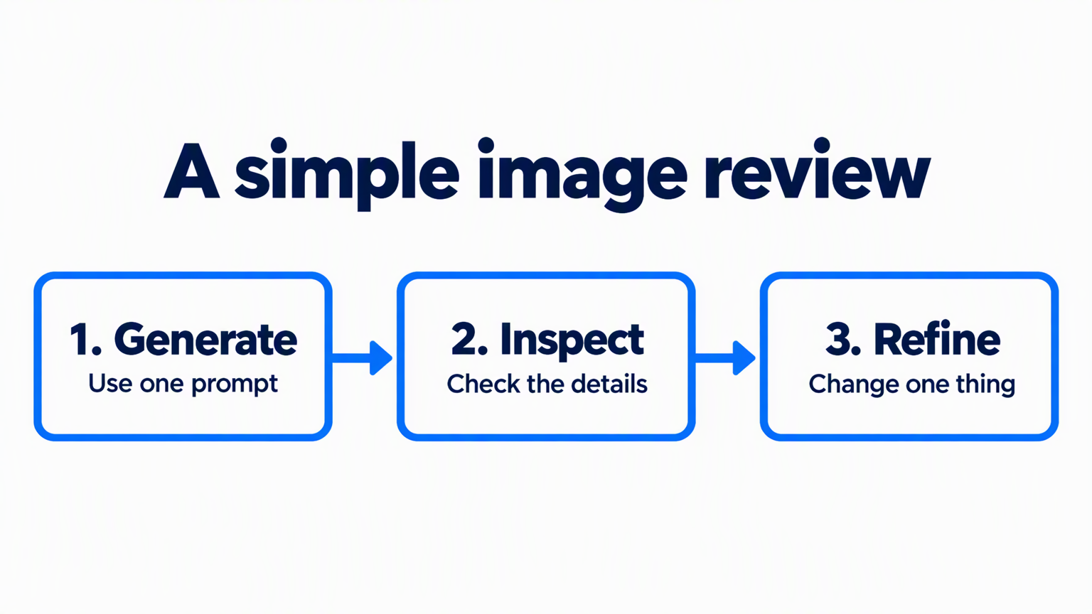 | 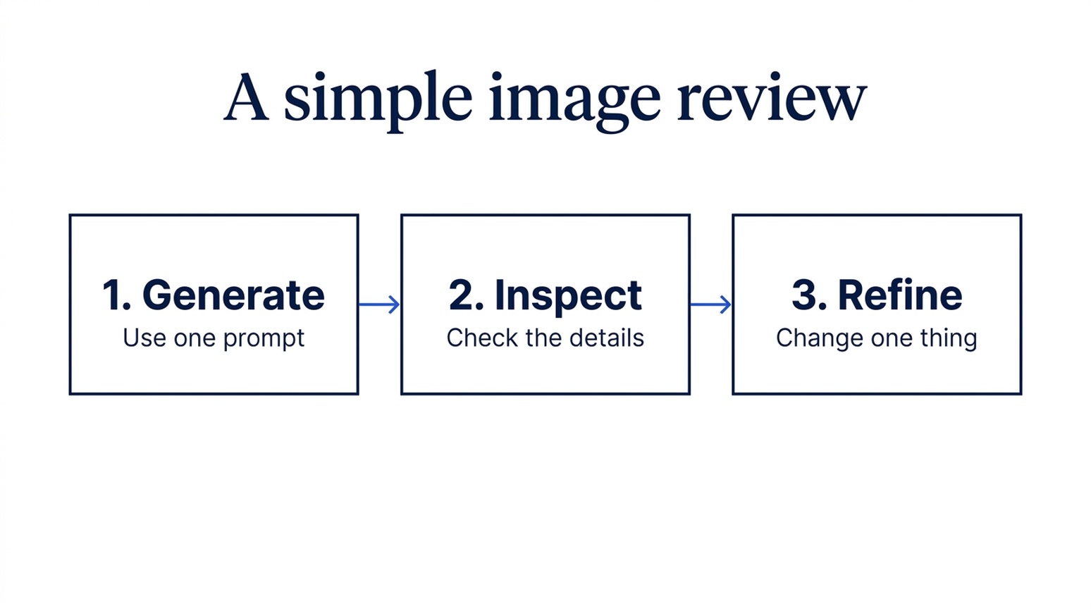 |
دونوں آؤٹ پٹس میں لیبلز، سپورٹنگ ٹیکسٹ اور تین مرحلوں کی ترتیب برقرار ہے۔ جی پی ٹی میں موٹے نیلے تیر اور گول فریم ہیں۔ نینو بنانا 2.1 میں پتلے کنیکٹرز اور سادہ باکسز ہیں۔ دونوں کو لینڈ اسکیپ فارمیٹ میں کہا گیا تھا۔
استعمال کا وقت: اگر تربیتی سلائیڈ میں ترتیب نمایاں چاہیے تو جی پی ٹی منتخب کریں۔ اگر رپورٹ میں سپورٹنگ پراسیس چاہیے تو نینو بنانا 2.1 منتخب کریں۔ مواد کی درستگی میں واضح فرق نہیں۔
10. سائنسی تصور کی وضاحتیں
مشترکہ ہدایت: سادہ ڈفیوزن پراسیس کی وضاحت کریں: چار شور والے سیمپلز، پھر چار ڈی نوائزنگ سیمپلز الٹی ترتیب میں۔
| جی پی ٹی امیج 2.5 | نینو بنانا 2.1 |
|---|---|
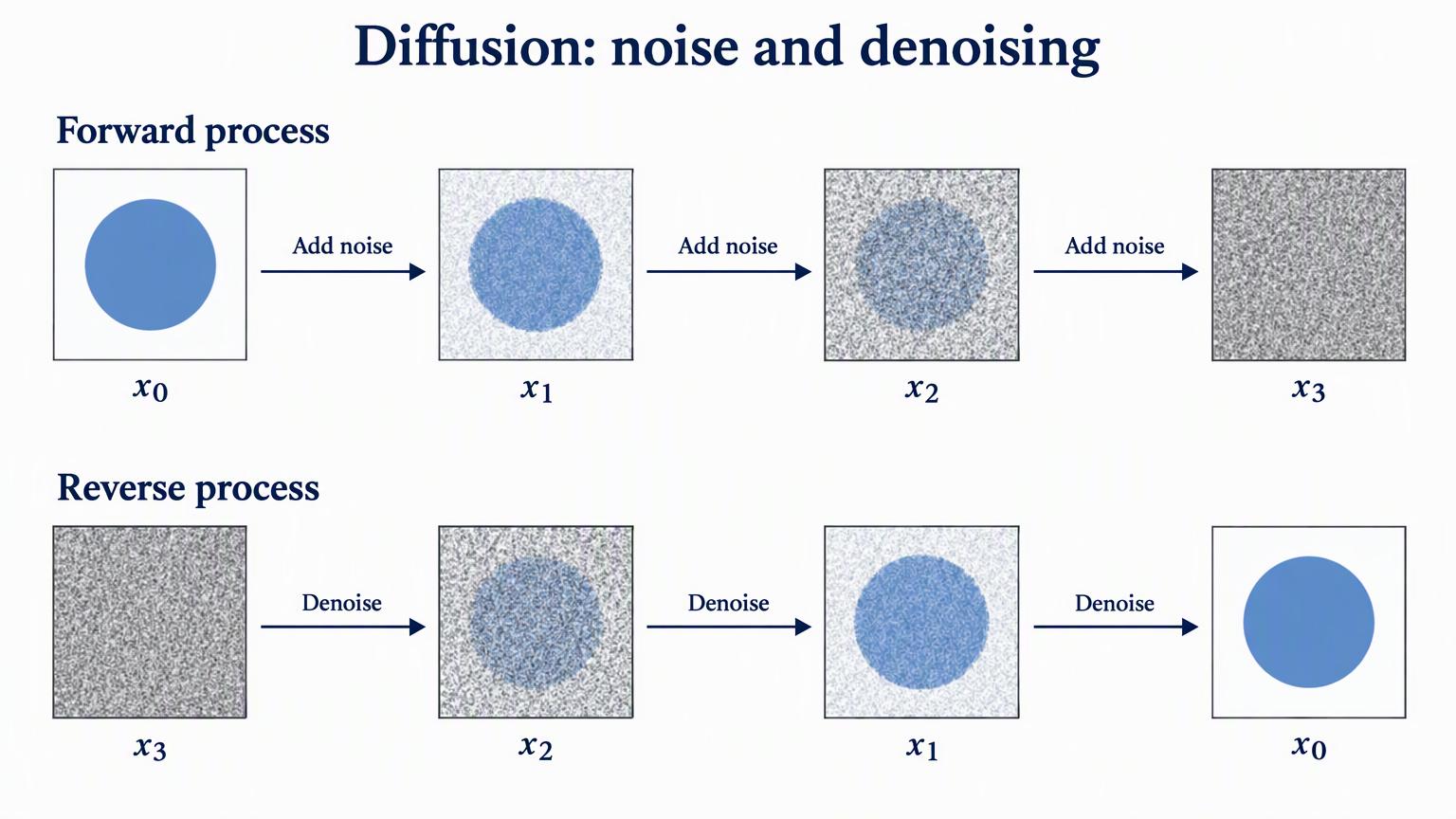 | 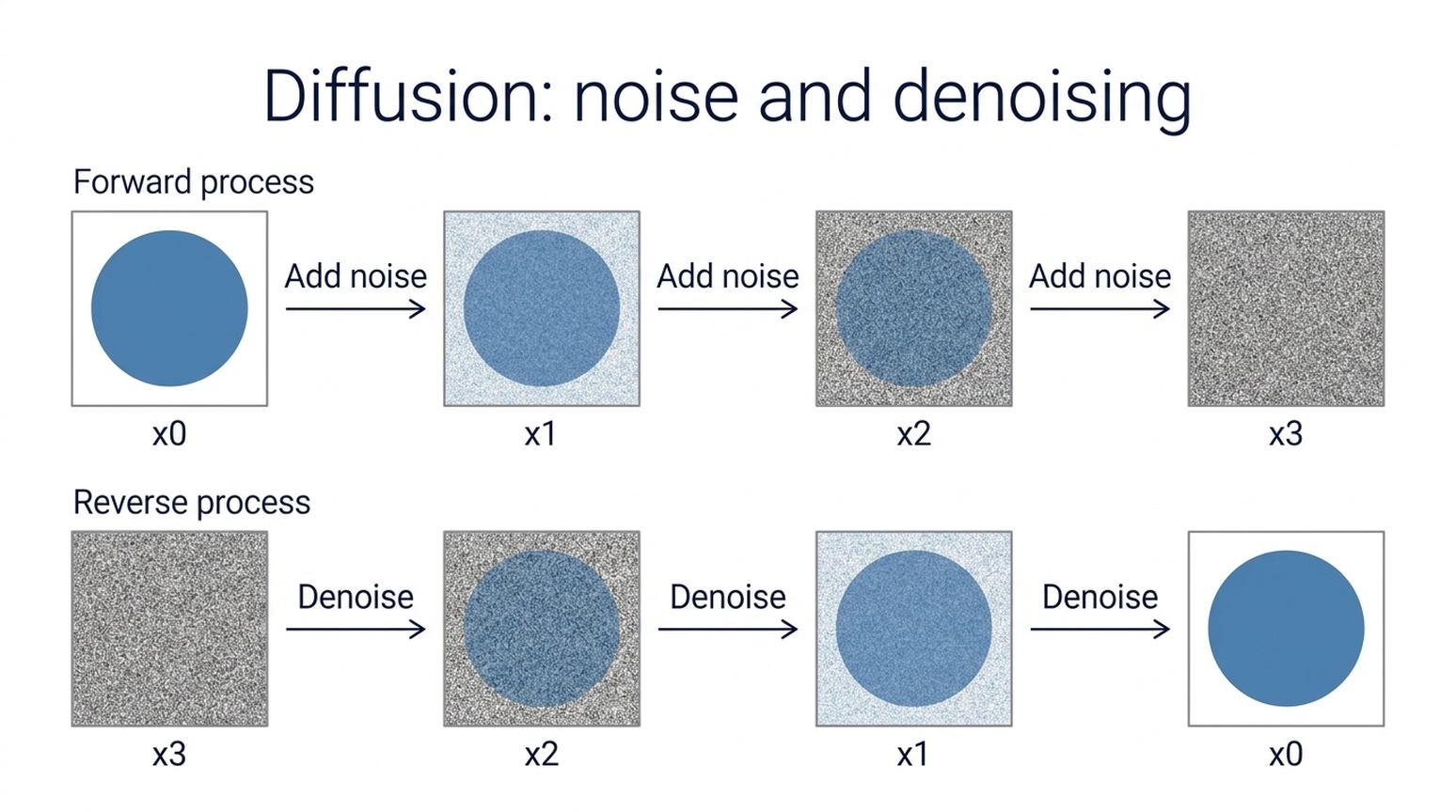 |
دونوں ماڈلز نے سیمپل کاؤنٹس، x0-to-x3 اور x3-to-x0 ترتیب اور تیر کی سمت برقرار رکھی۔ جی پی ٹی نے ریاضیاتی سب اسکرپٹس اور شور کی واضح ترقی دکھائی۔ نینو بنانا 2.1 میں سادہ لیبلز اور سادہ لے آؤٹ ہے۔
استعمال کا وقت: اگر پیپر اسٹائل وضاحتی شکل چاہیے تو جی پی ٹی سے شروع کریں، یا سیدھی کلاس روم سلائیڈ کے لیے نینو بنانا 2.1 آزمائیں۔ یہ تصوری خاکے ہیں، تجرباتی نتائج نہیں۔ اصل پیپر نوٹیشن اور پراسیس چیک کریں۔ بنیادی تصور Denoising Diffusion Probabilistic Models میں بیان ہوا ہے۔
11. ریسرچ میتھڈ اور ماڈل آرکیٹیکچر ڈایاگرامز
مشترکہ ہدایت: مین امیج پروسیسنگ پاتھ، فیچر فیوژن میں داخل ہونے والی ریفرنس برانچ، اور Input image سے Image decoder تک ڈیشڈ اسکیپ کنکشن دکھائیں۔
| جی پی ٹی امیج 2.5 | نینو بنانا 2.1 |
|---|---|
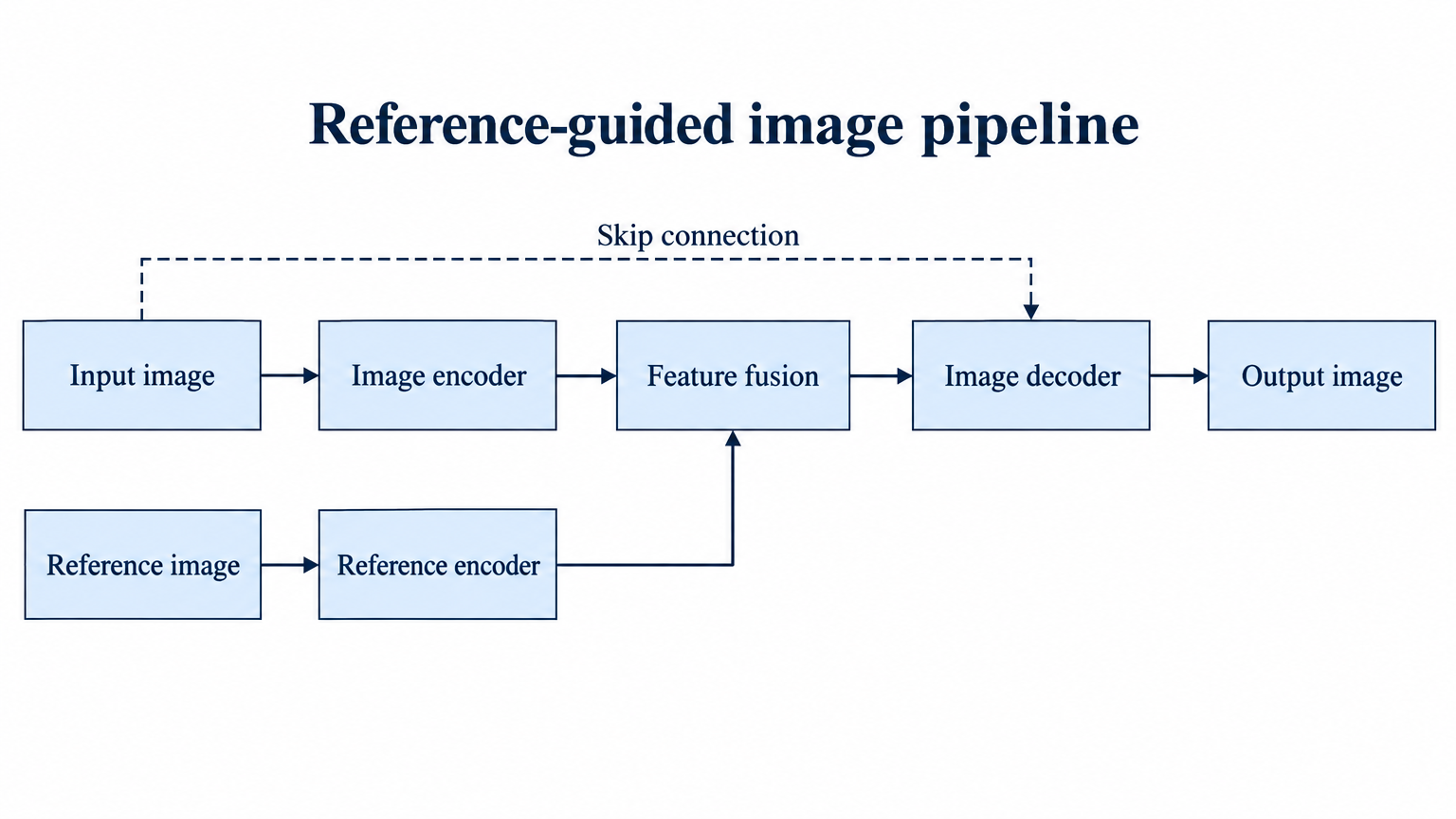 | 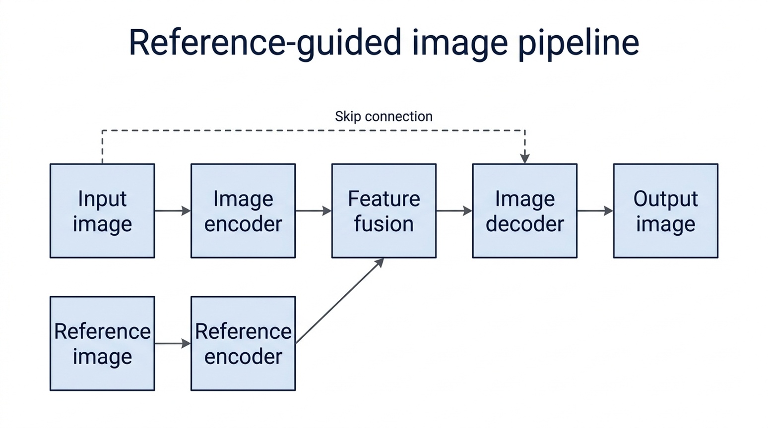 |
دونوں ماڈلز نے مین پاتھ، ریفرنس برانچ اور اسکیپ کنکشن کو مطلوبہ باکسز سے جوڑا۔ جی پی ٹی نے لمبے لیبلز کو چوڑے نوڈز میں رکھا اور واضح برانچ بنائی۔ نینو بنانا 2.1 نے لیبلز کو دو لائنوں میں تقسیم کیا، اس کے نیچے والے ریفرنس لیبلز باکس کے کنارے کے قریب ہیں۔
استعمال کا وقت: اس میتھڈ ڈایاگرام کے لیے جی پی ٹی سے شروع کریں کیونکہ کم ایڈجسٹمنٹ چاہیے۔ نینو بنانا 2.1 نے بھی درست ٹوپولوجی بنائی۔ فریم ورک فرضی ہے؛ اصل پیپر کے لیے ہر تیر کا آغاز، اختتام اور سمت چیک کریں۔
12. کہانی کی عکاسی اور کانسیپٹ آرٹ
مشترکہ ہدایت: ایک چھوٹا آبزرویٹری اور ماہر فلکیات کو شفاف چائے کے کپ میں کائی پر، نیلے جنگل میں رکھیں۔
| جی پی ٹی امیج 2.5 | نینو بنانا 2.1 |
|---|---|
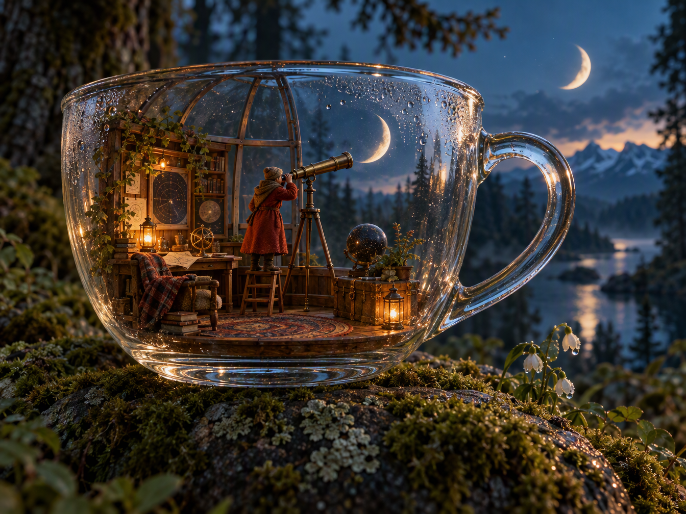 | 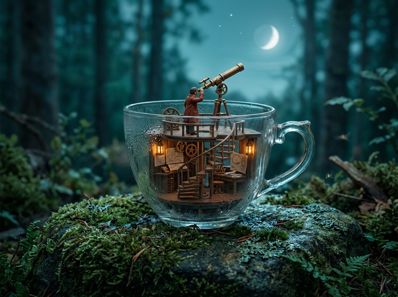 |
جی پی ٹی نے بھرپور سجاوٹ والا کمرہ اور شیشے کی عکاسی بنائی، لیکن دوسرا ہلال چاند بھی شامل کیا۔ نینو بنانا 2.1 نے سادہ آبزرویٹری اور ایک چاند کپ کے اوپر بنایا۔ دونوں نے ہر ہدایت کو مکمل طور پر لاگو نہیں کیا۔
استعمال کا وقت: اگر تفصیلی فینٹسی کانسیپٹ چاہیے تو جی پی ٹی سے شروع کریں اور اضافی چاند درست کریں۔ اگر پرسکون منی ایچر چاہیے تو نینو بنانا 2.1 آزمائیں۔ زیادہ تفصیلی امیج زیادہ وفادار نہیں۔
13. انٹیریئر ڈیزائن کانسیپٹس
مشترکہ ہدایت: ریڈنگ کیفے دکھائیں: بائیں طرف تین گول میزیں، کھڑکی کے ساتھ بک کیس، پیچھے کاؤنٹر اور درمیان میں خالی راستہ ہو۔
| جی پی ٹی امیج 2.5 | نینو بنانا 2.1 |
|---|---|
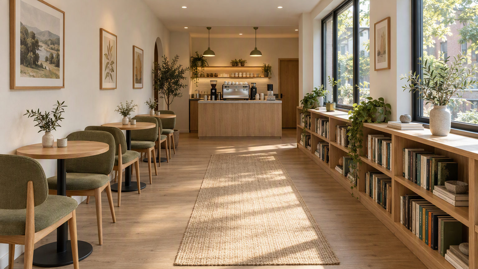 | 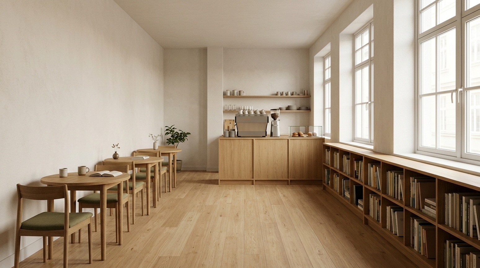 |
جی پی ٹی نے سائیڈ لائٹ، اوک بناوٹ اور زیتونی اپہولسٹری کو نمایاں کیا، اور قالین، آرٹ ورک اور پودے شامل کیے۔ نینو بنانا 2.1 میں کم سجاوٹ اور سیدھا منظر ہے۔ پیچھے کا فرنیچر اوورلیپ کرتا ہے، اس لیے میز اور کرسیوں کی گنتی چیک کریں۔
استعمال کا وقت: اگر ماحول والا کلائنٹ کانسیپٹ چاہیے تو جی پی ٹی سے شروع کریں؛ اگر سادہ سمت چاہیے تو نینو بنانا 2.1 آزمائیں۔ کوئی بھی پرسپیکٹو امیج پیمائش، راستے یا قابل تعمیر پلان ثابت نہیں کرتا۔
اپنے کام کے لیے انتخاب
تھمب نیل یا پروڈکٹ ڈیٹیل ہیرو کے لیے، جی پی ٹی امیج 2.5 نمایاں متن اور ڈیٹیل کراپس کے لیے موزوں ہے۔ ٹائپوگرافی والے ایونٹ پوسٹرز کے لیے، نینو بنانا 2.1 گرافک سمت فراہم کرتا ہے۔ بار چارٹ کے لیے، اس کی جیومیٹری تینوں زبانوں میں قریب تر رہی۔
ریفرنس پروڈکٹس کے لیے، پہلے آبجیکٹ چیک کریں۔ سائنسی شکلوں کے لیے، رشتے چیک کریں۔ مقامی مارکیٹنگ کے لیے، اصل ہدف زبان کی امیج چیک کریں: چینی چیک لسٹ میں اضافی انگریزی سب ٹائٹل جاپانی اور کوریائی نمونوں میں نہیں آیا۔
ان Felo ٹولز سے اپنی تصاویر بنائیں
اوپر دی گئی مثالوں کی بنیاد پر ایک ابتدائی ٹول منتخب کریں:
| آپ کا کام | تجویز کردہ Felo ٹول |
|---|---|
| پروڈکٹ کی تفصیل گرافکس، نمایاں تھمب نیل یا تحقیق کے طریقہ کار کے ڈایاگرام ڈرافٹ | GPT Image 2.5 |
| ایونٹ پوسٹرز، سادہ علم کارڈز یا آسان بار چارٹ ڈرافٹ | Nano Banana 2.1 |
| ماڈل منتخب کرنے سے پہلے تصویر کا خیال دریافت کریں | AI Image |
نیچے دیئے گئے ضمیمہ سے مماثل پرامپٹ کاپی کریں۔ منصفانہ موازنہ کے لیے دونوں ماڈل ٹولز میں ایک ہی پرامپٹ، حوالہ تصویر اور بالکل وہی انگریزی، جاپانی یا کورین عبارت استعمال کریں۔ اشاعت سے پہلے پروڈکٹ کی تفصیلات، لیبلز اور ڈیٹا کا جائزہ لیں۔
جنریشن اور ریویو نوٹس
آرٹیکل میں 23 جوڑے ہیں: 13 مرکزی کیسز اور دس اضافی جاپانی/کوریائی ورژنز، کل 46 موازنہ امیجز۔ ہر جوڑا ایک ہی پرامپٹ اور جہاں ضروری ہو، ایک ہی ریفرنس استعمال کرتا ہے۔ جی پی ٹی نے ePhone GPT Image 2.5 Sunburst اسکل پر ہائی کوالٹی میں رن کیا؛ نینو بنانا 2.1 نے اسکل ڈیفالٹس استعمال کیے۔ کوالٹی سیٹنگز اور لاگت برابر نہیں۔ ہر رن میں پہلا کامیاب نتیجہ رکھا اور مواد میں کوئی تبدیلی نہیں کی۔
متن کی مشاہدات بصری چیک ہیں، مقامی زبان کی تصدیق یا بار بار ٹیسٹ نہیں۔ چھوٹے حروف، جاپانی وقت کی علامت اور کوریائی اسپیسنگ کی ڈیلیوری چیک کریں۔ بار کے تناسب پکسلز سے تقریباً ناپے گئے اور اینٹی ایلائزنگ سے متاثر ہو سکتے ہیں۔ کلک تھرو ریٹ، کنورژن ریٹ یا بار بار رن کی جانچ نہیں ہوئی۔
موازنوں میں استعمال شدہ درست پرامپٹس
دونوں ماڈلز میں ایک ہی پرامپٹ اور ریفرنس امیج استعمال کریں۔ پروڈکٹ ریفرنس اوپر دکھایا گیا ہے۔
Ecommerce White
Create a square ecommerce catalog photograph using the supplied blue travel mug as the exact product reference. Preserve the cobalt-blue ceramic body, the curved handle on the left, the ivory drinking lid, the lid opening, the body proportions and surface texture. Remove the limestone block and the original environment. Show the complete mug centered on a pure white background, three-quarter view, with one subtle natural contact shadow beneath it. Product fills about 75% of the canvas height. No added objects, no text, no logo, no badge, no watermark. Do not redesign the product. Square 1:1.
Ecommerce Lifestyle
Create a realistic landscape lifestyle advertising photograph using the supplied blue travel mug as the exact product reference. Preserve its cobalt-blue ceramic body, curved handle, ivory drinking lid, and proportions. Place the complete mug on a light oak breakfast table next to one closed linen notebook in a quiet sunlit apartment kitchen. The mug is the sharp hero subject on the left third; the kitchen is softly out of focus. Warm morning light comes from the left. Leave the right third uncluttered as copy space. Natural believable scale and contact shadows. No people, no additional mugs, no text, no logo, no watermark. Landscape 16:9.
Academic Diffusion
Create a scientifically correct schematic for explaining a diffusion model in an academic presentation. Landscape 16:9, white background, precise thin lines, navy text, muted blue and gray palette, no decorative scenery. Exact title: 'Diffusion: noise and denoising'. Two clearly separated horizontal rows, each containing exactly four square image samples. The top row is labeled 'Forward process'. Its samples run left to right: a clean blue circle labeled 'x0', a lightly noisy version labeled 'x1', a very noisy version labeled 'x2', pure gray noise labeled 'x3'. Connect adjacent samples with three right-pointing arrows, each labeled 'Add noise'. The bottom row is labeled 'Reverse process'. Its samples run left to right: pure gray noise labeled 'x3', a very noisy blue circle labeled 'x2', a lightly noisy circle labeled 'x1', a clean blue circle labeled 'x0'. Connect adjacent samples with three right-pointing arrows, each labeled 'Denoise'. Preserve these exact labels, arrow directions, sample counts, and ordering. This is a conceptual explanation, not experimental results. No equations, no additional labels, no 3D, no watermark.
Interior Concept
Create a photorealistic interior design concept image of a small contemporary reading cafe, landscape 16:9. Wide view from the entrance at eye level, a clear continuous central aisle leading to the rear counter. Along the left wall, exactly three small round oak tables, each with exactly two chairs. Along the right wall, one continuous low oak bookcase beneath large windows. A compact coffee counter is centered on the rear wall. Warm white plaster, light oak, muted olive textiles, soft morning daylight from the right, believable furniture scale, coherent straight perspective, no people, no signage, no text, no extra tables, no watermark.
Academic Method
Create a precise academic method diagram for a hypothetical reference-guided image pipeline. White background, landscape 16:9, navy text, thin dark arrows, restrained pale blue rectangles, generous spacing, no decorative imagery. Exact title: 'Reference-guided image pipeline'. Use exactly seven boxes, each label appearing once. The main row runs left to right: 'Input image' -> 'Image encoder' -> 'Feature fusion' -> 'Image decoder' -> 'Output image'. A second row below the first two boxes contains 'Reference image' -> 'Reference encoder'. Draw one arrow from 'Reference encoder' upward and to the right into 'Feature fusion'. Draw one additional dashed skip-connection arrow from 'Input image' to 'Image decoder', routed above the main row and labeled exactly 'Skip connection'. All seven connectors must terminate on the specified boxes; do not connect the reference branch directly to the output or decoder. Keep every label readable and every box distinct. No extra boxes, no other labels, no graph statistics, no equations, no watermark. This is a hypothetical diagram, not an architecture attributed to a real paper.
Fantasy Scene
A cinematic editorial illustration of a tiny observatory built inside a clear glass teacup, resting on a moss-covered stone in a quiet forest at blue hour. A miniature astronomer in a rust-red coat looks through a brass telescope at a luminous crescent moon visible through the cup. Delicate reflections and condensation on the glass, rich tactile detail, restrained teal and amber palette, storybook realism, carefully composed, no text, no letters, landscape 4:3.
Product Concept
A premium studio product photograph of a matte cobalt-blue ceramic travel mug with an ivory lid, standing on a pale limestone block. Three-quarter view, soft morning window light from the upper left, subtle condensation, warm off-white background, generous negative space on the right, no logo, no text, no extra objects, realistic commercial photography, landscape 4:3.
Process Infographic
Create a clear horizontal infographic titled “A simple image review”. Show exactly three connected panels in this order, with these exact labels: “1. Generate”, “2. Inspect”, “3. Refine”. Add one small line under each: “Use one prompt”, “Check the details”, “Change one thing”. Flat editorial vector style, navy text, cobalt-blue connectors, white background, evenly spaced panels, no icons, no extra words, 16:9.
انگریزی، جاپانی اور کوریائی موازنہ پرامپٹس
ecommerce-detail-en
Language: English. Requested size: 1024x1280.
Specified text:
- Three details. One mug.
- Ceramic body
- Ivory lid
- Curved handle
Create a portrait ecommerce product detail graphic using the supplied blue travel mug as the exact product reference. Preserve its cobalt-blue ceramic body, left handle, ivory drinking lid, proportions, and texture. Put one full product view in the center, with three small circular detail crops around it: the ceramic body surface, the ivory lid, and the curved handle. Each detail crop must correspond to the same product. Add exactly this English headline: "Three details. One mug.". Add exactly these three labels next to their corresponding detail crops: "Ceramic body", "Ivory lid", "Curved handle". All text must be in English; do not add translations or another language. Use thin connector lines that point to the correct feature, generous spacing, a warm off-white background, navy text, refined commercial editorial layout. No invented performance claims, no numbers, no prices, no other words, no watermark. Portrait 4:5.
Reference: shared mug
data-infographic-en
Language: English. Requested size: 1536x864.
Specified text:
- Traffic sources
- Illustrative data, not real statistics
- Organic search
- Paid ads
- Direct
- Referrals
- 40%
- 25%
- 20%
- 15%
Design a precise flat vector infographic on a white background, landscape 16:9. Exact English title: "Traffic sources". Exact small subtitle: "Illustrative data, not real statistics". Draw exactly four vertical bars on one common zero baseline, left to right with these exact labels and values: "Organic search" 40%, "Paid ads" 25%, "Direct" 20%, "Referrals" 15%. Bar heights must be proportional to 40, 25, 20, 15: the first is tallest, the second is 62.5% of its height, the third is 50%, and the fourth is 37.5%. Put each value directly above its own bar and its category directly below. Use four restrained shades of blue, navy text, wide margins, readable typography. All text must be in English, with no translations or additional words. No perspective, no 3D, no icons, no extra charts, no watermark.
video-thumbnail-en
Language: English. Requested size: 1536x864.
Specified text:
- BETTER PHONE PHOTOS
- 3 COMPOSITION TIPS
Create a polished landscape 16:9 YouTube thumbnail for a English-language smartphone photography tutorial. On the left, a realistic close view of two hands holding one smartphone horizontally, its screen visibly framing the same neon-lit city street seen behind it. Use dramatic but believable teal and warm orange night lighting, a strong focal subject and crisp silhouettes. On the right, add exactly these two text strings in two distinct title groups: "BETTER PHONE PHOTOS" and "3 COMPOSITION TIPS". The first is larger; both must be readable at a thumbnail width of 320 pixels. Use bold high-contrast ivory typography with a subtle dark outline. Typography and line breaks must be natural for English, preserving every character exactly. All background signs must be abstract and unreadable. No other readable words, no translations, no camera brands, no logos, no comparison panels, no watermark. Keep all text inside the frame with generous margins.
event-poster-en
Language: English. Requested size: 1024x1024.
Specified text:
- NIGHT GARDEN
- Botanical light show · Kyoto · 7–9 pm
Design a square event poster with exactly this English headline: "NIGHT GARDEN". Add exactly this subtitle: "Botanical light show · Kyoto · 7–9 pm". Use luminous botanical silhouettes, deep forest green and warm amber, refined editorial typography, clear contrast, balanced margins, all text fully inside the canvas. Use natural English typography and line breaks without changing any characters. No other words, no translations, no logos, no watermark.
social-knowledge-en
Language: English. Requested size: 1024x1280.
Specified text:
- Weekend packing checklist
- Documents
- ID, tickets
- Clothes
- Jacket, spare clothes
- Electronics
- Phone, charger
- Toiletries
- Toothbrush, towel
- Bags
- Suitcase, organizers
- Essentials
- Tissues, umbrella
Design a readable portrait 4:5 English knowledge card for a travel packing checklist. Exact headline: "Weekend packing checklist". Use exactly six equal cards in a two-column by three-row grid. Left to right, top to bottom, each card has exactly this heading and one text line: "Documents" with "ID, tickets"; "Clothes" with "Jacket, spare clothes"; "Electronics" with "Phone, charger"; "Toiletries" with "Toothbrush, towel"; "Bags" with "Suitcase, organizers"; "Essentials" with "Tissues, umbrella". One simple relevant flat icon per card. Clean cream background, navy typography, restrained blue and orange accents, clear title hierarchy, comfortable whitespace, no overlapping elements. Use natural English typography and line breaks. Preserve all specified text and punctuation exactly. No extra copy, no translations, no other languages, no watermark.
ecommerce-detail-ja
Language: Japanese. Requested size: 1024x1280.
Specified text:
- カップの3つのディテール
- 陶器の本体
- アイボリーのふた
- カーブした持ち手
Create a portrait ecommerce product detail graphic using the supplied blue travel mug as the exact product reference. Preserve its cobalt-blue ceramic body, left handle, ivory drinking lid, proportions, and texture. Put one full product view in the center, with three small circular detail crops around it: the ceramic body surface, the ivory lid, and the curved handle. Each detail crop must correspond to the same product. Add exactly this Japanese headline: "カップの3つのディテール". Add exactly these three labels next to their corresponding detail crops: "陶器の本体", "アイボリーのふた", "カーブした持ち手". All text must be in Japanese; do not add translations or another language. Use thin connector lines that point to the correct feature, generous spacing, a warm off-white background, navy text, refined commercial editorial layout. No invented performance claims, no numbers, no prices, no other words, no watermark. Portrait 4:5.
Reference: shared mug
data-infographic-ja
Language: Japanese. Requested size: 1536x864.
Specified text:
- 流入元
- 説明用のデータです
- 自然検索
- 広告
- 直接アクセス
- 参照サイト
- 40%
- 25%
- 20%
- 15%
Design a precise flat vector infographic on a white background, landscape 16:9. Exact Japanese title: "流入元". Exact small subtitle: "説明用のデータです". Draw exactly four vertical bars on one common zero baseline, left to right with these exact labels and values: "自然検索" 40%, "広告" 25%, "直接アクセス" 20%, "参照サイト" 15%. Bar heights must be proportional to 40, 25, 20, 15: the first is tallest, the second is 62.5% of its height, the third is 50%, and the fourth is 37.5%. Put each value directly above its own bar and its category directly below. Use four restrained shades of blue, navy text, wide margins, readable typography. All text must be in Japanese, with no translations or additional words. No perspective, no 3D, no icons, no extra charts, no watermark.
video-thumbnail-ja
Language: Japanese. Requested size: 1536x864.
Specified text:
- スマホで映える写真
- 構図のコツ3選
Create a polished landscape 16:9 YouTube thumbnail for a Japanese-language smartphone photography tutorial. On the left, a realistic close view of two hands holding one smartphone horizontally, its screen visibly framing the same neon-lit city street seen behind it. Use dramatic but believable teal and warm orange night lighting, a strong focal subject and crisp silhouettes. On the right, add exactly these two text strings in two distinct title groups: "スマホで映える写真" and "構図のコツ3選". The first is larger; both must be readable at a thumbnail width of 320 pixels. Use bold high-contrast ivory typography with a subtle dark outline. Typography and line breaks must be natural for Japanese, preserving every character exactly. All background signs must be abstract and unreadable. No other readable words, no translations, no camera brands, no logos, no comparison panels, no watermark. Keep all text inside the frame with generous margins.
event-poster-ja
Language: Japanese. Requested size: 1024x1024.
Specified text:
- ナイトガーデン
- 植物のライトショー・京都・19〜21時
Design a square event poster with exactly this Japanese headline: "ナイトガーデン". Add exactly this subtitle: "植物のライトショー・京都・19〜21時". Use luminous botanical silhouettes, deep forest green and warm amber, refined editorial typography, clear contrast, balanced margins, all text fully inside the canvas. Use natural Japanese typography and line breaks without changing any characters. No other words, no translations, no logos, no watermark.
social-knowledge-ja
Language: Japanese. Requested size: 1024x1280.
Specified text:
- 週末旅行の持ち物リスト
- 書類
- 身分証、チケット
- 衣類
- 上着、着替え
- 電子機器
- スマホ、充電器
- 洗面用品
- 歯ブラシ、タオル
- 収納
- スーツケース、収納袋
- 日用品
- ティッシュ、傘
Design a readable portrait 4:5 Japanese knowledge card for a travel packing checklist. Exact headline: "週末旅行の持ち物リスト". Use exactly six equal cards in a two-column by three-row grid. Left to right, top to bottom, each card has exactly this heading and one text line: "書類" with "身分証、チケット"; "衣類" with "上着、着替え"; "電子機器" with "スマホ、充電器"; "洗面用品" with "歯ブラシ、タオル"; "収納" with "スーツケース、収納袋"; "日用品" with "ティッシュ、傘". One simple relevant flat icon per card. Clean cream background, navy typography, restrained blue and orange accents, clear title hierarchy, comfortable whitespace, no overlapping elements. Use natural Japanese typography and line breaks. Preserve all specified text and punctuation exactly. No extra copy, no translations, no other languages, no watermark.
ecommerce-detail-ko
Language: Korean. Requested size: 1024x1280.
Specified text:
- 컵의 세 가지 디테일
- 세라믹 바디
- 아이보리 뚜껑
- 곡선형 손잡이
Create a portrait ecommerce product detail graphic using the supplied blue travel mug as the exact product reference. Preserve its cobalt-blue ceramic body, left handle, ivory drinking lid, proportions, and texture. Put one full product view in the center, with three small circular detail crops around it: the ceramic body surface, the ivory lid, and the curved handle. Each detail crop must correspond to the same product. Add exactly this Korean headline: "컵의 세 가지 디테일". Add exactly these three labels next to their corresponding detail crops: "세라믹 바디", "아이보리 뚜껑", "곡선형 손잡이". All text must be in Korean; do not add translations or another language. Use thin connector lines that point to the correct feature, generous spacing, a warm off-white background, navy text, refined commercial editorial layout. No invented performance claims, no numbers, no prices, no other words, no watermark. Portrait 4:5.
Reference: shared mug
data-infographic-ko
Language: Korean. Requested size: 1536x864.
Specified text:
- 유입 경로
- 설명용 예시 데이터
- 자연 검색
- 유료 광고
- 직접 방문
- 추천 링크
- 40%
- 25%
- 20%
- 15%
Design a precise flat vector infographic on a white background, landscape 16:9. Exact Korean title: "유입 경로". Exact small subtitle: "설명용 예시 데이터". Draw exactly four vertical bars on one common zero baseline, left to right with these exact labels and values: "자연 검색" 40%, "유료 광고" 25%, "직접 방문" 20%, "추천 링크" 15%. Bar heights must be proportional to 40, 25, 20, 15: the first is tallest, the second is 62.5% of its height, the third is 50%, and the fourth is 37.5%. Put each value directly above its own bar and its category directly below. Use four restrained shades of blue, navy text, wide margins, readable typography. All text must be in Korean, with no translations or additional words. No perspective, no 3D, no icons, no extra charts, no watermark.
video-thumbnail-ko
Language: Korean. Requested size: 1536x864.
Specified text:
- 스마트폰 사진 잘 찍기
- 구도 팁 3가지
Create a polished landscape 16:9 YouTube thumbnail for a Korean-language smartphone photography tutorial. On the left, a realistic close view of two hands holding one smartphone horizontally, its screen visibly framing the same neon-lit city street seen behind it. Use dramatic but believable teal and warm orange night lighting, a strong focal subject and crisp silhouettes. On the right, add exactly these two text strings in two distinct title groups: "스마트폰 사진 잘 찍기" and "구도 팁 3가지". The first is larger; both must be readable at a thumbnail width of 320 pixels. Use bold high-contrast ivory typography with a subtle dark outline. Typography and line breaks must be natural for Korean, preserving every character exactly. All background signs must be abstract and unreadable. No other readable words, no translations, no camera brands, no logos, no comparison panels, no watermark. Keep all text inside the frame with generous margins.
event-poster-ko
Language: Korean. Requested size: 1024x1024.
Specified text:
- 나이트 가든
- 식물 라이트 쇼 · 교토 · 오후 7–9시
Design a square event poster with exactly this Korean headline: "나이트 가든". Add exactly this subtitle: "식물 라이트 쇼 · 교토 · 오후 7–9시". Use luminous botanical silhouettes, deep forest green and warm amber, refined editorial typography, clear contrast, balanced margins, all text fully inside the canvas. Use natural Korean typography and line breaks without changing any characters. No other words, no translations, no logos, no watermark.
social-knowledge-ko
Language: Korean. Requested size: 1024x1280.
Specified text:
- 주말 여행 준비물
- 서류
- 신분증, 승차권
- 의류
- 겉옷, 여벌 옷
- 전자기기
- 휴대폰, 충전기
- 세면용품
- 칫솔, 수건
- 수납
- 여행 가방, 정리 파우치
- 생활용품
- 티슈, 우산
Design a readable portrait 4:5 Korean knowledge card for a travel packing checklist. Exact headline: "주말 여행 준비물". Use exactly six equal cards in a two-column by three-row grid. Left to right, top to bottom, each card has exactly this heading and one text line: "서류" with "신분증, 승차권"; "의류" with "겉옷, 여벌 옷"; "전자기기" with "휴대폰, 충전기"; "세면용품" with "칫솔, 수건"; "수납" with "여행 가방, 정리 파우치"; "생활용품" with "티슈, 우산". One simple relevant flat icon per card. Clean cream background, navy typography, restrained blue and orange accents, clear title hierarchy, comfortable whitespace, no overlapping elements. Use natural Korean typography and line breaks. Preserve all specified text and punctuation exactly. No extra copy, no translations, no other languages, no watermark.
یہ مضمون ان زبانوں میں بھی دستیاب ہے: English, 简体中文, 日本語, 한국어, 繁體中文, हिन्दी, Français, العربية, Русский, Bahasa Indonesia, Deutsch, Tiếng Việt, Türkçe, Italiano, ไทย, Español, বাংলা and Português۔