GPT Image 2.5 提示词指南:如何写出有效的提示词

一份实用的 GPT Image 2.5 提示词指南:七步提示词结构、12 个可复制粘贴的提示词、编辑规则,以及关键设置。在 Felo 免费试用。
GPT Image 2.5 消除了大多数借口。
它更贴合指令。它让人脸、产品或角色在多次编辑中保持可识别。它能渲染出可读的短文本。生成速度比 GPT Image 2 快约 50%,可以同时尝试五种方向。
这意味着当生成结果仍然不对时,问题通常不在模型,而在于需求说明。
OpenAI 官方的图像提示指南用一句话总结:先确定你需要的图像,然后描述主题、构图、风格和限制条件。这个方法读起来简单,实际操作却出乎意料地难,而提示中的细节才是真正值得保留的部分。
所以这里有一个更实用的版本:每个提示栏的作用、十二个你今天就能复制的提示,以及区分可用图像和偶然好运的规则。
如果你想边读边试,Felo 的 GPT-Image 2.5 工作区可免费使用,浏览器直接运行,无需 API 密钥。
本指南中的所有图片均由 Felo 上的 GPT-Image 2.5 生成,包括封面。无设计叠加。
GPT Image 2.5 有哪些变化
四项升级对提示词编写影响最大,每一项都改变了你的可控范围。
- 自然光感与材质。 皮肤、织物、金属和玻璃表现为真实材质而非表面。你可以明确描述它们并得到对应结果。
- 参考还原度。 上传照片后,主体的独特特征在新场景、风格或构图下依然保留。这让角色和产品系列成为可能。
- 多轮稳定编辑。 多轮修改中,未提及的部分保持原样。早期的编辑不会被破坏。
- 可读文本。 短文本——标题、标签、包装、UI 字符串——渲染更准确,尤其在你用引号标明并指定位置时。
API 背后有两个模型,选择取决于速度与精度的权衡:
| Model | Built for | Trade-off |
|---|---|---|
| GPT-Image-2.5 Flare | 日常生成、社交和产品内容、快速原型、高频需求 | 质量与 GPT Image 2 相当,延迟最多降低 50% |
| GPT-Image-2.5 Sunburst | 商业创意、精细编辑、丰富细节、面向客户场景 | 质量高于 GPT Image 2,单图速度较慢 |
两者每 token 价格相同。如果不确定用哪个,分别在两者上生成同一提示词,比较你真正关心的点——通常是文本准确度或人脸一致性,而不是整体美观。我们在 Felo 的 GPT-Image 2.5 上线说明中有详细介绍。
GPT Image 2.5 提示词的七个部分
大多数提示词只描述了主体,忽略了其他要素。模型会为你做出“合理”选择,但“合理”很少等于你的需求。
补全这七个部分,输出就不再靠运气:
- 用途——图像的用途。产品照、活动海报、角色设定、幻灯片。只需一句话,构图就会不同。
- 主体——画面中的人或物,包含身份特征:年龄、材质、颜色、磨损、表面处理。
- 动作与互动——发生了什么。手的位置、视线方向、物品如何持握。
- 构图——取景、机位、主体占据空间比例、为文本预留的空白。
- 光线、材质与质感——物理描述。柔和窗光、拉丝铝、粗糙纸张、湿润沥青。
- 风格与媒介——写实摄影、杂志照片、扁平矢量插画、水彩、3D 渲染。目标为写实时,直接要求“写实”或“真实照片”。
- 文本与限制——用引号标明的准确文案、出现位置、出现次数,以及必须避免的内容:多余文本、logo、水印、重度修图。
如需描述多于一个主体,将各部分分组并加标签。OpenAI 指南推荐“场景 / 主体 / 细节 / 限制”结构,这种格式最能经受多轮编辑:
场景:环境、时间、氛围。
主体:图像的主角或物品。
细节:构图、光线、材质、风格、准确文本。
限制:必须保持或禁止出现的内容。
弱提示词 vs. 有效提示词
同一个想法,两种细节层级。
弱:
A premium coffee bag on a table, nice lighting.
你会得到一个咖啡袋,但不是你的咖啡袋,不是你需要的角度,也没有可读的标签。
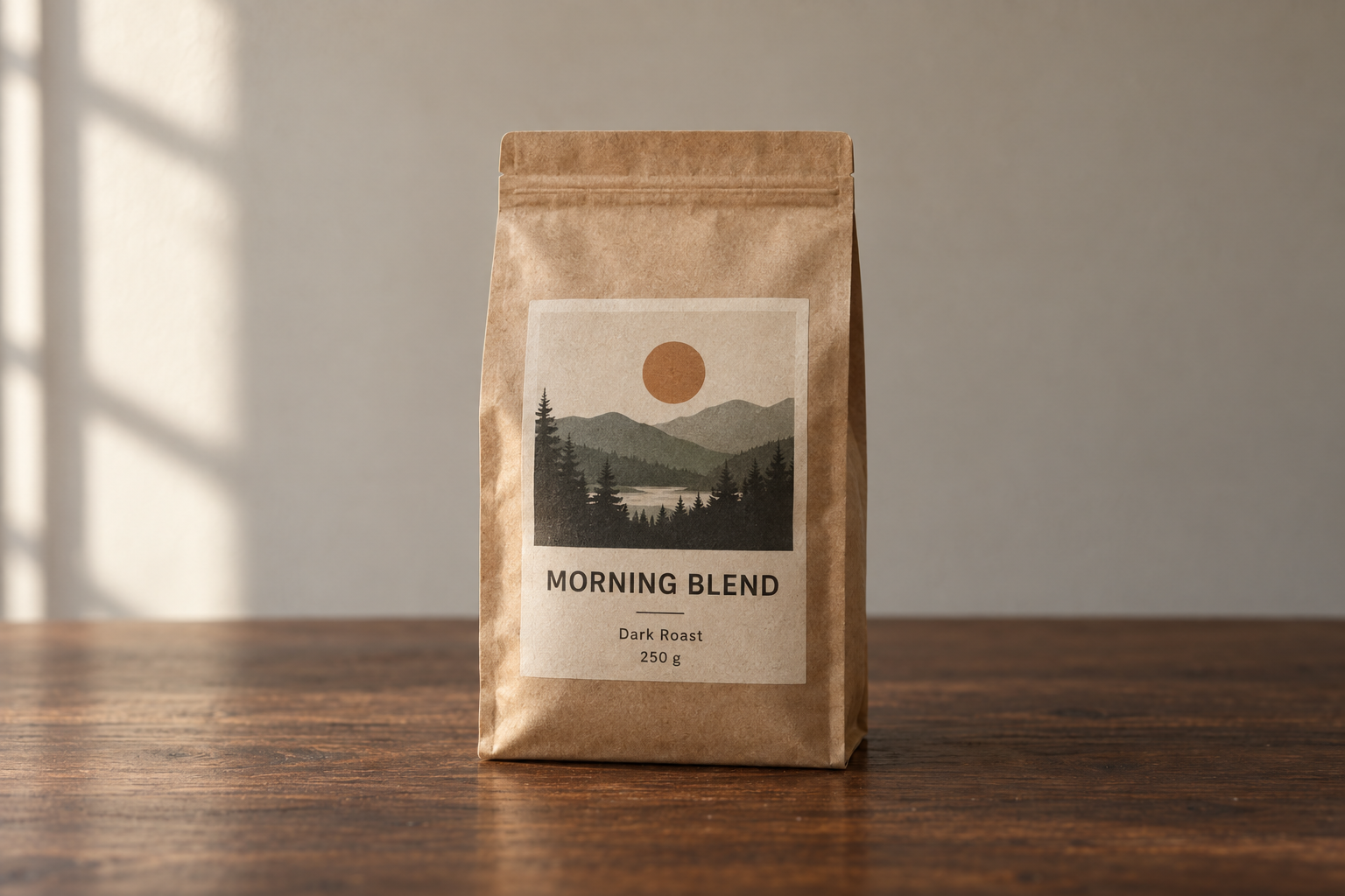
有效:
Product photograph of a 250 g matte kraft-paper coffee bag standing upright on a dark walnut
table. The front label faces the camera straight on and stays fully legible.
Label text (exact): "MORNING BLEND" as the headline, "Dark Roast · 250 g" beneath it.
Composition: centered, three-quarter height, generous negative space above for a headline.
Light: soft directional window light from the left, gentle contact shadow under the bag,
warm neutral color balance.
Style: premium e-commerce photography, shallow depth of field, subtle film grain.
Constraints: no extra text, no logos, no watermarks, no hands, no props crowding the frame.
同一模型,同一设置,结果完全不同。
不要写进提示词的设置项
通过 OpenAI API 生成时,尺寸、质量和背景属于参数,而不是句子。用文字说“生成 4K”只是建议,设置 size 才有保证。
| Parameter | What to set it to | When it matters |
|---|---|---|
model | gpt-image-2.5-flare 或 gpt-image-2.5-sunburst | 按需求权衡速度与精度 |
quality | low, medium, high, xhigh, max | 小字、复杂图表、最终交付物 |
size | 1024x1024, 1536x1024, 1024x1536, 2048x2048, 2048x1152, 3840x2160, 2160x3840,或自定义 WIDTHxHEIGHT | 印刷、幻灯片、竖版社交格式 |
background | auto, opaque, 或 transparent | 抠图、贴纸、logo、合成 |
自定义尺寸需遵循硬性规则:每条边为 16 的倍数,最长边不超过 3,840 px,长宽比不超 3:1,总像素介于 655,360 到 8,294,400。输出超 3,686,400 像素(即 2560×1440 以上)为实验性,发布前需检查。
两条习惯让质量设置更有价值:
- 草稿低,定稿高。 用
low或medium试构图,定稿用high或更高。质量档位影响输出 token,最高档成本约为最低档的 36 倍。 - 只为修正而升档。 小字模糊或图表标签塌陷时再升档,不要因“更高更安全”而盲目提升。高档位并不保证每次都更好。
在 Felo 上,这一层完全自动:选择 GPT-Image 2.5,设定格式和分辨率,直接生成。参数由工作区管理,你只需写好提示词。
12 个可复制粘贴的提示词
这些是实用起点,不是标准答案。更换主体,保留结构即可。
1. 写实人像,不显合成感
Create a photorealistic candid photograph of a bicycle mechanic in her late 40s,
wiping her hands on a rag in a narrow repair shop.
Visible skin texture: pores, freckles, a small scar on the forearm. Faded ink smudges
on her knuckles. A denim apron worn soft at the edges.
Shot like a 35 mm film photograph, medium shot at eye level, 50 mm lens.
Light: overcast daylight through an open garage door, soft falloff, no harsh highlights.
Color: natural and slightly muted, subtle grain.
Feel: unposed and ordinary, real materials and everyday clutter.
Constraints: no glamorization, no heavy retouching, no studio lighting, no text.
有效原因:明确了用途(抓拍照片)、光线和胶片参考,并拒绝模型默认的修图。
2. 电商产品照,标签清晰可读
Studio product photograph of a frosted glass 50 ml serum bottle with a brushed gold cap,
standing on a pale stone plinth against a soft beige backdrop.
Label text (exact): "LUMEN" as the brand, "Hydrating Serum · 50 ml" beneath it.
Render the label text once, straight on, sharp and fully legible.
Composition: centered, full bottle in frame, generous empty space on the right.
Light: large softbox from the upper right, gentle gradient falloff, clean contact shadow.
Style: premium beauty e-commerce photography, crisp detail, no props.
Constraints: no additional text, no logos, no watermarks, no reflections of studio equipment.
有效原因:短文本、精确引用、指定位置和次数——让图中文案保真的三要素。
3. 可读标题的海报
Design a bold event poster for an electronic music night.
Headline (exact, once): "CITY LIGHTS FESTIVAL"
Subline (exact, once): "SAT 14 NOV · DOCK 9 · 22:00"
Visual: a duotone night skyline in deep indigo and warm amber, grain texture, strong diagonal
composition with the headline sitting in the calm upper third.
Typography: heavy condensed sans-serif, high contrast against the background, generous kerning.
Format: vertical poster, print quality.
Constraints: no extra text, no sponsor logos, no watermarks, no stock-photo people.
有效原因:将画面与字体要求分开,明确两条文案,并保持海报所需的简洁。
4. 系列角色参考表
Create a character reference sheet for an original character.
Character: a young forest ranger with close-cropped dark hair, freckles across the nose,
a moss-green canvas jacket, a burnt-orange scarf, and scuffed leather boots.
Sheet contents: three views — front, three-quarter, and profile — plus one detail close-up
of the scarf knot.
Style: clean concept-art illustration, soft cel shading, consistent line weight,
neutral light gray background.
Layout: evenly spaced figures, same proportions across every view, no overlapping limbs.
Constraints: original design, no copyrighted characters, no text, no watermarks.
有效原因:参考表是一种格式而非单幅图,明确视角和细节,便于后续场景复用。
5. 英雄一致的四格漫画
Create a four-panel horizontal comic strip, same character in every panel.
Character consistency: same face, same short red jacket, same black bob haircut,
same proportions and line weight throughout.
Panel 1: she opens the front door and looks back into the apartment.
Panel 2: the door clicks shut; the cat, alone, turns slowly toward the empty room.
Panel 3: the cat sprawls across the sofa in a shaft of afternoon light.
Panel 4: the door opens again; the cat sits primly by the entrance, composed.
Style: clean flat comic illustration, limited palette, thin black outlines.
Constraints: no speech bubbles, no text, no watermarks, no style drift between panels.
有效原因:逐条列出分镜,并反复强调一致性,不假设模型会自动保持。
6. 解释流程的信息图
Create a clean infographic titled "How a Heat Pump Heats a House" for a general audience.
Show four stages connected by arrows: the outdoor unit absorbs heat from the air →
the refrigerant is compressed → heat is released indoors → the refrigerant expands and loops back.
Label each stage with a short caption, and label the key parts: outdoor unit, compressor,
expansion valve, indoor coil.
Style: flat vector illustration, muted blue and warm orange palette, white background,
consistent icon style, generous white space, readable labels.
Constraints: no tiny text, no decorative clutter, no watermarks.
有效原因:将图像视为教学设计——受众、流程、标签、视觉系统——而非单纯插画。
7. 带真实数据的路演幻灯片
Create one pitch-deck slide titled "Market Opportunity" in the style of a clean Series A deck.
Layout: title top-left, a TAM/SAM/SOM nested-circle diagram in muted blues and grays,
a bar chart beneath it showing growth from 2021 to 2026, and a quiet footer line.
Use exactly these numbers: TAM $42B, SAM $8.7B, SOM $340M.
Footnotes (exact): "Source: internal analysis"
Style: white background, modern sans-serif typography, generous margins, crisp data hierarchy,
no shadows and no gradients.
Constraints: no clip art, no stock photos, no decorative elements, no extra text.
有效原因:明确交付物(单页)、画布、层级和实际数据,并将脚注标为文本,防止模型自作主张。
8. 真实感 App UI 模型图
Create a realistic mobile app UI mockup for a neighborhood farmers market.
Screens: a simple header, a short vendor list with small photos and category labels,
a "Today's specials" section with two items, and a footer with location and opening hours.
Style: white background, subtle natural accent colors, clear type scale, minimal decoration,
realistic spacing and touch targets. It should look like a real, usable, well-designed product.
Present the screen inside a modern phone frame, straight on, on a plain light background.
Constraints: no concept-art styling, no invented brand logos, no watermarks.
有效原因:将产品描述为已上线,要求界面真实,而非概念图。
9. 透明产品抠图
Extract the product from the input image and isolate it on a fully transparent background.
Output: centered product, crisp silhouette, clean alpha edges, no halos or fringing.
Preserve product geometry, proportions, and label legibility exactly.
Add only light polishing. Do not add a solid backdrop, checkerboard, scenery, floor, or shadow.
Do not restyle the product.
Constraints: transparency must be real alpha, not a painted background.
有效原因:既要求主体抠出,也要求透明背景,并提前列出常见失败点(棋盘格、光晕)。
10. 风格迁移到新主体
Use the visual style from the input image — its palette, texture, and rendering medium —
and apply it to a new subject: a lighthouse on a rocky coast at dusk.
Keep the style's color range, brush treatment, and level of detail.
Change only the subject. Do not copy the original composition or reuse its objects.
Constraints: no text, no watermarks, no signature, no frame border.
有效原因:为参考图指定具体作用——色彩、质感、媒介——而非泛泛地说“同风格”,避免模型照搬整图。
11. 精确局部编辑
In this room photo, replace only the white dining chairs with chairs made of light oak.
Preserve everything else exactly: camera angle, wall color, rug pattern, table, pendant light,
window light direction, floor shadows, and surrounding objects.
Match the existing perspective and soft daylight; add realistic contact shadows and wood grain.
Constraints: change nothing outside the chairs, no added decor, no text.
有效原因:只改一处,详细列出需保持的内容。若结果仍然漂移,通常是遗漏了清单中的某项。
12. 不破坏设计的翻译
Translate the text in the infographic from English to Spanish.
Do not change any other aspect of the image: layout, icons, colors, typography,
line weights, spacing, and illustration style all stay exactly as they are.
Match the original type size and alignment so the translated text fits the same areas.
Constraints: no leftover English words, no added text, no watermarks.
有效原因:翻译提示词常因布局被重做而失败。“只翻译,不重设计”加上固定内容清单,保证资产可复用。
如何写出能被准确渲染的文本
文本曾是 AI 图像最容易露馅的地方。现在表现更好,但前提是你给出可用的内容。
- 精确引用文案。
headline reads "CITY LIGHTS FESTIVAL"优于“加点活动文字”。 - 说明出现次数。 “Render the tagline exactly once” 防止重复或回声。
- 拼写特殊内容。 品牌名或特殊拼写,逐字给出,输出后逐字核对。
- 指定字体风格。 粗体、紧凑无衬线、居中、字距宽、对比强。
- 保持简短。 标题、标签、价格、短提示。段落仍需用排版工具处理。
- 关上后门。 结尾加“no extra text, no watermarks, no logos”,否则模型可能自创说明或标识。
- 小字需高质量。 密集标签、图例、坐标轴、脚注建议用
high或更高,并选横向尺寸留出空间。
使用前两步检查:逐字读图中每个词,逐个核对每个数字。图表和信息图最容易出现“看似对”的错误。
参考图像需要分工,不要只给氛围
上传多张图片时,编号并分配角色。“Use the references”让模型随意混合,分工则能精准控制。
Image 1 is the identity reference for the person — preserve face, features, and proportions.
Image 2 is the clothing reference — dress the person in these garments.
Image 3 is the background reference — place her in that environment.
Match the lighting and color temperature of image 3, and keep the pose from image 1.
Constraints: do not change her face, body shape, or hairstyle; do not add accessories, text, or logos.
两条规则保证可靠:
- 明确变动与保持。 “Place the dog from image 2 next to the woman in image 1, matched to the existing light”是合成说明。“Combine these”只是愿望。
- 每轮重申锚点。 做系列时,每次都重复身份特征——服装颜色、面部特征、比例、色调。约束不重申,模型就会漂移。
做角色或产品系列时,先定一张基准图,每次新场景都用它做输入。后续版本漂移时,仍有可用基准。
编辑不漂移的方法
GPT Image 2.5 多轮编辑能力提升,但“更好”不等于“自动”。以下模式最稳妥:
- 每轮只改一处。 光线、背景或文案,三选一。否则无法判断哪步有效。
- 用“只改 X”公式。 “Change only X”,后接详细保持清单。需像素级不变的区域,建议合成回原图,不依赖提示词。
- 用上一步输出做输入。 编辑刚通过的图片,而不是重述场景。
- 保存每个定稿版本。 编辑破坏构图时,有可回退的版本,而不是凭记忆重现。
- 精细排版交给专业工具。 字距和间距的最后 5% 用排版工具比多生成几次更快。
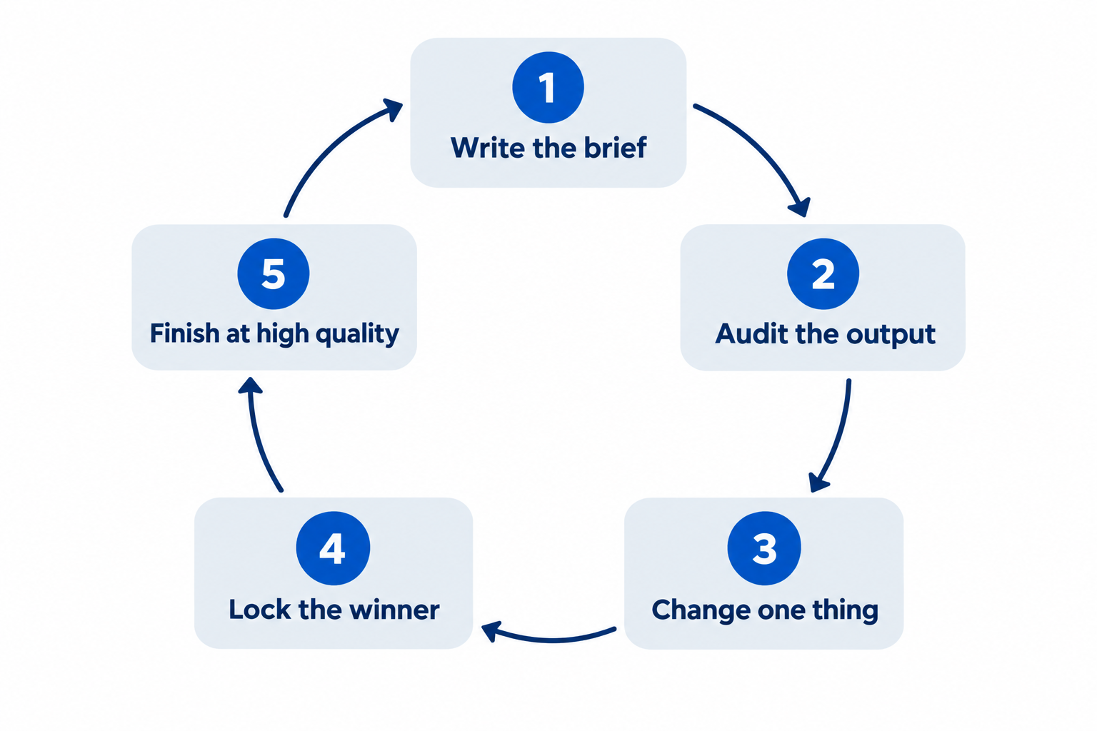
15 分钟迭代循环
能产出可用图像的人和靠运气的人,区别不在词汇,而在流程。
- 基线(2 分钟)。 写好七个部分,草稿质量生成一张图。
- 审查(2 分钟)。 检查主体、构图、光线、文本、限制五项,大声说出最大问题。
- 单点修改(2 分钟)。 只重写出错的部分,其余保持不变,便于对比。
- 锁定(1 分钟)。 满意后保存,并记录对应提示词版本,作为后续参考。
- 定稿(5 分钟)。 用高质量和全分辨率重生成,按最终用途检查效果——手机、幻灯片或打印,而非只在显示器上放大。
大多数人跳过第 3 步,每次都重写全部提示词,结果一小时过去,模型响应什么却一无所知。
常见失败与修正方法
| 症状 | 实际原因 | 修正方法 |
|---|---|---|
| 皮肤和表面像塑料 | 提示词用了“完美”“光滑”,却没提质感 | 明确皮肤、毛孔、磨损、材质,加“no heavy retouching”或“no glamorization” |
| 文本乱码或重复 | 文案被意译,未说明出现次数 | 精确引用,说明“exactly once”,小字用高质量 |
| 角色多图不一致 | 一致性细节未重复 | 用基准图做输入,每轮重申身份特征 |
| 编辑超出预期 | 没有保持清单 | 列出需固定内容,像素级不变建议合成 |
| 某细节反复出错 | 每次都重写全部提示词 | 只改一处,其余保持,便于对比 |
| “透明”PNG 有灰色棋盘格 | 背景被画出来而非抠掉 | 明确要求透明,导出 PNG 或 WebP,检查 alpha 通道 |
| 4K 输出细节模糊 | 小字用草稿质量生成 | 文本密集图用 high 或更高,按最终用途检查 |
| 全部像图库照片 | 只描述了类别,无具体场景 | 加用途、地点、时间和一个值得关注的细节 |
在 Felo 上运行这些提示词
本指南内容可直接通过 OpenAI API 使用,自带密钥、计费和参数管理。如果你更想专注于提示词,Felo 让 GPT-Image 2.5 直接在浏览器运行:
- 免费起步。 每日额度,无需信用卡,无需 API 密钥。
- 无水印,商用无忧。 免费版也可商用。
- 最高 4K 输出。 原生 3840×2160,首图即成品。
- 50+ 风格,支持 50+ 语言文本。 适合海报、包装、菜单、多语种营销。
- 一站集成主流模型。 GPT-Image 2.5、GPT-Image 2、Nano Banana Pro、Nano Banana 2 Lite、Grok Imagine 2.0、Gemini 3.1 Flash Image 等,按需切换。
- 引导式工作流。 分镜、表情表、片头、精灵表,开局即有结构化提示词。
工作区内还内置现成提示词库,六格分镜、活动海报、产品包装、漫画、解说图、广告变体等,随时试用。把它们当作校准工具:先跑一遍,读结果,再用七步结构写自己的项目。
常见问题解答
GPT Image 2.5 最佳提示词写法是什么? 像给设计师写 brief 一样描述图像:用途、主体、动作、构图、光线与材质、风格,最后是精确文本和限制。复杂图像分段标注,迭代时每次只改一项。
Flare 和 Sunburst 应该选哪个? 速度优先、快速审核时用 Flare。商业创意、细节丰富、精细编辑用 Sunburst。两者同价,区别在质量和延迟,不在成本。
如何让 AI 图像中的文本可读? 精确引用文案,说明位置和出现次数,指定字体风格,保持简短,加“no extra text”。输出后逐字检查,小字用高质量。
如何让角色或产品多图一致? 先定一张基准图,每次新场景上传做参考,分配明确角色,每轮提示词重申身份特征。一致性靠重复约束和固定参考,不靠运气。
为什么编辑时未提及部分也被改了? 因为只写了变动,没写保持清单。用“change only X”,并列出需保持的内容:机位、光线、结构、标签、背景物。
用这些提示词需要 OpenAI API 吗? 不需要。提示词技巧属于模型层面,Felo 的 GPT-Image 2.5 工作区直接浏览器运行,无需 API 密钥,随时粘贴本指南提示词生成。
GPT Image 2.5 生成的图片可以商用吗? 在 Felo 上可以——图片无水印,商用无忧,免费版同样适用。
写需求,不许愿
可用资产和平庸渲染之间,几乎从不靠“魔法词”。靠的是用途说明、构图、光线、材质、引用文案和不可变内容清单。
七个部分写全,效果立现。每次只改一项,模型响应一目了然。
打开工作区,粘贴本指南提示词,看看 GPT-Image 2.5 如何响应真实 brief。
本文还提供以下语言版本:English、日本語、한국어、繁體中文、हिन्दी、Français、العربية、Русский、اردو、Bahasa Indonesia、Deutsch、Tiếng Việt、Türkçe、Italiano、ไทย、Español、বাংলা、Português。